Create Stunning Responsive Images with the Picture Element


srcsetand the<picture>element are crucial for web designers and developers aiming to improve how website images look on different screens. This process involves using thesrcsetattribute and the<picture>element in HTML to show images that fit each user’s device, making pages load faster and images look better. This article will help you use these technologies to improve your web page’s visibility and bring in visitors.

Discover how at OpenReplay.com.
Responsive images are essential to modern web design, adapting seamlessly to various devices and screen sizes. They ensure optimal image presentation by serving the right size and quality for each device, improving user experience and page loading speed. These images are designed to adjust their size and resolution based on the device or screen they are being viewed on. This technique makes an image look sharp and clear on any screen, regardless of size.
The article’s primary objective is to educate readers on the significance of responsive images, the challenges faced in serving them, and the techniques and tools available, specifically srcset and the <picture> element, to achieve responsive and visually appealing web design. It aims to provide both an understanding of the topic and practical knowledge that readers can apply in their web development endeavors.
Understanding Responsive Images
In this section, we’ll explore the essence of understanding these images, unlocking the key to making your web content look great on all devices.
Adaptive visuals are more than just pretty pictures; they are a fundamental component of web applications that enhance user engagement and overall performance. Responsive images help increase the loading speed of web pages, offer a better user experience, help reduce page load time, and improve performance.
Serving responsive images is an essential part of modern web design. However, it sometimes comes with some difficulties. Below are some revealed challenges and complexities faced when dealing with responsive images:
- Handling Diverse Screen Sizes and Resolutions: In responsive images, the challenge is making pictures look good on all devices, from big to small screens. This means adjusting image size and quality to fit each screen while keeping things clear and efficient. Techniques like the
srcsetattribute and the<picture>element help with this. Finding the right balance between good quality and fast loading times is a continuous challenge, but it’s necessary for a consistent user experience, no matter the device. - Balancing Image Quality with File Size Optimization: We want great images that load fast and save data, but balancing image quality and file size is a big challenge for serving responsive images. In this article, we explore ways to make images both beautiful and efficient for a better web experience.
- Ensuring Cross-Browser and Cross-Device Compatibility: In today’s digital world, making images look great on different web browsers and devices is a big challenge. Each browser and device does things differently, so getting images to look just right everywhere is tricky. The goal is to balance image quality and how quickly they load. To solve this issue, web experts use tools like frameworks and testing to ensure pictures look good, no matter what you’re using to look at them. It’s all about giving everyone a great experience, no matter which browser or device they use.
Mastering Responsive Images with srcset and <picture> Element
In this section, we will explore the art of crafting responsive images through a deep dive into the powerful tools of srcset and the <picture> element.
scrset is an attribute in HTML used in web development to specify a set of image files with varying resolutions or sizes for a single image element. This attribute is particularly useful for creating responsive web designs, as it allows the browser to choose the most appropriate image to display based on the user’s device and screen size. By providing multiple image options, each optimized for different screen resolutions, srcset ensures that the user receives a clear and appropriately sized image, enhancing both visual quality and webpage loading speed.
The purpose of srcset is to provide the browser with different image options to adapt to various devices and screen sizes. It helps optimize the user experience by serving images well-suited for the viewer’s device, improving load times and visual quality.
Benefits of srcset
Below are some of the benefits of using srcset in web development:
- Improved Performance: Using
srcsetimproves website performance. It lets developers offer different images for various screen sizes so the right one appears on your device. This means faster loading times and a better user experience. - Bandwidth Optimization: Using
srcset, web designers can send smaller images to small screens and larger, high-quality images to big screens. This is important for mobile users with limited data plans because it saves data by not sending large images to their devices. - SEO Benefits: Search engine optimization (SEO), or making websites friendly for search engines, is crucial. Search engines like speedy websites, and responsive images using
srcsethelp with that. They make pages load faster, boosting performance and the chance of ranking higher in search results. This helps a website reach a larger audience.
Limitations of srcset
While srcset is a valuable tool for optimizing images in responsive web design, it does come with certain limitations that developers should be aware of. Below are some of the limitations associated with using srcset in website projects:
- Browser Support: One limitation of
srcsetis that web browsers handle it differently. Most newer browsers work well with it, but older or less popular ones might not use it properly. This can lead to images not displaying correctly on some devices because the browser can’t pick the best image for the screen. - Complex Syntax: The syntax for the
srcsetattribute can become quite complex, especially when dealing with a wide range of image sources with different resolutions. This complexity can make it challenging to manage and maintain code, particularly for web developers unfamiliar with this attribute. - Limited Image Format Support: One thing to know about
srcsetis that it’s great for adjusting image quality based on screen types but doesn’t naturally handle different image formats. This is important because certain devices and browsers prefer specific formats (like WebP for Chrome). To work around this, developers may need to use JavaScript or server-side methods to pick the correct format for each situation.
Syntax and Attributes
The srcset attribute is vital to creating responsive images in HTML. It’s easy to use; just put it inside an <img> element. This attribute lists image files and their sizes. Then, the browser picks the correct image based on your device and screen size. The srcset attribute looks like this: srcset="image1.jpg 200w, image2.jpg 400w, image3.jpg 800w". Each image is followed by its width (like ‘200w’ for 200 pixels wide). This helps the browser choose the best image, making websites faster and better for everyone.
Real-world Examples
Below is a practical example illustrating how the srcset attribute effectively produces responsive images:
Example:
<!doctype html>
<html lang="en">
  <head>
    <meta charset="UTF-8" />
    <meta http-equiv="X-UA-Compatible" content="IE=edge" />
    <meta name="viewport" content="width=device-width, initial-scale=1.0" />
    <title>Document</title>
  </head>
  <body>
    <h2>The srcset attribute</h2>
    <img
      src="cat.jpg"
      alt="A cat"
      srcset="cat_small.jpg 320w, cat_medium.jpg 640w, cat_large.jpg 960w"
      sizes="(max-width: 320px) 100px,
          (max-width: 640px) 280px,
          400px"
    />
  </body>
</html>
Output:
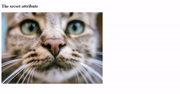
In the above example, when viewed on different screens, the browser will choose the most suitable image from the **srcset** based on the viewport width and the conditions specified in **sizes**. This practice helps optimize the image’s display for a responsive, faster-looking web page.
Exploring the <picture> Element
In this section, we will explore the <picture> element, look at some of its advantages and limitations for developers, and provide practical examples for a complete understanding.
The <picture> element is a powerful tool for web designers and developers, letting you control how images appear on different devices. The <picture> element serves as a container for multiple image resources. It ensures your content looks great on all screen sizes, from small phones to big computers, by serving the right image for each. In this article, we’ll explore using the <picture> element to make your website work well on any device.
Benefits
Here are some of the advantages of using the <picture> element in your web projects:
- Precise Control Over Image Selection: The
<picture>element offers a valuable feature; it allows web designers to select the best-fitting image for different screens. Web designers can specify various image sources for different screen sizes and resolutions, ensuring that the displayed image looks sharp and properly sized on all devices, whether a small phone or a large desktop screen. - Simplified Responsiveness: The
<picture>element simplifies making images responsive. Developers no longer need to rely mainly on CSS or JavaScript to make images adapt to different screen sizes. This method creates an efficient workflow, making it easier to create responsive web designs that adapt easily to the different kinds of devices available today. - Improved Accessibility: The
<picture>element not only empowers web developers to tailor images for different screen sizes but also aligns with the principles of web accessibility. The<picture>element allows developers to include alternative text and captions for each image source; it ensures that users with disabilities can access and understand the content, ensuring that all users can access the content.
Limitations
The <picture> element is a valuable tool for gaining control over different selections of images, but it does come with certain limitations that developers should be aware of. Below are some of the limitations associated with using the <picture> element in website projects:
- Browser Support: A major issue with the
<picture>element is that it might not work well on older web browsers. While newer browsers handle it just fine, older ones may not fully understand or display it. This can result in people using outdated browsers not seeing the images as they should, which could reduce the quality of their website experience. - Limited to Images: While the
<picture>element is fantastic for images, it’s unsuitable for handling other media types like videos. Developers must rely on different methods and technologies when working with non-image media in a responsive design. - Increased HTML Markup: To effectively implement the
<picture>element, you need to include multiple child elements, each specifying different sources for your image. This can lead to increased HTML markup, which, if not managed properly, can make your code more challenging to maintain and read.
Practical, specific examples
Below are practical examples showing how the <picture> element helps developers gain control over image selection in website projects:
Example:
<!doctype html>
<html lang="en">
  <head>
    <meta charset="UTF-8" />
    <meta http-equiv="X-UA-Compatible" content="IE=edge" />
    <meta name="viewport" content="width=device-width, initial-scale=1.0" />
    <title>Document</title>
  </head>
  <body>
    <h2>The Picture Element</h2>
    <picture>
      <source
        media="(min-width: 650px)"
        srcset="img_rainbow.jpg"
        alt="rainbow"
      />
      <source media="(min-width: 450px)" srcset="img_macaw.jpg" alt="macaw" />
      <img src="img_car.jpg" alt="car" />
    </picture>
  </body>
</html>
The above code displays a <picture> element with two source files and an image to return to.
Note: Always place an <img> element as the last part inside the <picture> element. The <img> element is used by browsers that do not support the <picture> element or if none of the <source> tags match.
Output:
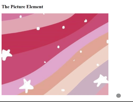
In the above example, we resize the browser to see different versions of the picture loading at different viewport sizes. The browser looks for the first source option that matches the size of the user’s screen, based on what it can see, and then fetches the image mentioned in the srcset.
Conclusion
In web design, mastering responsive images through srcset and <picture> is an essential skill for creating websites and applications that look great on all kinds of devices. We’ve taken a journey through the importance of responsive images, tackled the challenges involved, and delved deep into understanding srcset and the <picture> element.
This isn’t just about making things look good; they’re about making websites load faster and work better. By understanding these techniques, we can design online experiences that captivate and perform effortlessly on screens of all sizes. Whether you’re just starting out in web design or you’re already a pro, using responsive images is like having a special tool to make your website content look great on all kinds of screens.
Truly understand users experience
See every user interaction, feel every frustration and track all hesitations with OpenReplay — the open-source digital experience platform. It can be self-hosted in minutes, giving you complete control over your customer data. . Check our GitHub repo and join the thousands of developers in our community..