Creating a Sidebar Menu Layout with SvelteKit


In this article, we are going to create a responsive sidebar menu layout using SvelteKit 1.0.0 and Flowbite-Svelte. You can find the demo at https://flowbite-sveltekit-responsive-sidebar-layout.vercel.app/. Flowbite-Svelte is an official Flowbite UI component library for Svelte. It has more than 50 UI components, and you can build websites faster.
Let’s get started.
Installing all packages
We are going to create a new SvelteKit app:
npm create svelte@latest responsive-sidebar-layout
cd responsive-sidebar-layout
npm i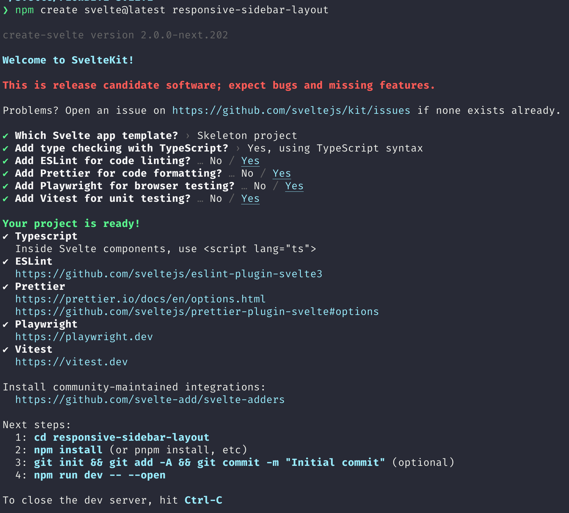
Tailwind CSS is a utility-first CSS framework. You can add it directly to your markup. Let’s install Tailwind CSS:
npx svelte-add@latest tailwindcss
npm i
Update tailwind.config.cjs:
const config = {
  content: [
    "./src/**/*.{html,js,svelte,ts}",
    "./node_modules/flowbite-svelte/**/*.{html,js,svelte,ts}",
  ],
  theme: {
    extend: {},
  },
  plugins: [
    require('flowbite/plugin')
  ],
  darkMode: 'class',
};
module.exports = config;
Installing Flowbite, Flowbite-Svelte, and dependencies:
npm i -D flowbite flowbite-svelte classnames @popperjs/core At the time of writing this, you may need to use esbuild@0.16.8:
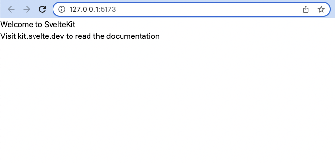
npm i -D esbuild@0.16.8Start the server and check if it works without any errors:
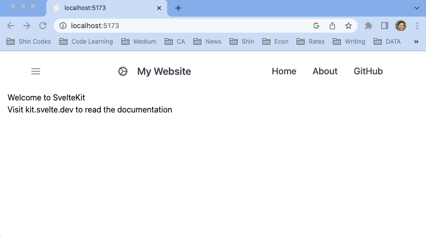
npm run devYou should see the following at http://127.0.0.1:5173/.
We will use Svelte-Heros SVG icons for menu icons and our logo. Let’s install it:
npm i -D svelte-heros-v2Here we installed Hero icons version 2 with Svelte-Heros-v2.
Creating dummy pages
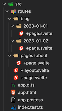
We need some dummy pages. Create src/routes/pages/about/+page.svelte, src/routes/blog/2022-01-01/+page.svelte, and src/routes/blog/2022-01-2/+page.svelte.
Instead of creating separate directories for each page, you can use a script to add multiple files to a directory at once. This can save time and effort, especially if you have many pages. I will demonstrate this method in a future article, so stay tuned!
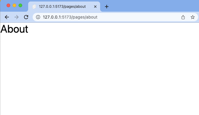
You can add any content for each article. Now you can visit http://127.0.0.1:5173/pages/about, http://127.0.0.1:5173/blog/2023-01-01, and http://127.0.0.1:5173/blog/2023-01-02.
Importing components and utilities
Let’s import various components from the Flowbite-Svelte library and some additional utilities such as Cog from svelte-heros-v2 and the page from SvelteKit, onMount, and sinIn easing function from Svelte.
<script lang="ts">
  import '../app.postcss';
  import { page } from '$app/stores';
  import { onMount } from 'svelte';
  import {
    Navbar,
    NavBrand,
    NavLi,
    NavUl,
    NavHamburger,
    Sidebar,
    SidebarGroup,
    SidebarItem,
    SidebarWrapper,
    Drawer,
    CloseButton,
    SidebarDropdownWrapper
  } from 'flowbite-svelte';
  import { Cog } from 'svelte-heros-v2';
  import { sineIn } from 'svelte/easing';
</script>- Line 3: The SvelteKit
$pagestore is imported, which allows the current page, parameters, current route, and status to be accessed. - Line 4: Svelte
[onMount](https://svelte.dev/docs#run-time-svelte-onmount)run as soon as the component has been mounted to the DOM. We are going to use it to check the screen width. - Lines 5-18: Various Flowbite-Svelte components, including Navbar, Drawer, and Sidebar, are imported for use in the code.
- Line 19: An icon is imported for use in the NavBrand component.
- Line 20: The Svelte
sineIneasing function is imported.
Main navigation
The top navigation bar consists of a hamburger menu for the Drawer and a full menu for larger screens. The NavUl and NavLi components are used to construct the main navigation.
<script lang="ts">
  // Append the following
  // Navigation component
  let drawerHidden: boolean = false;
  const toggleDrawer = () => {
    drawerHidden = !drawerHidden;
  };
  let divClass = 'w-full md:block md:w-auto pr-8';
  let ulClass = 'flex flex-col p-4 mt-4 md:flex-row md:space-x-8 md:mt-0 md:text-lg md:font-medium';
</script>

<Navbar let:hidden let:toggle>
  <NavHamburger on:click={toggleDrawer} btnClass="ml-3 lg:hidden" />
  <NavBrand href="/" class="lg:ml-64">
    <Cog />
    <span class= "self-center whitespace-nowrap text-xl font-semibold dark:text-white pl-4">
      My Website
    </span>
  </NavBrand>
  <NavHamburger on:click={toggle} />
  <NavUl {hidden} {divClass} {ulClass}>
    <NavLi href="/">Home</NavLi>
    <NavLi href="/pages/about">About</NavLi>
    <NavLi href="https://github.com/shinokada/flowbite-sveltekit-responsive-sidebar-layout"
      >GitHub</NavLi
    >
  </NavUl>
</Navbar>

<div class="flex px-4 mx-auto w-full">
  <main class="lg:ml-72 w-full mx-auto">
    <slot />
  </main>
</div>- Lines 4-7: The
toggleDrawerfunction shows the Drawer component when the hamburger menu is clicked. - Lines 8-9: Styling for the component.
- Line 12-29: The
Navbarcomponent is added to the code, withlet:hiddenandlet:toggledirectives. These prop values can be used in child components. Thehiddenprop is used with theNavUlcomponent, and thetoggleprop is used with theNavHamburgercomponent. - Line 13: The hamburger menu is hidden on screens larger than 1024px and has a click event (
toggleDrawer) that allows it to show the Drawer component. - Lines 14-19: The
NavBrandcomponent is added, using the imported icon as the logo. - Line 20: The hamburger menu for screens smaller than 768px is added, with the
toggleprop for the click event. - Lines 21-27: The
NavUlandNavLicomponents are used to construct the main navigation. - Line 30-34: Adding styling to the main content.
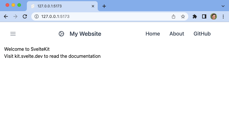
Screen size larger than 769px:
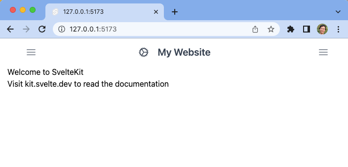
Screen size less than 768 px:
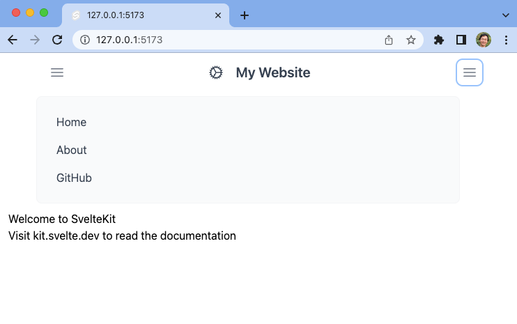
Opening the main navigation when the screen size is less than 768px:
Currently, the left hamburger menu doesn’t do anything. In the next section, we are going to add the Drawer component.
Session Replay for Developers
Uncover frustrations, understand bugs and fix slowdowns like never before with OpenReplay — an open-source session replay tool for developers. Self-host it in minutes, and have complete control over your customer data. Check our GitHub repo and join the thousands of developers in our community.
Drawer component
<script lang="ts">
  // Append the following
  // Drawer component
  let backdrop: boolean = false;
  let activateClickOutside = true;
  let breakPoint: number = 1024;
  let width: number;
  let transitionParams = {
    x: -320,
    duration: 200,
    easing: sineIn
  };
  $: if (width >= breakPoint) {
    drawerHidden = false;
    activateClickOutside = false;
  } else {
    drawerHidden = true;
    activateClickOutside = true;
  }
  onMount(() => {
    if (width >= breakPoint) {
      drawerHidden = false;
      activateClickOutside = false;
    } else {
      drawerHidden = true;
      activateClickOutside = true;
    }
  });
</script>

<svelte:window bind:innerWidth={width} />
<!-- After Navbar -->
<Drawer
  transitionType= "fly"
  {backdrop}
  {transitionParams}
  bind:hidden={drawerHidden}
  bind:activateClickOutside
  width="w-64"
  class="overflow-scroll pb-32"
  id= "sidebar"
>
  Drawer
</Drawer>- Line 4: The backdrop for the Drawer component is set to
false. The default value istrue, so if you want to show the backdrop, remove it or set it totrue. - Line 5: The
activateClickOutsideprop is set totrue, allowing the Drawer component to be closed by clicking outside its area. - Line 6: The breakpoint for the screen size is set to 1024px.
- Line 7: A
widthvariable is created to store the screen width. - Line 8-12: Transition parameters are set.
- Line 13-19: The
drawerHiddenandactivateClickOutsideprops are controlled based on the screen size. If the screen size is less than the breakpoint (1024px), they are set tofalse; otherwise, they are set totrue. - Line 20-28: The same actions are performed on the component mount, checking the screen size at that time.
- Line 31: The
<svelte:window>element is used to add event listeners for changes in the window size, and theinnerWidthis bound to thewidthvariable. - Line 33-44: We add the Drawer component using the
transitionTypeproperty to “fly” and pass values to thebackdropandtransitionParamsproperties. We also bind thehiddenproperty to a valuedrawerHiddenand set theactivateClickOutsideproperty. Thewidthproperty is set tow-64.
Make the screen size less than 1024px and click the hamburger menu to see the Drawer component in action.
In the next section, we will add the Sidebar Component within the Drawer component.
Sidebar
<script lang="ts">
// Append the following
// Sidebar Component
const toggleSide = () => {
  if (width < breakPoint) {
    drawerHidden = !drawerHidden;
  }
};
$: activeUrl = $page.url.pathname;
let spanClass = 'pl-2 self-center text-md text-gray-900 whitespace-nowrap dark:text-white';
</script>

<!-- Add the following within the Drawer component -->
<div class=" flex items-center">
  <CloseButton on:click={() => (drawerHidden = true)} class="mb-4 dark:text-white lg:hidden" />
</div>
<Sidebar asideClass="w-54">
  <SidebarWrapper divClass="overflow-y-auto py-4 px-3 rounded dark:bg-gray-800">
    <SidebarGroup>
      <SidebarItem label="Home" href="/" on:click={toggleSide} active={activeUrl === `/`} />
      <SidebarItem
        label= "About"
        href="/pages/about"
        {spanClass}
        on:click={toggleSide}
        active={activeUrl === '/pages/about'}
      />
      <SidebarDropdownWrapper label="Articles">
        <SidebarItem
          label= "Article 1"
          href={`/blog/2023-01-01`}
          {spanClass}
          on:click={toggleSide}
          active={activeUrl === '/blog/2023-01-01'}
        />
        <SidebarItem
          label= "Article 2"
          href="/blog/2023-01-02"
          {spanClass}
          on:click={toggleSide}
          active={activeUrl === '/blog/2023-01-02'}
        />
      </SidebarDropdownWrapper>
    </SidebarGroup>
  </SidebarWrapper>
</Sidebar>- Line 4-8:
toggleSideis a function that toggles the value ofdrawerHiddenif the screen’s width is less than thebreakPointvalue. - Line 9:
activeUrlis a reactive variable set to the current page’s URL pathname. - Line 10:
spanClasscontains a class for styling aSidebarItemcomponents.
Check it on your localhost:
npm run dev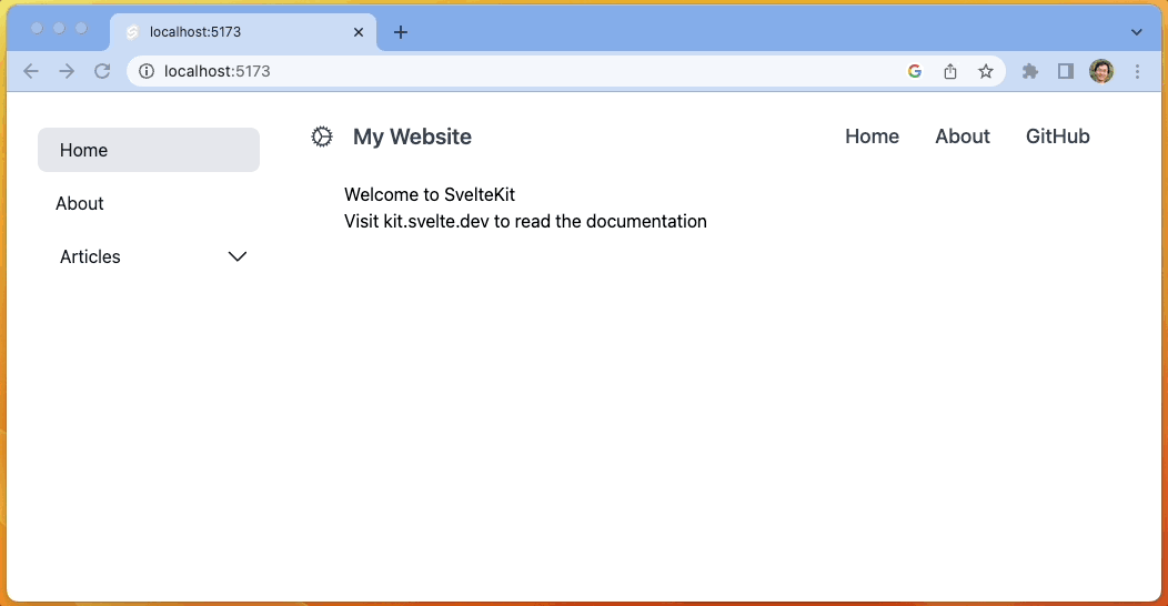
Adding icons to sidebar items
You can enhance the appearance and usability of your sidebar menu by adding icons to its items. For instance, you can add a home icon next to the ‘Home’ menu item to make it more visually appealing and easier to identify for users.
<script>
import { Home } from 'svelte-heros-v2'
</script>

<SidebarItem label="Home" href="/" on:click={toggleSide} active={activeUrl === `/`}>
  <svelte:fragment slot="icon">
    <Home />
  </svelte:fragment>
<SidebarItem />
Remember to include the necessary import statement at the top of your script tag: import { Home } from 'svelte-heros-v2". Then, you can use the icon` slot to add your icon component within the menu item. This will ensure that the icon is displayed properly in your sidebar menu.
Conclusion
This tutorial provided in this article demonstrates how to use SvelteKit and Flowbite-Svelte to create a responsive sidebar menu layout for a website. These tools allow for the creation of a professional-looking menu with minimal effort and time. By following the steps outlined in the tutorial, you can easily set up and customize your own responsive sidebar menu layout using SvelteKit and Flowbite-Svelte. There may be additional tasks to complete before your site is fully functional, but many of them can be efficiently addressed by utilizing the Flowbite-Svelte components. These components provide pre-built, customizable elements that can save time and simplify development.
- Adding a dark mode
- Adding a breadcrumb component
- Adding a footer component
- More components can be found from https://flowbite-svelte.com/
Additional details can be found in the repository and demo at https://sveltekit-sidebar-layout.vercel.app/.
A TIP FROM THE EDITOR: If you are interested in Svelte, don’t miss Exploring SvelteKit In 2022 By Building A Portfolio Website.
Gain Debugging Superpowers
Unleash the power of session replay to reproduce bugs and track user frustrations. Get complete visibility into your frontend with OpenReplay, the most advanced open-source session replay tool for developers.