
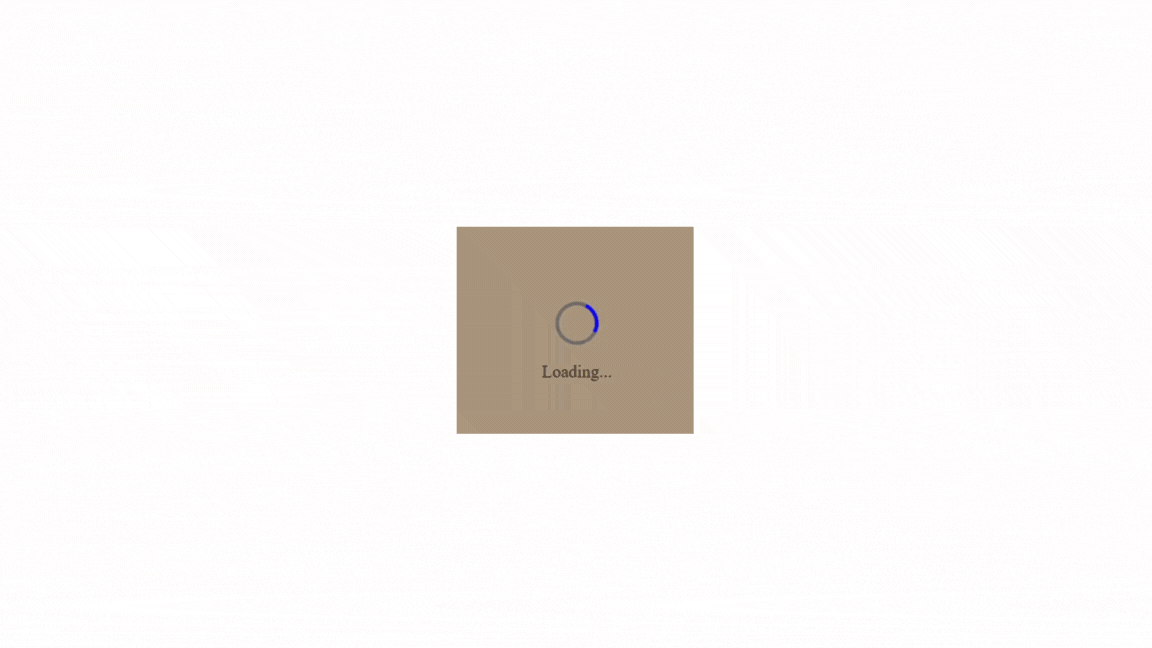
Gone are the days of boring loading screens! While default spinners serve their purpose, custom-loading spinners offer an opportunity to infuse creativity and brand identity into your web projects. They are essential elements of user interface design, providing visual feedback to users during content loading or actions. In this article, we’ll explore the art of crafting them using CSS, empowering you to create unique and engaging loading experiences for your users.

Discover how at OpenReplay.com.
Loading spinners, also known as loading indicators or preloaders, are graphical elements used in user interfaces to signify that a process is underway and the system is waiting for something to complete. They provide visual feedback to users during content loading or actions, indicating that the application is working on a task and may need some time to finish it. They are often animated, typically rotating or moving in some manner, to convey the ongoing activity to users.
They serve various purposes, including:
-
Feedback and Progress Indication: They provide visual feedback to users, indicating that their action has been recognized and the system is working on it. This feedback is essential for maintaining user confidence and preventing frustration, especially during tasks requiring longer processing times.
-
Preventing User Abandonment: In situations with a delay in content loading or actions, users might perceive the application as unresponsive or broken, leading to frustration and potential abandonment. They reassure users that the application is functioning and encourage them to wait patiently for the task to be completed.
-
Managing Expectations: They manage user expectations by communicating that a process is underway. Users are more likely to tolerate delays if they know the system is actively working on their request.
-
Improving Perceived Performance: Even if a process takes some time to complete, their presence can create the perception of faster performance. This psychological effect makes the waiting experience more tolerable for users.
-
Providing Accessibility Support: They can also benefit users with disabilities or slower internet connections by providing clear visual cues about ongoing processes. This contributes to a more inclusive user experience.
Types of Loading Spinners
There are several types, each with its unique visual style and animation.
Here are some common types:
-
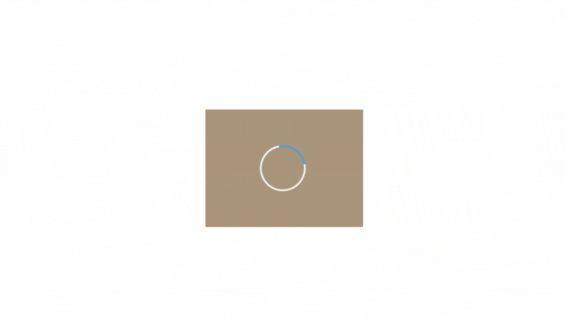
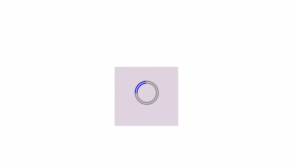
Circular Spinners: They consist of one or more circles that rotate to indicate activity. They are one of the most common types of spinners and are often used in web and mobile applications. Here is an example:
-
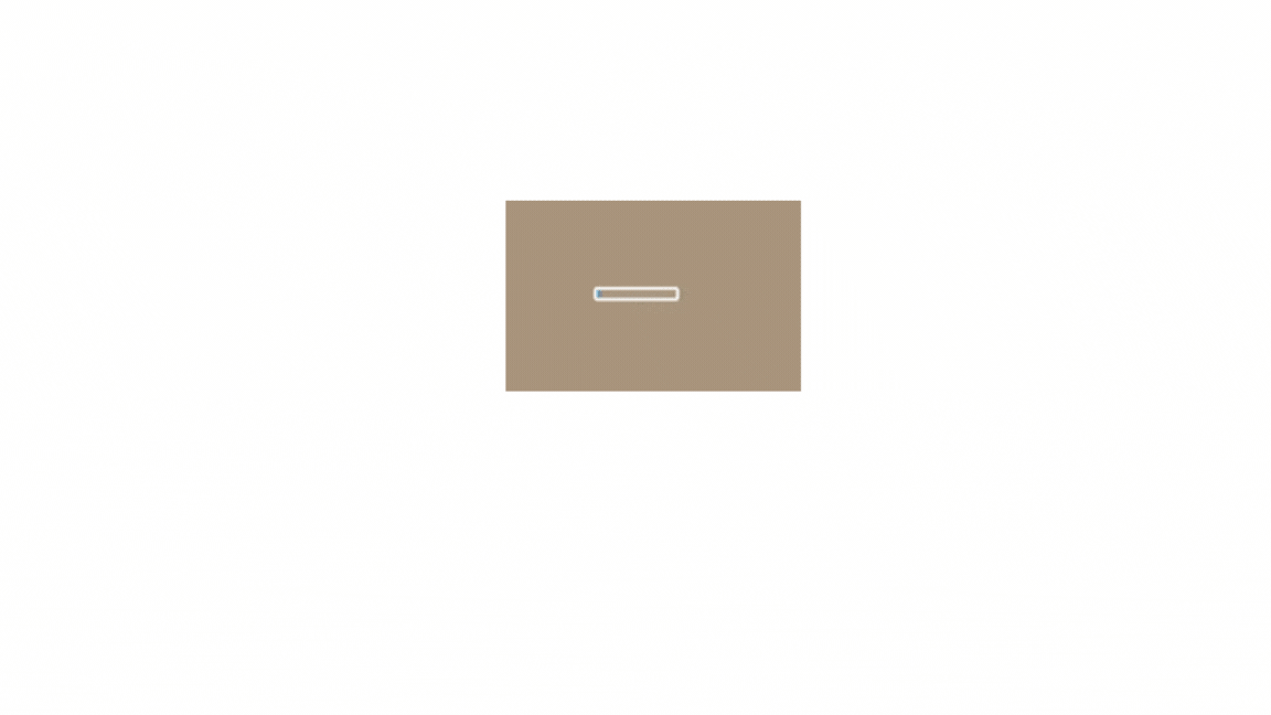
Linear Spinners: They move horizontally or vertically in a linear fashion to signify progress. They are often used when a determinate amount of progress is to be shown, such as when downloading a file or uploading data. Here is an example:
-
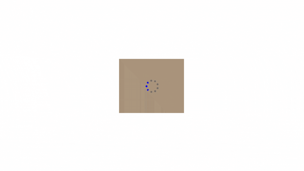
Dots or ellipses: This type of spinner uses three or more dots that bounce or fade in and out one after another. It’s a simple and effective way to show that something is happening without being too distracting. Here is an example:
-
Spinner with Text: Spinners with text display a textual message or percentage alongside the spinning animation to provide additional context about the ongoing process. This type of spinner is beneficial for conveying information about a task’s progress. Here is an example:
-
Custom Shape Spinners: Spinners with unique shapes or icons that reflect the theme or purpose of the website or application.
Techniques for Creating Custom Loading Spinners
When creating loading spinners using HTML and CSS, the focus lies on structuring the HTML elements to represent the spinner and styling them using CSS to achieve the desired appearance and animation.
Here’s a concise guide:
HTML Structure
The HTML structure provides the foundation for the spinner. It typically consists of a container element to hold the spinner and one or more elements representing the spinner’s components. In the example provided, we have a <div> element with the class spinner-container to contain the spinner and another <div> element with the class spinner to represent the spinner itself.
Start by defining the HTML structure for your spinner. This typically involves a container element with one or more elements representing the spinner’s components. Here’s an example of the HTML structure for a basic spinner:
<div class="spinner-container">
  <div class="spinner"></div>
</div>
Let’s break down each part of this structure:
-
Spinner Container (
<div class="spinner-container">): This is a container element that holds the spinner. It helps to position and style them within a specific area of the webpage. You can adjust its size, position, and other CSS properties to control its appearance and behavior within the container. -
Spinner Element (
<div class="spinner"></div>): This is the actual spinner element. It’s the part that visually represents the loading animation. You’ll apply CSS styles and animations to this element to create your desired spinning effect or any other visual representation.
You can place this HTML structure wherever you need the loading spinner to appear within your webpage. Adjust the classes and styles as necessary to fit your design requirements.
CSS Styling
CSS styling is crucial for creating the visual appearance and animation of the loading spinner. It allows you to create visually appealing, brand-consistent, and performant animations that provide explicit user feedback and enhance the overall user experience. By leveraging CSS effectively, you can design them not only to serve a functional purpose but also to contribute positively to the aesthetics and usability of your web projects.
You can use CSS properties like animation, @keyframes, transform, and border-radius to create the spinning animation and desired visuals.
Using animation is a common and effective technique to create dynamic visual feedback for users. CSS animations allow you to define custom motion effects, such as rotation, scaling, or fading, to bring the spinner to life.
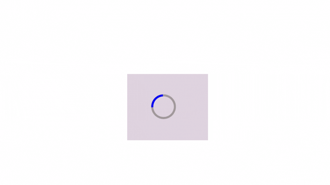
Here’s how you can use CSS to style a circle loading spinner:
<!-- Spinner Container -->
<div class="spinner-container">
  <!-- Spinner Element -->
  <div class="spinner"></div>
</div>
body {
background-color: rgb(222, 207, 222);
}
/* Define styles for the spinner container */
.spinner-container {
display: flex;
align-items: center;
justify-content: center;
height: 100vh; /* Make the container the full height of the viewport */
}
/* Define styles for the spinner */
.spinner {
width: 100px;
height: 100px;
border: 10px solid #968f8f;
border-radius: 50%;
border-top-color: blue; /* Color for the spinning part */
animation: spin 2s linear infinite; /* Apply the spinning animation */
}
/* Define keyframe animation for spinning */
@keyframes spin {
from {
transform: rotate(0deg); /* Start spinning from 0 degrees */
}
to {
transform: rotate(360deg); /* End spinning at 360 degrees (full rotation) */
}
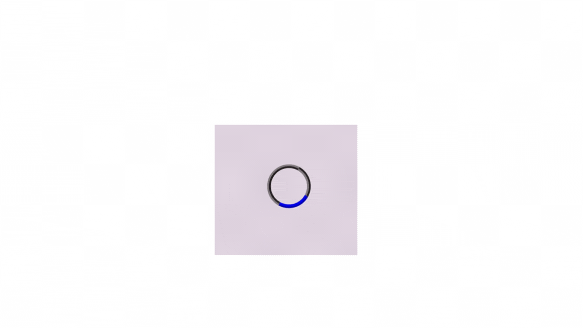
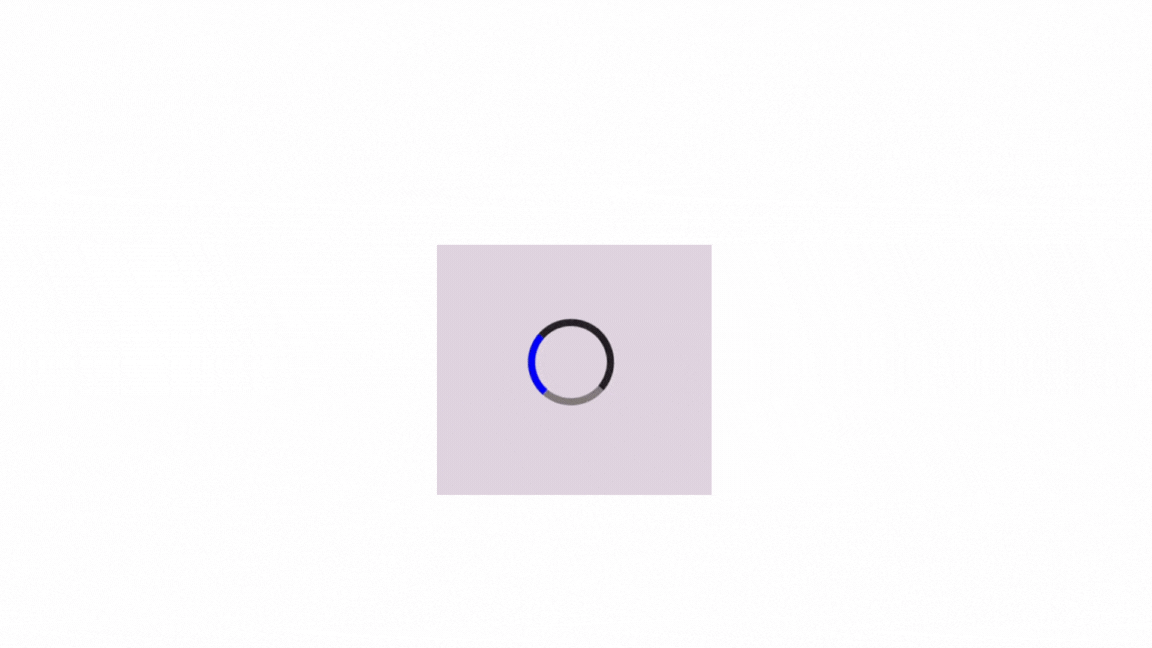
}The result:
In this example:
We define a spinner container with the class .spinner-container to center the spinner horizontally and vertically within the viewport. The spinner is represented by a <div> element with the class .spinner. It has a circular shape created using border-radius: 50%;, and its appearance can be customized using CSS properties like border, border-top-color, and border-radius.
The spinning animation is defined using @keyframes. It establishes the animation named spin and defines the starting state of the animation, where the element is rotated 0 degrees. It also defines the ending state of the animation, where the element is rotated 360 degrees (a full circle). It sets the animation duration to 1 second and the timing function to linear (constant speed). It also makes the animation loop infinitely.
This code creates a circular loading spinner with a blue spinning element. You can customize the dimensions, colors, animation duration, and other properties according to your design requirements.
CSS offers various ways to create loading spinners using different shapes beyond the classic circle. Let’s explore how to create them with different shapes:
Custom Square Loading Spinner
You can create a square-shaped spinner using CSS. Here’s how you can do this:
<div class="spinner-container">
  <div class="spinner-square"></div>
</div>
/* Define styles for the spinner container */
.spinner-container {
display: flex;
align-items: center;
justify-content: center;
height: 100vh;
}
/* Define styles for the square spinner */
.spinner-square {
width: 100px;
height: 100px;
border: 5px solid #968f8f;
border-top-color: blue;
animation: spin 1.5s linear infinite;
}
/* Define keyframe animation for spinning */
@keyframes spin {
from {
transform: rotate(0deg);
}
to {
transform: rotate(360deg);
}
}The result:
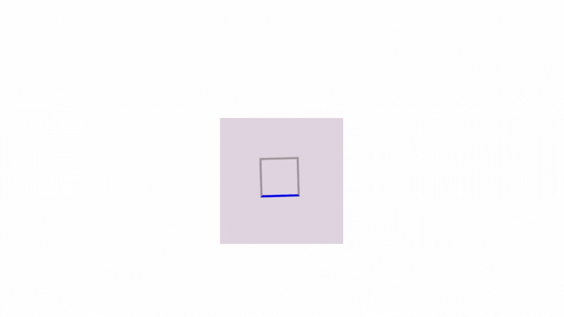
This code creates a square spinner with a border, and the spinning part is highlighted differently. You can adjust the size, border properties, and colors as needed to customize it according to your preferences.
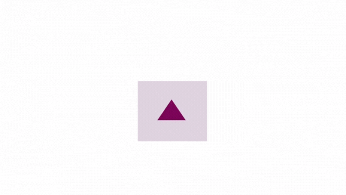
Custom Triangle Loading Spinner
This spinner has three sides that form a triangular shape. It rotates to indicate visually that a process is in progress. Here is how you can create it:
<div class="spinner-container">
  <div class="spinner-triangle"></div>
</div>
/* Define styles for the spinner container */
.spinner-container {
display: flex;
align-items: center;
justify-content: center;
height: 100vh;
}
/* Define styles for the square spinner */
.spinner-triangle {
width: 0;
height: 0;
border-left: 55px solid transparent;
border-right: 55px solid transparent;
border-bottom: 80px solid rgb(116, 11, 81);
animation: spin 1.5s linear infinite;
}
/* Define keyframe animation for spinning */
@keyframes spin {
from {
transform: rotate(0deg);
}
to {
transform: rotate(360deg);
}
}The result:
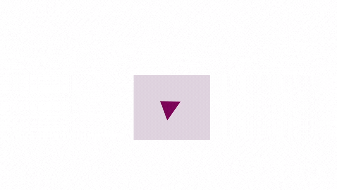
In the above example, the .spinner-triangle class defines the appearance of the triangle spinner, creating a triangle shape with no visible width or height. It also creates the borders, forming a triangle pointing upwards with an animation named spin that rotates 360 degrees over 1.5 seconds, creating the spinning effect.
Here are some adjustments you can make to the triangle loading spinner:
- You can modify the previous example to create a triangle with rounded corners by adding the style below:
.spinner {
  border-radius: 50%; /* Add rounded corners */
}
Below is how it will look:
You can adjust the dimensions, color, and animation duration as needed to fit your design requirements.
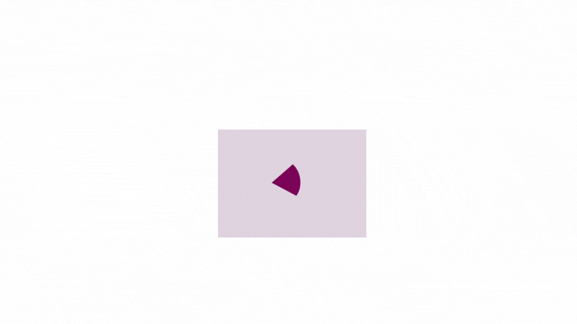
- You can also create a triangle that grows and shrinks. Below is how you can do this:
<div class="spinner-container">
 <div class="spinner-triangle"></div>
</div>.spinner-container {
display: flex;
align-items: center;
justify-content: center;
height: 100vh;
}
.spinner-triangle {
width: 0px;
height: 0px;
border-left: 55px solid transparent;
border-right: 55px solid transparent;
border-bottom: 80px solid #968f;
animation: spin-grow 1s ease-in-out infinite;
margin: 0 auto; /* Center the spinner horizontally */
}
@keyframes spin-grow {
0% {
transform: scale(1.1); /* Start with slight growth */
}
60% {
transform: scale(1.3); /* Increase size to 1.3 times */
}
100% {
transform: scale(1.1); /* Return to slightly larger size */
}
}The result:
Here, the animation property applies the “spin-grow” animation to the spinner, which scales the triangle size to create a pulsating effect.
Implementing Loading Spinners with Border Styles
Instead of using a solid border, you can utilize other border styles such as dashed, dotted, double, groove, ridge, inset, or outset. This approach can improve your web applications’ user experience and visual appeal. By experimenting with different border styles, you can customize your spinners to match your web application’s aesthetic preferences and branding, enhancing user engagement and satisfaction.
Let’s see how we can use them:
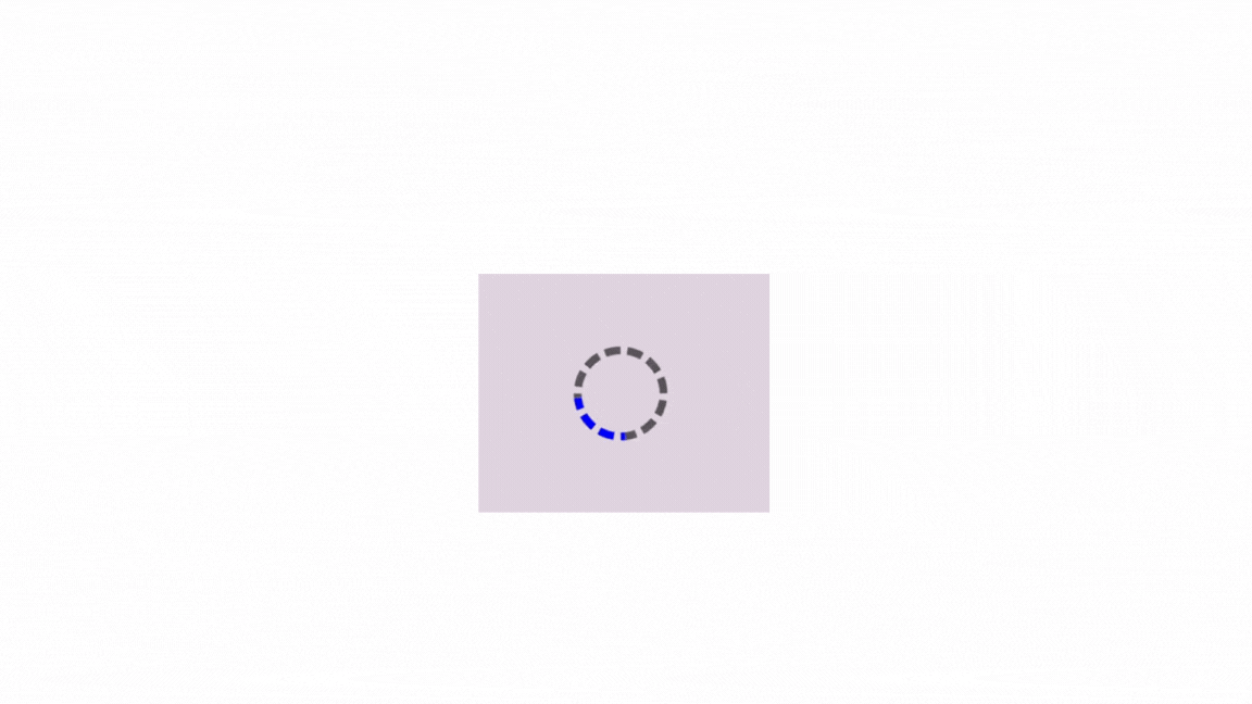
Using the dashed Border Style
A dashed border style can add a dynamic element to your application’s loading process. This style can create a visually engaging spinner that captivates user attention. Here is how you can use this:
<!-- Spinner Container -->
<div class="spinner-container">
  <!-- Spinner Element -->
  <div class="spinner"></div>
</div>.spinner-container {
display: flex;
align-items: center;
justify-content: center;
height: 100vh;
}
/* Define styles for the spinner */
.spinner {
width: 60px;
height: 60px;
border: 10px dashed #767070; /* Dashed border style */
border-radius: 50%;
border-top-color: blue; /* Color for the spinning part */
animation: spin 2s linear infinite; /* Apply the spinning animation */
}
@keyframes spin {
from {
transform: rotate(0deg);
}
to {
transform: rotate(360deg);
}
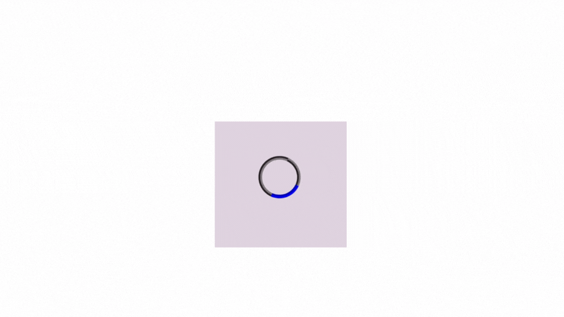
}This will create a loading spinner with a dashed border style, where the top border will appear to be spinning, as shown below:
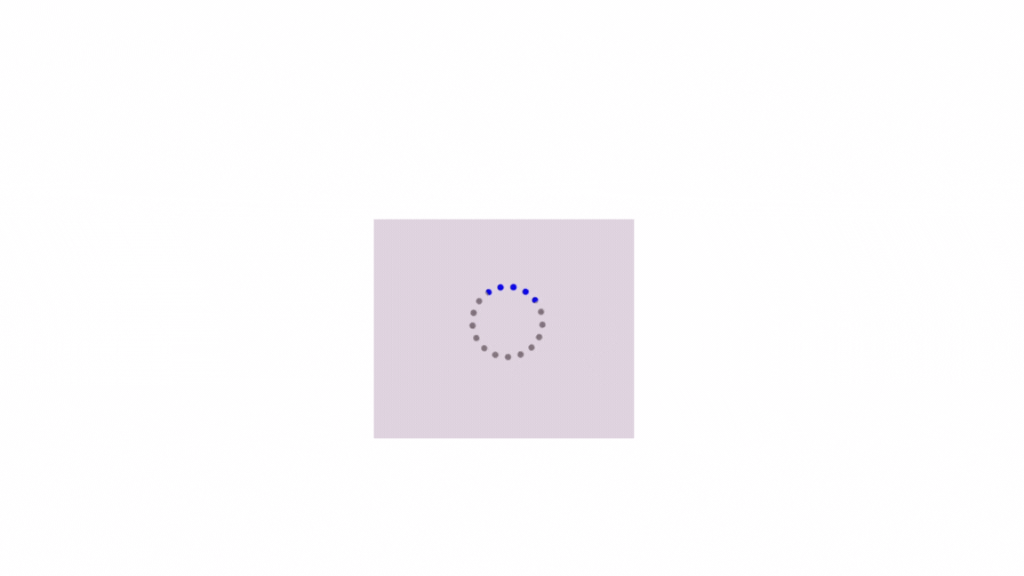
dotted Spinner
Using a dotted border style can make your loading spinner simple and elegant. This style provides a clean, minimalistic aesthetic for modern web interfaces. Here is how you can do this:
<!-- Spinner Container -->
<div class="spinner-container">
  <!-- Spinner Element -->
  <div class="spinner"></div>
</div>.spinner-container {
display: flex;
align-items: center;
justify-content: center;
height: 100vh;
}
.spinner {
width: 60px;
height: 60px;
border: 10px dotted #767070; /* Dotted border style */
border-radius: 50%;
border-top-color: blue;
animation: spin 2s linear infinite;
}
@keyframes spin {
from {
transform: rotate(0deg);
}
to {
transform: rotate(360deg);
}
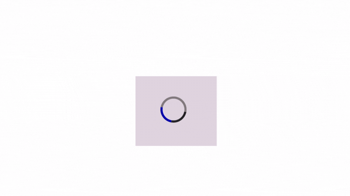
}Here, this code will display a loading spinner with a dotted border style in the center of the viewport, as shown below:
Using the double Border Style
Elevate your loading spinner with the distinctive appearance of a double-border style. This style adds depth and sophistication to your spinner, creating a striking visual impact. Here is how you can create it:
<!-- Spinner Container -->
<div class="spinner-container">
  <!-- Spinner Element -->
  <div class="spinner"></div>
</div>.spinner-container {
display: flex;
align-items: center;
justify-content: center;
height: 100vh;
}
.spinner {
width: 60px;
height: 60px;
border: 10px double #767070; /* Double border style */
border-radius: 50%;
border-top-color: blue;
animation: spin 2s linear infinite;
}
@keyframes spin {
from {
transform: rotate(0deg);
}
to {
transform: rotate(360deg);
}
}Here, the code creates a loading spinner with a double border style. It is centered vertically and horizontally on the viewport and rotates continuously in a clockwise direction, as shown below:
Using the groove Border Style
With the 3D groove effect, you can immerse users in your application’s loading process. This border style adds depth and texture to your spinner, creating a visually appealing experience. Here is how you can have a border with a 3D groove effect:
<!-- Spinner Container -->
<div class="spinner-container">
  <!-- Spinner Element -->
  <div class="spinner"></div>
</div>.spinner-container {
display: flex;
align-items: center;
justify-content: center;
height: 100vh;
}
.spinner {
width: 60px;
height: 60px;
border: 10px groove #767070; /* Groove border style */
border-radius: 50%;
border-top-color: blue;
animation: spin 2s linear infinite;
}
@keyframes spin {
from {
transform: rotate(0deg);
}
to {
transform: rotate(360deg);
}
}The code above generates a loading spinner with a groove border style. The spinner is vertically and horizontally centered on the viewport and rotates continuously in a clockwise direction, as shown below:
Using the ridge Border Style
You can elevate your loading spinner with the textured ridge border style. This border style adds a tactile element to your spinner, enhancing user engagement and interaction. Here is how you can have a 3D ridge effect:
<!-- Spinner Container -->
<div class="spinner-container">
  <!-- Spinner Element -->
  <div class="spinner"></div>
</div>.spinner-container {
display: flex;
align-items: center;
justify-content: center;
height: 100vh;
}
.spinner {
width: 60px;
height: 60px;
border: 10px ridge #767070; /* Ridge border style */
border-radius: 50%;
border-top-color: blue;
animation: spin 2s linear infinite;
}
@keyframes spin {
from {
transform: rotate(0deg);
}
to {
transform: rotate(360deg);
}
}The above example creates a loading spinner with a ridge border style. It is centered vertically and horizontally on the viewport and rotates continuously in a clockwise direction, as shown below:
Using the inset Border Style
The inset border style introduces a sense of depth and realism to your loading spinner. It creates a visually striking effect of physical objects embedded within the interface. Here is how you can have a 3D inset effect:
<!-- Spinner Container -->
<div class="spinner-container">
  <!-- Spinner Element -->
  <div class="spinner"></div>
</div>.spinner-container {
display: flex;
align-items: center;
justify-content: center;
height: 100vh;
}
.spinner {
width: 60px;
height: 60px;
border: 10px inset #767070; /* Inset border style */
border-radius: 50%;
border-top-color: blue;
animation: spin 2s linear infinite;
}
@keyframes spin {
from {
transform: rotate(0deg);
}
to {
transform: rotate(360deg);
}
}The example above generates a loading spinner with an inset border style. It is vertically and horizontally centered on the viewport and rotates continuously in a clockwise direction, as shown below:
Using the outset Border Style
With the outset border style, you can inject energy and dynamism into your loading spinner. It adds a sense of movement and vitality to your spinner, capturing user attention and anticipation. Here is how you can have a 3D outset effect:
<!-- Spinner Container -->
<div class="spinner-container">
  <!-- Spinner Element -->
  <div class="spinner"></div>
</div>.spinner-container {
display: flex;
align-items: center;
justify-content: center;
height: 100vh;
}
.spinner {
width: 60px;
height: 60px;
border: 10px outset #767070; /* Outset border style */
border-radius: 50%;
border-top-color: blue;
animation: spin 2s linear infinite;
}
@keyframes spin {
from {
transform: rotate(0deg);
}
to {
transform: rotate(360deg);
}
}The example above creates a loading spinner with an outset border style. It is centered vertically and horizontally on the viewport and rotates continuously in a clockwise direction, as shown below:
You can customize the border’s thickness, style, and color to match your preferences.
Using CSS Gradients and Shadows
Another effective technique for creating visually appealing loading spinners is using CSS gradients and shadows. Gradients allow for smooth color transitions, while shadows add depth and dimension to the spinner.
Let’s explore how to incorporate gradients and shadows: Gradient Loading spinner:
<div class="spinner-container">
  <div class="spinner-gradient"></div>
</div>.spinner-container {
display: flex;
align-items: center;
justify-content: center;
height: 100vh;
}
.spinner-gradient {
width: 100px;
height: 100px;
background: linear-gradient(
45deg,
rgb(203, 12, 12),
rgb(12, 12, 192),
#dc8585
); /* Gradient color */
border-radius: 50%; /* Creates a circular shape */
animation: spin 1.2s linear infinite; /* Apply the spinning animation */
}
@keyframes spin {
from {
transform: rotate(0deg);
}
to {
transform: rotate(360deg);
}
}The result:
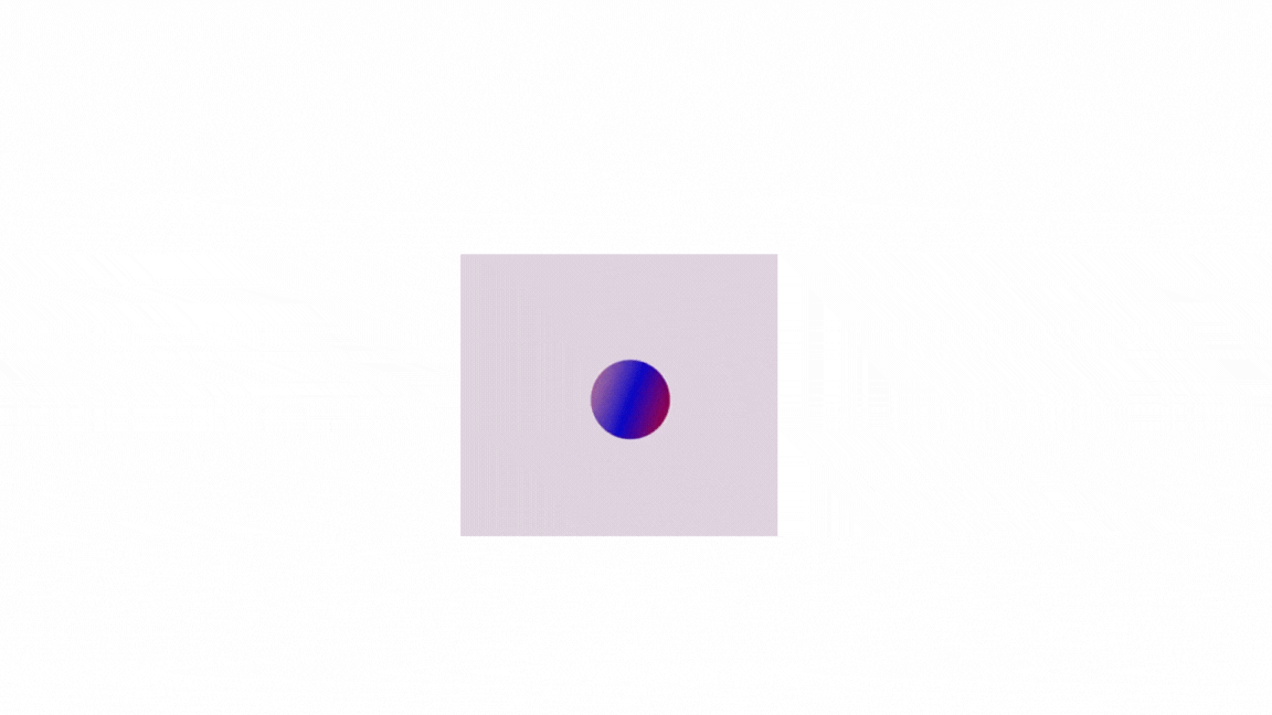
In the above example, we define a background-gradient with three colors, creating a smooth color transition across the circle.
The animation spins the element, making the gradient appear to rotate. This creates a visually appealing loading spinner with a gradient background transitioning between multiple colors. Adjust the gradient colors, spinner dimensions, and animation duration as needed to fit your design requirements.
Gradient and Shadow Loading Spinner:
<div class="spinner-container">
  <div class="spinner-gradient-shadow"></div>
</div>.spinner-container {
display: flex;
align-items: center;
justify-content: center;
height: 100vh;
}
.spinner-gradient-shadow {
width: 100px;
height: 100px;
background: linear-gradient(
45deg,
rgb(203, 12, 12),
rgb(12, 12, 192),
#dc8585
);
border-radius: 50%;
box-shadow: 2px 3px 2px rgba(0, 0, 0, 0.5); /* Offset, spread, and a darker color for a deeper shadow */
animation: spin 1s linear infinite;
}
@keyframes spin {
from {
transform: rotate(0deg);
}
to {
transform: rotate(360deg);
}
}The result:
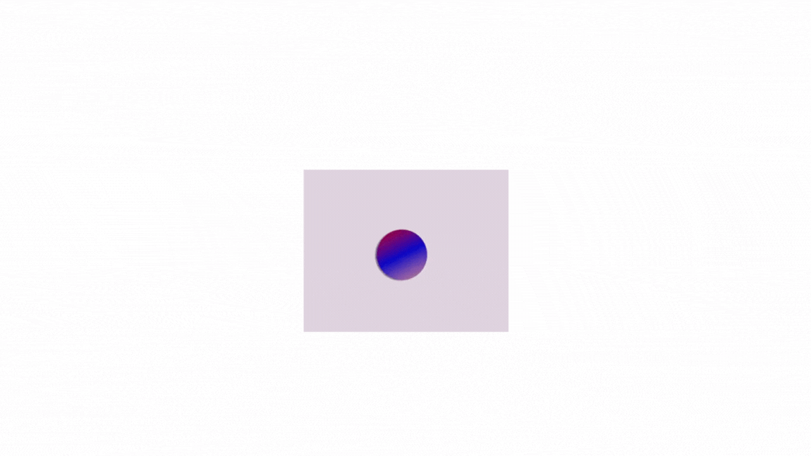
In the example above, the box-shadow property (box-shadow: 2px 3px 2px rgba(0, 0, 0, 0.5);) for .spinner-gradient-shadow adds a more profound shadow effect by increasing the horizontal and vertical offset (2px and 3px, respectively) and applying a slightly darker color with an alpha value of 0.5.
The box-shadow property in CSS offers various properties, and you can adjust them to customize the shadow appearance. You can fine-tune the shadow appearance by experimenting with these values to fit your specific design preferences.
Design Principles and Considerations
While exploring different techniques and functionalities for creating loading spinners, it’s crucial to consider some design principles and considerations. This involves considering several principles and factors to ensure they are effective, visually appealing, and contribute positively to the user experience.
Here are some design principles and considerations:
-
Simplicity: Keep them simple and straightforward to understand. Avoid overly complex designs that may confuse users.
-
Consistency: Maintain consistency in their design across different parts of your website or application. Consistent spinners help establish familiarity and reinforce brand identity.
-
Responsiveness: Ensure that they are responsive and adapt well to various screen sizes and devices. They should remain visible and functional on both desktop and mobile platforms.
-
Visibility: Make them sufficiently visible and distinguishable from the background. Choose colors, sizes, and animations that stand out without being distracting.
-
Aesthetics: Choose a spinner design that complements the overall aesthetics of your website or app. Consider factors like color scheme, style, and branding guidelines. While unique designs are great, ensure they maintain a level of professionalism and fit the overall user experience.
-
Performance: They should be lightweight and perform efficiently to avoid impacting page load times. Complex animations or excessive use of graphics can negatively affect user experience.
-
Accessibility: Ensure they are accessible to users with disabilities. Consider factors such as color contrast, animation speed, and alternative text for screen readers.
-
User Experience: When choosing or designing them, consider the overall user experience. Strive to find a balance between informing users about ongoing activity and keeping them engaged while they wait. Avoid overly long or repetitive animations that might frustrate users.
Conclusion
Loading spinners play a crucial role in user interface design by providing visual feedback to users during content loading or actions. This exploration has covered various techniques and considerations for creating them using CSS. By understanding these techniques, considerations, and principles, you can use them to enhance your web projects and improve the user experience. Remember, creativity and experimentation are essential, but always prioritize clarity, performance, and inclusivity in your designs.
Truly understand users experience
See every user interaction, feel every frustration and track all hesitations with OpenReplay — the open-source digital experience platform. It can be self-hosted in minutes, giving you complete control over your customer data.
Star on GitHub12k

