
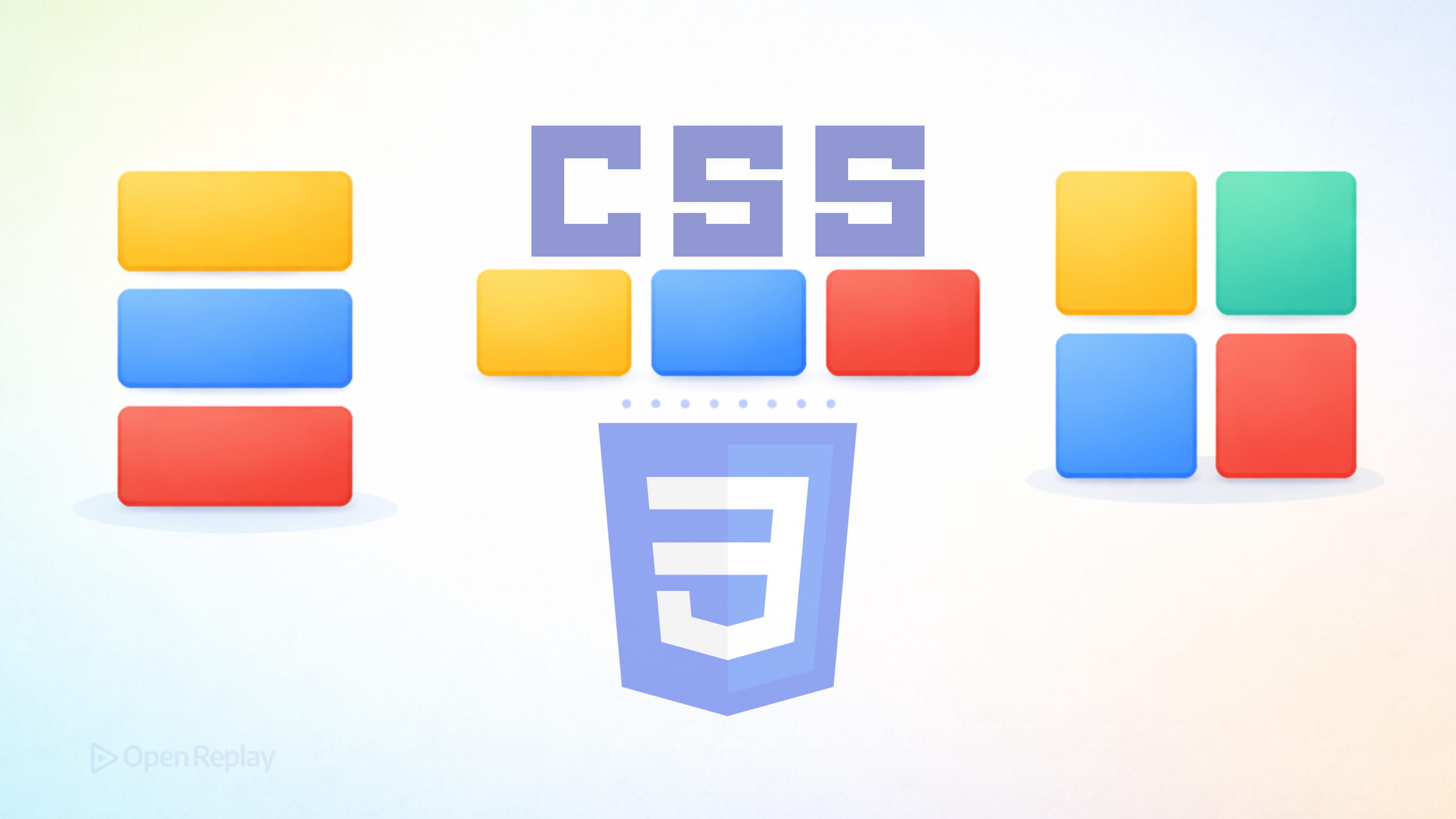
Understanding CSS Display Modes

Every layout decision you make in CSS traces back to a single property: display. Yet most explanations treat it as a flat list of values to memorize. That approach misses the point. The display property actually controls two distinct things—how an element participates in its parent’s layout, and how it arranges its own children. Understanding this dual nature transforms how you think about modern CSS layout fundamentals.
Key Takeaways
- The CSS
displayproperty controls two behaviors: an outer display type (how the element relates to siblings) and an inner display type (how it lays out its children). - Block and inline are the foundational outer display types in normal flow—block elements stack vertically and fill available width, while inline elements flow with text.
- Flex is ideal for one-dimensional layouts along a single axis. Grid is built for two-dimensional layouts controlling rows and columns simultaneously.
display: noneremoves an element from both the layout and the accessibility tree, unlikevisibility: hidden, which only hides it visually.display: contentscan flatten wrapper elements but carries accessibility risks—test thoroughly before using it.
The Modern Mental Model: Outer and Inner Display Types
The CSS display property defines two separate behaviors:
Outer display type determines how the element’s box behaves in relation to its siblings. Does it take the full width and start on a new line? Or does it sit inline with surrounding content?
Inner display type controls how the element’s children are laid out. Do they follow normal document flow? Or do they participate in a flex or grid context?
When you write display: flex, you’re actually saying: “This element behaves as a block on the outside, and its children use flex layout on the inside.” The CSS Display Level 3 specification made this explicit with multi-keyword syntax—display: block flex—though single keywords remain valid and widely used.
This outer-and-inner model clarifies why certain combinations exist and helps you predict behavior without memorization.
Block vs Inline: The Foundation
Block and inline represent the two fundamental outer display types in normal flow.
Block elements generate a box that:
- Starts on a new line
- Expands to fill available width
- Respects width, height, margin, and padding on all sides
Inline elements generate boxes that:
- Flow with text content
- Only take the space their content requires
- Ignore width and height properties (except for replaced elements like images)
- Only respond to horizontal margins and padding (vertical margins are ignored, and vertical padding does not affect surrounding layout)
/* Block: fills container width, stacks vertically */
.card { display: block }

/* Inline: flows with text, sized by content */
.label { display: inline }
Understanding block vs inline vs flex vs grid starts here. Block and inline describe participation in normal flow—the default layout algorithm browsers use before you apply anything else.

Discover how at OpenReplay.com.
Flex and Grid: Modern Inner Display Types
When you need more control over how children are arranged, you change the inner display type.
When to Use Flex
Flexbox excels at one-dimensional layouts—distributing items along a single axis:
.nav-list {
  display: flex;
  gap: 1rem
}
Use flex when content size should influence layout, when you need items to wrap naturally, or when alignment along one axis is your primary concern.
When to Use Grid
Grid handles two-dimensional layouts—controlling both rows and columns simultaneously:
.card-grid {
  display: grid;
  grid-template-columns: repeat(auto-fit, minmax(250px, 1fr))
}
Choose grid when you need precise placement, overlapping elements, or layouts where structure matters more than content size.
Both flex and grid create new formatting contexts for their children, which affects how margins, floats, and other properties behave inside them.
Display None: Removing Elements Completely
Setting display: none removes an element from the layout entirely. The document renders as if the element doesn’t exist. This differs from visibility: hidden, which hides the element while preserving its space.
Note that display: none also removes elements from the accessibility tree—screen readers won’t announce them.
A Note on Display Contents
The display: contents value makes an element’s box disappear while keeping its children in the layout. While this sounds useful for flattening wrapper elements in flex or grid contexts, it carries significant accessibility risks. Browser implementations have historically removed the element from the accessibility tree, breaking semantics for tables, lists, and interactive elements. Although browser support has improved, approach with caution and test thoroughly.
Choosing the Right CSS Display Mode
Start with this question: What problem are you solving?
- Normal document flow? Use
blockorinline - One-dimensional distribution? Use
flex - Two-dimensional placement? Use
grid - Remove from layout? Use
none
Conclusion
The CSS display property isn’t about memorizing values—it’s about understanding that every element has an outer role and an inner layout strategy. The outer type governs how the element sits among its siblings, while the inner type dictates how its children are arranged. Once that dual nature clicks, choosing the right display mode becomes straightforward, and layout decisions follow naturally from the problem you’re trying to solve.
FAQs
Display none removes the element from the document layout entirely. It takes up no space and is also removed from the accessibility tree. Visibility hidden hides the element visually but preserves the space it occupies in the layout. Screen readers may still detect elements with visibility hidden depending on the implementation.
Not on the same element simultaneously, since both are inner display types and only one can apply at a time. However, you can nest them freely. A grid item can itself be a flex container, and a flex item can be a grid container. This lets you combine both layout models across parent and child relationships.
Inline-block is useful when you want an element to flow inline with text while still respecting width, height, and vertical margin and padding. It works well for small UI elements like buttons or badges within a line of text. For distributing multiple items along an axis with spacing and alignment control, flex is the better choice.
Yes. Historically, browsers removed elements with display contents from the accessibility tree, which broke semantics for elements like tables, lists, and buttons. Browser vendors have been fixing these issues, but inconsistencies remain. Always test with screen readers if you use display contents on semantic or interactive elements.
Gain control over your UX
See how users are using your site as if you were sitting next to them, learn and iterate faster with OpenReplay. — the open-source session replay tool for developers. Self-host it in minutes, and have complete control over your customer data. Check our GitHub repo and join the thousands of developers in our community.
