

As web developers, we may frequently be required to display large volumes of data on a website, with functionalities such as editing, selection, pagination, export, sorting, selecting, and filtering data, which is an effective way to manage multiple records. With that comes the difficulty of creating a component to handle such a feature from scratch.
Material UI (MUI) Data grid is a react-data-table and react-data-grid library that can be extended. It is highly extensible and provides a wide variety of features that can be used to display data properly. The library has a weekly download of 528k on npm and 2.3k stars on GitHub.
This article will cover this library and how to effectively use it to display large data in React applications. It has unique features that can be utilized. We will be using the free version of the library, which also has a pro version.
Setting up the Project
In this section, we’ll use the code block below to create a React application:
npx create-react-app mui-grid-app
cd mui-grid-app
To install the MUI Data Grid library, we will use one of the following code blocks:
yarn add @mui/material @emotion/react @emotion/styled @mui/x-data-grid axiosor
npm install @mui/material @emotion/react @emotion/styled @mui/x-data-grid axiosTo add some style, replace the entire App.css file with the code block below:
.Container {
  max-width: 1440px;
  margin: auto;
  display: flex;
  justify-content: center;
  align-items: center;
  height: 100vh;
}

.Grid {
 height: 500px;
 width: 100%;
 padding: 4rem;
}
Render the Data Grid Component
This section will review how to use the library to handle data locally and display it in your react application.
import "./App.css";
import { DataGrid } from "@mui/x-data-grid";
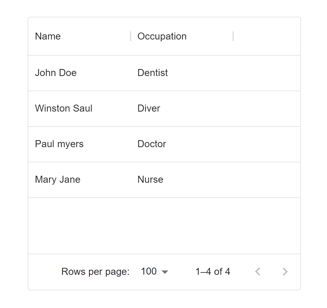
const rows = [
{ id: 1, name: "John Doe", occupation: "Dentist" },
{ id: 2, name: "Winston Saul", occupation: "Diver" },
{ id: 3, name: "Paul myers", occupation: "Doctor" },
{ id: 4, name: "Mary Jane", occupation: "Nurse" },
];
const columns = [
{ field: "name", headerName: "Name", width: 150 },
{ field: "occupation", headerName: "Occupation", width: 150 },
];
function App() {
return (
<div className="Container">
<div className="Grid">
<DataGrid rows={rows} columns={columns}/>
</div>
</div>
);
}
export default App;The DataGrid component was imported from the @mui/x-data-grid library in the preceding code block. We then created two variables, rows and columns, which we passed into the DataGrid component as prop values.
Render Data from an API
This section will demonstrate how to display data from an API to the DataGrid component.
import "./App.css";
import { DataGrid } from "@mui/x-data-grid";
import { useEffect, useState } from "react";
import axios from "axios";
function App() {
const [rows, setRows] = useState([]);
const fetchProducts = async () => {
await axios
.get("https://dummyjson.com/products")
.then((res) => setRows(res.data.products));
};
useEffect(() => {
fetchProducts();
}, []);
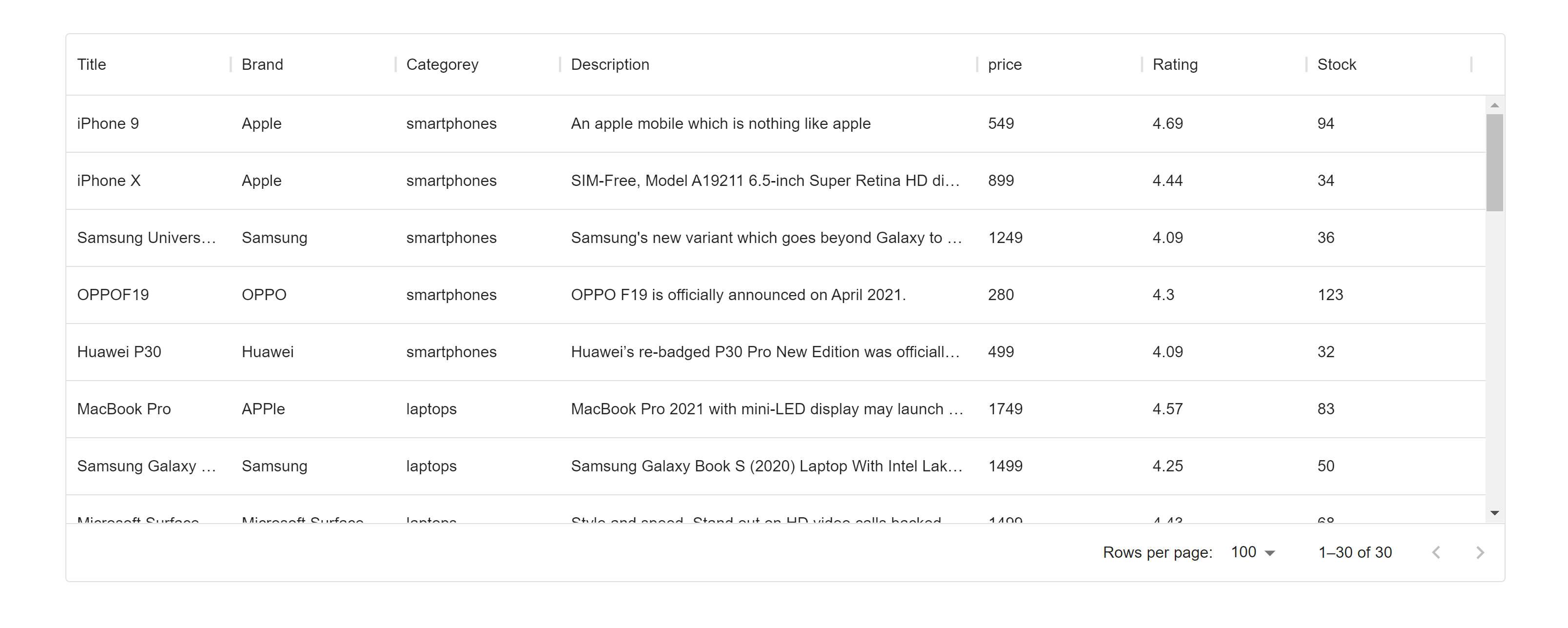
const columns = [
{ field: "title", headerName: "Title", width: 150 },
{ field: "brand", headerName: "Brand", width: 150 },
{ field: "category", headerName: "Categorey", width: 150 },
{ field: "description", headerName: "Description", width: 380 },
{ field: "price", headerName: "price", width: 150 },
{ field: "rating", headerName: "Rating", width: 150 },
{ field: "stock", headerName: "Stock", width: 150 },
];
return (
<div className="Container">
<div className="Grid">
<DataGrid
rows={rows}
columns={columns}
/>
</div>
</div>
);
}
export default App;In the above code block, rows was set to an empty array, and we created fetchProducts to handle the API call and set the data returned to rows. Following that, we created the columns array to contain the same fields as the API. We are currently showing seven of eleven fields. Following that, we passed rows and columns to the DataGrid component.
Session Replay for Developers
Uncover frustrations, understand bugs and fix slowdowns like never before with OpenReplay — an open-source session replay tool for developers. Self-host it in minutes, and have complete control over your customer data. Check our GitHub repo and join the thousands of developers in our community.
Features Material UI Data Grid Provides
The MUI Data Grid includes several features that help with data handling; we’ll look at a few.
Editing
Add the editable property to the specific column definition to enable column editing in the DataGrid component. This is not limited to one single column, by the way.
...
 { field: "price", headerName: "price", width: 150, editable: true },
 ...
In the above code block, we added editable: true to the price header column.

Sorting
The DataGrid component’s sorting feature is enabled by default. The column header contains a list of functionalities.
The sorting feature includes various options, such as sorting in ascending or descending order, hiding a column, filtering a column, and so on.
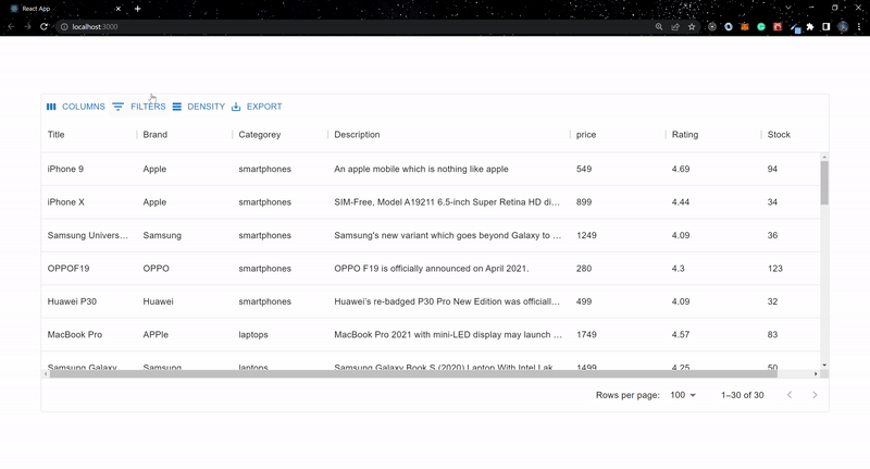
Filtering
You get some extra features when you enable the MUI Data Grid filtering feature. Add the component prop and pass the object containing the Toolbar with the value GridToolbar into it.
...
<DataGrid
  rows={rows}
  columns={columns}
  components={{ Toolbar: GridToolbar }}
/>
...
Columns, filters, density, and export features are available when the GridToolbar is enabled.
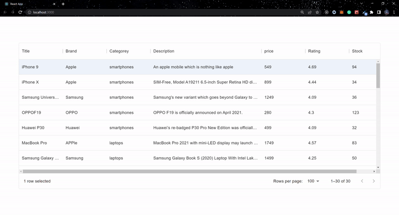
Selection
Set the checkboxSelection prop to true; this enables the checkbox feature.
...
<DataGrid
  rows={rows}
  columns={columns}
  components={{ Toolbar: GridToolbar }}
  checkboxSelection={true}
/>
...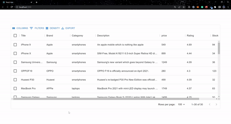
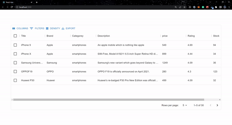
Pagination
Pagination is enabled by default in the DataGrid component. But we need the flexibility to adjust it to meet our needs. The pagination, rowsPerPageOptions, onPageSizeChange, and pageSize props can be used to accomplish this.
...
 const [pageSize, setPageSize] = useState(5);
...

...
<DataGrid
  rows={rows}
  columns={columns}
  components={{ Toolbar: GridToolbar }}
  checkboxSelection={true}
  pageSize={pageSize}
  onPageSizeChange={(newPageSize) => setPageSize(newPageSize)}
  rowsPerPageOptions={[5, 10, 20, 30]}
  pagination

/>
...
Conclusion
We displayed local and asynchronous data using Material UI Data Grid’s fast and extensible features. We also made use of some of the library’s available functionality.
Visit the live version here and the source code on GitHub.
Gain Debugging Superpowers
Unleash the power of session replay to reproduce bugs and track user frustrations. Get complete visibility into your frontend with OpenReplay, the most advanced open-source session replay tool for developers.