
Centering text content or divs (or any other block content) horizontally and vertically is one of the problems every front-end developer faces in the early stages of their learning. In this article, we will explore five unique ways to do so and recommend the method that works better in most situations.
1. Using Table Display
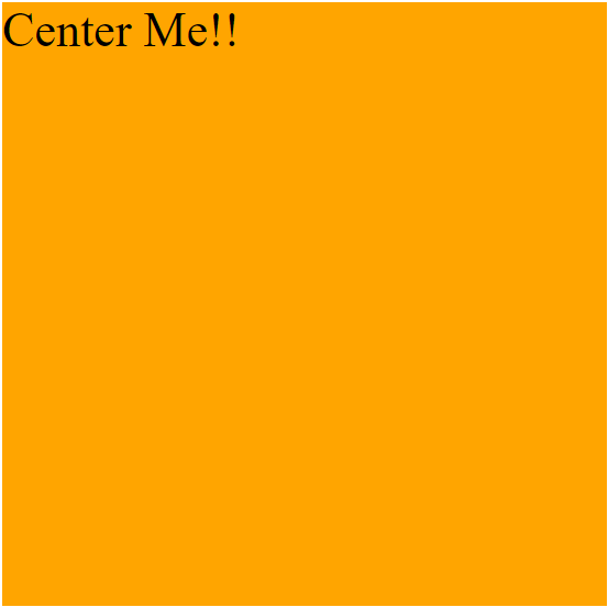
Consider the simple markup:
<div class="parent">
      <p class="child-text">Center Me!!</p>
</div>
With the styling
.parent {
  height: 400px;
  width: 400px;
  background: orange;
}
.child-text {
  font-size: 2rem;
  margin: 0;
}
The output:
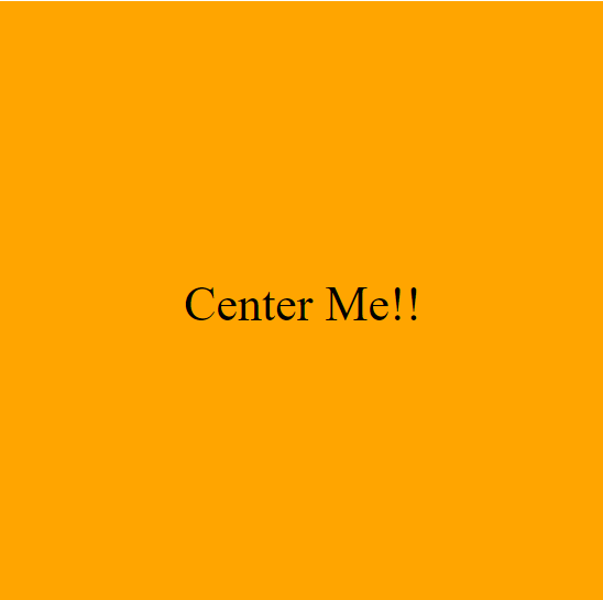
Tables in the past were the way to create web layouts, and this is one of the techniques used to achieve that. This could be done by the code below:
.parent{
display: table;
}

.child-text {
display: table-cell;
text-align: center; /* Centers text Horizontally */
vertical-align: middle; /* Centers text Vertically */
}
How it works
The text-align property sets the horizontal alignment of an inline element inside a block level one. It is often used to center text horizontally. The vertical align property works like text-align but for the vertical axis. It is often used in table elements to center their contents. The display: table property makes the parent element act like a table, while table-cell make the child like a cell. This is why the vertical-align property works here.
Limitation
This method isn’t flexible enough to handle wide-range scenarios like with divs. It is no longer used in modern CSS, but it is important to know if it’s seen when handling legacy codebase.
For the rest of the methods, we will use the markup and styles below:
<div class="parent">
    <div class="child">
  </div>
</div>.parent {
width: 500px;
height: 500px;
background-color: orange;
}
.child {
width: 100px;
height: 100px;
background-color: blue;
}The Output:

Fig: Initial styling of the other four methods.
In the four remaining methods, we will center the child (blue) horizontally and vertically in the parent (orange) container.
The end product is to have the child perfectly centered in its parent.

Fig: Child element centered in its parent.
2. Using absolute positioning with translate
One way to center the child element will be to use absolute positioning.
.parent {
  position: relative;
}

.child {
  position: absolute;
  top: 50%;
  left: 50%;
  transform: translate(-50%, -50%);
}
How it works
The position property determines an element’s position on the page. It takes four values static, relative, absolute, and relative, with static being the default.
Absolute positioning is a way to position an element relative to its nearest positioned ancestor. If none of its parents is positioned (relative or absolutely), it becomes relative to the whole document.
This is why we set the position:relative on the parent.
The top and left properties set the distance of the child element halfway from the top and left of the parent, respectively. They only work when an element is positioned, and the value is not static.
 Fig: top:50%
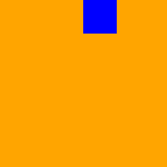 Fig: left:50%
Combining both methods will center the element both vertically and horizontally.
The element’s top-left will then sit in the parent’s center. This is why we need the translate property to send the element back to its correct positioning.
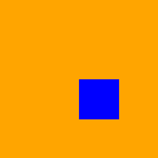 Fig: Without the translate property
Limitation
Absolute positioning removes an element from the document’s normal flow; hence this can cause overlapping and responsiveness problems on multi-content layouts. In modern CSS, using as little absolute positioning as possible is advised.
3. Using absolute positioning with auto margins
.parent {
  position: relative;
}
.child {
  position: absolute;
  margin: auto;
  /* Center the element vertically */
  top: 0;
  bottom: 0;
  /* Center the element horizontally */
  left: 0;
  right: 0;
}
How It Works
Similar to method 2, we use the position absolute property.
The margin property set to auto lets the browser select a suitable margin for the element.
The top and bottom values set to 0 center the element on the vertical axis.
 Fig: top and bottom property set to 0.
While right and left values are set to 0, center the element on the horizontal axis.
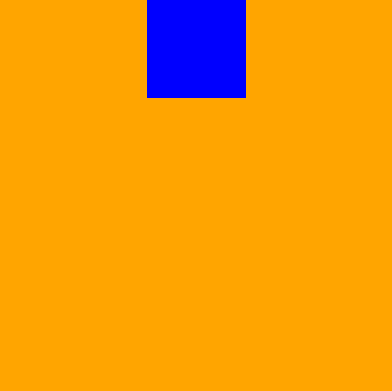 Fig: left and right property set to 0.
Combining the two will perfectly put the child element in the center. One short way to combine all properties is to use inset, which is short for all four positionings. The code above could be written in the following way:
.parent {
  position: relative;
}
.child {
  position: absolute;
  margin: auto;
  inset: 0; /* Centers element both horizontally and vertically */
}
Limitations
As stated in the previous method, absolute positioning should be used less often. We will look at more flexible and modern approaches in the next methods.
Session Replay for Developers
Uncover frustrations, understand bugs and fix slowdowns like never before with OpenReplay — an open-source session replay tool for developers. Self-host it in minutes, and have complete control over your customer data. Check our GitHub repo and join the thousands of developers in our community.
4. Using Flexbox
Flexbox is a CSS module that is designed to model one-dimensional layouts. It provides features that control elements’ alignment, spacing, and order. This centering problem could be solved simply by the CSS below:
.parent {
  display: flex; /* Make parent a flex-container */
  justify-content: center; /* Centers child horizontally */
  align-items: center; /* Centers child vertically */
}
How it works
We make the parent a flex container to access the other two properties.
justify-content property determines how the children of the parent are aligned on the main axis (horizontal in this case)
while align-items determine their alignment on the cross-axis (vertical in this case).
Limitations
Flexbox is a modern and very powerful tool for creating layouts, and the only downside, in this case, is the support for older browsers like Internet Explorer.
5. Using Grid
Grid is a modern CSS model designed to build multi-dimensional layouts. You can define rows and columns in a grid container to create a two-dimensional grid.
The children of a grid container are called grid items. Centering elements could be easily achieved in grid layouts by the code below:
.parent {
  display: grid;
  place-items: center;
}
And that’s it; with just two lines of CSS, we can center our child element perfectly.
How It Works
First, we use the display property to make the parent element a grid container.
Then, we set the place-items property. place-items is short for two properties, justify-items and align-items.
justify-items sets the alignment mode on the horizontal axis while align-items is on the vertical axis.
Setting place-items to center will set the two properties to center too.
Other ways to achieve the same result using a grid are:
Using place-content
.parent {
  display: grid;
  place-content: center;
}
place-content is short for justify-content and align-content. For a grid layout with only one item, both place-content and place-items work interchangeably
Using margin auto on the child element
.parent {
  display: grid;
}
.child {
 margin: auto;
}
In a grid container, the margin property set to auto make the browser automatically set the margins of all sides of the child element.
Using place-self on the child element
.parent {
  display: grid;
}
.child {
place-self: center
}
The place-self property, similar to place-content and place-items, is short for justify-self and align-self. It is applied on a grid-item and sets the alignment of that item on the horizontal and vertical axis of the parent Grid container.
Expected Result
Methods 2, 3, 4, and 5 produce this outcome:

Conclusion
In this article, we looked at five different ways to center elements (text and divs) in their parent container. We could summarize what we learned in the following points:
- Center any text horizontally using
text-align: center. - Using
display: tablewithvertical-align:centerto center text vertically in its container. - Using
absolutepositioning withtransform: translateormargin:autoto center a div in its parent. - Employing more flexible and modern approaches,
flexboxandgrid, to achieve the same output.
I recommend using either flexbox or grid because they achieve the desired result faster and more maintainable code. They also work with text and block contents (like divs).
Resources
To understand flexbox and grid better, see the following articles
Gain Debugging Superpowers
Unleash the power of session replay to reproduce bugs and track user frustrations. Get complete visibility into your frontend with OpenReplay, the most advanced open-source session replay tool for developers.