

To help businesses and customers (consumers) with sales, marketing, financing, and other issues, web and mobile applications are frequently used. But providing a design that fixes your users’ issues is insufficient, and user attrition will be significant if the design is complicated. Regardless of how sophisticated your solution is, we’ll look at some guidelines for building a straightforward user interface in this article.
Any digital product or service must include the creation of a simple user interface (UI). Since it is the first thing users encounter and engage with, it greatly influences how they feel and how satisfied they are. In this article, we’ll go over the essential components of a user interface and how to create a powerful, interesting, and user-centered UI design.
When working on a design, you need to understand the fundamentals, such as the UX (user experience) processes involved, the elements used (such as whether to make some elements bigger or smaller), and the principles of design (such as increasing (or decreasing) the amount of white space around an element). This is especially true if you are a beginner UI designer who wants to learn how to make your designs more consistent and user-friendly. What about the color? Should it be lighter or perhaps darker?
The advice and techniques provided in this article can be followed by those with little to no expertise, so let’s get started now!
Laws of UX
A collection of guidelines called “The Laws of UX” was created to enhance the user experience of websites and other digital products. These rules were created by user experience designer Jon Yablonski and are based on the results of studies in human-computer interaction.
User experience design (UX design) is a way of designing digital products that address problems that affect people. This user-centered design process ensures that design teams make their choices based on user demands rather than assumptions.
UX designers need to be aware of the goals users have when utilizing a digital product and any potential obstacles they may face. The Laws of UX include the following:
-
Heuristics: In the user experience (UX) field, heuristics are a set of guidelines or principles that designers can employ to evaluate the usability of a product or interface. These recommendations, sometimes known as “heuristics of UX,” are based on the collective wisdom of UX researchers and designers and are meant to ensure that a product is easy to use and gives the user a satisfying experience. They consist of the following:
- Aesthetic-Usability Effect: Users often consider aesthetically beautiful designs to be more usable and effective, even when the design features have no practical purpose. This phenomenon is known as the aesthetic usability effect. Designers can use this phenomenon to produce aesthetically pleasing and useful interfaces. According to the aesthetic usability effect, users tend to view them as more usable even when design components serve no functional purpose. In essence, even if a design has no bearing on functionality, consumers will nevertheless perceive it as more effective if it looks attractive. By including aesthetically pleasant features like typography, color, and layout while still making sure the design is practical and user-friendly, the aesthetic usability effect can be used to interface design. Designers may produce interfaces that are not only aesthetically pleasing but also practical and efficient by fusing aesthetics with utility.
- Fitt’s Law: Fitt’s Law is a mathematical model that illustrates the connection between a target’s size and distance and the amount of time and precision needed to hit it. It is employed to create effective and simple user interfaces. According to Fitt’s law, the time needed to reach a target is inversely related to its size and directly proportional to its distance. In other words, a goal is easier to attain the larger and closer it is. Fitt’s law is applied to interface design by placing touch targets at locations that are simple to access, as those mentioned in the first sentence. Making tasks easier and taking less time and effort can enhance the user experience.
- Hick’s Law: According to the psychological principle known as Hick’s law, a person takes longer to decide as more options are available. It is applied to interface design to lower the user’s options, enhancing decision-making speed and effectiveness. According to Hick’s law, the time it takes to decide is inversely correlated with the number of options. In essence, the longer it takes a user to decide, the more options they have. Providing users with fewer alternatives and making it apparent which ones are most pertinent to the task are two ways to apply Hick’s law to interface design. Hence, users may be able to make decisions more swiftly and confidently. The use of progressive disclosure techniques, collapsed categories, and drop-down menus are a few examples of this strategy. Designers may produce user-friendly and efficient interfaces by putting Hick’s law to work.
- Goal-gradient Effect: The goal-gradient effect is a psychological phenomenon that describes how people exert more effort as they get closer to a goal. This impact can be included in interface design to encourage users to complete tasks and accomplish their goals. According to the goal-gradient effect, people get more motivated and exert more effort as they approach a goal. Fitness objectives, loyalty programs, and other forms of behavior that are motivated all fall under the umbrella of this impact. By developing visual indicators that show advancement towards a goal, the goal-gradient effect can be applied to interface design. By displaying how far they have come and how far they still have to go, a progress bar or percentage tracker, for instance, can encourage users to finish a task. Designers can also use incentives and prizes to motivate users to do jobs more quickly or to accomplish particular goals. Designers can produce more user-friendly and enticing interfaces by utilizing the goal-gradient effect.
- Jakob’s Law: Users anticipate an interface to adhere to established conventions, according to the interface design principle known as Jakob’s law. It is used to design user-friendly, intuitive interfaces. According to Jakob’s law, users’ perceptions and expectations are shaped by their prior interactions with different interfaces. Users generally anticipate new interfaces to adhere to the same standards and patterns as other interfaces they are accustomed to. By adhering to known design patterns and standards, Jakob’s law can be used to interface design. A website’s navigation menu, for instance, ought to be placed consistently somewhere on the left or at the top of the screen. The terminology used inside an interface should also be in accordance with accepted practices and industry standards. Designers can produce more user-friendly and intuitive interfaces by adhering to accepted design patterns and conventions.
- Miller’s Law: According to Miller’s Law, a psychological theory, the average person can only hold 7 (plus or minus 2) items in working memory at once. This idea is applied in interface design to lessen cognitive strain and make data simpler to take in and retain. According to Miller’s law, people have limited working memory storage and processing power. Designers must therefore be careful about how much information they give consumers at any given time. By organizing information into manageable bits, Miller’s law can be used to interface design. This can involve making the material easier for people to comprehend by using lists, bullet points, and other visual aids. The most critical information can be shown first because of the designers’ ability to prioritize information. By using Miller’s law, designers can make interfaces that are simpler to use and more effective in delivering information.
- Parkinson’s Law: According to Parkinson’s law, work enlarges to occupy the time allotted for completion. Setting deadlines and enhancing productivity are both employed in interface design. According to Parkinson’s law, people will finish a task in the allotted time, and this indicates that without a deadline, people frequently take longer than necessary to accomplish a task. By establishing specific deadlines and fostering a sense of urgency, Parkinson’s law can be used to interface design. To assist users in staying on task and achieving their objectives, this can involve using countdown timers, progress bars, and other visual aids. Designers can also incorporate prizes and feedback to keep users motivated and interested. Designers may make more effective and efficient interfaces and assist users in quickly achieving their goals by using Parkinson’s law.
-
Principles: Principles offer a collection of recommendations that designers can utilize to make efficient and user-friendly interfaces. Some typical practices include:
-
Gestalt: The Gestalt Principles are a collection of design ideas used in the realm of UX design and have their roots in psychology. They discuss how individuals process and arrange visual data, which can be applied to enhance the usability of digital products. Among the Gestalt Principles are:
- Law of Common Region: An interface design idea known as “The Law of Common Region” contends that people tend to associate visually grouped items. Users can use it to better understand how various UI elements connect to one another. According to the Law of Common Region, visually grouped objects are perceived by consumers as belonging to the same region or category. This means that designers can utilize visual clues like color, shape, and proximity to inform users of the relationships between various items in an interface. The Law of Common Region can be used to interface design by visually combining related items. This may involve dividing off different areas of an interface using visual signals like color or white space. To make it easier for users to grasp how various parts connect to one another, designers can also apply consistent visual cues throughout an interface. Designers can make interfaces more user-friendly and intuitive by using the Law of Common Region. This also helps users comprehend how various interface elements connect to one another.
- Law of Proximity: The Law of Proximity is a design guideline for interfaces that contends that people tend to associate items that are close to one another with one another. Users can use it to better understand how various UI elements connect to one another. According to the Law of Proximity, people tend to think that objects placed adjacent to one another belong to the same family or category. This means that designers can utilize layout and spacing as visual clues to assist users in comprehending the relationships between various pieces in an interface. By visually grouping relevant things together, the Law of Proximity can be used in interface design. This may entail forming discrete groups inside an interface by employing uniform spacing and layout. Designers can also divide several groupings of pieces using visual signals like borders or lines. Designers can make interfaces more user-friendly and intuitive by using the Law of Proximity. This also helps users comprehend how various interface elements connect to one another.
- Law of Pragnanz: The Law of Pragnanz, sometimes called the Law of Simplicity or the Gestalt principle of Simplicity, is a psychological and design principle that contends that people prefer and recall simple, unambiguous, and orderly patterns and forms over complex and erratic ones. It is applied in design to produce user interfaces that are simple to comprehend and utilize. According to the Law of Pragnanz, humans want simplicity and organization in visual information by nature. This means that even if they are not immediately apparent, humans often arrange visual information into distinct, consistent forms and patterns. As a result, symmetry, balance, and order may appear to be present in the visual field. By adopting straightforward designs and patterns, avoiding visual clutter, and giving clear and concise information, the Law of Pragnanz can be applied to interface design. To give users a seamless visual experience, this can involve adopting consistent design components like typefaces, colors, and layout. Designers can also employ visual signals like white space, contrast, and repetition to produce patterns and shapes in a distinct and well-organized interface. Designers can develop interfaces that are more aesthetically beautiful, simpler to grasp, and more memorable to consumers by using the Law of Pragnanz.
- Law of Similarity: According to the psychology and design principle known as “The Law of Similarity,” people have the propensity to group similar pieces and see them as a cohesive whole. Design professionals utilize it to produce intuitive, aesthetically pleasing interfaces. According to the Law of Similarity, people think that things with similar visual properties—like shape, color, or texture—belong together. This indicates that even if two visual items are not physically related, they will be grouped in the viewer’s mind if they have some characteristics. The Law of Similarity can be used to interface design to provide a unified and aesthetically pleasing result by using consistent visual elements like typefaces, colors, shapes, or textures. Designers can create a sense of unity and coherence that helps users understand how various portions of the interface are related by employing comparable elements in various parts of an interface. This can be achieved by employing uniform color palettes, fonts, or icons to provide a unified visual language across the interface. Moreover, designers can employ visual signals like repetition, contrast, and white space to draw attention to key details and produce logical interface patterns. Designers can produce more aesthetically pleasing interfaces, simple to grasp and memorable to consumers by using the Law of Similarity.
- Law of Uniform Connectedness: According to the psychology and design principle known as “The Law of Uniform Connectedness,” people tend to view related visual elements as a single entity or group. It is employed in design to produce interfaces that are logically arranged and simple to use. According to the Law of Uniform Connectedness, people are likelier to think that two or more visual items are related if a line, shape, or color connect them. This means that even when objects are physically separated, related pieces are still seen as a single group or unit. By employing visual cues like lines, forms, or colors to join together relevant elements, the Law of Uniform Connectedness can be used to interface design. Designers may provide the interface with a sense of coherence and structure that makes it easier for users to comprehend how various pieces are related by establishing consistent visual linkages between related items. This can involve using consistent color coding or labeling to signify related information or utilizing visual hierarchies to group relevant information together. Designers can also employ visual cues like white space, contrast, and repetition to produce recognizable and well-organized patterns in the interface. Designers can create more aesthetically pleasing, user-friendly, and memorable interfaces using the Law of Uniform Connectedness.
-
Cognitive Bias: Cognitive biases are systematic mistakes in reasoning and judgment brought on by our thought processes and patterns. These biases can influence how users perceive and interact with digital products in the context of UX design, so designers must be aware of them and consider them when developing interfaces. They consist of the following:
Designers can produce interfaces that are user-friendly, accessible, simple to understand, and aesthetically pleasing by taking these laws into account. Better user experiences and greater product or service adoption result from this.
Designers should consider the laws of UX, a collection of best practices, when developing user interfaces. These laws can be categorized into four parts, namely:
- Usability: This encompasses the ease of use and overall user experience of a product or interface.
- Accessibility: This involves ensuring the interface is usable for people with disabilities and meets the necessary accessibility standards.
- Learnability: This refers to how quickly and easily a user can learn to use a product or interface and includes consistency, feedback, and discoverability.
- Desirability: This involves ensuring the interface is visually appealing, emotionally engaging, and appealing to users.
Designers can use these guidelines to help create user interfaces that are clear and understandable. By understanding and using these ideas, designers can create more useful and user-friendly products.
Session Replay for Developers
Uncover frustrations, understand bugs and fix slowdowns like never before with OpenReplay — an open-source session replay tool for developers. Self-host it in minutes, and have complete control over your customer data. Check our GitHub repo and join the thousands of developers in our community.
UX Processes
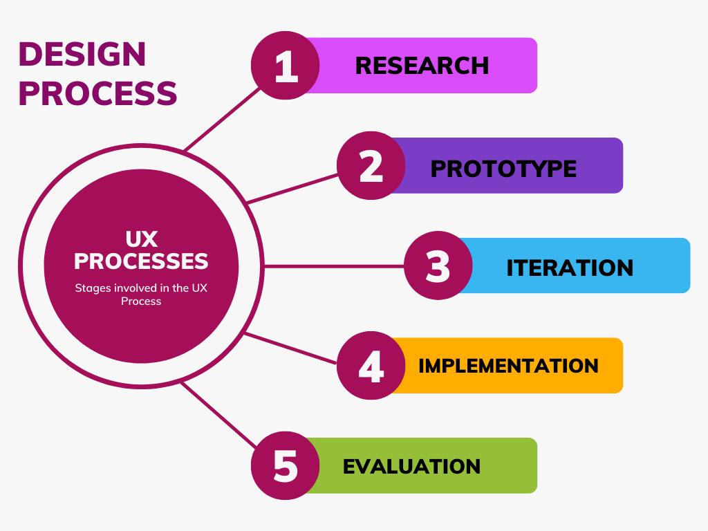 The stages and techniques used to create and produce digital goods that satisfy user wants, and expectations are referred to as the UX (user experience) process. The following steps are often involved in the UX process:
- Research: Gather information about target users and their needs, goals, and expectations. This stage may include user interviews, surveys, and other user research methods.
- Prototype: Create sketches, wireframes, and prototypes of the product, exploring and testing different design options and features.
- Iteration: Gather feedback from real users and iterate on the design, making improvements and refinements based on their feedback.
- Implementation: Develop the final product, incorporating feedback and design refinements.
- Evaluation: Monitor and analyze the product’s usage and performance, making necessary improvements and refinements.
During this iterative process, designers frequently travel back and forth between stages to improve and enhance the final result. The user experience (UX) process aims to provide digital goods that are easy to use, effective, and fun to use, resulting in improved user experiences and more uptake of the good or service.
Elements of UI (User Interface) Design
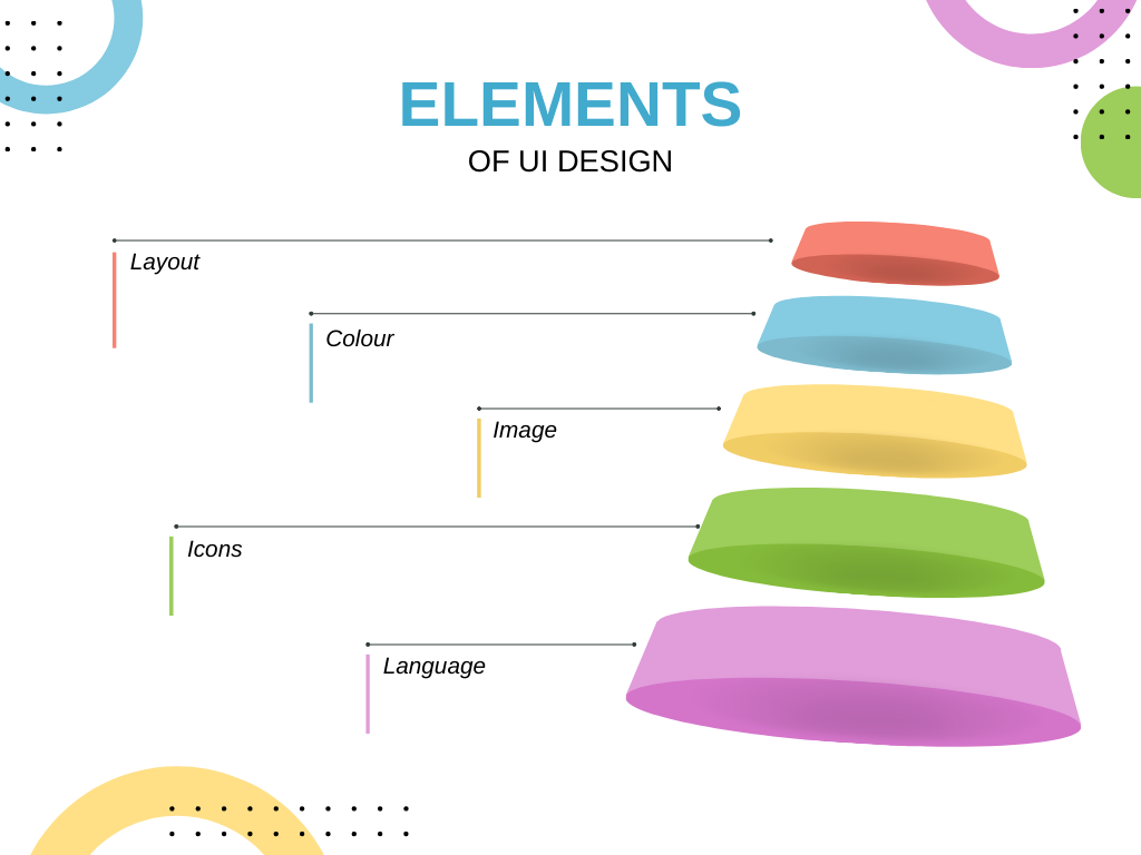
The visual and interactive design components that make up the user interface of a digital product are considered UI (user interface) design elements. Some of the essential components of UI design include the following:
- Layout: Layout refers to the arrangement and placement of elements on a page or screen in a digital product. A good layout is essential for creating a visually appealing, intuitive, and usable interface.
- Typography: Typography refers to the use of typefaces, font sizes, and other design elements related to the text. Good typography can greatly improve the readability and overall aesthetic of a product.
- Colour: Color can greatly affect a product’s mood, tone, and perception and is an important consideration in UI design. Colors can be used to create contrast, direct attention, and provide visual cues to users.
- Icons: Icons are graphical elements used to represent actions, concepts, or objects. They are an important part of the visual language of digital products and can help users quickly understand what a particular button or link does.
- Image: Images can be used to enhance the visual appeal of a product, provide context or illustration, and help users understand complex information.
- Language: The language used in digital products, including the labels and text used in buttons, menus, and other elements, can greatly impact the user’s understanding and experience. Careful consideration of the language used in a product can help ensure that users understand how to use it effectively.
Designers may produce aesthetically pleasing interfaces, simple to use, and intuitive by considering these factors and implementing them into the design process. As a result, users will have a better overall experience, and the product or service will be used more frequently.
Principles of UI Design
To produce efficient and usable interfaces, designers must adhere to the UI (user interface) design principles. They comprise:
- Hierarchy: Arranging elements in a clear and logical order, with the most important elements given prominence and placed at the top of the page or screen.
- Contrast: Creating visual contrast between elements to help users quickly differentiate between them and understand their relative importance.
- Alignment: Aligning elements along common lines or grids to create a visually consistent and organized interface.
- Proximity: Placing related elements close to each other creates visual connections and makes it easier for users to understand their relationships.
- Repetition: Repeating patterns, styles, or visual elements throughout the interface to create a consistent and unified look and feel.
- Balance: This is creating a visual balance between elements by adjusting their size, spacing, and placement on the page or screen.
- White-spacing: White-spacing uses blank space effectively to create visual balance and make the interface feel less cluttered and more manageable.
These guidelines assist designers in producing interfaces that are aesthetically pleasing, simple to use, and effective, resulting in improved user experiences and greater product or service acceptance. By keeping these ideas in mind, designers may produce efficient and interesting interfaces that satisfy user needs.
Conclusion
Conclusively, UI design foundations are fundamental building blocks for producing functional and usable interfaces. It is essential for designers to have a thorough understanding of the principles of UI design as well as the elements of UI design, such as hierarchy, contrast, alignment, proximity, repetition, balance, and white spacing, to create interfaces that satisfy user needs and provide an enjoyable and intuitive experience. The foundations of UI design, along with an awareness of user demands and behaviors, can assist designers in developing successful, effective, and simple interfaces, increasing the success of the product or service.
The overall quality of the product or service can be raised, and user adoption can be increased by concentrating on UI design principles. By doing so, designers can produce aesthetically pleasing and practical interfaces.
Gain Debugging Superpowers
Unleash the power of session replay to reproduce bugs and track user frustrations. Get complete visibility into your frontend with OpenReplay, the most advanced open-source session replay tool for developers.