
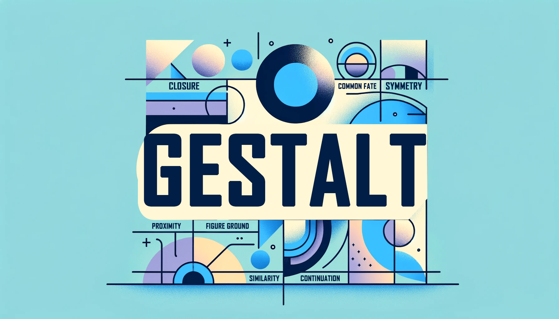
The term “Gestalt” originated in Germany in the early 20th century and is commonly translated to “form” or “shape” in English. According to Gestalt theory, the brain creates meaningful experiences from sensory information by filling in gaps, grouping similar elements, and paying attention to patterns. This article will show you how that theory applies to the design of effective web pages.

Discover how at OpenReplay.com.
The Gestalt principles are psychological laws that explain how the human brain perceives and organizes visual information. For example, the principle of similarity states that the brain tends to group objects with similar features, such as color, size, or shape.
Gestalt principles can be applied in web design to create pages that are more intuitive and easy to navigate for users. By understanding how the brain organizes visual information, designers can use elements such as proximity, similarity, and continuity to create websites that are more visually appealing and easy to use. For example, grouping similar elements can help users quickly identify the information they need, while using proximity to indicate relationships between elements can help users navigate the site more efficiently.
Designers in various fields, from web design to product design, can benefit from a deeper understanding of perceptual psychology. By studying how the human brain organizes and interprets visual information, designers can create interfaces and experiences that are more effective and user-friendly. Perceptual psychology considers factors such as how the brain prioritizes information, groups similar elements together, and interprets spatial relationships. Knowing how these processes work allows designers to create more intuitive and engaging designs.
Why Gestalt Principles in Design?
Some of the reasons why Gestalt Principles in design is necessary are:
Enhancing user experience
Gestalt principles play an important role in creating effective user experiences, as they help designers create designs that are easy to understand and interact with. Some of the ways that these principles contribute to enhancing user experience include:
- Clear communication and understanding: Using Gestalt principles like proximity, similarity, and closure, designers can ensure that users can make sense of complex information quickly and easily. This allows designers to communicate the meaning and purpose of their designs without overwhelming or confusing users.
- Reducing Cognitive Load: When users see a design that utilizes closure, they naturally fill in the gaps, allowing them to comprehend the page’s overall structure. This makes it easier for them to focus on the most important information. In addition, symmetry creates a sense of balance and order that helps to reduce cognitive load, allowing users to process information more efficiently.
- Intuitive Navigation: The Gestalt principles of proximity and similarity help designers create a logical navigation system for websites and applications. Users can easily identify and access the information they need by grouping related navigation elements together. Continuity further aids navigation by creating a natural flow between different sections of the design so users can easily move from one page to another. When these principles are applied well, users can easily find their way around a website or app without feeling lost or confused.
- Visual Hierarchy: The Gestalt principles of similarity, closure, and continuity help to establish this hierarchy by organizing information into distinct units and making it easy for users to identify and prioritize the most important elements on a page. By grouping related elements and creating a logical flow through the design, users can quickly and easily understand the page’s structure and find the necessary information.
Guiding attention and focus
Gestalt Principles are a powerful tool for guiding attention and focus in design. Using these principles to organize information and create a logical flow through the design, users can be directed to the most important elements and information. Some of the ways that these principles contribute to guiding attention and focus include:
- Figure-Ground Distinction: The figure-ground principle is one of the most important Gestalt principles in design, as it helps users focus on the essential content while ignoring the background elements. This distinction between the figure (the main content) and the ground (the background) is crucial in creating a design that is easy to navigate and use.
- Proximity and Similarity for Grouping: The principles of proximity and similarity are often used in tandem to help users recognize patterns and relationships in a design. By placing similar elements close together, designers can help users quickly and easily perceive them as part of a group. This allows users to focus on important information and actions while discarding irrelevant details.
- Motion and Common Fate: The Gestalt principle of common fate refers to the human tendency to perceive objects moving in the same direction as a group. In interactive design, this principle can direct user attention to specific elements through motion. This helps to create a smooth, intuitive experience and draw attention to key elements of the design.
When to Use Gestalt Principles in Design?
Gestalt Principles in design can be used in:
Initial design stages
Incorporating Gestalt Principles into the initial design stages is important in creating a successful user experience. This early consideration of usability and user engagement can help to create a cohesive and effective design. Using these principles from the start can set the tone for the entire project and lead to a better final product. Some of the ways the use of Gestalt Principles aligns with the initial design stages include:
- Conceptualization: Gestalt Principles can help designers understand how users naturally perceive information and interact with digital interfaces. The designers can use this understanding to guide the design layout and how information is organized. This approach allows designers to create an effective user experience right from the start.
- Setting Information Hierarchy: In this stage, the Gestalt Principles can help designers create a clear hierarchy of elements. By understanding and incorporating these principles, designers can create a clear visual hierarchy that guides users through the design. This can improve the overall usability and aesthetics of the design.
- Defining Visual Style: In the early stages of design, defining the visual style plays a key role in establishing the project’s overall aesthetic. Understanding how users perceive similarity and continuity is essential to creating a consistent and unified design. Using these principles, designers can make informed decisions about color palettes, typography, and the overall look and feel of the design. This can result in a design that is not only visually appealing but also easy to use and navigate.
- Prototyping
- Wireframing
Problem-solving in design
Design problem-solving often involves addressing challenges related to communicating information effectively, creating an intuitive and engaging user experience, and ensuring that the design is successful overall. Applying the Gestalt Principles can be extremely useful in these situations. For example, when a design is overly complex and confusing, the principle of closure can simplify the design and make it easier to understand. When a design lacks consistency, the principles of similarity and proximity can be used to create a more unified look. Using these principles as problem-solving tools, the Gestalt Principles can help designers resolve various design issues and create a more effective and user-friendly design. In addition to solving specific problems, applying these principles can also lead to more creative solutions and interesting designs.
Closure can create unity and coherence in a design by implying connections between elements that are not physically connected. This can be achieved using shapes, colors, or other visual cues to suggest continuity.
Imagine a website with many elements, such as text, images, and buttons. The site can appear cluttered and overwhelming without any clear organization or hierarchy. To address this problem, the designer can use the principle of closure to connect the different elements, creating a sense of unity. For example, the designer could use similar colors or shapes to connect the different elements and create a cohesive design. This can make the site easier to navigate and more visually appealing.
Redesign and optimization
Design optimization and redesign are essential processes in creating a successful design. By applying the Gestalt Principles during these stages, designers can enhance the effectiveness and usability of their work.
One of the best ways to apply the Gestalt Principles is to analyze existing designs and identify areas where they can be improved. By looking at a design through the lens of the principles, you can identify confusing layouts, unclear groupings, and poor figure-ground distinction. This analysis can help you to identify where the design is lacking and suggest ways to improve it. The design process should be an ongoing and iterative process, with regular feedback and refinement. By gathering user feedback and applying the principles to the design, you can create a product that looks great, works well, and provides a positive user experience.
Using the Gestalt Principles can significantly improve the clarity and usability of a design. By using closure to create clear and distinct figures and continuity to guide users through the design, you can eliminate confusion and make the design more intuitive. Optimizing the design based on the Gestalt Principles can increase user engagement by making it easier for users to access the necessary information.
Additionally, Data analysis can provide insights into how users interact with the design and how they perceive it. Using this data, you can identify opportunities for further optimization and improve the user experience.
What Gestalt Principles Should Be Used For
Gestalt principles can be applied to:
Establishing a visual hierarchy
Visual hierarchy is a key concept in design, which refers to the way the viewer’s eye perceives different elements in a design. The Gestalt Principles are a valuable tool for establishing a clear visual hierarchy, guiding the viewer’s eye, and ensuring that the most important information is perceived first. Some specific principles used to establish visual hierarchy include:
- Size and Position: In visual hierarchy, size is key in determining which elements are perceived as more important. Larger elements are naturally perceived as more important, while smaller elements are perceived as less important. Additionally, elements positioned in the center or at focal points of the design tend to draw more attention than those placed in the periphery.
- Color and Contrast: Color is another important factor in establishing visual hierarchy besides size. Elements in high contrast or with brighter and more saturated colors tend to stand out and appear more important to the viewer. This principle can draw attention to the most important elements in a design, making them more visually prominent.
- Grouping and Proximity: Grouping is a powerful technique that can create a strong visual unit from a group of related elements. Elements placed close together are perceived as being related, while those further apart are perceived as less related. This principle can be used to create a visual flow and establish a logical relationship between elements in a design. It can also create a sense of balance and unity in the overall design.
- Direction and Lines: Lines and arrows are powerful visual cues that can guide the viewer’s eye through a design. When elements are placed along a line or path, they are perceived as related and following a sequence. This can help viewers understand the most important information first and logically navigate the design. Using these visual cues, designers can create effective and intuitive designs that are easy to navigate and comprehend.
Fostering simplicity and clarity
In a world where we are constantly bombarded with information, simplicity, and clarity in design are more important than ever. The Gestalt principles provide guidelines that can help designers create effective designs that are visually appealing and easy to understand. By using these principles, designers can create designs that stand out from the crowd and communicate their message clearly and concisely. This is especially important in a world with short attention spans, and information overload is the norm. Some specific principles used to foster simplicity and clarity include:
- Prägnanz: The principle of Prägnanz (“conciseness”) is a key tenet of Gestalt psychology that states that the human brain tends to perceive visual stimuli in the simplest way possible. This means that when viewing a design, the brain will automatically try to make sense of the elements in the simplest way possible. This implies that designs should be kept as uncluttered and streamlined as possible, without any unnecessary elements that might distract from the core message. Negative space, or the space around elements in a design, is a powerful tool for avoiding visual clutter. Designers can draw attention to what matters most by leaving space around key elements. Additionally, removing unnecessary details, such as excessive text or embellishments, can make the design feel more streamlined and easier to comprehend.
- Similarity: Similarity is a fundamental principle of Gestalt psychology that states that elements that share similar features are perceived as related. This can be achieved using consistent colors, shapes, sizes, or textures throughout a design. Similarity can be used to create visual unity by grouping related elements. This can be done by placing them close together, aligning them, or using similar colors or styles. This will help to create a cohesive and organized design that is easy to navigate.
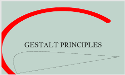
- Continuation: The principle of continuity states that elements arranged in a line or curve are perceived as part of the same group. This can create a sense of flow in a design, guiding the viewer’s eye from one element to the next. This is especially useful when trying to convey a story or sequence of events in a design. By taking advantage of continuity, designers can help users to follow the narrative and understand the intended message.
Enhancing emotional connection
Emotional connection is an important aspect of any design. The Gestalt principles can be a powerful tool for designers to evoke emotions and create designs that resonate with users. Overall, the use of Gestalt principles can help designers create designs that are not only visually appealing but also emotionally engaging. Some specific principles used to enhance emotional connection include:
- Similarity and Commonality: Similarity in design can create a sense of commonality, belonging, and trust. Using elements that share similar features, such as color, shape, or texture, can create a visual harmony that communicates a sense of unity and shared purpose. Additionally, designers can evoke specific emotions through the use of color. Warm colors like red and orange can create feelings of energy and passion, while cool colors like blue and green can create feelings of relaxation and serenity. This can be a powerful tool for creating a connection with the audience and achieving the desired emotional response.
- Proximity and Connection: The principle of proximity can create a sense of intimacy and connection in a design. By placing related elements close together, they can be perceived as part of the same group, creating a sense of belonging and cohesion. Additionally, this principle can strengthen the desired emotional response by placing elements that evoke similar emotions close together. This creates a visual flow that can help the viewer feel and understand the intended message.
- Closure and Completion: The principle of closure suggests that human perception is driven by the need to complete and make sense of partial or ambiguous information. Designers can take advantage of this by intentionally leaving some elements in a design incomplete or mysterious. This can spark curiosity and encourage the user to participate in creating the final image, leading to a deeper emotional connection with the design. Designers can create more memorable and effective designs by creating this sense of participation and engagement.
- Continuity and Flow: The principle of continuation suggests that the human eye follows a line or movement through a design. Designers can use this principle to create a sense of journey and progression in the user’s experience. By carefully arranging elements in a way that leads the user’s eye toward the climax of the design, designers can create a sense of anticipation and enhance the emotional impact of the design. This can be a powerful tool for creating designs that resonate with users on a deeper level.
Case Studies
Below are case studies to show the application of Gestalt Principles.
Real-world examples illustrating the successful application of Gestalt Principles
-
FedEx Logo: This logo uses the principle of closure to create a dynamic and directional design. The negative space between the “E” and “x” forms the shape of an arrow, guiding the eye of the viewer. This clever use of negative space not only adds visual interest but also conveys the idea of progress and movement. The logo is a great example of how the Gestalt principles can create a more engaging and effective design.

-
Apple Logo: The famous Apple logo is a great example of the Gestalt principle of Prägnanz. The design is simple and iconic, using only the shape of an apple with a bite taken out of it. Despite its minimal details, the logo is easily recognizable and memorable. The principle of Prägnanz states that the brain prefers simplicity and tends to reduce complex images to their essential elements. This makes the Apple logo so effective - its simplicity makes it easy to remember and identify.

-
Coca-Cola Logo: The Coca-Cola logo is another great example of a design that uses the Gestalt principle of similarity. The logo uses the same font and color scheme across all its branding materials, creating a sense of unity and coherence. This makes the logo instantly recognizable, even when seen out of context. Using the principle of similarity creates a strong and consistent brand identity, making the Coca-Cola logo one of the world’s most iconic and successful designs.

Challenges and Considerations
Gestalt Principles are a valuable resource for designers, but there are some challenges to remember.
Potential limitations and constraints
While the Gestalt principles offer useful guidelines for effective design, it’s important to recognize that they are not infallible. There are always exceptions to the principles, and it’s important to approach them with a critical eye. Some of these limitations and constraints include:
- Oversimplification: It’s a common pitfall to become overly reliant on the Gestalt principles, to the point where designs can become formulaic and unoriginal. In an attempt to create a “perfect” design, some designers may try to adhere too strictly to the principles at the expense of creativity and originality. This can result in designs that are bland and uninspiring. The best designs balance following the principles and adding a unique twist that makes them stand out.
- Cultural Differences: It’s important to remember that their culture and background can influence how people perceive visual stimuli. What may be considered effective in one culture may not be well-received in another. It’s essential to consider the cultural context of a design and tailor it accordingly. A design that works in one country may need to be modified to be effective in another. This is an important consideration for designers working in a global marketplace.
- Difficulty in Applying Certain Principles: One of the challenges of using Gestalt principles is that they are inherently subjective and open to interpretation. For example, the principle of Prägnanz, which refers to the brain’s tendency to perceive objects as complete and whole, can vary greatly from person to person. What one person sees as a complete shape, another person may not. This can make it difficult to create universally effective designs. However, understanding these subjective factors can help designers create more likely to be well-received designs.
- Static Nature: The Gestalt principles were originally developed with static images and layouts in mind, and they remain most relevant in that context. While some of the principles can also be applied to interactive or dynamic designs, they may not always be as effective. For example, the principle of common fate, which refers to the perception of elements that move together as a group, may not be as useful in a constantly changing and updating design. It’s important to consider the principles’ limitations when using them in different contexts.
Good cases and Bad cases of the use of some features of Gestalt Principles in design
-
Size:
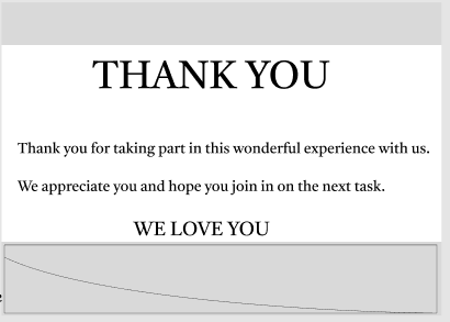
- Good case: Using the image above as a case study, it is seen that by using a range of sizes, the designer can create a structure that is easy for the viewer to understand and navigate. This principle of size can be used in various ways to create visual interest and enhance the overall design.
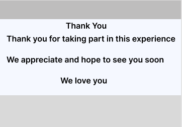
- Bad case: In other contexts, the lack of variation in size makes it difficult for the viewer to understand the information hierarchy. The user can’t determine which elements are most important if all the elements are the same size. This can lead to confusion and frustration.
- Good case: Using the image above as a case study, it is seen that by using a range of sizes, the designer can create a structure that is easy for the viewer to understand and navigate. This principle of size can be used in various ways to create visual interest and enhance the overall design.
-
Position:

- Good case: From the image above, by following the intuitive structure of position, the designer has made the content more accessible and readable. By understanding how users naturally scan and read designs, designers can create layouts that are visually appealing and easy to navigate.
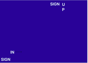
- Bad case: The poorly positioned elements create a chaotic and confusing layout. The elements will be scattered throughout the design, with no clear order or sequence. This makes it difficult for users to follow the flow and process the information. Additionally, the lack of alignment creates visual clutter, making it hard for the eye to focus on any element. This lack of hierarchy and organization makes the design less effective overall.
- Good case: From the image above, by following the intuitive structure of position, the designer has made the content more accessible and readable. By understanding how users naturally scan and read designs, designers can create layouts that are visually appealing and easy to navigate.
-
Color:
- Good case: color is a powerful tool to guide users and create a visual hierarchy. As seen in the picture above, the use of color enhances the design’s overall effectiveness, making it easy for the user to navigate and understand. It also adds visual interest and appeal, creating a more engaging and memorable experience.
- Bad case: using the picture above, it is evident that poor color choices create a sense of confusion and chaos. The lack of contrast between elements makes it difficult to determine which are most important or what requires the user’s attention. Similar colors create a lack of visual hierarchy, making it challenging to navigate the design and understand the intended message. This can lead to a frustrating and confusing user experience.
- Good case: color is a powerful tool to guide users and create a visual hierarchy. As seen in the picture above, the use of color enhances the design’s overall effectiveness, making it easy for the user to navigate and understand. It also adds visual interest and appeal, creating a more engaging and memorable experience.
-
Contrast:

- Good case: From the image above, this use of contrast highlights key information and guides the user’s eye through the design, making it simple to navigate and understand. It also creates a sense of visual interest, making the design more appealing and memorable.
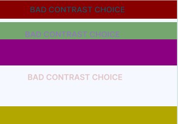
- Bad case: from the image above, the lack of contrast between text and background makes reading and understanding the information challenging. The similarity in colors between different elements creates a confusing and disorienting visual experience. Without enough contrast, the user’s eye can struggle to distinguish between the various elements of the design. This ultimately leads to a design that is less effective and engaging, as well as more difficult to use.
- Good case: From the image above, this use of contrast highlights key information and guides the user’s eye through the design, making it simple to navigate and understand. It also creates a sense of visual interest, making the design more appealing and memorable.
Conclusion
The Gestalt Principles are an invaluable resource for designers. They provide a foundation for understanding the psychology of perception and the way that the human brain processes visual information. Applying the Gestalt Principles can not only enhance the user experience but can also benefit the design process itself. By considering these principles from the start, designers can save time by avoiding common mistakes and pitfalls. Ultimately, designers who are well-versed in the Gestalt Principles are better equipped to create designs that are not only visually appealing but also highly effective and memorable.
The design landscape constantly shifts, but the Gestalt Principles remain a constant. They provide a roadmap for creating designs that balance aesthetics and functionality and truly connect with the viewer. In an ever-changing design landscape, the Gestalt Principles offer designers a stable foundation upon which to build their creative vision.
Truly understand users experience
See every user interaction, feel every frustration and track all hesitations with OpenReplay — the open-source digital experience platform. It can be self-hosted in minutes, giving you complete control over your customer data.
Star on GitHub12k