How to: Enhancing SELECT Dropdowns with no Programming
Enhance your dropdowns with ease


The
<select>dropdown is a workhorse, often overlooked for its simplicity. Yet, it holds a critical role in shaping user interactions. This unassuming HTML element is the conduit between user input and seamless navigation, acting as a gateway to various functionalities. However, its default styling can be limiting, hindering the potential for a visually captivating and user-friendly interface. This article will show you how to transform<select>dropdowns into polished and professional components, wielding the power of HTML and CSS.

Discover how at OpenReplay.com.
The <select> dropdown is an HTML element that creates a dropdown list, allowing users to select from a predefined set of options. This dropdown menu is commonly employed in forms or settings where a user needs to choose from a list of available choices. It’s crucial for gathering user input in forms, surveys, navigation menus, and more. They are fundamental HTML elements for creating interactive and user-friendly forms on the web. They offer a straightforward way for users to make selections from predefined options.
Importance of <select> Dropdown
The <select> dropdown is an essential and versatile HTML element, playing a crucial role in web development.
Here’s a breakdown of the significance of <select> dropdowns in web development:
-
User-Friendly Input: The
<select>dropdowns provide a user-friendly interface for selecting one option from a list of choices. This is particularly valuable in forms where users must make specific selections, as they present clear options, streamlining decision-making and eliminating the potential for incorrect free-text entries. They also offer efficient interaction, especially for long lists, and conserve screen space compared to long lists of checkboxes or radio buttons -
Form Handling and Data Submission:
<select>elements help standardize and organize data collection in forms. Users can choose from predefined options, ensuring consistency and accuracy in the information submitted. -
Consistency and Standardization: Dropdowns help maintain consistency by presenting a standardized list of choices. This is especially important when specific, predefined options are required, such as selecting a state or product category.
-
Space Efficiency: Dropdowns save screen space by displaying only the currently selected option, making them ideal for situations where many choices might otherwise clutter the interface.
-
Enhanced Usability: Dropdowns aid in efficient navigation, especially when dealing with long lists of options. Users can quickly scroll or search for the desired item. They visually organize and group options, enhancing clarity. They also facilitate sorting or filtering options, boosting navigation and search.
-
Accessibility: Properly implemented
<select>elements are keyboard-accessible, enhancing usability for disabled users. Assistive technologies can easily interpret them, promoting inclusive experiences. -
Customization and Styling: While the default styling is functional, developers can use CSS to customize the appearance of
<select>dropdowns, aligning them with the overall design aesthetics of the website. -
Mobile Responsiveness: Dropdowns seamlessly accommodate varying screen sizes and devices, making them suitable for responsive web design. On smaller screens, they often transform into touch-friendly interfaces for easy selection. They are also ideal for mobile forms and navigation menus with limited screen space.
-
Data Validation: Dropdowns limit choices to predefined options, reducing the chances of having input errors and ensuring that submitted data conforms to expected values. They also streamline data processing on the server side and reinforce standardization across inputs.
-
Cross-Browser Compatibility: All major web browsers support the
<select>dropdowns, ensuring consistent platform functionality.
Default Styling of <select> Dropdowns
Default styling refers to the built-in or inherent appearance browsers apply to HTML elements when the developer defines no specific styles. Each HTML element has a default set of styles provided by the browser’s default stylesheet. This default styling ensures a baseline level of readability and functionality for web content.
For example, when you create a simple HTML document without applying any custom styles, the browser will apply default styles to elements like paragraphs (<p>), headings (<h1> to <h6>), lists (<ul>, <ol>, <li>), links (<a>), and many others.
The default styling of <select> dropdowns in HTML is often basic, uninspired, and sometimes even downright ugly. While it does the job of presenting a list of options, it often lacks visual appeal and can be clunky to use. The default styling of <select> dropdowns is provided by browsers and operating systems, and while it serves a functional purpose, it has certain limitations.
Here are some of its drawbacks:
-
Operating System Dependence: Browsers typically render
<select>dropdowns using the default styling of the underlying operating system. This means that the appearance may vary across different platforms, leading to inconsistencies in the design. -
Limited Customization: The default styling offers limited options for customization. While basic styling like font and color can be applied, more advanced styling options are often restricted.
-
Limited Aesthetics: The default appearance is often simple and may not align with the overall design aesthetics of a website. This limitation becomes more apparent in projects that require a highly customized or branded user interface.
-
Difficult Arrow Styling: Styling the dropdown arrow, a common customization desire, is often challenging with default styles. Browsers may not allow easy modification of the arrow’s appearance using standard CSS.
-
Responsiveness Challenges: Default dropdowns may not constantly adapt seamlessly to different screen sizes in a responsive design and might not provide an optimal user experience on mobile devices.
-
Limited Icon or Image Integration: Incorporating custom icons or images alongside dropdown options is challenging with default styles. This can hinder efforts to enhance the visual appeal of the dropdown.
-
Difficulty in Animation: By default styles, implementing animated effects or transitions is constrained. Achieving smooth animations or transitions may require more advanced techniques and customization.
The Power of HTML in Structuring Dropdowns
HTML lays the foundation for creating well-structured and accessible dropdown menus. The power of HTML in structuring dropdowns lies in its ability to provide a simple yet robust framework for creating interactive and user-friendly dropdown menus. By effectively utilizing HTML’s structural capabilities, you can lay the groundwork for crafting dropdowns that function correctly and promote usability, accessibility, and visual appeal.
Guide on Creating <select> Elements in HTML
Creating <select> elements in HTML involves a straightforward process. Below is a step-by-step guide on creating a <select> dropdown in HTML, incorporating visual aids for clarity:
- Container for Dropdowns: The
<select>element is the fundamental building block for creating dropdowns. It acts as a container for a list of options from which users can choose. This tag marks the beginning of the dropdown list. The syntax:
<select>
  <!-- Options will go here -->
</select>
You can assign a descriptive name attribute for form submission and a unique id for styling and scripting.
The syntax:
<select id="dropdownSelection" name="userChoice">
  <!-- Options go here -->
</select>
The id attribute is set to “dropdownSelection,” providing a unique identifier for styling with CSS and targeting with JavaScript or scripting purposes. The name attribute is set to “userChoice,” indicating that the selected value will be identified as “userChoice” when the form is submitted. The name attribute gives the <select> element a name, which is crucial for form submission. It identifies the dropdown in the form data when the form is submitted.
Note: While a basic <select> without id and name will render as a dropdown, including these attributes provides additional functionality, improves accessibility, and allows for more robust styling and scripting capabilities.
- Defining Choices: The
<option>element is nested inside the<select>element and defines individual choices within the dropdown. Each<option>represents an item that users can select. The syntax:
<select>
  <option value="option1">Option 1</option>
  <option value="option2">Option 2</option>
  <option value="option3">Option 3</option>
</select>
Each <option> represents an item in the dropdown. The value attribute specifies the data associated with each option.
- Default Selection: If you want to select one option by default, use the
selectedattribute. Theselectedattribute can pre-select an option when the dropdown is initially rendered. The syntax:
<select>
  <option value="option1">Option 1</option>
  <option value="option2" selected>Option 2 (Default)</option>
  <option value="option3">Option 3</option>
</select>- Grouping option: HTML allows grouping related options using the
<optgroup>element. This approach helps organize and structure the dropdown when there are multiple categories or sections. Example:
<select>
  <optgroup label="Group 1">
    <option value="option1">Option 1</option>
    <option value="option2">Option 2</option>
  </optgroup>
  <optgroup label="Group 2">
    <option value="option3">Option 3</option>
    <option value="option4">Option 4</option>
  </optgroup>
</select>
In this example, there are two groups (“Group 1” and “Group 2”), and each group contains individual options. The label attribute provides a label or title for the group. This label is displayed as the heading for the group within the dropdown menu.
- Multiple selections: Users can select multiple options using the
multipleattribute. The syntax:
<select multiple>
  <!-- Options go here -->
</select>- Form integration: The
<form>element defines the beginning and end of an HTML form. It wraps the entire form, including the dropdown, for data submission. The syntax:
<form>
  <label for="dropdown">Choose an option:</label>
  <select id="dropdown" name="dropdown">
    <!-- Options go here -->
  </select>
  <input type="submit" value="Submit">
</form>
This form structure allows users to choose an option from the dropdown and submit the form, sending the selected value to the server for further processing. It’s a typical pattern for incorporating user input into web applications.
The <label> element is associated with the <select> element using the for attribute. This provides a label for the dropdown, enhancing accessibility and user experience. The <input> element with type="submit" represents the submit button.
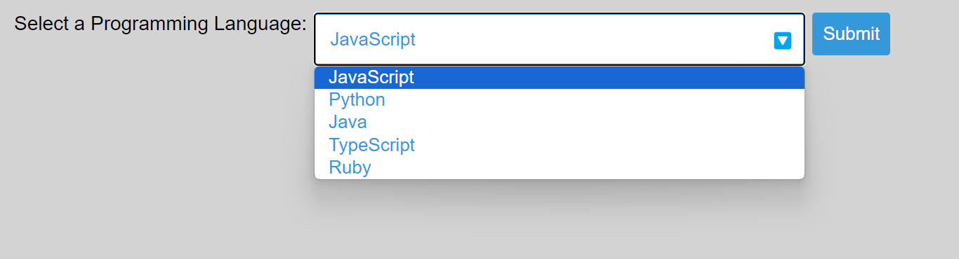
Let’s demonstrate with an example of structuring the HTML of a tech-themed custom dropdown for selecting programming languages showcasing various elements and attributes we’ve discussed:
<!DOCTYPE html>
<html lang="en">
<head>
  <meta charset="UTF-8">
  <title>Tech Dropdown</title>
</head>
<body>
  <form>
    <div class="custom-dropdown">
      <label for="languageSelection">Select a Programming Language:</label>
      <select id="languageSelection" name="selectedLanguage" class="styled-select">
        <option value="javascript">JavaScript</option>
        <option value="python">Python</option>
        <option value="java">Java</option>
        <option value="typescript">TypeScript</option>
        <option value="ruby">Ruby</option>
      </select>
    </div>
    <input type="submit" value="Submit">
  </form>
</body>
</html>
The outcome:
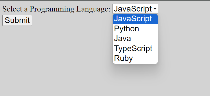
This HTML code creates a webpage with a form containing a dropdown for selecting programming languages. The <select> element defines the dropdown, allowing users to choose from JavaScript, Python, Java, TypeScript, or Ruby options. The associated <label> provides a clear description for the dropdown, enhancing accessibility. Classes like “custom-dropdown” and “styled-select” indicate that the code is prepared for external CSS styling, allowing the form’s appearance to be customized. The form also includes a “Submit” button to trigger sending the chosen language (identified by its value) along with the entire form data (if any) to a server.
See how the previously discussed elements function in the <select> dropdown.
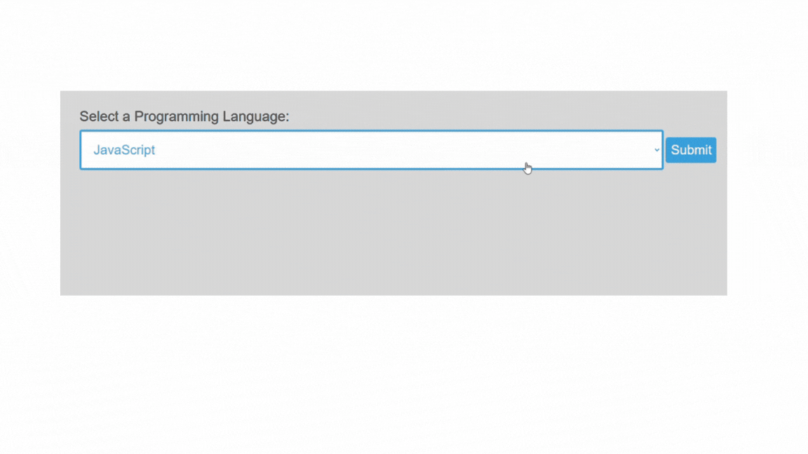
Fundamental CSS Properties for Styling
The default appearance of HTML dropdowns can be limited and may not always align with the design preferences of a website or application. Therefore, you can use CSS to enhance dropdowns’ visual appeal and user experience by targeting the relevant HTML elements, such as the <select> element and its associated components.
Here is a step-by-step instruction for basic customization of the <select> dropdown:
-
Consistency: You can reset default margins and paddings for
body,h1,form,label,select, andinputelements. This approach ensures a consistent visual baseline across different browsers and devices. -
Font and Spacing: The
bodyelement can be assigned a global font and some spacing. -
Presentation: The label element can be styled for better presentation. You can make the label a block-level element for proper spacing, with some bottom margin to create separation and set the font size for clarity.
-
Positioning: You can position the dropdown container relatively, allowing for positioning elements within it.
-
Select Dropdown Styling: You can style the select dropdown with width, padding, border, border-radius, font size, and color. You can also change the cursor to a pointer to indicate interactivity.
-
Color style: You can set colors to match your preference. You can also specify a uniform background color to ensure a consistent appearance across browsers.
-
Submit Button Styling: You can style the submit button with padding, background color, text color, border, and border radius. You can also change the cursor to a pointer to signal clickability.
Here is an example of how to apply these styles to <select> dropdown:
/* Resetting default margin and padding for consistency */
body, h1, form, label, select, input {
  margin: 0;
  padding: 0;
}

/* Apply a global font and some spacing */
body {
  font-family: 'Arial', sans-serif;
  padding: 20px;
  background-color: lightgray;
}

/* Style the label for better presentation */
label {
  display: block;
  margin-bottom: 10px;
  font-size: 26px;
}

/* Style the custom dropdown container */
.custom-dropdown {
  display: flex;
  flex-direction: row;
  align-items: center;
}

/* Style the select dropdown */
select.styled-select {
  width: 100%;
  padding: 20px;
  border: 3px solid #3498db;
  border-radius: 5px;
  font-size: 26px;
  color: #3498db;
  cursor: pointer;
  margin-right: 10px;
}

/* Style the submit button */
input[type="submit"] {
  margin-top: 20px;
  padding: 15px;
  background-color: #3498db;
  color: white;
  border: none;
  border-radius: 5px;
  cursor: pointer;
  font-size: 26px;
}
The outcome:
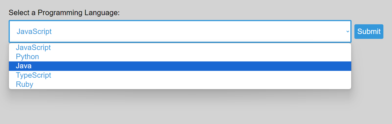
The example above sets a consistent baseline by resetting the margin and padding for several HTML elements and applying a global font and padding to the body. It styles a label for better presentation, creates a custom dropdown container, and styles a full-width select dropdown with specific properties. It also styles a submit button with specified attributes, including background color, font size, and border radius. You can add styles further based on your preferences.
Enhancing the <select> Dropdown with Icons and Images
Enhancing a dropdown with icons and images adds a visually appealing dimension to user interfaces, providing users with a more engaging and intuitive selection experience. However, standard <select> elements don’t support background images on individual options.
Here is how you can use a single icon or image for the entire dropdown, not individual icons for each option:
- Image: You can set an image on the entire
selectelement using the’ background-image’ property. Just use the URL of the icon or image you want. This creates a visual element behind the dropdown options. Example:
background-image: url('path/to/your/image.png');In this example, the background-image property sets the image URL. Replace the URL with the path to your desired image.
-
Image Positioning: The
background-position,background-repeat, andbackground-sizeproperties control the positioning, repetition, and size of the background image. -
Image Size: You can also use the
background-sizeproperty to adjust the image’s original size. -
Custom Dropdown Container: You can style the custom dropdown container with a relative position, width, and hidden overflow to prevent issues with positioned elements.
Let us look at how we can use a single icon or image for the entire dropdown:
body, h1, form, label, select, input {
  margin: 0;
  padding: 0;
}

body {
  font-family: 'Arial', sans-serif;
  padding: 30px;
  background-color: lightgray;
}

label {
  display: block;
  margin-bottom: 10px;
  font-size: 26px;
}

.custom-dropdown {
  display: flex;
  flex-direction: row;
  align-items: center;
  width: 100%;
  overflow: hidden;
}

select.styled-select {
  width: 100%;
  padding: 20px;
  border: 4px solid #3498db;
  border-radius: 5px;
  font-size: 28px;
  color: #3498db;
  cursor: pointer;
  margin-right: 10px;
  background-image: url('https://tse4.mm.bing.net/th?id=OIP.gDW1S5lPCzJoTzNu-NhtwQHaER&pid=Api&P=0&h=220');
  background-position: 95% center;
  background-repeat: no-repeat;
  background-size: 80%;
}

input[type="submit"] {
  margin-top: 20px;
  padding: 15px;
  background-color: #3498db;
  color: white;
  border: none;
  border-radius: 5px;
  cursor: pointer;
  font-size: 26px;
}
The outcome:
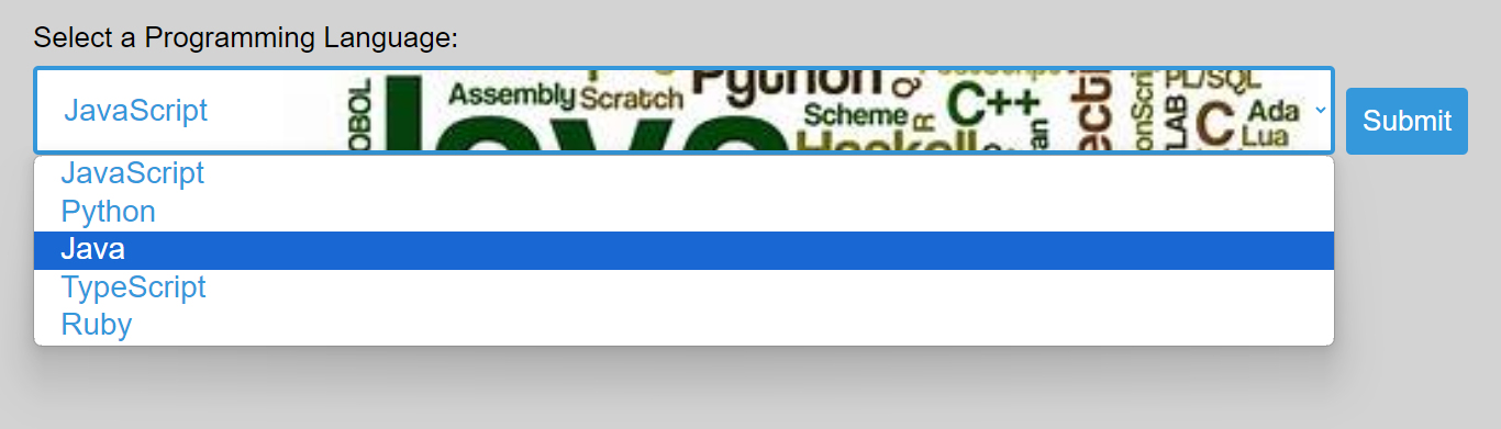
The above example effectively applies a background image to the entire dropdown element. This approach involves creating a custom dropdown container and styling the <select> element to include a background image, effectively providing a single icon or image for the entire dropdown.
You can use any image you choose and set it the way you want; just ensure it does not make the dropdown content invisible.
Styling the Dropdown Arrow
The default arrow on select dropdowns can feel bland and uninspired. Styling the dropdown arrow can be achieved using various techniques. Let’s explore some exciting techniques to replace the default arrow with a custom and stylish alternative:
Custom Arrow via Background Image
This technique uses a background-image property to create a custom-styled arrow for a dropdown element. Instead of relying on pseudo-elements or default browser styles for the dropdown arrow, replace it with a custom image. This approach offers more visual flexibility than a pseudo-element and enhances compatibility for hiding the default arrow.
The syntax:
background-image: url('The_image_URL');-
This line sets the background image for the dropdown arrow. You can replace the “The_image_URL” with the link to your arrow image.
-
You can now use background properties (
background-position,background-repeat,background-size) to set the arrow how you want it. -
To ensure consistency across different browsers, you must also remove the default dropdown arrow styles provided by WebKit (Chrome, Safari), Firefox, and others. Example:
-webkit-appearance: none;
-moz-appearance: none;
appearance: none;
Let’s see a practical example of using a background image for the arrow:
<!DOCTYPE html>
<html lang="en">
<head>
  <meta charset="UTF-8">
  <title>Dropdown Arrow Using Background Image</title>
</head>
<body>
  <form>
    <div class="custom-dropdown">
      <label for="programmingLanguage">Select a Programming Language:</label>
      <select id="programmingLanguage" name="selectedLanguage" class="styled-select">
        <option value="javascript">JavaScript</option>
        <option value="python">Python</option>
        <option value="java">Java</option>
        <option value="typescript">TypeScript</option>
        <option value="ruby">Ruby</option>
      </select>
    </div>
    <input type="submit" value="Submit">
  </form>
</body>

</html>
body {
font-family: 'Arial', sans-serif;
padding: 30px;
background-color: lightgray;
}
label {
display: block;
margin-bottom: 10px;
font-size: 26px;
}
.custom-dropdown {
display: flex;
flex-direction: row;
align-items: center;
width: 100%;
overflow: hidden;
}
select.styled-select {
width: 100%;
padding: 20px;
border: 4px solid #3498db;
border-radius: 5px;
font-size: 28px;
color: #3498db;
cursor: pointer;
margin-right: 10px;
background-image: url('https://tse3.mm.bing.net/th?id=OIP.jJ_0wlmyy0Il5USj9zkWngHaGc&pid=Api&P=0&h=220');
background-position: 95% center;
background-repeat: no-repeat;
background-size: 30px;
-webkit-appearance: none;
-moz-appearance: none;
appearance: none;
}
input[type="submit"] {
margin-top: 20px;
padding: 15px;
background-color: #3498db;
color: white;
border: none;
border-radius: 5px;
cursor: pointer;
font-size: 26px;
}The outcome:
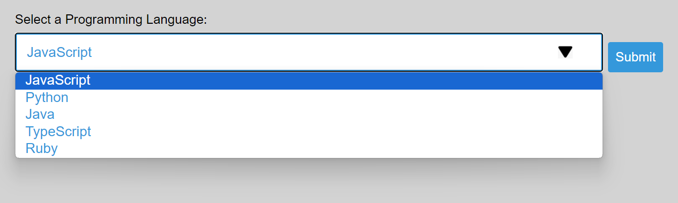
In the example above, the <select> element with the class styled-select` is styled with a custom background image (an arrow) positioned to the right. The appearance of the default dropdown arrow is removed for cross-browser consistency.
By using a background image for the arrow, you have complete control over the visual style of the arrow. This flexible approach enables you to create a custom design that fits your webpage aesthetics.
Custom Arrow via Character/Emoji
This approach uses a custom arrow icon (a character or emoji) to replace the default dropdown arrow. It provides more control over the appearance of the dropdown arrow, allowing you to use a custom design that fits your overall styling.
Here is how you can use a custom arrow icon:
-
Choose an Emoji or Character: Pick an emoji or character representing your desired arrow for your dropdown. For example, you can use the ”🔽” emoji. You can also utilize icon libraries like FontAwesome to embed arrow icons as web fonts. FontAwesome provides a collection of scalable vector icons that can be customized and styled using CSS.
-
Embed the Emoji/Character in Your HTML: Place the chosen emoji or character next to your
<select>element to represent the dropdown arrow visually. Example:
<span class="dropdown-icon">🔽</span>In this example, the emoji ”🔽” represents the dropdown arrow. If you prefer to use a character or emoji from a different source, you can replace it accordingly.
- Style the Emoji/Character: Apply CSS styles to position and size the emoji or character as needed. Example:
.dropdown-icon {
  position: absolute;
  top: 50%;
  right: 6px;
  transform: translateY(-50%);
  font-size: 25px;
}- You may also need to adjust the dropdown styles to accommodate the space taken by the emoji or character.
Let us see a practical way of applying the above steps.
<!DOCTYPE html>
<html lang="en">
<head>
  <meta charset="UTF-8">
  <title>Custom Arrow using Emoji/Character for the Dropdown</title>
</head>
<body>
  <form>
    <div class="custom-dropdown">
      <label for="programmingLanguage">Select a Programming Language:</label>
      <div class="select-wrapper">
        <select id="programmingLanguage" name="selectedLanguage" class="styled-select">
          <option value="javascript">JavaScript</option>
          <option value="python">Python</option>
          <option value="java">Java</option>
          <option value="typescript">TypeScript</option>
          <option value="ruby">Ruby</option>
        </select>
        <span class="dropdown-icon">🔽</span>
      </div>
    </div>
    <input type="submit" value="Submit">
  </form>
</body>
</html>
body {
font-family: 'Arial', sans-serif;
padding: 20px;
background-color: lightgray;
}
label {
display: block;
font-size: 28px;
margin-right: 10px;
}
.custom-dropdown {
display: flex;
flex-direction: row;
align-items: flex-start;
}
.select-wrapper {
position: relative;
display: inline-block;
margin-bottom: 10px;
}
select.styled-select {
width: 700px;
padding: 20px;
border: 3px solid #3498db;
border-radius: 5px;
font-size: 26px;
color: #3498db;
cursor: pointer;
appearance: none;
margin-right: 10px;
}
.dropdown-icon {
position: absolute;
top: 50%;
right: 25px;
transform: translateY(-50%);
font-size: 25px;
}
input[type="submit"] {
padding: 15px;
background-color: #3498db;
color: white;
border: none;
border-radius: 5px;
cursor: pointer;
font-size: 26px;
}The outcome:
In the example above, the emoji is positioned within the dropdown using the .dropdown-icon class. The emoji chosen (🔽) serves as a visual cue for users, indicating that the dropdown can be expanded to reveal options. The design ensures a clean and stylish appearance, improving the user interface for selecting programming languages.
Hover and Focus Effects for <select> Dropdown
Enhance user interaction with your <select> dropdown by implementing hover and focus effects. Elevate the visual experience by applying subtle shadows on hover and a more prominent shadow when the dropdown gains focus. These effects provide users with clear feedback and improve the overall usability of your form. The :hover and :focus pseudo-classes are essential for creating dynamic effects based on user interaction.
Here are ways to achieve the hover effect and focus effect for the <select> dropdown:
- Apply Hover Effect: Add a hover effect to the
selectelement (select.styled-select) to provide visual feedback when the user hovers over the dropdown. This will enable the creation of a shadow around the dropdown when the user hovers over it. Example:
select.styled-select:hover {
  <!-- The styles go here -->
}- Apply Focus Effect: Add a focus effect to the
selectelement (select.styled-select) to indicate when the dropdown has keyboard focus. This will enable you to create a more pronounced shadow when the dropdown gains focus. You must also remove the default focus outline browsers apply to focused elements. In some cases, this default outline may interfere with the design or styling of the element. Also, removing the focus outline can impact accessibility, as it helps users navigate and identify focused elements, especially for those who rely on keyboard navigation. Example:
select.styled-select:focus {
<!-- The styles go here -->
}- Submit button: Add a hover effect to the submit button. This will help you change the background color of the submit button when the user hovers over it. Example:
input[type="submit"]:hover {
<!-- The styles go here -->
}-
Box Shadow: The
box-shadowproperty is versatile in adding visual depth and emphasis without relying on borders or outlines. It is applied when the select dropdown is in a hover state or is focused. It is used as part of the hover and focus effects to make the<select>dropdown more visually engaging. -
Visual Cues: You can apply the hover effects on both the button and dropdown
selectelement to provide visual feedback to the user.
Let us apply hover and focus effects to the <select> dropdown practically:
<!DOCTYPE html>
<html lang="en">
<head>
  <meta charset="UTF-8">
  <title>Applying Hover and Focus Effects to select Dropdown</title>
</head>
<body>
  <form>
    <label for="languageSelection">Select a Programming Language:</label>
    <select id="languageSelection" name="selectedLanguage" class="styled-select">
      <option value="javascript">JavaScript</option>
      <option value="python">Python</option>
      <option value="java">Java</option>
      <option value="typescript">TypeScript</option>
      <option value="ruby">Ruby</option>
    </select>
    <input type="submit" value="Submit">
  </form>
</body>
</html>
body {
font-family: 'Arial', sans-serif;
padding: 30px;
background-color: lightgray;
}
label {
display: block;
margin-bottom: 10px;
font-size: 28px;
}
select.styled-select {
width: 90%;
padding: 20px;
border: 4px solid #3498db;
border-radius: 4px;
font-size: 26px;
color: #3498db;
cursor: pointer;
}
select.styled-select:hover {
box-shadow: 0 0 5px rgba(52, 152, 219, 0.8);
background-color: #eee;
}
select.styled-select:focus {
outline: none;
box-shadow: 0 0 10px rgba(52, 152, 219, 1);
}
input[type="submit"] {
margin-top: 10px;
padding: 10px;
background-color: #3498db;
color: #fff;
border: none;
border-radius: 5px;
cursor: pointer;
font-size: 26px;
}
input[type="submit"]:hover {
background-color: #2980b9;
}The outcome:
This example applies the hover effect using the :hover pseudo-class to the select element with the class styled-select. When the user hovers over the dropdown, it triggers a subtle box shadow and changes the background color from white to lighter gray, enhancing the visual feedback.When you hover over the submit button, the color changes to dark blue. On the other hand, the focus effect is applied using the :focus pseudo-class and is activated when the dropdown gains focus. It removes the default focus outline and adds a more pronounced box shadow, indicating the focused state. Both effects contribute to a more interactive and visually appealing user experience.
Advanced CSS Techniques for <select> Dropdown
To enhance the user experience further, you can implement CSS transitions and animations for smooth effects on the <select> dropdown. These advanced techniques allow you to create subtle and visually pleasing transitions between different states, such as hover, focus, and dropdown expansion. This adds a layer of sophistication to the design, providing a seamless and polished feel to the user interactions with the dropdown element. The incorporation of transitions and animations is achieved through CSS properties, allowing for graceful changes in appearance and behavior.
Here’s how to introduce CSS transitions and animations for smooth effects in <select> dropdowns:
-
Identify Elements for Transition: Determine which elements or properties you want to apply transitions. In this case, you might want to add transitions to the
box-shadowproperty for the:hoverand:focusstates of theselect.styled-selectelement. -
Define Transition Properties: Add the
transitionproperty to the selected element. Specify the properties to be transitioned, the duration of the transition, and any timing functions if needed. For example, you can add the following to theselect.styled-selectrule:
transition: box-shadow 0.3s ease;This will transition the box-shadow property for 0.3 seconds with an easing function for a smooth effect.
Example of how to apply transition practically:
<!DOCTYPE html>
<html lang="en">
<head>
  <meta charset="UTF-8">
  <title>Using Transitions for select Dropdown</title>
</head>
<body>
  <form>
    <label for="languageSelection">Select a Programming Language:</label>
    <select id="languageSelection" name="selectedLanguage" class="styled-select">
      <option value="javascript">JavaScript</option>
      <option value="python">Python</option>
      <option value="java">Java</option>
      <option value="typescript">TypeScript</option>
      <option value="ruby">Ruby</option>
    </select>
    <input type="submit" value="Submit">
  </form>
</body>
</html>
body {
font-family: 'Arial', sans-serif;
padding: 30px;
background-color: lightgray;
}
label {
display: block;
margin-bottom: 10px;
font-size: 28px;
}
select.styled-select {
width: 90%;
padding: 20px;
border: 4px solid #3498db;
border-radius: 4px;
font-size: 26px;
color: #3498db;
cursor: pointer;
transition: box-shadow 0.3s ease, background-color 0.3s ease;
&:hover {
box-shadow: 0 0 5px rgba(52, 152, 219, 0.8);
background-color: lightblue;
}
&:focus {
outline: none;
box-shadow: 0 0 10px rgba(52, 152, 219, 1);
background-color: #e0e0e0;
}
}
input[type="submit"] {
margin-top: 10px;
padding: 10px;
background-color: #3498db;
color: #fff;
border: none;
border-radius: 5px;
cursor: pointer;
font-size: 26px;
transition: background-color 0.3s ease;
}
input[type="submit"]:hover {
background-color: #2980b9;
}The outcome:
The above example incorporates transitions to introduce smooth effects during interactions. The select.styled-select element features transitions for the box-shadow and background-color properties, creating a gradual change in appearance when hovered over or focused. This transition effect enhances user experience by providing visual feedback. Similarly, the input[type="submit"] element has a transition on the background-color property, ensuring a smooth color change during hover interactions, further contributing to a polished and responsive design.
You can experiment with different properties and values to suit your design preferences.
- Introduce Animation Keyframes: If you want to go a step further and add animations, you can use keyframes. Define
@keyframesto create animation sequences. Let us look at a practical example of using animation with the<select>dropdown:
<!DOCTYPE html>
<html lang="en">
<head>
    <meta charset="UTF-8">
    <title>Using Animation for select Dropdown</title>
</head>
<body>
    <form>
        <label for="languageSelection">Select a Programming Language:</label>
        <select id="languageSelection" name="selectedLanguage" class="styled-select">
            <option value="javascript">JavaScript</option>
            <option value="python">Python</option>
            <option value="java">Java</option>
            <option value="typescript">TypeScript</option>
            <option value="ruby">Ruby</option>
        </select>
        <input type="submit" value="Submit">
    </form>
</body>
</html>
body {
font-family: 'Arial', sans-serif;
padding: 30px;
background-color: lightgray;
}
label {
display: block;
margin-bottom: 10px;
font-size: 28px;
}
select.styled-select {
width: 90%;
padding: 20px;
border: 4px solid #3498db;
border-radius: 4px;
font-size: 26px;
color: #3498db;
cursor: pointer;
&:hover {
box-shadow: 0 0 5px rgba(52, 152, 219, 0.8);
}
/* Apply focus effect */
&:focus {
outline: none;
box-shadow: 0 0 10px rgba(52, 152, 219, 1);
}
}
input[type="submit"] {
margin-top: 10px;
padding: 10px;
background-color: #3498db;
color: #fff;
border: none;
border-radius: 5px;
cursor: pointer;
font-size: 26px;
transition: background-color 0.3s ease;
}
input[type="submit"]:hover {
background-color: #2980b9;
margin-left: 10px;
animation: shake 0.5s ease;
}
/* Keyframes for the shake animation */
@keyframes shake {
0%, 100% {
transform: translateX(0);
}
25%, 75% {
transform: translateX(-5px);
}
50% {
transform: translateX(5px);
}
}The outcome:
The CSS animation shake was added to the submit button in the example above. The shake animation is applied, utilizing keyframes (@keyframes shake). This animation introduces a subtle side-to-side movement to the button, enhancing the interactive and playful aspect of the hover effect. When you hover over the submit button, it will change the background color and shake slightly. The animation can be customized by adjusting the keyframes.
You can experiment with different properties and values to achieve the desired effect.
Responsive Considerations for <select> Dropdown
Improving the responsiveness of <select> dropdowns can enhance the user experience on your website. It is necessary to make your <select> dropdowns more responsive and user-friendly, especially on smaller screens and touch devices.
Here are some techniques you can consider:
-
Optimize Styling for Mobile: Ensure the dropdown is visually appealing and usable on smaller screens. Adjust font sizes, padding, and margins to make it touch-friendly.
-
Consider Progressive Enhancement: To enhance the responsiveness of the select dropdown, you can use media queries to apply additional styling or features for larger screens, ensuring a better user experience on the desktop while maintaining basic functionality on smaller screens. This approach is known as progressive enhancement. Here’s an example of how you can use media queries for the
<select>dropdown:
<!DOCTYPE html>
<html lang="en">
<head>
  <meta charset="UTF-8">
  <meta name="viewport" content="width=device-width, initial-scale=1.0">
  <title>Responsive Tech Dropdown</title>
</head>
<body>
  <form>
    <label for="languageSelection">Select a Programming Language:</label>
    <select id="languageSelection" name="selectedLanguage" class="styled-select">
      <option value="javascript">JavaScript</option>
      <option value="python">Python</option>
      <option value="java">Java</option>
      <option value="typescript">TypeScript</option>
      <option value="ruby">Ruby</option>
    </select>
    <input type="submit" value="Submit">
  </form>
</body>
</html>
body {
font-family: 'Arial', sans-serif;
padding: 30px;
background-color: lightgray;
}
label {
display: block;
margin-bottom: 10px;
font-size: 28px;
}
select.styled-select {
width: 90%;
padding: 20px;
border: 4px solid #3498db;
border-radius: 4px;
font-size: 26px;
color: #3498db;
cursor: pointer;
}
@media (min-width: 768px) {
select.styled-select {
width: 60%;
font-size: 28px;
}
}
input[type="submit"] {
margin-top: 10px;
padding: 10px;
background-color: #3498db;
color: #fff;
border: none;
border-radius: 5px;
cursor: pointer;
font-size: 26px;
}The outcome:

The media query (@media (min-width: 768px)) targets screens with a minimum width of 768 pixels. Inside the media query, you can define additional styles to enhance the dropdown’s appearance for larger screens, such as adjusting the width or increasing the font size. This way, you progressively enhance the user experience on desktop devices.
-
Test the dropdown on different screen sizes to ensure the image scales appropriately.
-
Use the HTML
sizeAttribute: The size attribute allows you to specify the number of visible options without requiring the user to open a dropdown. This can be useful for smaller lists where you want users to see all options without scrolling. Example:
<select size="3">
   <option value="option1">Option 1</option>
   <option value="option2">Option 2</option>
   <option value="option3">Option 3</option>
</select>- Use
<optgroup>to group related options. This can make the dropdown more organized and easier to navigate, especially on smaller screens.
<select>
   <optgroup label="Group 1">
      <option value="option1">Option 1</option>
      <option value="option2">Option 2</option>
   </optgroup>
   <optgroup label="Group 2">
      <option value="option3">Option 3</option>
      <option value="option4">Option 4</option>
   </optgroup>
</select>- Set a Default Option: Include a default or placeholder option at the top of the list. This allows users to make a selection without scrolling quickly.
<select>
   <option value="" disabled selected>Select an option</option>
   <option value="option1">Option 1</option>
   <option value="option2">Option 2</option>
</select>
Accessibility Considerations for <select> Dropdown
Accessibility is crucial when designing web interfaces, including <select> dropdowns. By making accessibility considerations, you can create an inclusive and user-friendly experience for all users, including those with disabilities.
Here are some key accessibility considerations for <select> dropdowns:
-
Always use semantic HTML. The
<select>element is the appropriate choice for dropdowns. -
Implement Accessible Rich Internet Applications (ARIA) attributes to enhance accessibility. Example:
<select aria-labelledby="dropdownLabel" aria-describedby="dropdownDescription">
   <!-- Options go here -->
</select>-
Use the
<label>element to give a label to the<select>dropdown. This improves usability and helps screen readers. -
Include a default or placeholder option marked as disabled and selected. This approach helps screen reader users understand the purpose of the dropdown and prompts them to make a selection. Example:
<option value="" disabled selected>Select an option</option>-
Ensure that option text is clear and concise. Avoid ambiguous or overly technical language.
-
If you use a background image for the dropdown, ensure it doesn’t interfere with readability or usability for visually impaired users.
-
It is essential to consider accessibility when creating custom icons or emojis as they might not be universally understood, and screen readers might not interpret them accurately.
Conclusion
While often overlooked, <select> dropdowns can be transformed into visually appealing and engaging elements with careful attention to HTML structure and CSS styling. Mastering the practices discussed in this article can elevate your web forms and interfaces, creating a more polished and user-friendly experience. Practice and experimentation are vital in mastering these techniques. By leveraging the power of HTML and CSS, you can create dropdowns that function effectively and delight users with their visual appeal and interactivity.
Truly understand users experience
See every user interaction, feel every frustration and track all hesitations with OpenReplay — the open-source digital experience platform. It can be self-hosted in minutes, giving you complete control over your customer data.
Star on GitHub12k