

Form validation helps you control and sanitize values keyed into form inputs in your applications; this also helps provide meaningful messages for wrong values in the form. Validating form input is essential to development, ensuring we receive only the required information from the form. There are a few ways to handle form validation in a web application; one of these methods is using PristineJS, and in this article, we’ll show you how to use it.
PristineJS is a JavaScript library that helps simplify HTML form validation, allowing you to create custom form validation and error messages. In addition, it provides a lot of flexibility when handling validation and errors for your application, allowing you to set priority to form values verification, create input-specific error messages, etc.
There are several pros to using PristineJS for form validation, and we will be covering some of them below:
- Lightweight and easy to integrate: The file size is minimal and relatively easy to add to your web applications; all you need to do is download the zip file and link the pristine.js file in the dist folder to your application.
- Zero Dependency
- It allows you to create custom global validation easily accessible in inputs using element attributes.
- Custom validation to a specific field.
- Custom error messages for errors.
- Provision of control over error priority level.
For reference, you can find a list below if you would like to explore other libraries that facilitate form validation.
Form Validation With PristineJS
In this section, we will look at how to integrate PristineJS into your application and build a feature-rich form that is properly validated.
To add PristineJS to your application, visit the official website and click on the download button in the image below.
Once the download is complete, unzip the file and copy either the pristine.min.js or pristine.js file from the dist folder and paste it into your project folder. Finally, link the file you copied into your HTML file.
    ...
        <!-- PristineJS file -->
        <script src="./src/pristine.min.js"></script>
        <!-- PristineJS file -->
        <script src="./src/app.js"></script>
    ...
When completed, we will have this structure:
📦pristinejs
  ┣ 📂src
  ┃ ┣ 📜app.js
  ┃ ┣ 📜bootstrap.css
  ┃ ┣ 📜pristine.min.js
  ┃ ┗ 📜style.css
  ┗ 📜index.html
NB: You can also install PristineJS in your application by running the command on your terminal:
npm install pristinejsFollowing this, we can get started with validating forms. To validate a form using PristineJS, we need to call a new instance; the instance has three arguments; the form element you want to validate, an optional configuration object, and a boolean for live validation with a default value of true. If the parameter passed to live validation(third argument) is false, field validations would only happen on form submission; else, validation will occur as you key in values to a field.
const pristine = new Pristine(formElement, config, live);To show you a real-life example of how to validate forms using PristineJS with the HTML form below:
...
    <div class="my-4">
        <h2>Form validation</h2>

        <form novalidate id="form1">
          <div class="mb-3">
            <label for="form1-email" class="form-label">Email address</label>
            <input
              required
              type="email"
              class="form-control"
              id="form1-email"
              placeholder="Enter your email"
            />
          </div>
          <div class="mb-3">
            <label for="form1-message" class="form-label">Message</label>
            <textarea
              required
              minlength="5"
              class="form-control"
              id="form1-message"
              rows="3"
            ></textarea>
          </div>

          <button class="btn btn-primary w-100">Submit</button>
        </form>
      </div>
...
If you look at the code block above, we have the novalidate attribute on the form; this will disable the default HTML validation. So, in our app.js, we will create a new Pristine instance and pass the form element as a parameter; on the submit event for the form, we will call the validate method from the Pristine class to trigger form validation.
const defaultConfig = {
  // class of the parent element where the error/success class is added
  classTo: "form-group",
  errorClass: "has-danger",
  successClass: "has-success",
  // class of the parent element where error text element is appended
  errorTextParent: "form-group",
  // type of element to create for the error text
  errorTextTag: "div",
  // class of the error text element
  errorTextClass: "text-help",
};
...
window.onload = function () {
  const form1 = el("form1");
  const pristine1 = new Pristine(form1);

  form1.addEventListener("submit", function (e) {
    e.preventDefault();
    const valid = pristine1.validate();

    if (valid) {
      alert("Form is valid");
    } else {
      alert("Form is invalid");
    }
  });
...
};

function el(id) {
  return document.getElementById(id);
}
If you look at the code block above, you will also notice the variable defaultConfig; this is an object with properties on how PristineJS will handle the errors.
Open Source Session Replay
OpenReplay is an open-source, session replay suite that lets you see what users do on your web app, helping you troubleshoot issues faster. OpenReplay is self-hosted for full control over your data.

Start enjoying your debugging experience - start using OpenReplay for free.
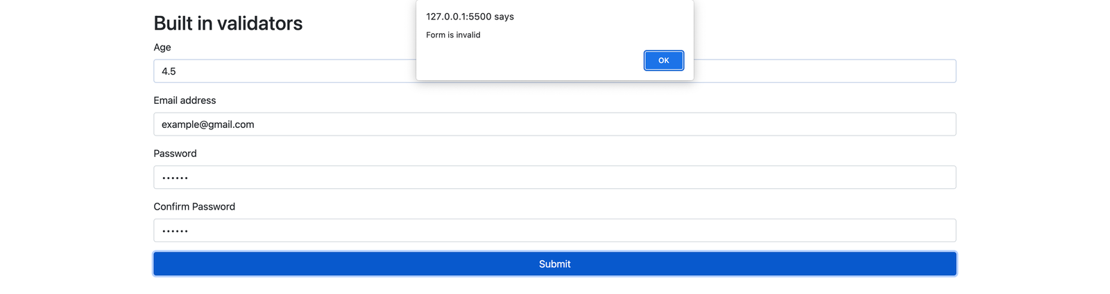
Built-in validators
In this section, we will be looking at some of the built-in validators for PristineJS:
...
<div class="my-4">
        <h2>Built in validators</h2>

        <form novalidate autocomplete="off" id="form2">
          <div class="mb-3">
            <label for="form2-age" class="form-label">Age</label>
            <input
              required
              data-pristine-type="integer"
              class="form-control"
              id="form2-age"
              placeholder="Enter your age"
            />
          </div>

          <div class="mb-3">
            <label for="form2-email" class="form-label">Email address</label>
            <input
              autocomplete="off"
              required
              data-pristine-type="email"
              class="form-control"
              id="form2-email"
              placeholder="Enter your email"
            />
          </div>

          <div class="mb-3">
            <label for="form2-email" class="form-label">Password</label>
            <input
              autocomplete="off"
              required
              type="password"
              class="form-control"
              id="form2-password"
              placeholder="Enter your password"
            />
          </div>

          <div class="mb-3">
            <label for="form2-confirmPassword" class="form-label"
              >Confirm Password</label
            >
            <input
              autocomplete="off"
              required
              type="password"
              data-pristine-equals="#form2-password"
              class="form-control"
              id="form2-confirmPassword"
              placeholder="Confirm your password"
            />
          </div>

          <button class="btn btn-primary w-100">Submit</button>
        </form>
      </div>
...
From the code block above, we have the “data-pristine-type” attribute on the first input element; this attribute specifies the value accepted by the input field, with the parameter as either email, number, or integer; it determines the validation type accepted by the input field. We also have the “data-pristine-equals” validator attribute; this accepts the selector of the field value to match. PristineJS validation attributes take the format data-pristine-Validation_rule_tag.
Below is a table with the built-in validators for PristineJS
| Validator | Definition |
|---|---|
| data-pristine-type | This specifies the data type of a field; it accepts numbers, integers, or email as values |
| data-pristine-required | This validator indicates that a field is required |
| data-pristine-maxlength | This allows you to specify the maximum count for characters in a field. |
| data-pristine-minlength | This allows you to specify the minimum count for characters in a field. |
| data-pristine-min | Specifies the minimum value for a field |
| data-pristine-max | Specifies the maximum value for a field |
| data-pristine-pattern | This validator accepts a regular expression pattern, which it would use to validate a field. |
| data-pristine-equals | Validates if the field is equal to the field passed as a value to the attribute. e.g, data-pristine-equals=“#form2-password” |
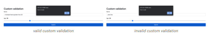
Custom Validation
PristineJS allows you to create custom global validators that you can use across fields in your forms or custom validations tied to a specific field/ input element.
...
  Pristine.addValidator(
    "name",
    function (value) {
      return value.length > 0 && value.length < 20;
    },
    "Name must be between 1 and 20 characters"
  );
...
The code block above creates a global validator; we can achieve that by calling the addValidator method on the global Pristine class. The addValidator method takes in four parameters: the validation name, a function with the field’s value to validate passed as an argument, the validation message, and the priority level for the validation.
To create custom validation tied to a field, you will call the addValidator method from a new instance of the Pristine class. The method also accepts the same parameters as the global validator above, the only distinction being the first parameter; instead of a validation name, the element to validate is the first parameter.
...
pristine3.addValidator(
    el("form3-age"),
    (value) => {
      return value >= 18 && value <= 65;
    },
    "Age must be between 18 and 65"
  );
...
We will apply the custom validators created above will be applied to an HTML form in the code block below:
<!-- CUSTOM VALIDATION -->
<div class="my-4">
  <h2>Custom validation</h2>

  <form autocomplete="off" id="form3">
    <div class="mb-3">
      <label for="form3-name" class="form-label">Name</label>
      <input
        data-pristine-required
        data-pristine-name
        class="form-control"
        id="form3-name"
        placeholder="Enter your name"
      />
    </div>

    <div class="mb-3">
      <label for="form3-age" class="form-label"
        >Age: <b id="form3-age-slot"></b
      ></label>
      <input
        data-pristine-required
        type="range"
        value="0"
        class="form-range"
        id="form3-age"
      />
    </div>

    <button class="btn btn-primary w-100">Submit</button>
  </form>
</div>
<!-- CUSTOM VALIDATION -->
The input element above with the id “form3-name” takes the global validation with the tag name as the attribute data-pristine-name. Also, we linked the age range input to the element-specific custom validation.
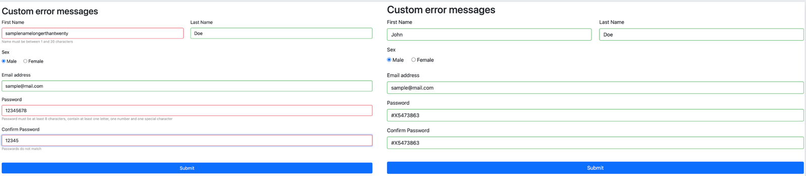
Custom error messages
PristineJS gives you the flexibility of overwriting default error messages for specified fields with the attribute data-pristine-validation_tag-message, with the custom message passed as the attribute’s value:
...
    <div class="form-group mb-3">
    <label for="form4-message" class="form-label">Message</label>
    <input
      class="form-control"
      data-pristine-required
      data-pristine-name
      data-pristine-required-message="First name is required"
      data-pristine-name-message="First name cannot be more than 20 characters"
      placeholder="Enter your first name"
      id="form4-firstName"
    />
  </div>
...
We created a custom error message in the code block above for the data-pristine-required and data-pristine-name validations.
To correctly append error messages, we have to wrap the input in a div with a class corresponding to the classTo property in your configuration object for the Pristine instance where the validation is acting on.
Conclusion
I hope this article has helped you learn how to properly handle validation for your form using PristineJS. We have also covered creating custom errors and customizing error messages. If you want to review the library further, you can check the official website and the GitHub repository with the examples used in the article.