
Implementing Neumorphic Shadows


As is so often the case in modern digital design, the origin of Neumorphism was attributed to a Ukraine-based UI/UX designer, Alexander Plyuto. He created and uploaded this design pattern on Dribbble in late 2019. The design immediately gained fame, accumulating thousands of likes in just a few months. The Dribbble shot inspired many designers to make their version of it and has taken a seat on websites and native application development ever since. The CSS box-shadow and highlight features are used in Neumorphism, also known as soft UI or the upgrade development of skeumorphism, to provide the idea that objects appear as though they are leaving the web page or user interface. Alexander Plyuto created an interface that demonstrated how contemporary programs might appear as an advancement of skeuomorphism. Neumorphism (soft UI) became the most trending digital design pattern in 2020.
The article focuses on different implementations of neumorphism in a website’s user interface; readers are advised to understand and know the basics of the Box-Shadow element in CSS designs. It will cover the implementation of neumorphism in various elements, the primary issue with its design in web and native apps, and a potential fix.
Origin of Neumorphism
We all have a source, just like everything else that exists. The development of skeuomorphism and flat design patterns gave rise to neumorphism. For practical reasons, we should be well-versed in flat and skeuomorphic design.
Skeumorphic Designs
Digital designs began with Skeuomorphism in the 1980s and became popular as it was used for Steve Jobs’s early Apple designs. The term “skeuomorphism” is most frequently used in the context of graphical user interface design to characterize interface elements that closely resemble their real-world equivalents regarding appearance and usability. The icon used to delete data, the recycle bin, is a well-known illustration. Skeuomorphism uses notions that consumers are familiar with to make interface objects seem familiar. Skeuomorphism, however, produced cluttered interfaces with illegible item relationships and unclear navigation. The majority of web users frequently find website UIs to be confusing. Performance on websites suffered as well; it took longer for graphics to load. You can look at what it resembles here.
Flat Designs
Bright colors and 2D elements are used in flat design, a user interface style that gained popularity in late 2012. Microsoft, Apple, and Google used flat designs for responsive design, enabling the website’s content to adapt naturally based on the screen size of the device used. In contrast, skeuomorphic designs caused poor web page performance. Simple forms and a few textures used in flat designs ensure that responsive designs function efficiently and load quickly (especially important since mobile devices have slower internet speeds). Users benefit from a simplified and ideal user experience because flat design lessens the quantity of visual noise, such as textures and shadows. You can look at what it resembles here.
Neumorphic Designs
The most significant advantage of Flat Design in its application is its ability to be scaled and easily adaptable to multiple screen sizes. Of course, flat design has limitations, which may result in excessively simple and unintuitive designs. Despite Skeumorphism’s disadvantage in load time, it’s a great design, as it uses three-dimensional elements for its designs. This downside in both designs gave birth to Neumorphism. That’s why it’s referred to as a soft UI design which is an advancement of both flat and skeuomorphic design. Flat because it eliminates the lengthy graphics load time, and Skeumorphic because it describes interface elements that closely resemble their real-world counterparts.
Implementing Neumorphic designs
When modified, the Box-shadow property in CSS produces an incredibly beautiful appearance enabling the production of Neomorphic designs. The attributes are:
- Horizontal offset: This attribute regulates the shadow’s horizontal location. It accepts both positive (+) and negative values (-). While negative (+) sets the shadow on the left side of the box, positive (+) sets it on the right.
- Vertical offset: This property is used to describe the position of the shadow’s vertical value. V stands for vertical. The box’s shadow is set above it using a negative value, while its shadow is set below it using a positive value.
- Blur: Although this trait is optional, it will be necessary for this essay. It only serves to obfuscate (blur) the box.
- Spread: This affects the size of the shadow.
- Color: As its name implies, it’s utilized to provide additional tones to the shadow as needed.
- Inset: we may use this property to generate a shadow inside an element.
- Initial: This option is used to reset the box-shadow property to its default value.
Session Replay for Developers
Uncover frustrations, understand bugs and fix slowdowns like never before with OpenReplay — an open-source session replay tool for developers. Self-host it in minutes, and have complete control over your customer data. Check our GitHub repo and join the thousands of developers in our community.
Neumorphic shadows
By using commas to divide the values for the box shadow, numerous shadows can be applied. One value for each side of the box can be concatenated up to four times. The basic implementation looks like this:
    box-shadow: -H - Blur-radius color(rgba(0,0,0,0.5)),
                 H V Blur-radius color(rgba(0,0,0,0.5));
    //INSET
    box-shadow: inset Horizontal Vertical Blur-radius color(rgba(0,0,0,0.5)),
                inset -Horizontal -Vertical Blur-radius color(rgba(0,0,0,0.5));
Buttons
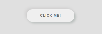
Buttons are major site elements, and they are responsible for many navigations. You can apply neumorphic designs to buttons in this way:
<body class="Body">
<div class='container'>
    <button class="btn">click me!</button>
</div>
</body>

//CSS
.container {
    height: 100vh;
    display: flex;
    align-items: center;
    justify-content: center;
}

.Body {
    height: 100vh;
    display: flex;
    justify-content: center;
    align-items: center;
    background-color: #e0e0e0;
}

button {
    border-radius: 20px;
    border: none;
    outline: none;
    font-size: 12px;
    font-weight: bold;
    padding: 15px 45px;
    margin: 14px;
    letter-spacing: 1px;
    text-transform: uppercase;
    cursor: pointer;
    transition: transform 80ms ease-in;
}

.btn {
    box-shadow: -5px -5px 10px rgb(207, 206, 206), 5px 5px 8px #babebc;
    color: #707070;
}
Inputs
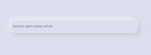
We find inputs in almost all applications; it could be WhatsApp, YouTube, Facebook, or Google. It’s only an advantage if you can add neumorphic shadows to them. The below styles help with that:
// HTML
<body class="Body">
    <input type="search" name="" class="input" placeholder="favorite open-replay article">
</body>
// CSS
.input {
border: 1px solid #fff;
background-color: #e0e0e0;
border-radius: 15px;
padding: 8px;
box-shadow: 9px 9px 16px rgba(189, 189, 189, 0.6),
-9px -9px 16px rgba(255, 255, 255, 0.5);
width: 400px;
height: 50px;
}
Forms
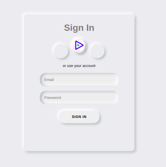
Forms are a CSSmajor part of every application that deals with registration and authentication, so having neumorphic shadows on these would be great. Let’s see what it looks like:
<body class="Body">
  <div class="wrapper">
    <div class="container">
      <div class="sign-in-container">
        <form>
          <h1>Sign In</h1>
          <div class="social-links">
            <div>
              <a href="#"></a>
            </div>
            <div class="replay">
              <div class="img1">
                <a href="#">
                  <img
                    src="https://res.cloudinary.com/crunchbase-production/image/upload/c_lpad,f_auto,q_auto:eco,dpr_1/l1rdsqvpqkkzyhmjqabi"
                    alt=""
                    class="img"
                /></a>
              </div>
            </div>
            <div>
              <a href="#"></a>
            </div>
          </div>
          <span>or use your account</span>
          <input type="email" placeholder="Email" />
          <input type="password" placeholder="Password" />
          <button class="form_btn">Sign In</button>
        </form>
      </div>
    </div>
  </div>
</body>
styling.css
.body {
height: 100vh;
display: flex;
align-items: center;
justify-content: center;
background-color: #fff;
font-family: "Montserrat", sans-serif;
margin: 0;
padding: 0;
}
.wrapper {
width: 100%;
height: 100vh;
display: flex;
justify-content: center;
align-items: center;
background: #ebecf0;
overflow: hidden;
}
.container {
border-radius: 10px;
box-shadow: -5px -5px 10px #fff, 5px 5px 10px #babebc;
position: absolute;
width: 30%;
min-height: 480px;
overflow: hidden;
}
form {
background: #ebecf0;
display: flex;
flex-direction: column;
padding: 0 50px;
height: 100%;
justify-content: center;
align-items: center;
}
form input {
background: #eee;
padding: 16px;
margin: 8px 0;
width: 85%;
border: 0;
outline: none;
border-radius: 20px;
box-shadow: inset 7px 2px 10px #babebc, inset -5px -5px 12px #fff;
}
button {
border-radius: 20px;
border: none;
outline: none;
font-size: 12px;
font-weight: bold;
padding: 15px 45px;
margin: 14px;
letter-spacing: 1px;
text-transform: uppercase;
cursor: pointer;
transition: transform 80ms ease-in;
}
.form_btn {
box-shadow: -5px -5px 10px #fff, 5px 5px 8px #babebc;
}
.form_btn:active {
box-shadow: inset 1px 1px 2px #babebc, inset -1px -1px 2px #fff;
}
.social-links {
margin: 20px 0;
}
form h1 {
font-weight: bold;
margin: 0;
color: rgb(131, 125, 125);
margin-top: 10%;
}
p {
font-size: 16px;
font-weight: bold;
letter-spacing: 0.5px;
margin: 20px 0 30px;
}
span {
font-size: 12px;
color: #000;
letter-spacing: 0.5px;
margin-bottom: 10px;
}
.social-links div {
width: 50px;
height: 50px;
display: inline-flex;
justify-content: center;
align-items: center;
margin: 0 5px;
box-shadow: -5px -5px 10px #fff, 5px 5px 8px #babebc;
cursor: pointer;
border-radius: 50%;
}
.img {
height: 100%;
width: 100%;
border-radius: 50%;
}
The Main Problem with Neumorphic Shadows
An excess or, in some cases a little addition of things breaks purpose. Neumorphism, though a great design, has its downside: Accessibility.
The contrast ratio between the components and the background is improper. This is because many neumorphism design techniques only use shadows and slight transparency changes to distinguish components and hierarchies that don’t have an appropriate contrast ratio with the background. Visually impaired people will find this design disturbing due to the improper contrast ratio between the components and the background, which goes against the Web Content Accessibility Guidelines. Unfortunately, not only users who require strong contrasts to see the interface clearly that may be affected. The tiny nuances that make the design will be missed by users of devices with low-quality screens, making it challenging to tell which items are clickable.
On one page, neumorphism shouldn’t be the dominant style; designers could mix flat designs with neumorphic designs for better usability. I think neumorphism works best when designers or developers can mix matching colors for better results. In reality, striking a balance between design philosophies can be tricky, making it a difficult challenge for UI designers. Additionally, designers should exercise caution when using neumorphic design excessively. Large-scale use of the Neumorphic style can be disastrous for usability. The appropriate components should be subjected to neumorphic design appropriately.
Conclusion
This article reviewed the history and applications of neumorphism before moving on to potential issues with the design and finding the best possible resolution. I wish you a lot of fun while styling.
A TIP FROM THE EDITOR: For more on Neumorphism, look at Introduction To Neumorphic Designs, and on the topic of shadows, don’t miss Shadows In CSS.
Gain Debugging Superpowers
Unleash the power of session replay to reproduce bugs and track user frustrations. Get complete visibility into your frontend with OpenReplay, the most advanced open-source session replay tool for developers.
