Implementing Password Policies in React
Learn how to apply checks for more secure passwords


Password policies are rules for creating passwords. Passwords are the keys to your digital world, from emails to social media, but not all passwords are strong. Some are weak and easy to guess, while others are strong and hard to crack. This article will explain what a password policy is, why it matters, and how to implement it.

Spot abnormal user behaviors and iron out the bugs early with OpenReplay. Dive into session replays and reinforce your front-end against vulnerabilities that hackers search for.
Discover how at OpenReplay.com.
Password policies play a critical role in our digital lives, safeguarding financial data, personal emails, and business information. Despite their importance, we often overlook this fundamental aspect of digital security.
Weak passwords are like an open invitation to cybercriminals. They present notable security risks, and the consequences of such breaches can be bad. Here are a few compelling reasons why password policies matter:
- Risks of Weak Passwords: Weak passwords, like “123456” or “password,” are a hacker’s dream. They can crack, allowing unauthorized access to sensitive accounts. This may be personal information and even financial assets.
- Significance of Strong Password Policies: Strong password policies are the first line of defense against online threats. They set standards for creating secure passwords that are difficult for attackers to crack.
- Real-World Examples: Consider the countless high-profile data breaches that have made headlines. Companies, organizations, and even individuals have suffered the consequences of weak password security. From the Yahoo data breach, which affected billions of accounts to others reported. This highlights the devastating effects of insufficient password policies as reported by Firewalltimes.
- Personal and Business Implications: The importance of strong password policies extends beyond individual users. In case of a security breach, businesses and organizations may not only incur data losses. They can also suffer damage to their reputation and a loss of customer trust.
Key Components of a Password Policy
As the first line of defense for our digital fortress, here are some common components. They form the foundation of a robust password policy:
-
Password Length: The first and most intuitive component is password length. The longer the password, the more difficult it is for hackers to crack. A longer password provides a greater range of combinations. This makes it a formidable barrier against brute-force attacks.
-
Password Complexity: This is another critical component. It involves using mixed character types in the combination, such as uppercase and lowercase letters, numbers, and special symbols. A complex password is much more resilient to various types of attacks. The rationale behind complexity is simple yet effective. Mixing various character types boosts the number of potential password combinations. This means hackers have to try a larger number of combinations, thus making it difficult to crack.
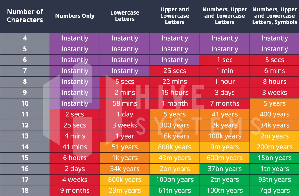
Look at the infographics above, cited from HiveSystems. We can get a basic idea of how password vulnerability decreases with an increase in password length and complexity.
Project Setup
UI build
For the sake of this article and to simplify the procedure, all examples and discussions will be on the App.tsx.
We shall build a sample user sign-up form to implement the password policy.
In the App.tsx file we define the structure of the data using an interface called FormData. This specifies the data for our policy should include fields for:
email,password,confirmPassword,showPassword.
The useState hook is then used to create a state variable called formData. This variable holds the data, and it’s initialized with empty values for each field in form data as below.
//App.tsx
interface FormData {
  email: string;
  password: string;
  confirmPassword: string;
  showPassword: boolean;
}

const App = () => {
  const [formData, setFormData] = useState<formData>
    {
      email: "",
      password: "",
      confirmPassword: "",
      showPassword: false,
    };
};
Next, we’ll create event handlers to link the input fields to the HTML section of our form. We’ll keep these functions separate and well-organized to make this more beginner-friendly.
-
handleEmailChangehandles changes in the email input field. When the user enters or modifies their email address, the new value is extracted. This updates the email field in theformDatastate while preserving the other fields. -
handlePasswordChange: handles changes in the password input field. This function calls for updates when a user enters or changes the password. It extracts the field’snameand newvalueand updates the corresponding field. TheformDataupdates for the specific value while keeping other fields unchanged. -
handleShowPasswordtoggles theshowPasswordproperty in theformDatastate between true and false. This state handles password visibility. Users trigger this when they desire to show or hide password characters. -
handleConfirmPasswordChange: is likehandlePasswordChange. This function manages changes in theconfirmPasswordfield.
//change handlers
  const handleEmailChange = (e: React.ChangeEvent<HTMLInputElement>) => {
    const { value } = e.target
    setFormData({
      ...formData,
      email: value,
    })
  }

  const handlePasswordChange = (e: React.ChangeEvent<HTMLInputElement>) => {
    const { name, value } = e.target
    setFormData({
      ...formData,
      [name]: value,
    })
  }

  const handleShowPassword = () => {
    setFormData({ ...formData, showPassword: !formData.showPassword })
  }

  const handleConfirmPasswordChange = (
    e: React.ChangeEvent<HTMLInputElement>,
  ) => {
    const { value } = e.target
    setFormData({
      ...formData,
      confirmPassword: value,
    })
  }
Next, we continue by building the user interface. We will be styling using Tailwind CSS, and the created handler functions are added below.
//App.tsx
//Creating the UI
<main className="flex items-center justify-center mx-auto w-full min-h-[100vh] bg-gray-800 py-10">
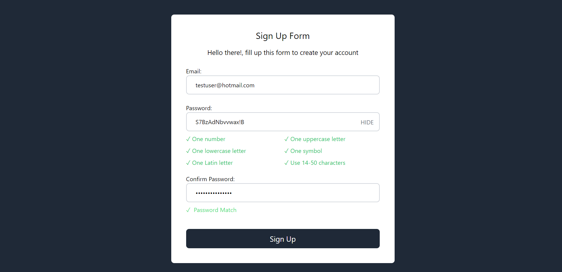
<form className="bg-white rounded-lg w-[600px] sm:mx-20 mx-4 sm:p-10 p-6 ">
<h1 className="sm:text-2xl text-xl text-center">Sign Up Form</h1>
<p className="sm:text-lg text-sm pt-4 pb-6 text-center">
Hello there! fill up this form to create your account
</p>
<div>
<label htmlFor="email">Email:</label> <br />
<input
type="email"
name="email"
id="email"
className="w-full border-2 border-gray-300 rounded-lg px-6 py-3 !focus:border-green-400"
value={formData.email}
onChange={handleEmailChange}
/>
</div>
<br />
<div className="relative">
<label htmlFor="password">Password:</label> <br />
<input
type={formData.showPassword ? "text" : "password"}
autoComplete="off"
name="password"
id="password"
value={formData.password}
className="w-full border-2 border-gray-300 rounded-lg px-6 py-3 !focus:border-green-400"
onChange={handlePasswordChange}
/>
<button
className="uppercase absolute top-[38px] right-4 text-gray-500 bg-white"
type="button"
onClick={handleShowPassword}
>
{formData.showPassword ? "Hide" : "Show"}
</button>
</div>
<div>
<label htmlFor="confirmPassword">Confirm Password:</label> <br />
<input
type="password"
name="confirmPassword"
id="confirmPassword"
autoComplete="off"
className="w-full border-2 border-gray-300 rounded-lg px-6 py-3 !focus:border-green-400"
value={formData.confirmPassword}
onChange={handleConfirmPasswordChange}
/>
</div>
<button
type="submit"
name="submit-form"
className={`w-full py-3 rounded-lg text-white text-xl mt-10`}
>
Sign Up
</button>
</form>
</main>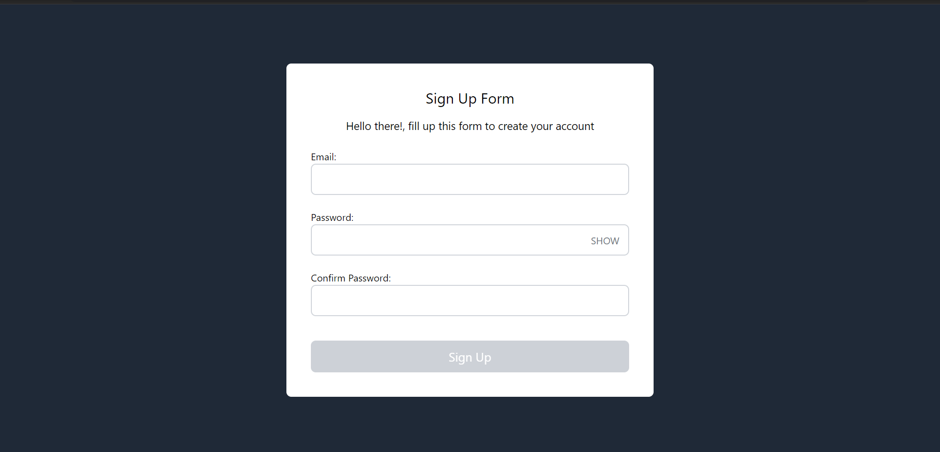
Implementing the password policy rules
The code snippet below implements password policy rules. It checks for the presence of various elements, such as numbers, uppercase and lowercase letters, and symbols, and ensures the password length falls within a specified range.
//password policy criteria
interface PasswordValidationCriteria {
  label: string;
  isValid: boolean;
}

const [passwordValidation, setPasswordValidation] = useState<PasswordValidationCriteria[]>([
  { label: 'One number', isValid: false },
  { label: 'One uppercase letter', isValid: false },
  { label: 'One lowercase letter', isValid: false },
  { label: 'One symbol', isValid: false },
  { label: 'One Latin letter', isValid: false },
  { label: 'Use 14-50 characters', isValid: false },
]);

const validatePassword = (password: string) => {
  const updatedPasswordValidation = passwordValidation?.map((criteria) => {
      switch (criteria.label) {
        case 'One number':
          criteria.isValid = /[0-9]/.test(password)
          break
        case 'One uppercase letter':
          criteria.isValid = /[A-Z]/.test(password)
          break
        case 'One lowercase letter':
          criteria.isValid = /[a-z]/.test(password)
          break
        case 'One symbol':
          criteria.isValid = /[!@#$%^&*]/.test(password)
          break
        case 'One Latin letter':
          criteria.isValid = /[a-zA-Z]/.test(password)
          break
        case 'Use 14-50 characters':
          criteria.isValid = password.length >= 14 && password.length <= 50
          break
        default:
          break
      }
      return criteria
    })

    setPasswordValidation([...updatedPasswordValidation])
}
Firstly, we define an interface called PasswordValidationCriteria. It describes the structure of objects used to represent password validation criteria. This includes a description label and a validity indicator isValid.
The useState hook here creates a state variable named passwordValidation. This variable is an array of objects, each representing a specific criterion. At initialization, the criteria are all marked as not met, with isValid set to false.
From the code snippet above, the validatePassword function employs regular expressions to inspect a password against specific requirements. This might not always be the case as developers can use other methods to inspect against a specific requirement.
Next, under the password input field, we leverage the JavaScript higher-order function map. This is to display and show the status of password updates. The criteria.siValid property plays a key role in styling attribute determination. It helps to apply these styles based on whether it evaluates to true or false
<div>
<ul className="grid sm:grid-cols-2 grid-cols-1 pt-2 pb-5 gap-2">
{passwordValidation.map((criteria, index) => (
<li
key={index}
className={criteria.isValid ? "text-green-500" : "text-gray-400"}
>
<span>
{criteria.isValid ? (
<span>✓ </span>
) : (
<span>• </span>
)}
</span>
{criteria.label}
</li>
))}
</ul>
</div>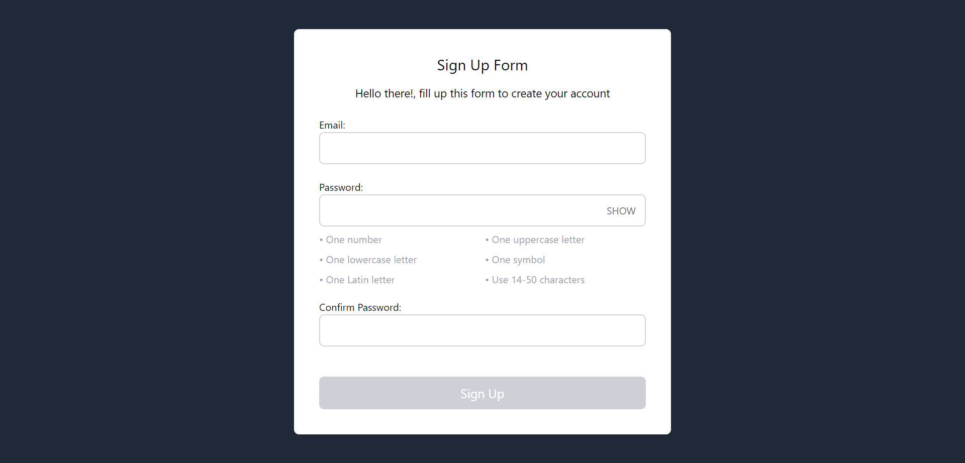
Validating passwords and handling errors
Here, we use the validatePassword function mentioned earlier inside the password handler. This ensures each character the user enters follows the password criteria we’ve set.
//change password handler with validatePassword function
const handlePasswordChange = (e: React.ChangeEvent<HTMLInputElement>) => {
  const { name, value } = e.target
  setFormData({
      ...formData,
      [name]: value,
  })

  validatePassword(value) //called here
}
We also confirm the password in the handleConfirmPasswordChange. This ensures it matches the password entered in the handlePasswordChange.
We create a state variable and related functions to handle password confirmation. It guarantees what the user writes in confirmation matches the password.
//confirm password change validation
//state to track changes
const [isPasswordMatch, setIsPasswordMatch] = useState<boolean>(false)
From the above, isPasswordMatch is a boolean state variable. This keeps track of whether the confirmation password matches the password. The validatePasswordConfirmation function is used to validate and set the isPasswordMatch state. This is based on the comparison between the password and the confirmation.
We also write a function to ensure that the confirmPassword value is the same as that of the password. This will be nested inside of the confirm password change handler.
The handleConfirmPasswordChange function updates the formData state. This then calls validatePasswordConfirmation to ensure the confirmation matches the password. It helps in real-time validation and updating the user interface and also informs the user whether the passwords match or not.
By doing this, we help the users help themselves to ensure a more secure online experience.
Best Practices
Here are some of the best practices for implementing a password policy in React applications
- Client-Side Validation with Feedback: Test the password’s complexity in real time. This saves the user from several trials and errors when setting a password.
- Password Strength Meter: Display a visual indicator of how strong the password is. This steers the user in the right direction to know if the password is strong or not.
- Server-side security: Always verify passwords on the server side for added security. This would ensure that both the client and server are in sync, thus providing a robust security system
Conclusion
In conclusion, password policies play a vital role in online security. These policies are like the protective shields that keep our digital fortress safe.
To see these principles in action, check out the live demonstration on Vercel. You can also find the code on the GitHub repository.
Always keep in mind that the ability to safeguard our online presence is a valuable skill to own.
Detect, Fix, and Fortify
Spot abnormal user behaviors and iron out the bugs early with OpenReplay. Dive into session replays and reinforce your front-end against vulnerabilities that hackers search for.
Explore DevTools