
Implementing Notifications with ngx-toastr in Angular

Often, we encounter a notification pop-up when interacting with a website, especially when we’ve entered correct data, and the website wants us as users to know that the data we entered was successful or when we get an error notification when we enter incorrect data. This article will show you an easy way to inform the user by using the
ngx-toastrlibrary.

Discover how at OpenReplay.com.
The Angular notification library ngx-toastr has been created for developers to easily use on their websites to pass different information to users. It is important because it provides a simple, bold way of passing on success, error, warning, and helpful messages. Integrating this library makes it possible for developers to be sure that users receive prompt and clear feedback, thereby improving the total user experience and interaction in the application.
In this article, we’ll see how to create notification pop-ups with this Angular library.
Getting Started
In this section, we’ll see how we can use this library by going through the necessary configurations.
To start creating a notification pop-up using this Angular library, we need to create an Angular project and then install all necessary dependencies.
Follow the steps below to get started:
- Use the code below to install an Angular CLI if you don’t already have it installed.
npm install -g @angular/cli- enter the code below to create a new Angular project in your terminal.
ng new notification-app- Install
ngx-toastrin your application.
npm install ngx-toastr --save- Install the
@angular/animationsmodule, which is a required dependency for the defaulttoastanimations.
npm install @angular/animations --save- After
@angular/animationshas been installed, we then addBrowserAnimationsModuleandToastrModulein ourapp.module.tsfile. What we set to achieve in the code below is to properly configure and initialize this Angular library within our application.
import { NgModule } from "@angular/core";
import { AppComponent } from "./app.component";
import { BrowserAnimationsModule } from "@angular/platform-browser/animations";
import { ToastrModule } from "ngx-toastr";

@NgModule({
  declarations: [AppComponent],
  imports: [BrowserAnimationsModule, ToastrModule.forRoot],
  providers: [],
  bootstrap: [AppComponent],
})
export class AppModule {}- If you’re using a standalone component, add
provideToastrto theprovidersarray as seen in the code below. This code also configures and initializes the Angular library within our application.
import { bootstrapApplication } from "@angular/platform-browser";
import { AppComponent } from "./src/app.component";
import { provideAnimations } from "@angular/platform-browser/animations";
import { provideToastr } from "ngx-toastr";

bootstrapApplication(AppComponent, {
  providers: [provideAnimations(), provideToastr()],
});- The last setting up we’ll do is to add the default styles to our
notifications-app.component.cssfile. We added the default styles because the library provides them. These styles define the position, look, and responsiveness of thetoastnotifications, ensuring they are shown well across different screen sizes.
Creating Notification Pop-ups
In this section, we’ll see how to use this library to create simple notification pop-ups. Seeing that we’re done with configurations, let’s go ahead and implement a notification application using this library.
In your notifications-app.component.ts file, enter the code below to inject ToastrService in the component:
import { ToastrService } from "ngx-toastr";Next, we implement the following functions to show either a success message, information, error, or a warning message.
import { Component } from "@angular/core";
import { ToastrService } from "ngx-toastr";
@Component({
selector: "app-notifications-app",
templateUrl: "./notifications-app.component.html",
styleUrls: ["./notifications-app.component.css"],
})
export class NotificationsAppComponent {
constructor(private toastr: ToastrService) {}
showInfoMsg() {
this.toastr.info("This is how Toastr works", "Info");
}
showSuccessMsg() {
this.toastr.success("Data Saved Successfully", "Success Message");
}
showErrorMsg() {
this.toastr.error("Error in sending data", "Error Message");
}
showWarningMsg() {
this.toastr.warning("Enter a Correct Password", "Warning Message");
}
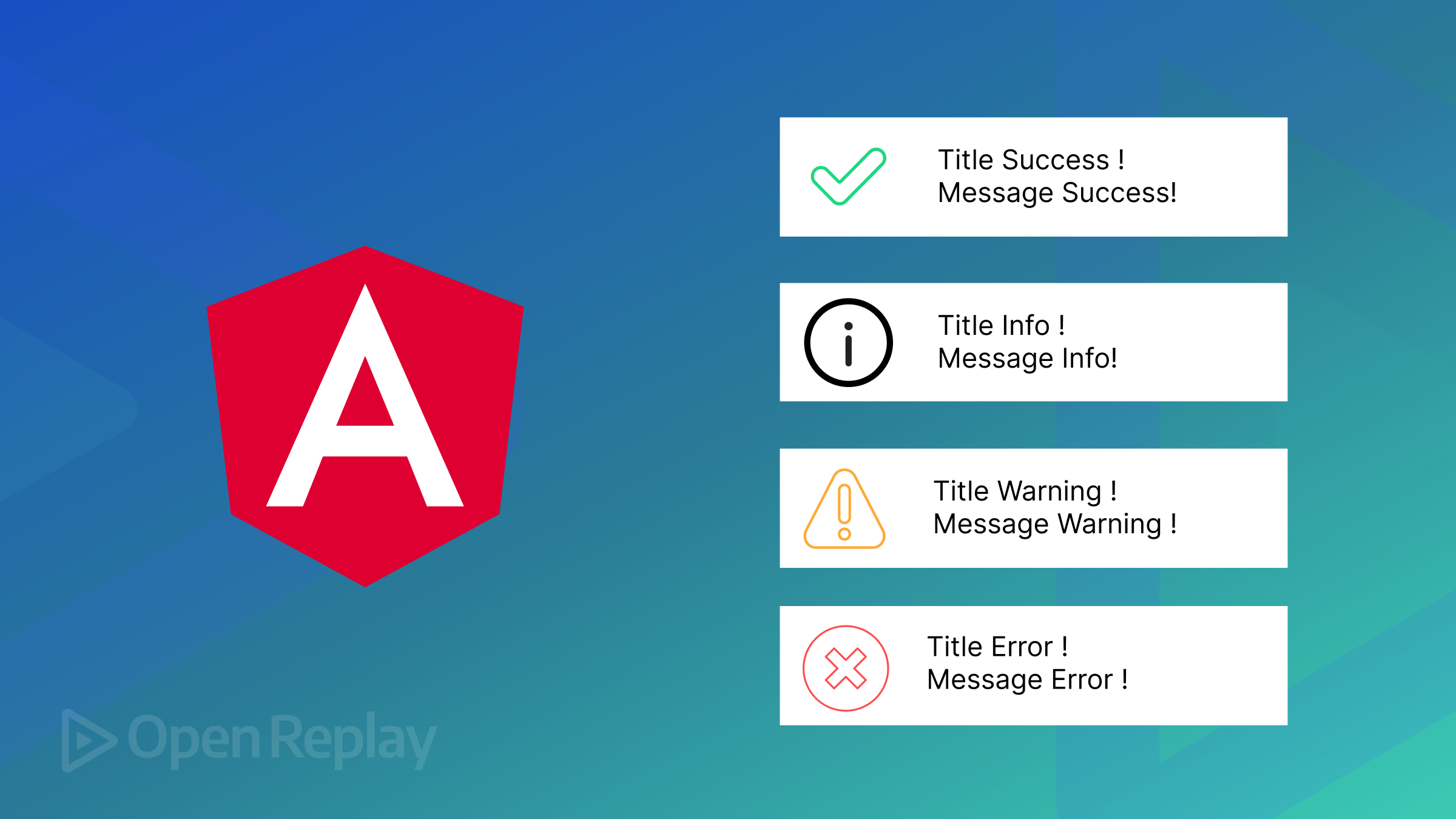
}In the above code, we defined four functions to display different types of notification pop-ups using the ToastrService:
- Success Notification: The
showSuccessMsgfunction shows a success message to tell the user that their action, such as saving data, was successful. - Info Notification: The
showInfoMsgfunction shows a message to pass helpful information to the user. - Error Notification: The
showErrorMsgfunction shows an error message to tell the user of a problem, such as an error that happened while submitting data. - Warning Notification: The
showWarningMsgfunction shows a warning message to warn the user, such as asking them to enter a correct password.
In your notifications-app.component.html file, enter the following code:
<section class="border border-danger d-flex gap-3">
  <button class="bg-primary text-light" (click)="showInfoMsg()">
 Show Info
  </button>
  <button class="bg-success text-light" (click)="showSuccessMsg()">
 Show Success
  </button>
  <button class="bg-danger text-light" (click)="showWarningMsg()">
 Show Warning
  </button>
  <button class="bg-danger text-light" (click)="showErrorMsg()">
 Show Error
  </button>
</section>
From the code above, we have four different buttons. When a button is clicked, it triggers its function to show its corresponding notification pop-up.
In the demo below, we’ll see that when any of the four buttons are clicked, their corresponding functions are triggered, and their notification pop-ups showing the title and message are displayed.
Conclusion
A notification pop-up is important when developing a website, as it helps pass certain messages to a user. We have seen how we can easily create a notification pop-up using this library.
We should note that the notification pop-ups we created using this library are subject to change. This means we can change the default styles to align with our needs.
Gain Debugging Superpowers
Unleash the power of session replay to reproduce bugs, track slowdowns and uncover frustrations in your app. Get complete visibility into your frontend with OpenReplay — the most advanced open-source session replay tool for developers. Check our GitHub repo and join the thousands of developers in our community.
