Mastering Navigation in React Native apps


This guide encompasses all the essential aspects of navigation implementation, delving into its significance and providing practical insights on integrating navigation into your React Native applications.

Discover how at OpenReplay.com.
Making mobile apps easy to use involves ensuring smooth navigation. In React Native, we rely on libraries like React Navigation to help with this. React Navigation provides a range of tools and features to help manage how users move around your app, making it simple for them to switch between screens and features.
React Navigation provides several built-in navigators, each catering to specific navigation patterns:
- Stack Navigator: The stack navigator is like a stack of cards, with each new screen placed on top of the previous one. It’s great for situations where users move forward through a series of screens, such as onboarding or browsing products with a shopping cart.
- Tab Navigator: This navigator uses tabs at the bottom or top of the screen, making it easy for users to switch between different parts of the app. It works well for apps with distinct sections, like social media apps with separate tabs for the feed, messages, and profile.
- Drawer Navigator: With this navigator, a side menu slides in from the screen’s side, offering access to different app sections and settings. It’s handy for apps with lots of content or navigation options that shouldn’t clutter the main interface.
Importance of Navigational Structures in Mobile Apps
A well-designed navigation structure is fundamental to the success of any mobile app. Here’s why:
- Better User Experience: Simple and easy-to-follow navigation makes it effortless for users to discover what they need and accomplish tasks quickly, leading to less frustration and higher user involvement.
- Improved Organization: A well-structured navigation system logically arranges your app’s content, aiding users and developers in understanding and maintaining the app effectively.
- Easier Maintenance: Separating navigation logic from UI components simplifies managing complexity and allows for more efficient updates to navigation patterns.
- Uniform Design: React Navigation ensures navigation follows platform-specific conventions on iOS and Android, guaranteeing your app meets user expectations and feels native across different platforms.
Setting Up
This section focuses on setting up navigation in React Native, including installing all required dependencies and configuring the necessary libraries.
Installing Dependencies
To begin, make sure your React Native app is running smoothly. Next, we’ll install react-navigation/native and react-navigation/stack. In your project terminal, run the following command:
npm install @react-navigation/native @react-navigation/stackConfiguring React Navigator and Stack Navigator
There aren’t many configurations required in this section. You just need to understand how to use React Navigation with Stack navigation, which is straightforward. We’ll demonstrate this process using code inside the App.js file.
First, we’ll create our root stack, which will contain all the screens we’ll be creating. This root stack is imported from @react-navigation/stack, which we installed earlier in the previous section.
import { createStackNavigator } from "@react-navigation/stack";

const RootStack = createStackNavigator();
const App = () => {
  return (
    <NavigationContainer>
      <RootStack.Navigator
        initialRouteName=""
        screenOptions={{
          headerTitleAlign: "center",
          headerStyle: {
            backgroundColor: "black",
          },
          headerTintColor: "#bbb",
          headerTitleStyle: {
            fontSize: 20,
            fontWeight: "normal",
          },
        }}
      >
        // Screens...
      </RootStack.Navigator>
    </NavigationContainer>
  );
};
export default App;
The code above imports createStackNavigator from React Navigation, which is used to create a stack navigator responsible for managing navigation between screens. The RootStack.Navigator component sets up the navigation structure, specifying the initial route and defining screen options such as header styling. Although the specific screens are not shown in the excerpt, they would be specified within the NavigationContainer. This setup allows for customizable header styles and sets the initial routes for navigating between screens within the app.
Bottom Tab Navigator
The Bottom Tab Navigator, a part of React Navigation for React Native applications, provides a versatile bottom tab bar navigation pattern. Its adaptable design simplifies integration with other navigation elements and ensures a seamless user experience. Prioritizing accessibility and seamless integration with React Native components further enhances the overall usability and accessibility of the application.
Exploring the Basics
In this part, we’ll delve into the fundamentals of the bottom tab navigator. We’ll utilize the createBottomTabNavigator function from the react-navigation/bottom-tabs package, which allows us to initiate the use of bottom-tab navigation. The entire code snippet for implementing bottom tab navigation is presented below, and we’ll provide detailed explanations for each aspect immediately following the code.
import FontAwesome from "react-native-vector-icons/FontAwesome";
import Foundation from "react-native-vector-icons/Foundation";
import MaterialCommunityIcons from "react-native-vector-icons/MaterialCommunityIcons";
import { createBottomTabNavigator } from "@react-navigation/bottom-tabs";
const BottomTab = createBottomTabNavigator();
const BottomTabFunction = () => {
  return (
    <BottomTab.Navigator
      screenOptions={({ route }) => ({
        tabBarIcon: ({ focused, size, color }) => {
          return (
            <Text>
              {route.name === "Home" && (
                <Foundation name={"home"} color={color} size={24} />
              )}
              {route.name === "Chat" && (
                <MaterialCommunityIcons name={"chat"} color={color} size={24} />
              )}
              {route.name === "Settings" && (
                <FontAwesome name={"gear"} color={color} size={24} />
              )}
            </Text>
          );
        },
      })}
    >
      <BottomTab.Screen name="Home" component={Home} />
      <BottomTab.Screen name="Chat" component={Chat} />
      <BottomTab.Screen name="Settings" component={Settings} />
    </BottomTab.Navigator>
  );
};
The code establishes a bottom tab navigator using React Navigation’s createBottomTabNavigator function. It imports icons from different icon libraries to use as tab icons. The BottomTab.Navigator component sets up the navigation structure, assigning icons to each tab based on the route name. Each screen is linked to a tab using the BottomTab.Screen component specifies the screen component to display when the tab is selected. This setup results in a bottom tab navigation layout with personalized icons for each tab, improving the app’s navigation experience.
Following that, we’ll invoke the BottomTabFunction within our stack navigator, which we discussed in the previous section, as illustrated below:
const App = () => {
  return (
    <NavigationContainer>
      <RootStack.Navigator
        initialRouteName="BottomTabs"
        screenOptions={
          {
            // styles goes in here
          }
        }
      >
        // Calling BottomTabFunction
        <RootStack.Screen
          name="BottomTabFunction"
          initialRouteName="Home"
          options={{
            header: () => null,
            title: "Home",
          }}
          component={BottomTabFunction}
        />
      </RootStack.Navigator>
    </NavigationContainer>
  );
};
After calling the function, your UI will be displayed as shown below:
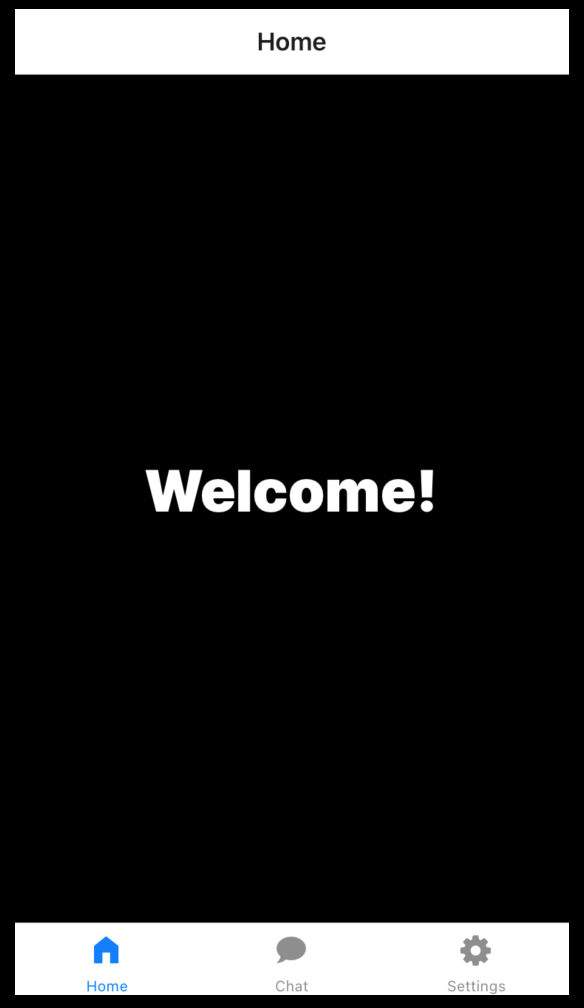
Customization and Styling
Based on the displayed output, the user interface lacks visual appeal. However, we can enhance the UI appearance in this section by applying custom styles after the tabBarIcon function, as depicted below:
const BottomTab = createBottomTabNavigator();
const BottomTabs = () => {
return (
<BottomTab.Navigator
screenOptions={({ route }) => ({
tabBarIcon: ({ focused, size, color }) => {
return (
<Text>
{route.name === "Home" && (
<Foundation name={"home"} color={color} size={24} />
)}
{route.name === "Chat" && (
<MaterialCommunityIcons name={"chat"} color={color} size={24} />
)}
{route.name === "Settings" && (
<FontAwesome name={"gear"} color={color} size={24} />
)}
</Text>
);
},
// Styles
tabBarActiveTintColor: "red",
tabBarInactiveTintColor: "#bbb",
tabBarActiveBackgroundColor: "black",
tabBarInactiveBackgroundColor: "black",
tabBarLabelStyle: { fontSize: 12 },
header: () => false,
})}
>
<BottomTab.Screen name="Home" component={Home} />
<BottomTab.Screen name="Chat" component={Chat} />
<BottomTab.Screen name="Settings" component={Settings} />
</BottomTab.Navigator>
);
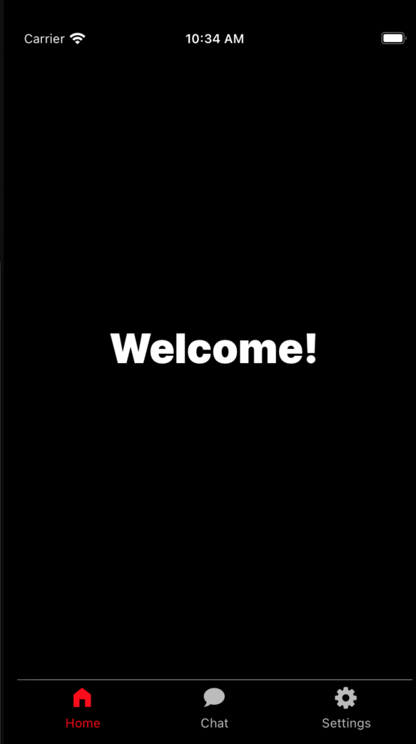
};The additional code snippet modifies the appearance and behavior of the bottom tab navigator. It sets the active and inactive colors for the tab icons and background, with red for active tabs and a lighter shade for inactive ones, against a black background. The tabBarLabelStyle adjusts the font size of the tab labels. Additionally, it hides the header for the navigator by providing a function that returns false for the header option, ensuring a clean and focused navigation interface without headers. To access the complete code in the GitHub repository, click here.
Below is the updated output:
I trust you found this section on the bottom tab navigation straightforward to implement. If you require additional assistance, refer to the official documentation for further guidance.
Material Bottom Tab Navigator
The Material Bottom Tab Navigator is a navigation component provided by the Material UI library for React Native apps. It allows developers to implement a bottom tab bar navigation pattern with aesthetic material design, offering users a visually cohesive and familiar navigation experience. With the Material Bottom Tab Navigator, developers can easily create tabs with icons and labels, customize their appearance to adhere to Material Design guidelines, and seamlessly integrate them into their React Native applications. This navigator simplifies the implementation of bottom tab navigation while ensuring a consistent and polished user interface.
Implementing Material Bottom Tabs
In this section, we’ll be integrating the Material Bottom Tab Navigation. The implementation process differs slightly from the regular bottom tab navigator. Below is the complete code for creating the Material Bottom Tab, which will be explained in detail immediately following the code.
const RootStack = createMaterialBottomTabNavigator();
const App = () => {
return (
<NavigationContainer>
<RootStack.Navigator
screenOptions={({ route }) => ({
tabBarIcon: ({ focused, size, color }) => {
let IconName;
color = focused ? "hotpink" : "white";
if (route.name == "Home") {
IconName = "greenhouse";
size = focused ? 25 : 20;
return (
<MaterialCommunityIcons
name={IconName}
color={color}
size={size}
/>
);
} else if (route.name == "Chat") {
IconName = "chat";
size = focused ? 25 : 20;
return (
<MaterialCommunityIcons
name={IconName}
color={color}
size={size}
/>
);
} else if (route.name == "Settings") {
IconName = "gear";
size = focused ? 25 : 20;
return <FontAwesome name={IconName} color={color} size={size} />;
}
},
})}
// for material ui styles
activeColor="white"
inactiveColor="#3e2465"
barStyle={{ backgroundColor: "hotpink" }}
>
<RootStack.Screen name="Home" component={Home} />
<RootStack.Screen name="Chat" component={Chat} />
<RootStack.Screen name="Settings" component={Settings} />
</RootStack.Navigator>
</NavigationContainer>
);
};
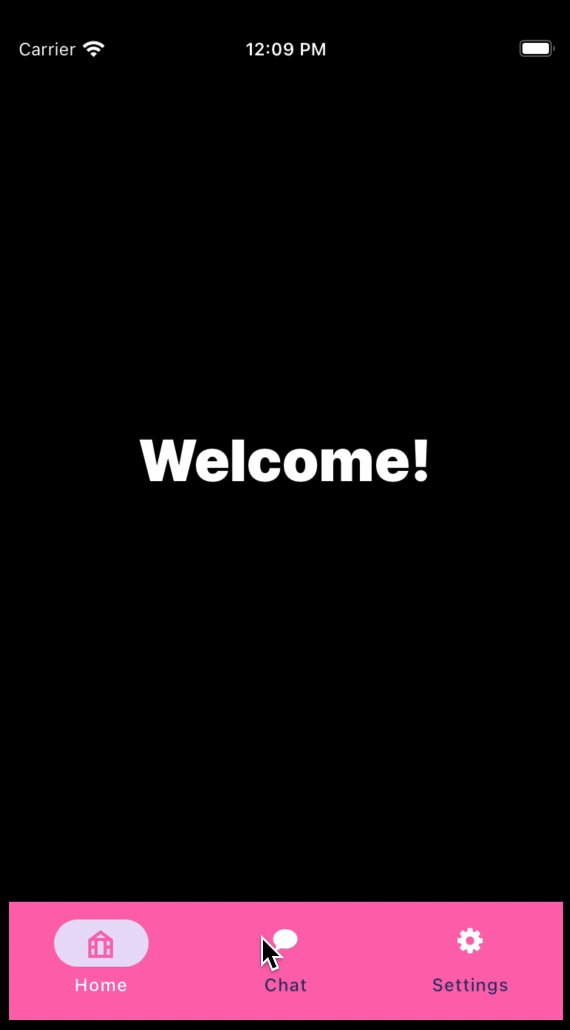
export default App;This code above sets up a navigation structure using the Material Bottom Tab Navigator from React Navigation’s Material UI. It creates a RootStack navigator with tabs at the bottom of the screen. The screenOptions function dynamically configures the appearance of each tab’s icon based on the route name. It determines the icon and size for each tab, changes the color based on whether the tab is focused, and renders the appropriate icon component from MaterialCommunityIcons or FontAwesome. Additionally, it specifies styling options for the tab bar, such as the active and inactive colors and the background color. Finally, it defines the screens associated with each tab: Home, Chat, and Settings.
Output:
A GitHub repository has been created for this section, where you can find all the codes and screens.
Material Top Tab Navigator
The Material Top Tab Navigator, a navigation component in Material UI for React Native apps, empowers developers to incorporate a top tab bar navigation pattern with Material Design aesthetics. This navigator offers users an intuitive and visually pleasing navigation experience. With its capabilities, developers can effortlessly create tabs with titles, customize their appearance to align with material design principles, and seamlessly integrate them into their React Native applications. By streamlining the implementation of top tab navigation, it ensures a cohesive and refined user interface.
Implementing Material Top Tab Navigator
To utilize the Material Top Tab Navigator, we just need to import createMaterialTopTabNavigator from @react-navigation/material-top-tabs. This function allows us to create a tab navigation layout at the screen’s top. Similar to the Material Bottom Tab we discussed earlier, this navigator offers users a visually cohesive and familiar navigation experience. Below is a complete code for creating a Material Top Tab navigator in React Native, and the explanation will follow the provided code.
import { createMaterialTopTabNavigator } from "@react-navigation/material-top-tabs";
const RootStack = createMaterialTopTabNavigator();
const App = () => {
return (
<NavigationContainer>
<RootStack.Navigator
screenOptions={({ route }) => ({
tabBarIcon: ({ focused, size, color }) => {
let IconName;
color = focused ? "gray" : "black";
size = focused ? 25 : 20;
if (route.name == "Home") {
IconName = "greenhouse";
return (
<MaterialCommunityIcons
name={IconName}
color={color}
size={size}
/>
);
} else if (route.name == "Chat") {
IconName = "chat";
return (
<MaterialCommunityIcons
name={IconName}
color={color}
size={size}
/>
);
} else if (route.name == "Settings") {
IconName = "gear";
return <FontAwesome name={IconName} color={color} size={size} />;
}
},
// Styles
tabBarLabelStyle: {
fontSize: 15,
fontWeight: "900",
color: "black",
},
})}
>
<RootStack.Screen name="Home" component={Home} />
<RootStack.Screen name="Chat" component={Chat} />
<RootStack.Screen name="Settings" component={Settings} />
</RootStack.Navigator>
</NavigationContainer>
);
};
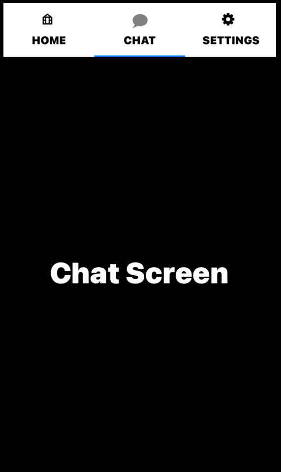
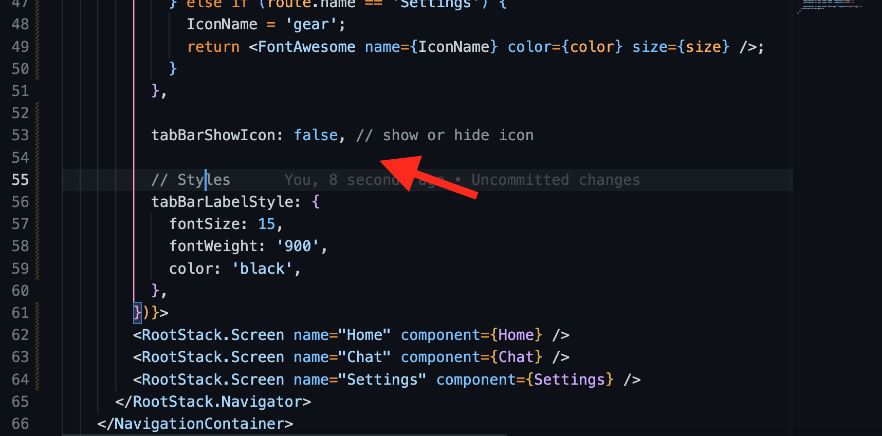
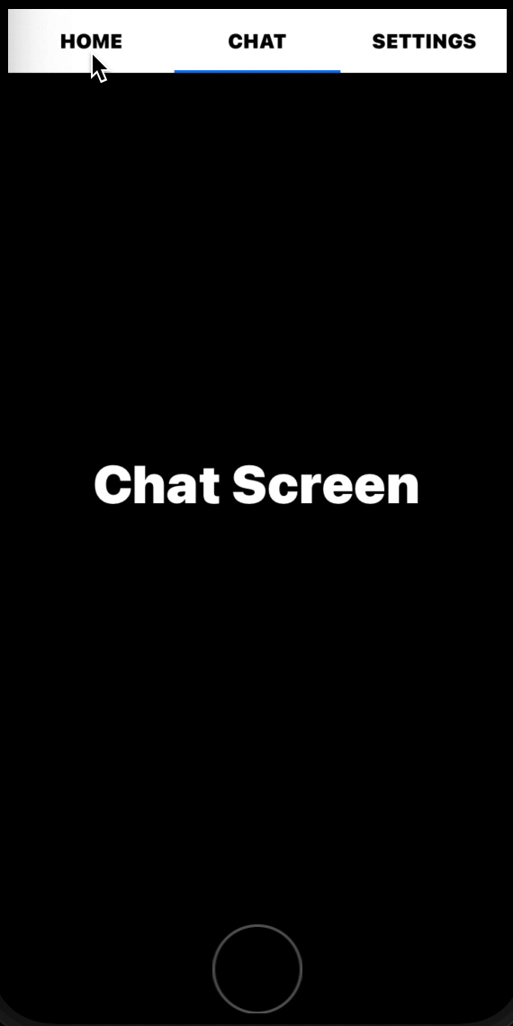
export default App;This code above sets up a navigation structure using the Material Top Tab Navigator from React Navigation’s Material UI. It creates a RootStack navigator with tabs at the top of the screen. The screenOptions function dynamically configures the appearance of each tab’s icon based on the route name. It determines the icon and size for each tab and changes the color based on whether the tab is focused or not. Additionally, it specifies styling options for the tab labels, such as font size, weight, and color. Finally, it defines the screens associated with each tab: Home, Chat, and Settings.
Output:
We can also remove the icon bar by adding tabBarShowIcon:false in the options object for each tab, as demonstrated below:
Output:
You can view the complete code for this section by clicking on this link to go to the GitHub repository.
Best Practices with Material Top Tab
When working with the Material Top Tabs Navigator in React Native, there are several best practices to keep in mind to ensure a smooth and effective implementation:
- Consistent UI Design: Maintain consistency in UI design across tabs to provide a cohesive user experience. Use similar styling for tab labels, icons, and content layouts to create a unified look and feel.
- Limited Number of Tabs: Avoid overcrowding the tab bar with too many tabs. Limit the number of tabs to a manageable amount to prevent clutter and make navigation easier for users. Meaningful Tab Labels: Use clear and descriptive labels for tabs to convey each tab’s purpose or content accurately. This helps users understand the navigation options and quickly find the information they need.
- Testing Across Devices: Test the tab navigator functionality across different devices and screen resolutions to identify layout or performance issues. Conduct thorough testing to ensure a consistent experience across various platforms.
Drawer Navigation and Side Menu
Drawer navigation and side menu are interface components used in apps and websites for navigation. The drawer slides in from the side, while the side menu is fixed and provides access to different sections or features. They make navigation intuitive and accessible for users.
Creating a Side Menu
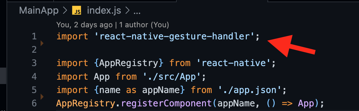
To create the drawer menu, you simply need to NavigationContainer from @react-navigation/native and also make sure you install react-native-gesture-handler and include it at the top section of your index.js file as shown below:
Afterward, you must navigate to your App.js file to begin setting up your drawer navigation. The code below serves as a comprehensive starting point for implementing a drawer menu. Please note that the code will be explained further below.
import * as React from "react";
import { View, Text } from "react-native";
import { NavigationContainer } from "@react-navigation/native";
import { createDrawerNavigator } from "@react-navigation/drawer";
function Home() {
  return (
    <View style={{ flex: 1, justifyContent: "center", alignItems: "center" }}>
      <Text style={{ fontSize: 50 }}>Home Screen</Text>
    </View>
  );
}
function Chat() {
  return (
    <View style={{ flex: 1, justifyContent: "center", alignItems: "center" }}>
      <Text style={{ fontSize: 50 }}>Chat Screen</Text>
    </View>
  );
}

const Drawer = createDrawerNavigator();
function MyDrawer() {
  return (
    <Drawer.Navigator>
      <Drawer.Screen name="Home" component={Home} />
      <Drawer.Screen name="Chat" component={Chat} />
    </Drawer.Navigator>
  );
}
export default function App() {
  return (
    <NavigationContainer>
      <MyDrawer />
    </NavigationContainer>
  );
}
This code above sets up a basic drawer navigation system in a React Native application using React Navigation. It defines two screen components, Home and Chat, each displaying a simple message. The createDrawerNavigator function creates a drawer navigator, and the Drawer.Navigator component configures the navigator with the specified screens. Finally, the App.js component wraps the drawer navigator inside a NavigationContainer to provide navigation context to the entire application.
Output:
Drawer Navigation: Passing Data Between Props
Passing data between props in drawer navigation refers to the process of transferring information between different components or screens within the drawer navigation system. This allows for the seamless exchange of data, such as user preferences or selected items, enhancing the application’s functionality and user experience.
Navigating Between Screens
You can move between screens either by pressing a button or automatically navigating. This can be achieved using the navigation prop on the current screen. The navigation prop includes a navigate() function, which takes two parameters: the name of the destination screen and an object that facilitates data transfer between screens.
Below is a simplified example demonstrating a navigation system:
function Home({ navigation }) {
  const onNavigateHandler = () => {
    navigation.navigate("Chat", {
      message: "Hello! Welcome to the Chat screen. How can I assist you today?",
    });
  };
}
The above code defines a functional component called Home that receives the navigation prop from React Navigation. Inside the component, there’s an onNavigateHandler function that uses the navigation.navigate method to navigate to the Chat screen and pass a message as a parameter. This function directs users to the Chat screen with a predefined greeting message when invoked.
To access the message on the Chat screen, you can utilize the route prop, which contains a params value for storing the data sent from the previous screen. Below is a straightforward code snippet demonstrating how to retrieve this data.
function Chat({ route }) {
  let message = route.params?.message;
  console.log(message);
}
This code above defines a functional component named Chat that receives props as input, including the route prop. Inside the component, it extracts the message parameter from the route.params object using optional chaining (?.) and assigns it to the message variable. Then, it logs the message to the console.
Efficient Data Transfer in Drawer Navigation
In this section, we’ll provide a comprehensive example of transferring data between screens, as discussed earlier. The complete code below demonstrates all aspects of navigating between screens. It’s important to note that this method isn’t limited to drawer navigation; it applies to navigation systems in general.
import * as React from "react";
import { View, Text, TouchableOpacity } from "react-native";
import { NavigationContainer } from "@react-navigation/native";
import { createDrawerNavigator } from "@react-navigation/drawer";
function Home({ navigation }) {
  const onNavigateHandler = () => {
    navigation.navigate("Chat", {
      message: "Hello! Welcome to the Chat screen. How can I assist you today?",
    });
  };
  return (
    <View style={{ flex: 1, justifyContent: "center", alignItems: "center" }}>
      <Text style={{ fontSize: 50 }}>Home </Text>
      <Text style={{ fontSize: 30, textAlign: "center", padding: 20 }}>
        Click the start button below to send a greeting message to the Chat
        screen.
      </Text>
      <TouchableOpacity
        onPress={onNavigateHandler}
        style={{
          padding: 20,
          paddingHorizontal: 50,
          backgroundColor: "hotpink",
          borderRadius: 10,
        }}
      >
        <Text style={{ color: "white", fontWeight: 900, fontSize: 20 }}>
          Start
        </Text>
      </TouchableOpacity>
    </View>
  );
}
function Chat({ navigation, route }) {
  const goBackHandler = () => {
    navigation.goBack();
  };
  return (
    <View style={{ flex: 1, justifyContent: "center", alignItems: "center" }}>
      <Text style={{ fontSize: 50 }}>Chat Screen</Text>
      <Text style={{ fontSize: 30, textAlign: "center", padding: 20 }}>
        <Text style={{ fontWeight: 900 }}> Message:</Text>{" "}
        {route.params?.message}{" "}
      </Text>
      <TouchableOpacity onPress={goBackHandler}>
        <Text style={{ color: "blue", fontWeight: "bold", fontSize: 20 }}>
          Go back
        </Text>
      </TouchableOpacity>
    </View>
  );
}
const Drawer = createDrawerNavigator();
function MyDrawer() {
  return (
    <Drawer.Navigator>
      <Drawer.Screen name="Home" component={Home} />
      <Drawer.Screen name="Chat" component={Chat} />
    </Drawer.Navigator>
  );
}
export default function App() {
  return (
    <NavigationContainer>
      <MyDrawer />
    </NavigationContainer>
  );
}
The code above defines two functional components, Home and Chat, where Home prompts the user to click a button to navigate to the Chat screen, passing a greeting message as a parameter. The Chat screen displays the received message and allows navigating back to the Home screen. The drawer navigator is configured using createDrawerNavigator, containing Home and Chat screens. The MyDrawer component renders the drawer navigator, and the App component wraps it within a NavigationContainer to manage the navigation state.
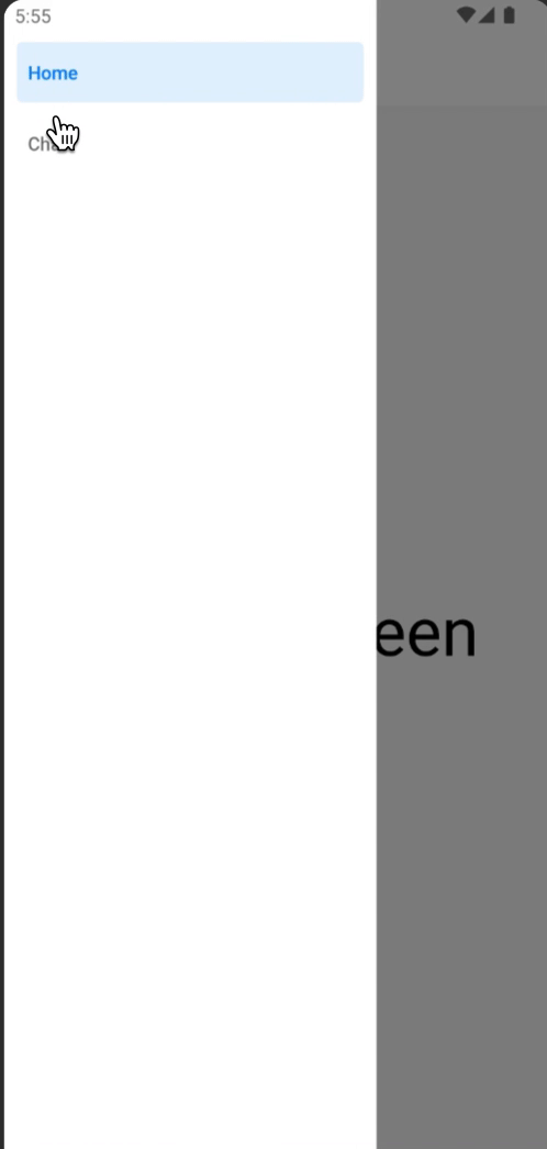
Below is the output generated by the code above:
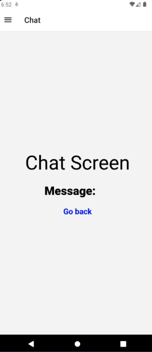
After examining the above output, you will notice that the greeting message did not initially appear on the chat screen. To address this issue, I accessed the side drawer to navigate back to the home screen. From there, I clicked the start button, successfully transmitting the greeting message to the chat screen. Additionally, you’ll see a ‘Go back’ button on the chat screen, which functions using the navigation.goBack() method from React Native navigation.
Conclusion
I hope you found this article on Navigation in React Native informative and insightful. By covering the importance and practical applications and highlighting their importance, we’ve aimed to equip you with the tools to confidently implement navigation systems in your projects. Whether you’re a beginner or an experienced developer, mastering navigation is crucial for creating seamless and intuitive user experiences. With the knowledge gained here, you’re well-prepared to embark on your journey of building engaging and user-friendly mobile apps. So, go ahead, explore, and enjoy the process of navigating through your projects.
Gain control over your UX
See how users are using your site as if you were sitting next to them, learn and iterate faster with OpenReplay. — the open-source session replay tool for developers. Self-host it in minutes, and have complete control over your customer data. Check our GitHub repo and join the thousands of developers in our community.