Creating Resizable Split Panes from Scratch
Use React and TailwindCSS to create resizable panes

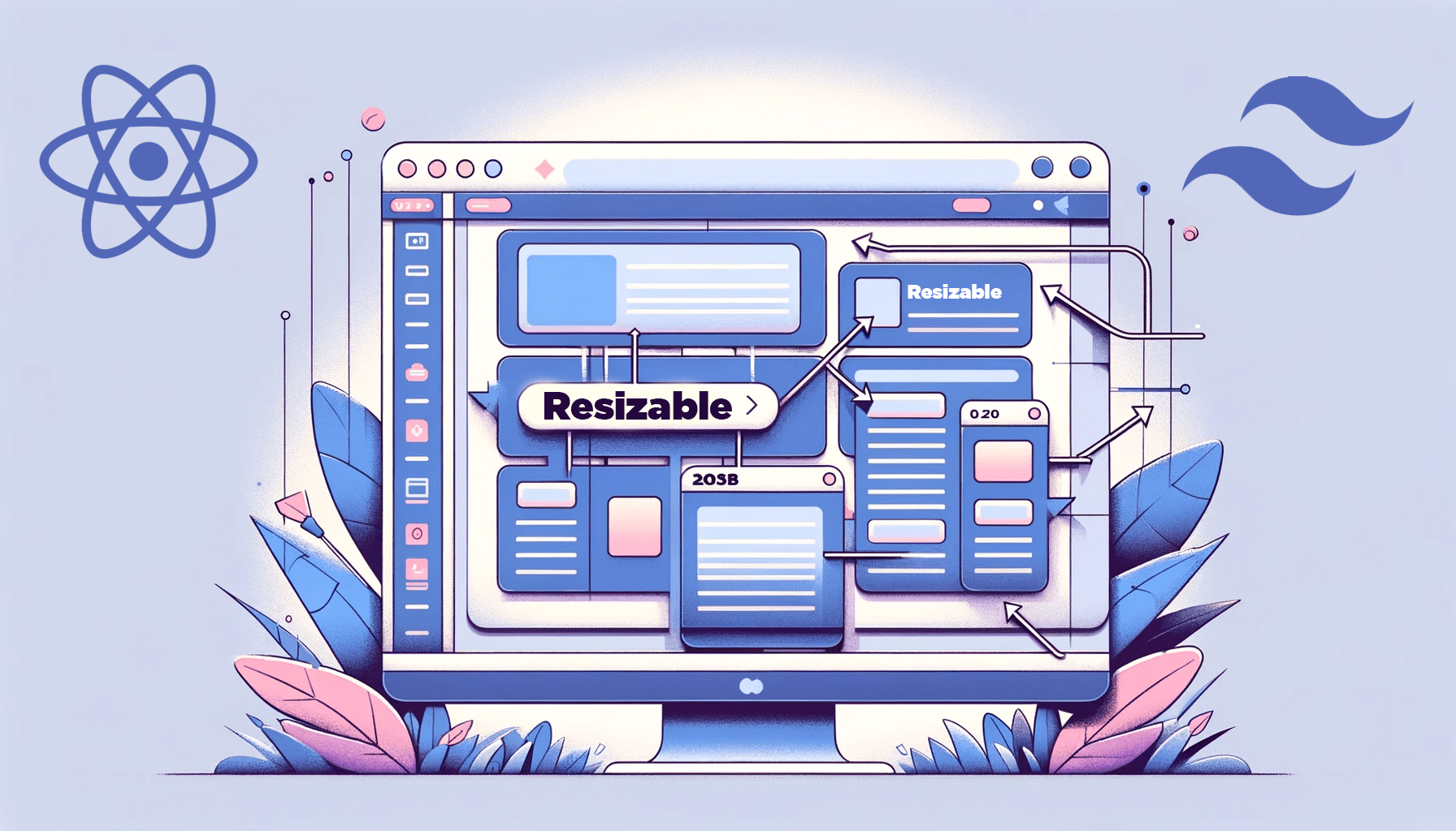
Resizable split panes work by splitting a window into separate sections, each showing different content. Each section is called a pane. And here’s the best part: these panes can be resized on the fly by dragging a little handle between them, and they’ll resize accordingly. This flexibility is useful for platforms where users can simultaneously view and work on multiple things. In this tutorial, you’ll use React and TailwindCSS to handle the resizing behavior, styling, and structure of these resizable panes.

Discover how at OpenReplay.com.
How to Create Resizable Split Panes from Scratch using React and TailwindCSS
You’ve probably seen the resizable split panes feature before on some platforms.
Let’s begin by ensuring all the necessary tools are installed.
First, ensure that you have Node.js installed on your computer.
Creating a New React Project
create-react-app would be used as it is the most popular and straightforward option.
Run these commands in your terminal:
npx create-react-app resizable-panes-app
cd resizable-panes-app
Linking TailwindCSS
For styling, TailwindCSS would be used. Run these commands to install and setup TailwindCSS:
npm install -D tailwindcss postcss autoprefixer
npx tailwindcss init
Then add the Tailwind directives to the index.css file:
@tailwind base;
@tailwind components;
@tailwind utilities;
And with everything fully set, run the build process for the react app:
npm run startImplementing Basic Split Panes
Let’s implement three functional components: the default, App.js, and two others, ResizablePanes and ResizablePane.
export default function App() {
return <ResizablePanes />;
}
function ResizablePanes() {
return (
<div className="w-screen h-screen flex">
<ResizablePane bgColor={"bg-red-400"} />
<ResizablePane bgColor={"bg-yellow-400"} />
</div>
);
}
function ResizablePane({ bgColor }) {
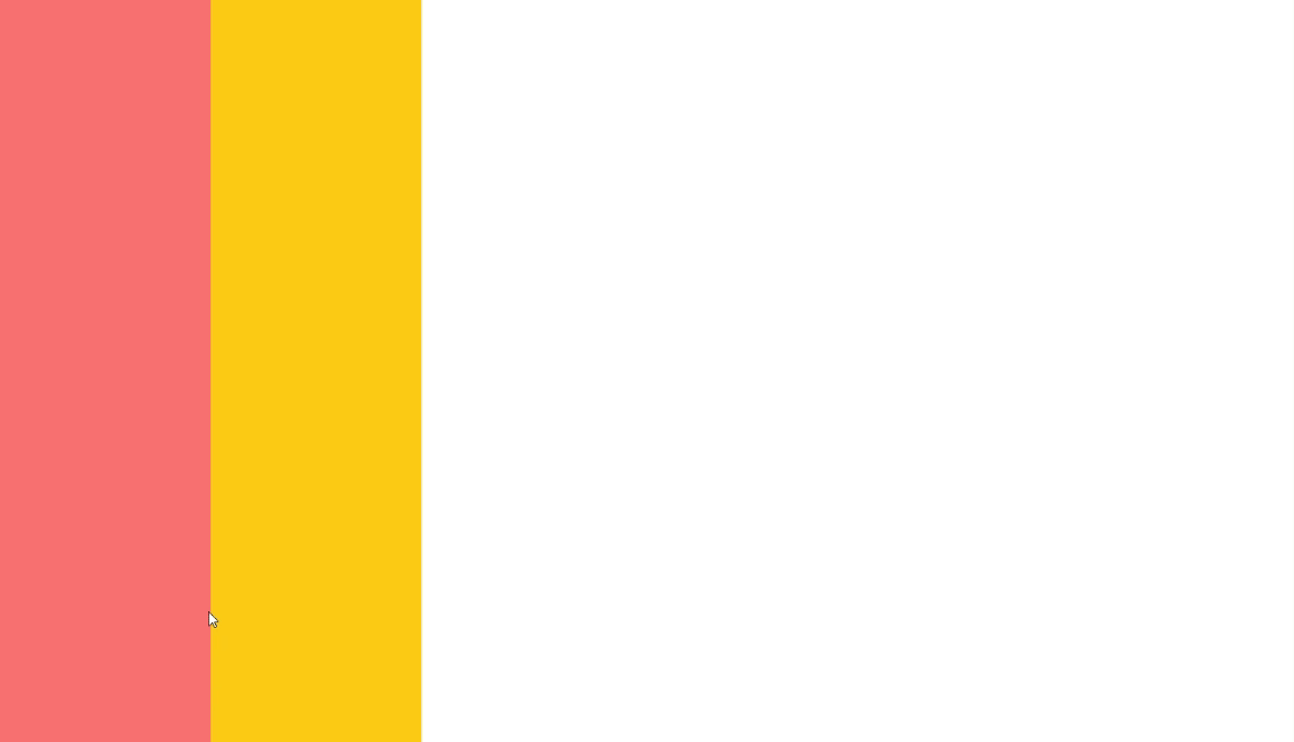
return <div className={`${bgColor}`} style={{ width: "200px" }}></div>;
}The ResizablePanes component would act as the container for all the different ResizablePane components that would be created. The ResizablePane component would act as each pane’s basic structure and appearance.
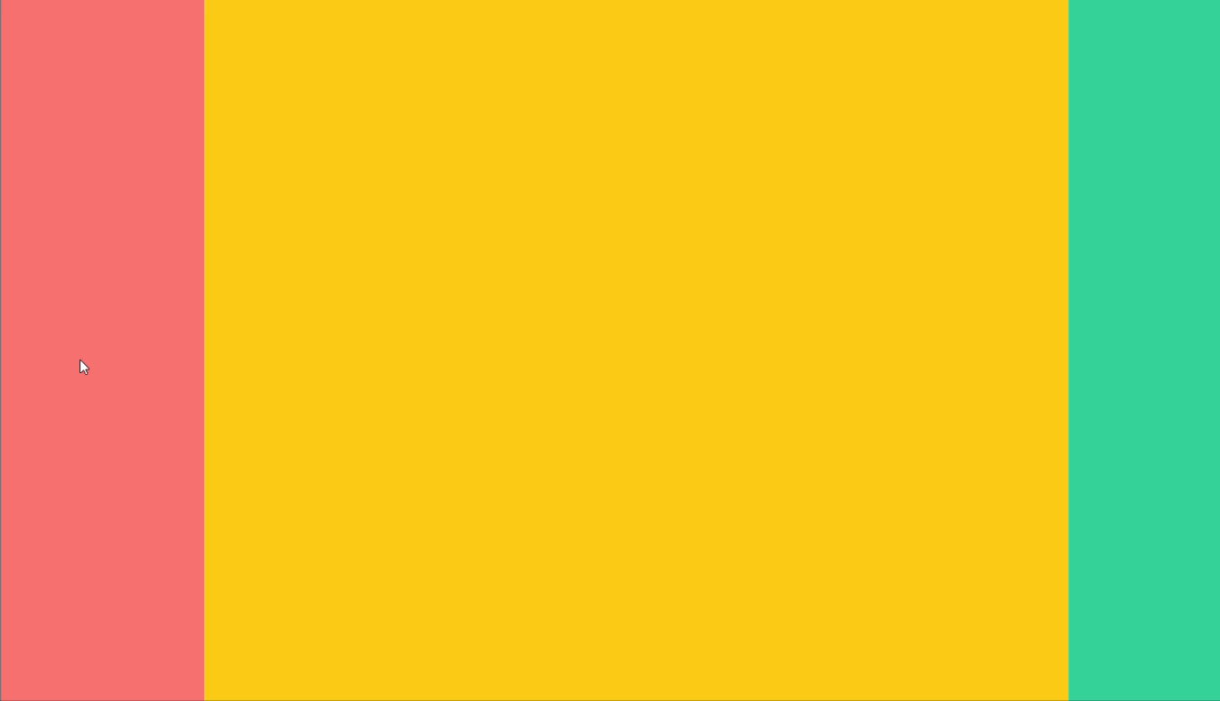
You should have a layout like this:

Now, the logic behind resizing a pane is simple. It all comes down to tracking the direction and distance of the mouse movement within a pane.
Luckily, JavaScript provides the right mouse event properties for this — the movementX and movementY properties. Note: You may think why not use clientX and clientY instead. Yes, that’d also work in providing the absolute mouse location. However, movementX and movementY determine how much the mouse moved in each direction, which is much easier and more accurate.
With this movement data, it’s all about adding or subtracting it from the pane’s current size based on the direction you’re dragging. This way, the pane resizes smoothly and dynamically in real time.
Now, back to the code.
Let’s start by defining each pane’s initial size (width) and a way to track it dynamically. We’ll use the useState hook for this:
function ResizablePane({ initialSize, bgColor }) {
  const [size, setSize] = useState(initialSize);

  return <div className={`${bgColor}`} style={{ width: `${size}px` }}></div>;
}
Next, in the ResizablePanes component, we update the ResizablePane components rendered with the desired initialSize.
function ResizablePanes() {
  return (
    <div className="w-screen h-screen flex">
      <ResizablePane initialSize={200} bgColor={"bg-red-400"} />
      <ResizablePane initialSize={200} bgColor={"bg-yellow-400"} />
    </div>
  );
}
And with this, we have laid the foundation for dynamic resizing.
Next, let’s apply the mouse movement logic.
In the ResizablePane component, a useEffect hook would be used in setting up (and cleaning up) the event listeners for mouse movements.
function ResizablePane({ initialSize, bgColor }) {
  const [size, setSize] = useState(initialSize);

  useEffect(() => {
    const handleMouseMove = (e) => {
      const movement = e.movementX;
      setSize(size + movement);
    };

    document.addEventListener("mousemove", handleMouseMove);
    return () => {
      document.removeEventListener("mousemove", handleMouseMove);
    };
  }, [size]);

  //...
}
The handleMouseMove function in the useEffect hook first captures the movementX property of the mouse event object, which represents the horizontal movement of the mouse.
This is then added to the current size value, updated through setSize().
Then, the handleMouseMove function is called whenever the mouse moves anywhere on the document by listening to the mousemove event. And we clean up the event listener to avoid memory leaks.
With this code in place, each ResizablePane now responds to mouse movements and dynamically adjusts its width.
There’s a slight issue — both panes are being resized simultaneously. This shouldn’t be the case, as we should be able to choose which pane to resize.
To fix this, we need a way to identify the specific pane under the mouse’s control.
function ResizablePane({ initialSize, bgColor }) {
  const [size, setSize] = useState(initialSize);
  const [isResizing, setIsResizing] = useState(false);
  // ...
}
A new state, isResizing, is used, which is initially set to false and would only be true when you click and hold down on a pane.
Now let’s modify the handleMouseMove function to check if the isResizing state is true before applying the resizing logic. If false, the pane will not be resized.
const handleMouseMove = (e) => {
  if (!isResizing) return;

  const movement = e.movementX;
  setSize(size + movement);
};
To allow only the pane clicked to use the resizing logic, let’s create a handleMouseDown function that sets isResizing to true.
const handleMouseDown = () => setIsResizing(true);Then add an onMouseDown event listener to the ResizablePane, which invokes the handleMouseDown function.
function ResizablePane({ initialSize, bgColor }) {
//...
return (
<div
className={`${bgColor}`}
style={{ width: `${size}px` }}
onMouseDown={handleMouseDown}
></div>
);
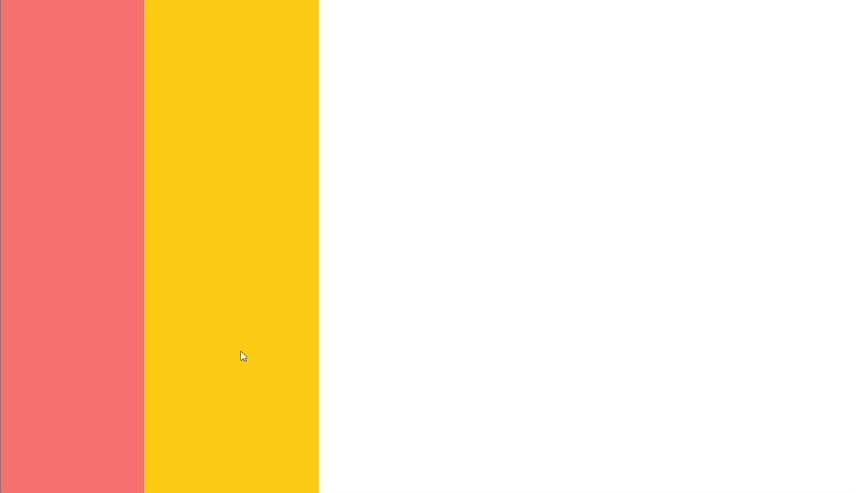
}With this, only the pane you click and hold on will respond to mouse movements and will be resized as needed.
Right now, the pane keeps resizing even if you let go of the mouse button. We need a way to fix that.
In the useEffect hook in ResizablePane, create a function, handleMouseUp that set isResizing to false. Then add a mouseup event listener to the document, which triggers handleMouseUp when the mouse button is released.
useEffect(() => {
  const handleMouseMove = (e) => {
    // ...
  };
  const handleMouseUp = () => setIsResizing(false);

  document.addEventListener("mousemove", handleMouseMove);
  document.addEventListener("mouseup", handleMouseUp);
  return () => {
    document.removeEventListener("mousemove", handleMouseMove);
    document.removeEventListener("mouseup", handleMouseUp);
  };
}, [size, isResizing]);
With these changes, the resizing stops as soon as you let go, and it should all work as expected now.
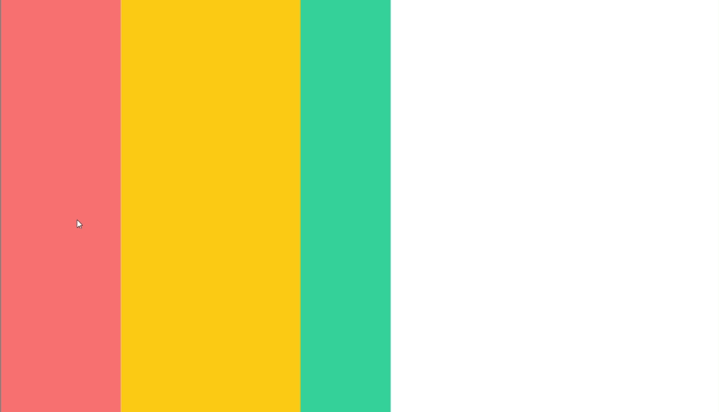
Also, just for fun, let’s add a third ResizablePane to our layout.
function ResizablePanes() {
  return (
    <div className="w-screen h-screen flex">
      <ResizablePane initialSize={200} bgColor={"bg-red-400"} />
      <ResizablePane initialSize={300} bgColor={"bg-yellow-400"} />
      <ResizablePane initialSize={150} bgColor={"bg-emerald-400"} />
    </div>
  );
}
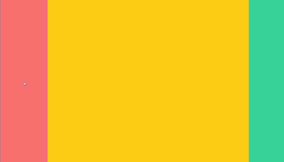
Stretching Panes to Fit the Screen
Typically, split panes cover the entire screen, with at least one pane expanding to fill any remaining space.
To achieve this, flex-grow can be used.
function ResizablePane({ initialSize, grow, bgColor }) {
  //...
  return (
    <div
      className={`${bgColor} ${grow ? "grow" : ""} shrink-0`}
      style={{ width: `${size}px` }}
      onMouseDown={handleMouseDown}
    ></div>
  );
}
ResizablePane takes another prop, grow, which defaults to false. Thus, depending on the grow prop boolean value, the TailwindCSS grow class (equivalent to flex-grow) would be added to the ResizablePane.
When set to true, this prop tells the pane to automatically grow and fill any remaining space on the screen.
Let’s update the ResizablePanes component to utilize the grow prop:
function ResizablePanes() {
  return (
    <div className="w-screen h-screen flex">
      <ResizablePane initialSize={200} bgColor={"bg-red-400"} />
      <ResizablePane initialSize={300} grow="true" bgColor={"bg-yellow-400"} />
      <ResizablePane initialSize={150} bgColor={"bg-emerald-400"} />
    </div>
  );
}
Now, the split panes fill up the screen nicely.
Adding Resizing Handles
Let’s give the resizable panes a handle that would act as the only clickable area that triggers the resizing functionality.
Create a new component called ResizableHandle:
function ResizableHandle({ isResizing, handleMouseDown }) {
  return (
    <div
      className={`absolute w-1 top-0 bottom-0 right-0 cursor-col-resize hover:bg-blue-600 ${
        isResizing ? "bg-blue-600" : ""
      }`}
      onMouseDown={handleMouseDown}
    />
  );
}
The ResizableHandle is styled as a really thin vertical element that’s positioned on the right side of the pane. However, you can style it any way you see fit.
The ResizableHandle uses the isResizing value to highlight the handle when it is being resized; this provides visual feedback.
Previously, the onMouseDown event was directly attached to the ResizablePane. However, now that responsibility has been passed down to the ResizableHandle.
Then render the ResizableHandle inside the ResizablePane and pass the necessary props.
function ResizablePane({ initialSize, grow, bgColor }) {
  //...
  return (
    <div
      className={`relative ${bgColor} ${grow ? "grow" : ""} shrink-0`}
      style={{ width: `${size}px` }}
    >
      <ResizableHandle
        isResizing={isResizing}
        handleMouseDown={handleMouseDown}
      />
    </div>
  );
}
In most cases, the pane selected to grow shouldn’t be resizable. This is because it could create empty spaces if resized lower than the available screen, making the layout unrealistic.
Let’s disable resizing for the expanding pane:
function ResizablePane({ initialSize, grow, bgColor }) {
  //...
  return (
    <div
      className={`relative ${bgColor} ${grow ? "grow" : ""} shrink-0`}
      style={{ width: `${size}px` }}
    >
      {!grow && (
        <ResizableHandle
          isResizing={isResizing}
          handleMouseDown={handleMouseDown}
        />
      )}
    </div>
  );
}
Now, if a ResizablePane has a grow prop set to true, it won’t render a ResizableHandle, disabling resizing for that pane.

Advanced Resizable Split Panes
Now that we’ve built the core resizing functionality of the split panes let’s go a little bit advanced. In this section, we would:
- Include minimum and maximum constraints
- Set up vertical and horizontal split panes
Minimum and Maximum Constraints
The split panes can’t shrink below or grow beyond a certain size in real-world applications. This is mainly done to prevent users from resizing the panes to unusable sizes.
In the ResizablePane component, introduce two new props, minSize and maxSize:
function ResizablePane({ minSize, initialSize, maxSize, grow, bgColor }) {
  //...
}
Then modify the handleMouseMove function located in the ResizablePane component:
const handleMouseMove = (e) => {
  if (!isResizing) return;

  const movement = e.movementX;
  let newSize = size + movement;

  newSize = Math.max(minSize, Math.min(newSize, maxSize));
  setSize(newSize);
};
In this code, Math.max() ensures the new size doesn’t fall below the minSize, and Math.min prevents it from exceeding the maxSize.
Here is how it works, Math.min(newSize, maxSize) would return maxSize only if newSize is greater, else it’d return newSize.
Then the derived value from Math.min() is passed to the Math.max() along with minSize, which would return minSize only if the derived value is less than minSize, else it’d return the derived value from Math.min().
Finally, in ResizablePanes, let’s set the desired minimum and maximum sizes for each pane:
function ResizablePanes() {
  return (
    <div className="w-screen h-screen flex">
      <ResizablePane
        minSize={150}
        initialSize={200}
        maxSize={300}
        bgColor={"bg-red-400"}
      />
      <ResizablePane
        minSize={150}
        initialSize={300}
        grow="true"
        bgColor={"bg-yellow-400"}
      />
      <ResizablePane
        minSize={150}
        initialSize={150}
        maxSize={300}
        bgColor={"bg-emerald-400"}
      />
    </div>
  );
}
If you notice, there isn’t a maxSize prop for the second ResizablePane. It is not needed because its flex-grow property would always expand to fill any available space and override any width set for that element.
As a plus, you can even use the ResizablePane on the left-hand side as a dedicated sidebar, and it’d work perfectly. Just set a minimum and maximum constraint on the ResizablePane of choice, and it won’t interfere with the main content area.
Vertical and Horizontal Split Panes
So far, the resizable split panes have been built to only resize horizontally. However, you might need split panes to be vertically aligned and resized.
Doing this is quite simple, but first, recollect that the ResizablePanes flex layout direction is set to a row by default. Thus, to achieve vertical stacking, let’s switch to a column layout.
Head over to the ResizablePanes component:
function ResizablePanes({ direction }) {
  const isVertical = direction === "vertical";

  return (
    <div
      className={`w-screen h-screen flex ${
        isVertical ? "flex-col" : "flex-row"
      }`}
    >
      {/* Resizable pane components... */}
    </div>
  );
}
A new prop, direction, and a variable, isVertical is created that check if the desired direction is set to “vertical”.
In the styling of the ResizablePane element, we dynamically add the flex-col or flex-row class depending on the isVertical value.
Moving on, in the App component, set the rendered ResizablePane direction prop to “vertical”:
export default function App() {
  return <ResizablePanes direction='vertical' />;
}
Next, the isVertical value is passed as a prop to ResizablePane for further use.
function ResizablePane({
  minSize,
  initialSize,
  maxSize,
  grow,
  isVertical,
  bgColor,
}) {
  //...
}
Note: Also, don’t forget to update the ResizablePane component when it is being rendered with prop, isVertical.
Next, let’s modify the handleMouseMove function to use the appropriate mouse event property.
const handleMouseMove = (e) => {
  if (!isResizing) return;

  const movement = isVertical ? e.movementY : e.movementX;
  let newSize = size + movement;

  newSize = Math.max(minSize, Math.min(maxSize, newSize));
  setSize(newSize);
};
This code checks the isVertical value and if it’s true, it uses e.movementY to capture the vertical movement for resizing. Otherwise, it sticks with e.movementX for horizontal resizing.
Furthermore, since we’re dealing with a vertical layout, the dimension that should be resized is the pane’s height.
In ResizablePane, create a dimension variable which would store whether to resize the pane’s width or height depending on the isVertical value.
const dimension = isVertical ? "height" : "width";Then we just dynamically update the CSS style property name, which could either be width or height depending on dimension.
function ResizablePane({
  minSize,
  initialSize,
  maxSize,
  grow,
  isVertical,
  bgColor,
}) {
  // ...
  return (
    <div
      className={`relative ${bgColor} ${grow ? "grow" : ""} shrink-0`}
      style={{ [dimension]: `${size}px` }}
    >
      {/* ... */}
    </div>
  );
}
It’d work a little bit well now, but the ResizableHandle is still positioned for horizontal resizing. Let’s adjust that by heading over to ResizableHandle:
function ResizableHandle({ isResizing, isVertical, handleMouseDown }) {
  const positionHandleStyle = isVertical
    ? "h-1 left-0 right-0 bottom-0 cursor-row-resize"
    : "w-1 top-0 bottom-0 right-0 cursor-col-resize";

  return (
    <div
      className={`absolute ${positionHandleStyle} hover:bg-blue-600 ${
        isResizing ? "bg-blue-600" : ""
      }`}
      onMouseDown={handleMouseDown}
    />
  );
}
isVertical is passed as a prop to ResizableHandle; it is then used to switch the handle location to either the right or bottom depending on whether isVertical is true or not.
Finally, update the rendered ResizableHandle with the isVertical prop:
<ResizableHandle
  isResizing={isResizing}
  isVertical={isVertical}
  handleMouseDown={handleMouseDown}
/>
It should work as expected now, and you can opt for either vertical or horizontal panes using the same code.

Alternative libraries for React Split Panes
Let’s face it: sometimes we all just want a shortcut.
So here are some great resizable split pane libraries for React:
These are just a few of the amazing libraries available. If you need something basic, go for react-resizable-panels. And if you need more advanced features, you should look into react-splitter-layout or react-split-pane.
Conclusion
So, there it is — a basic build of resizable split panes from scratch. You can find the complete code here.
Remember, building from scratch can be a rewarding experience, but it’s not always the most efficient. Don’t hesitate to use libraries to save yourself time and frustration.
Truly understand users experience
See every user interaction, feel every frustration and track all hesitations with OpenReplay — the open-source digital experience platform. It can be self-hosted in minutes, giving you complete control over your customer data.
Star on GitHub12k