Responsive Design with Flutter: Creating Layouts for all Screen Sizes
Learn how to do responsive layout designs in Flutter

In mobile and web development, creating user interfaces that seamlessly adapt to various screen sizes is crucial for delivering a consistent and engaging user experience. Flutter, Google’s UI toolkit, provides a framework for building natively compiled mobile, web, and desktop applications from a single codebase. This step-by-step guide will explore the fundamentals of responsive UI design in Flutter, demonstrating how to create layouts that gracefully adapt to different screen sizes and orientations.

Discover how at OpenReplay.com.
Responsive design involves creating user interfaces that respond to changes in screen size, ensuring that content remains readable and functional. In the context of Flutter, this means designing layouts that can adapt to varying screen widths and heights.
Responsive UI design ensures that your Flutter applications look and function well across various devices. Whether users are accessing your responsive app on a small mobile phone or a large tablet, a responsive design allows the UI to adjust dynamically, optimizing the user experience for each screen size.
Benefits of Responsive UI in Flutter Apps
Responsive UI design within Flutter applications offers advantages, contributing to the overall user experience. Let’s delve into the key benefits that responsive design brings to apps.
-
Improved User Experience: Users appreciate applications that feel natural on their devices, whether smartphones or tablets. A responsive UI contributes to a positive user experience.
-
Single Codebase: With Flutter, you can maintain a single codebase for multiple platforms, streamlining development and reducing the effort required to support multiple screen sizes.
-
Future-Proofing: As new devices with different screen sizes and resolutions are released, a responsive design allows your app to scale gracefully without extensive modifications.
Challenges and Considerations
While the benefits of responsive design are clear, there are challenges to overcome. Some considerations include:
- Text Legibility: Ensuring that text remains readable on smaller screens without sacrificing design integrity.
- Touch Targets: Adapting touch targets to different screen sizes, making interactive elements accessible on various devices.
- Performance: Balancing responsiveness with performance, especially on less powerful devices.
Flutter’s Layout System
Flutter’s widget-based approach to building UIs makes it well-suited for responsive design. Widgets are the building blocks of Flutter applications, and the framework provides various tools and techniques to create layouts that adapt to different screen dimensions.
Flutter’s layout system revolves around widgets arranged in a hierarchy to create the UI. Understanding how widgets interact with each other is fundamental to designing responsive layouts.
Understanding the Role of Widgets in Creating Responsive Designs
Widgets in Flutter serve as the UI components and layout elements. Nesting widgets construct the layout of an app within one another. Each widget contributes to the overall structure and appearance of the UI. Let’s create a simple layout using Flutter’s widget system.
class NonResponsiveWidget extends StatelessWidget {
 const NonResponsiveWidget({super.key});

 @override
 Widget build(BuildContext context) {
   return Scaffold(
     appBar: AppBar(
       title: const Text('Non-Responsive Widget'),
     ),
     body: Center(
       child: Container(
         width: 400.0,
         height: 200.0,
         color: Colors.blue,
         child: const Center(
           child: Text(
             'Non Responsive container',
             textAlign: TextAlign.center,
             style: TextStyle(
               color: Colors.white,
               fontSize: 40,
             ),
           ),
         ),
       ),
     ),
   );
 }
}
This example has a NonResponsiveWidget containing a Container widget with a fixed width and height. The Container is centered on the screen. The absence of adaptability in these fixed dimensions restricts the widget’s ability to adjust its layout based on the available screen space.
This limitation highlights the necessity for responsive design principles, enabling interfaces that dynamically respond to different screen sizes and orientations; while this isn’t a responsive design yet, it demonstrates the widget structure in a Flutter app.
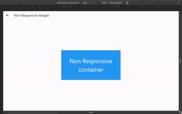
This gif showcases a user interface constructed using Flutter with the NonResponsiveWidget. The widget contains a blue-colored box (Container) with fixed dimensions (width: 400.0, height: 200.0) and centered text inside it.
The gif demonstrates a widget with fixed dimensions that do not adapt to different screen sizes, emphasizing the need for responsive design principles.
On Larger screens, such as tablets or desktops, The fixed dimensions might not make the best use of the available space, leaving the content small or confined to a limited screen area. This reduces the potential for an engaging user experience.
To make a layout responsive, we’ll introduce the concept of media queries in the next section.
Media Queries
Media queries in Flutter allow you to conditionally apply styles or layouts based on the characteristics of the device’s screen, such as its width and height. This enables you to create responsive designs by specifying different configurations for various screen sizes.
Defining Breakpoints for Different Screen Sizes and Orientations
Create a file called media_query.dart in the screens directory and add the code below to the file.
import 'package:flutter/material.dart';

class MediaQueryWidget extends StatelessWidget {
 const MediaQueryWidget({super.key});

 @override
 Widget build(BuildContext context) {
   // Use media query to get the screen size
   var screenSize = MediaQuery.of(context).size;

   // Define breakpoints for different screen sizes
   double breakpointSmall = 600.0;
   double breakpointMedium = 900.0;

   // Choose the appropriate layout based on screen width
   Widget content;
   if (screenSize.width < breakpointSmall) {
     content = buildSmallLayout();
   } else if (screenSize.width < breakpointMedium) {
     content = buildMediumLayout();
   } else {
     content = buildLargeLayout();
   }

   return SafeArea(
     child: Scaffold(
       appBar: AppBar(
         title: const Text('MediaQuery'),
       ),
       body: Center(
         child: Container(
           width: screenSize.width * 0.8,
           height: screenSize.height * 0.5,
           color: Colors.blue,
           child: Center(child: content),
         ),
       ),
     ),
   );
 }

 Widget buildSmallLayout() {
   return const Text(
     'Small Screen Layout',
     textAlign: TextAlign.center,
     style: TextStyle(fontSize: 40, color: Colors.white),
   );
 }

 Widget buildMediumLayout() {
   return Column(
     mainAxisAlignment: MainAxisAlignment.center,
     children: [
       const Text(
         'Medium Screen Layout',
         textAlign: TextAlign.center,
         style: TextStyle(fontSize: 60, color: Colors.white),
       ),
       const SizedBox(height: 20.0),
       Image.asset(
         'assets/images/2.0x/flutter_logo.png',
         width: 100,
         height: 100,
       )
     ],
   );
 }

 Widget buildLargeLayout() {
   return Row(
     mainAxisAlignment: MainAxisAlignment.center,
     children: [
       Image.asset(
         'assets/images/4.0x/flutter_logo.png',
         scale: 4.0,
         width: 100,
         height: 100,
       ),
       const SizedBox(width: 20.0),
       const Text(
         'Large Screen Layout',
         style: TextStyle(fontSize: 75, color: Colors.white),
       ),
     ],
   );
 }
}
In this example, we use MediaQuery.of(context).size to get the screen size. We then define breakpoints (breakpointSmall and breakpointMedium) to categorize the screen into small, medium, and large sizes. We choose a specific layout for our content depending on the screen width.
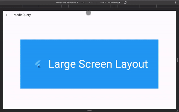 This GIF demonstrates how MediaQuery detects the device screen size in Flutter. The screen size information is used to categorize the layout as small, medium, or large based on breakpoints.
The image above illustrates how MediaQuery can be utilized to adjust the UI layout dynamically based on the detected screen size unlike the previous NonResponsiveWdget example which had a fixed height and width.
Using LayoutBuilder to Adapt to Parent Constraints
The LayoutBuilder widget is a widget that rebuilds its children when the parent widget changes constraints. This makes it suitable for creating responsive widgets that adapt to the available space.
import 'package:flutter/material.dart';

class LayoutBuilderExample extends StatelessWidget {
 const LayoutBuilderExample({super.key});

 @override
 Widget build(BuildContext context) {
   return Scaffold(
     appBar: AppBar(
       title: const Text('LayoutBuilder'),
     ),
     body: Center(
       child: Container(
         color: Colors.grey[300],
         padding: const EdgeInsets.all(20.0),
         child: LayoutBuilder(
           builder: (context, constraints) {
             if (constraints.maxWidth < 600.0) {
               return buildNarrowWidget();
             } else {
               return buildWideWidget();
             }
           },
         ),
       ),
     ),
   );
 }

 Widget buildNarrowWidget() {
   return Container(
     width: 350.0,
     height: 125.0,
     color: Colors.blue,
     child: const Center(
       child: Text(
         'Narrow Layout',
         style: TextStyle(color: Colors.white, fontSize: 20.0),
       ),
     ),
   );
 }

 Widget buildWideWidget() {
   return Container(
     width: 700.0,
     height: 300.0,
     color: Colors.green,
     child: const Center(
       child: Text(
         'Wide Layout',
         style: TextStyle(color: Colors.white, fontSize: 60.0),
       ),
     ),
   );
 }
}
Here, we wrap our content in a LayoutBuilder widget. The builder function provides the constraints of the parent widget, allowing us to choose the layout conditionally based on the available space.
The LayoutBuilder is handy when you need to adapt your UI based on the dimensions of the parent widget, ensuring responsiveness in various contexts. We will use it to compare different layouts in the article.
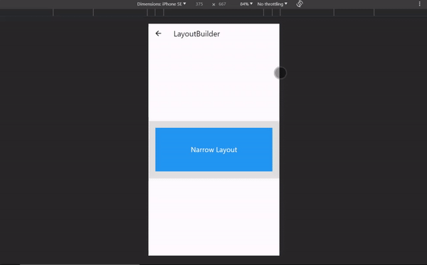 This GIF demonstrates the behavior of a layout controlled by a LayoutBuilder widget in Flutter. It adjusts the content based on the available width, showcasing a different layout for narrow and wide screens.
The image above demonstrates the flexibility of LayoutBuilder in changing the layout based on the constraints, making the UI responsive to different screen sizes.
Designing Adaptive Layouts Using Row and Column Widgets
The Row and Column widgets are fundamental for creating flexible and responsive layouts. They allow you to arrange children widgets horizontally (Row) or vertically (Column), making them essential for adapting UI elements based on screen sizes.
import 'package:flutter/material.dart';

class RowColumnWidget extends StatelessWidget {
 const RowColumnWidget({super.key});

 @override
 Widget build(BuildContext context) {
   return Scaffold(
     appBar: AppBar(
       title: const Text('Row and Column'),
     ),
     body: Center(
       child: Container(
         color: Colors.grey[300],
         padding: const EdgeInsets.all(20.0),
         child: LayoutBuilder(
           builder: (context, constraints) {
             if (constraints.maxWidth < 600) {
               // For smaller screens, use a Column layout
               return buildColumnLayout();
             } else {
               // For larger screens, use a Row layout
               return buildRowLayout();
             }
           },
         ),
       ),
     ),
   );
 }

 Widget buildColumnLayout() {
   return Column(
     mainAxisAlignment: MainAxisAlignment.center,
     crossAxisAlignment: CrossAxisAlignment.stretch,
     children: [
       Container(
         height: 100,
         color: Colors.blue,
         child: const Center(
           child: Text(
             'Item 1',
             style: TextStyle(
               color: Colors.white,
               fontSize: 40,
             ),
           ),
         ),
       ),
       const SizedBox(height: 20),
       Container(
         height: 100,
         color: Colors.green,
         child: const Center(
             child: Text('Item 2',
                 style: TextStyle(
                   color: Colors.white,
                   fontSize: 40,
                 ))),
       ),
       const SizedBox(height: 20),
       Container(
         height: 100,
         color: Colors.orange,
         child: const Center(
           child: Text(
             'Item 3',
             style: TextStyle(
               color: Colors.white,
               fontSize: 40,
             ),
           ),
         ),
       ),
     ],
   );
 }

 Widget buildRowLayout() {
   return Row(
     mainAxisAlignment: MainAxisAlignment.spaceEvenly,
     children: [
       Container(
         width: 150,
         height: 200,
         color: Colors.blue,
         child: const Center(
           child: Text(
             'Item 1',
             style: TextStyle(
               color: Colors.white,
               fontSize: 40,
             ),
           ),
         ),
       ),
       Container(
         width: 150,
         height: 200,
         color: Colors.green,
         child: const Center(
           child: Text(
             'Item 2',
             style: TextStyle(
               color: Colors.white,
               fontSize: 40,
             ),
           ),
         ),
       ),
       Container(
         width: 150,
         height: 200,
         color: Colors.orange,
         child: const Center(
           child: Text(
             'Item 3',
             style: TextStyle(
               color: Colors.white,
               fontSize: 40,
             ),
           ),
         ),
       ),
     ],
   );
 }
}
Here, we’ve modified our example to use a Column for small screens and a Row for large screens. The mainAxisAlignment property controls the alignment of children within the Row or Column. This simple adjustment allows us to create layouts more suited to different screen sizes.
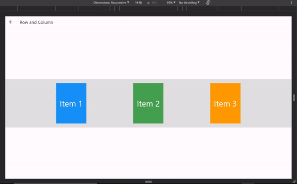 This GIF visualizes the usage of Row and Column widgets to create adaptive layouts in Flutter. It showcases a column layout for small screens and a row layout for larger screens.
It emphasizes the adaptability of Row and Column widgets in organizing UI elements vertically or horizontally based on screen size.
Working with Align and Alignments to Position Widgets
The Align widget precisely positions child widgets within a parent. The Alignments class also offers predefined constants for common alignment scenarios. Combining these tools allows for fine-grained control over widget placement in responsive layouts.
Handling Constraints and Overflowing Layouts with the Wrap Widget
The Wrap widget is an excellent choice for creating dynamic layouts that automatically wrap to the next line when the space is insufficient. This is particularly useful when dealing with a variable number of widgets or when you want a flexible and responsive design.
import 'package:flutter/material.dart';

class ResponsiveWrap extends StatelessWidget {
 const ResponsiveWrap({Key? key}) : super(key: key);

 @override
 Widget build(BuildContext context) {
   return SafeArea(
     child: Scaffold(
       appBar: AppBar(
         title: const Text('Responsive Wrap Example'),
       ),
       body: LayoutBuilder(
         builder: (context, constraints) {
           return buildResponsiveLayout(constraints.maxWidth);
         },
       ),
     ),
   );
 }

 Widget buildResponsiveLayout(double maxWidth) {
   if (maxWidth < 400.0) {
     return buildLargeLayout();
   } else {
     return buildLargeLayout();
   }
 }

 Widget buildSmallLayout() {
   // Simulate containers overflowing without Wrap widget
   return Row(
     mainAxisAlignment: MainAxisAlignment.center,
     children: List.generate(
       12,
       (index) => Container(
         margin: const EdgeInsets.all(8.0),
         width: 100.0,
         height: 100.0,
         color: Colors.blue,
         child: Center(
           child: Text(
             'Item $index',
             style: const TextStyle(color: Colors.white),
           ),
         ),
       ),
     ),
   );
 }

 Widget buildLargeLayout() {
   return Wrap(
     alignment: WrapAlignment.center,
     spacing: 12.0,
     runSpacing: 12.0,
     children: List.generate(
       15,
       (index) => Padding(
         padding: const EdgeInsets.all(8.0),
         child: Container(
           width: 100.0,
           height: 100.0,
           color: Colors.blue,
           child: Center(
             child: Text(
               'Item $index',
               style: const TextStyle(color: Colors.white),
             ),
           ),
         ),
       ),
     ),
   );
 }
}
In this example, we’ve replaced the Column and Row with the Wrap widget. The alignment property controls the alignment of the children within the Wrap. This allows for a more dynamic layout based on the available space.
Wrap widget becomes especially powerful when dealing with a variable number of widgets or when the content needs to adapt gracefully to different screen sizes.
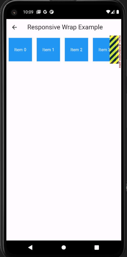
This image above shows a row of containers overflowing horizontally without the Wrap widget
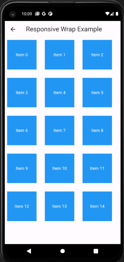
This image shows a row of containers using the Wrap widget that accommodates the content gracefully.
The image demonstrates the functionality of the Wrap widget in managing layouts that automatically wrap to the next line when space is insufficient, effectively handling content overflow.
Creating Adaptive Spacing
Spacing is a crucial aspect of responsive design. Flutter provides several widgets for controlling spacing, including SizedBox, Spacer, and Padding. These widgets enable precise control over the dimensions and positioning of UI elements.
- A
SizedBoxwidget is used to create fixed space between elements. It provides vertical or horizontal spacing between different sections of a layout. - A
Spacerwidget is a flexible space that takes up any available space in a Row or Column. - A
Paddingwidget creates padding around a widget. It adds space around the child widget based on the specified padding values.
These spacing techniques enhance the overall design and maintain responsiveness across different screen sizes.
Handling Landscape and Portrait Modes
Creating a responsive design also involves considering the orientation of the device, which is where the OrientationBuilder widget comes in.
import 'package:flutter/material.dart';
import 'dart:math';
class OrientationLayoutExample extends StatelessWidget {
const OrientationLayoutExample({super.key});
@override
Widget build(BuildContext context) {
return Scaffold(
appBar: AppBar(
title: const Text('Orientation Layout Example'),
),
body: OrientationBuilder(
builder: (context, orientation) {
return Center(
child: Container(
padding: const EdgeInsets.all(20.0),
color: Colors.grey[300],
child: orientation == Orientation.portrait
? buildPortraitLayout()
: buildLandscapeLayout(),
),
);
},
),
);
}
Widget buildPortraitLayout() {
return const Column(
mainAxisAlignment: MainAxisAlignment.center,
crossAxisAlignment: CrossAxisAlignment.center,
children: [
Icon(
Icons.phone_android,
size: 100.0,
color: Colors.blue,
),
SizedBox(height: 20.0),
Text(
'Portrait Mode',
style: TextStyle(fontSize: 24.0),
),
],
);
}
Widget buildLandscapeLayout() {
return Row(
mainAxisAlignment: MainAxisAlignment.center,
crossAxisAlignment: CrossAxisAlignment.center,
children: [
Transform.rotate(
angle: pi / 2.0,
child: const Icon(
Icons.phone_android,
size: 100.0,
color: Colors.green,
),
),
const SizedBox(width: 20.0),
const Text(
'Landscape Mode',
style: TextStyle(fontSize: 24.0),
),
],
);
}
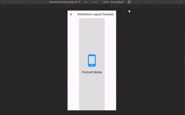
}In this example, we’ve introduced the OrientationBuilder widget, which rebuilds its child widget based on the device’s orientation. Different layouts (buildPortraitLayout and buildLandscapeLayout) are displayed depending on whether the orientation is portrait or landscape.
 This GIF above shows the UI dynamically changing based on device orientation using the OrientationBuilder widget in Flutter. It displays a layout for portrait mode and another layout (rotated) for landscape mode.
It demonstrates how the OrientationBuilder can adjust UI layouts based on device orientation, enhancing responsiveness.
In the upcoming sections, we’ll explore advanced techniques for designing responsive UI layouts in Flutter.
Advanced Techniques for Complex Layouts
In this section, we delve deeper into methodologies and widgets in Flutter, enabling the creation of responsive user interfaces.
Loading and Displaying Different Images for Various Screen Densities
When working with images in responsive designs, it’s essential to consider different screen densities to ensure optimal quality. Flutter provides a simple way to load and display images based on the device’s pixel ratio.
import 'package:flutter/material.dart';

class ResponsiveImage extends StatelessWidget {
 const ResponsiveImage({super.key});

 @override
 Widget build(BuildContext context) {
   double devicePixelRatio = MediaQuery.of(context).devicePixelRatio;
   double roundedPixelRatio =
       double.parse(devicePixelRatio.toStringAsFixed(2));

   return Scaffold(
     appBar: AppBar(
       title: const Text('Responsive Image'),
     ),
     body: Center(
       child: Column(
         mainAxisAlignment: MainAxisAlignment.center,
         children: [
           // Using Image.asset to load images based on device pixel ratio
           Image.asset(
             getImageBasedOnDevicePixelRatio(context),
           ),
           const SizedBox(height: 20),
           Text(
             'Device Pixel Ratio: $roundedPixelRatio',
             style: const TextStyle(fontSize: 20),
           ),
           const SizedBox(height: 20),
           if (devicePixelRatio > 2.0) ...{
             const Text(
               'High Pixel Ratio Device',
               style: TextStyle(fontSize: 20),
             ),
           } else if (devicePixelRatio > 1.5) ...{
             const Text('Medium Pixel Ratio Device'),
           } else ...{
             const Text('Normal Pixel Ratio Device')
           }
         ],
       ),
     ),
   );
 }

 String getImageBasedOnDevicePixelRatio(
   BuildContext context,
 ) {
   // Default image path
   String imagePath = 'assets/images/flutter_logo.png';
   double devicePixelRatio = MediaQuery.of(context).devicePixelRatio;
   // Check device pixel ratio and load appropriate image
   if (devicePixelRatio > 2.0) {
     imagePath =
         'assets/images/4.0x/flutter_logo.png'; // 4x image for higher density devices
   } else if (devicePixelRatio > 1.5) {
     imagePath =
         'assets/images/2.0x/flutter_logo.png'; // 2x image for medium density devices
   }
   return imagePath;
 }
}
In this example, we’ve used the Image.asset widget to load images from the asset folder.
The getImageBasedOnDevicePixelRatio method determines the image path based on the device’s pixel ratio retrieved using MediaQuery.
By providing different image assets for small and large screens, you can ensure that the appropriate image is displayed based on the device’s screen size.
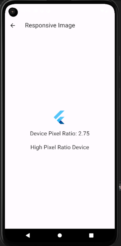
This image demonstrates a high-density image (3x) being displayed for larger, high-resolution screens based on the device’s pixel ratio. The UI displays the selected image along with information about the device’s pixel ratio.
The image showcases the implementation of loading different images based on the device’s pixel ratio to ensure optimal image quality across various screen densities, thereby improving the visual experience for users on different devices.
Responsive Grids with the GridView Widget
When dealing with complex layouts or displaying a collection of items, the GridView widget in Flutter becomes a powerful tool. It allows you to create responsive grids that adapt to various screen sizes.
import 'package:flutter/material.dart';
class ResponsiveGridView extends StatelessWidget {
const ResponsiveGridView({super.key});
@override
Widget build(BuildContext context) {
return SafeArea(
child: Scaffold(
appBar: AppBar(
title: const Text('GridView'),
),
body: LayoutBuilder(
builder: (context, constraints) {
return buildResponsiveGrid(constraints.maxWidth);
},
),
),
);
}
Widget buildResponsiveGrid(double maxWidth) {
// Determine the number of columns based on screen width
int columns = (maxWidth / 150).floor();
return GridView.builder(
gridDelegate: SliverGridDelegateWithFixedCrossAxisCount(
crossAxisCount: columns,
crossAxisSpacing: 8.0,
mainAxisSpacing: 8.0,
),
itemCount: 12,
itemBuilder: (context, index) {
return Container(
color: Colors.green,
child: Center(
child: Text(
'Item $index',
style: const TextStyle(
color: Colors.white,
fontSize: 40,
),
),
),
);
},
);
}
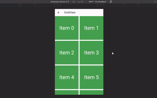
}We’ve used the GridView.builder in the code above to create a responsive grid. The gridDelegate property is configured with SliverGridDelegateWithFixedCrossAxisCount, which ensures a fixed number of columns. The number of columns is determined dynamically based on the screen width.
This gif portrays a responsive grid layout created using the GridView widget. It showcases a grid of containers adjusted dynamically based on the screen width.
This illustrates how GridView is utilized to create responsive grid layouts that adapt to different screen sizes, and it is beneficial when dealing with a number of items that vary in numbers.
Testing and Debugging Responsive Designs using Emulator for Different Screens
Testing and debugging ensure your responsive designs work seamlessly across various devices.
Using emulators or physical devices with different screen sizes and resolutions is crucial when testing responsive designs. Flutter’s hot reload feature allows for quick iterations during development, making fine-tuning layouts easier.
Best Practices for Responsive UI Design
Let’s explore strategies to optimize your responsive UI design.
Prioritize Touch-Friendly Interactions: Designing responsive UIs extends beyond layout adaptability. Prioritize touch-friendly interactions to ensure a seamless user experience. Utilize widgets like GestureDetector to capture taps or gestures on specific UI elements. This approach guarantees user-friendliness across various screen sizes, catering to both small and large devices.
Feedback for Touch Events: Implement visual or haptic feedback upon touch interactions to acknowledge user actions. Utilize Flutter’s feedback mechanisms, such as visual changes in UI elements, subtle animations, or vibration for feedback, ensuring users perceive and confirm their interactions, enhancing the overall usability of the app.
Conclusion
Building responsive UI layouts in Flutter involves thoughtful consideration of screen sizes, orientations, and touch interactions. Throughout this guide, we’ve explored various techniques, widgets, and best practices to create responsive designs that adapt gracefully to different devices.
Key Takeaways:
- Use
MediaQueryand breakpoints to categorize screen sizes. - Leverage widgets like
LayoutBuilder,Row,Column, andWrapfor responsiveness. - Consider screen orientation using
OrientationBuilder. - Optimize images for different screen densities.
- Test and debug on emulators and devices with diverse configurations.
Applying these principles and techniques allows you to create Flutter applications that provide a consistent and enjoyable user experience across a wide range of devices.
If you want to clone the repo and see all the examples and more, you can check it out on GitHub and leave a star.
Truly understand users experience
See every user interaction, feel every frustration and track all hesitations with OpenReplay — the open-source digital experience platform. It can be self-hosted in minutes, giving you complete control over your customer data.
Star on GitHub12k