Responsive Typography with Clamp
Make sites responsive with fluid typography, without media queries

As a FrontEnd Developer, one of the most tiring things to do is to specify the property of text elements for different screen sizes using
media-query,which leads to a large (Cascading Style Sheets) CSS code file. This article will show you how to make website texts responsive without having to usemedia-query,thereby saving time and space.

Discover how at OpenReplay.com.
Before diving into CSS clamp(), the tool we’ll be using, let us look at the meaning of “clamp” for a clearer understanding. Clamp according to the Merriam-Webster dictionary:
A clamp is designed to bind, constrict, or press two or more parts together to hold them firmly.
This is no different from CSS clamp(); it holds three values together, which guide the browser on what CSS property value to render based on the value stated in our clamp(). It clamps a value between the maximum and minimum bounds. The clamp() function is powerful and versatile; it eases responsiveness and is not just used for fonts alone but can be used on images, videos, etc.. for this article, we will be focusing on the typography use of the clamp() function, exploring its syntax, use cases and practical examples to demonstrate how it can be harnessed to create responsive designs that scale elegantly.
How CSS Clamp Works On Responsive Typography
Using the clamp() function for the font-size of our elements allows it to be fluid based on the specified viewport. This is a great way to ensure that our web page texts scale properly across different screen sizes, and this approach reduces the media-query codes we get to write. Let us now look at the syntax of the clamp() function
font-size: clamp(minimum, preferred, maximum);From the above syntax:
font-sizerefers to the CSS property that carries theclamp()function.minimum: This function tells the browser that the value is the smallest font can have and should not go lower than that. For example, if the minimum value is set to “10px”, thefont-sizeof our text on the smallest of screens will not go below “10px” because the browser reads it as the minimum font size.preferred: This is the center value of theclamp()function. It sets the viewport width that our font exists in; this width will be used when it fits in the range of the minimum and maximum values.clamp()texts are fluid according to theirview-width(vw).Therefore, our preferred value should be a dynamic unit such asvw.maximum: This is just the direct opposite of theminimum; it represents the highest value the font should take, which is not to be exceeded. The maximum value will be applied if the preferred value exceeds the maximum font size. Let’s now assign values to ourclamp()function above and see our result. Here is the HTML
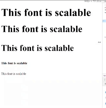
<body>
 <h1>This font is scalable</h1> <!-- Large font size -->
 <h2>This font is scalable</h2> <!-- Medium font size -->
 <h3>This font is scalable</h3> <!-- Small font size -->
 <h6>This font is scalable</h6> <!-- Smallest font size -->
 <p>This font is scalable</p> <!-- Default font size -->
</body>
And here is the CSS
/* Styling for different heading levels */
h1{
  font-size: clamp(25px,8vw,100px);
}
h2{
  font-size: clamp(18px,7vw,85px);
}
h3{
  font-size: clamp(14px,6vw,70px);
}
h6,p{
  font-size: clamp(10px,5vw,20px);
}
This is the output below:
How CSS Clamp Works With Relative Units
In our example above, the font-size is responsive; it scales according to the vw, which is what we want, but there is an issue: if our web page is zoomed in or zoomed out, the font-size stops being responsive. So to solve this, it is important to add a rem unit to the vw, which ensures that the font-size is readable and scales accordingly to the vw. Let us add a 1rem unit to each of our font-size to understand this better
h1{
  font-size: clamp(25px,8vw + 1rem,100px);
}
h2{
  font-size: clamp(18px,7vw + 1rem,85px);
}
h3{
  font-size: clamp(14px,6vw + 1rem,70px);
}
h6,p{
  font-size: clamp(10px,4vw + 1rem,20px);
}
Now, the font-size increases and decreases accordingly whenever we zoom in or out.
 How
How clamp() works with relative units differs, especially on the preferred vw indicated in the clamp() function. The combination of rem and vw can lead to font sizes that are comfortable to read across various devices, screen sizes, and orientations.
How To Use Clamp on Line Height And Letter Spacing
Using the clamp() function, we can also make the line-height and the letter-spacing of our font responsive across different screen sizes and browsers while maintaining its readability. Here is how to use clamp() on line-height and letter-spacing:
Line Height Using Clamp
The line-height property is commonly used to set the distance between two parallel lines of text by defining the height of each line of text. The line-height property is significant for maintaining readability and aesthetics in your typography. Here is an example of how to use line-height property in clamp():
.top_section h1 {
 font-size: clamp(40px, 8vw + 1rem, 100px);
 line-height: clamp(0, 10vw + 1rem, 60px);
}
In the example above, the line-height of the h1 element starts at the minimum of 0 and scales up to the maximum value of 60px, ensuring the text remains readable while adapting to a different screen size.
Letter Spacing Using Clamp
The letter-spacing property controls the amount of white space between characters of a word. It is used to increase or decrease the space between characters in a text element, which helps in the visual appearance of that text. Here is an example of how to use the letter-spacing property in clamp():
.top_section h1 {
 font-size: clamp(40px, 8vw + 1rem, 100px);
 letter-spacing: clamp(2px, 10vw + 1rem, 10px);
}
In the example above, the letter-spacing within the h1 element starts at the minimum of 2px and scales up to the maximum value of 10px, ensuring that the spacing remains appropriate while accommodating various screen sizes.
Now we know how to use the clamp() on both the line-height and the letter-spacing properties, let us combine both in this example below.
This is the HTML
<body>
 <div class="top_section">
  <h1>START PAGE</h1>
  <h6>Welcome To Start Page</h6>
  <button>Get Started</button>
 </div>
</body>
And this is the CSS
body {
 margin: 0 auto;
 width: 85%;
 padding: 0;
 font-family: "Inter", sans-serif;
}
.top_section {
 display: flex;
 flex-direction: column;
 text-align: center;
 align-items: center;
 justify-content: center;
 height: 100vh;
}
.top_section h1 {
 font-size: clamp(40px, 8vw + 1rem, 100px);
 letter-spacing: clamp(2px, 10vw + 1rem, 10px);
 line-height: clamp(0, 10vw + 1rem, 60px);
 margin: -10px 0;
}
.top_section h6 {
 font-size: clamp(14px, 8vw + 1rem, 20px);
 letter-spacing: clamp(2px, 10vw + 1rem,5px);
 line-height: clamp(0px, 10vw + 1rem, 60px);
}
.top_section button {
 background-color: #000;
 color: #fff;
 padding: 10px 30px;
 cursor: pointer;
 font-size: clamp(10px, 8vw + 1rem, 20px);
}
This is the output below:
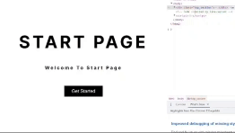
We can notice how the line-height and letter-spacing scales appropriately.
Fallback Values For Older Browsers
Although the browser support for CSS clamp() is pretty good across all modern browsers, you may want to set fallback values for clamp in case the website is running on a browser that is yet to support clamp().Doing so will help us ensure that our responsive design remains functional and visually acceptable for users on those browsers. Here is an example of how it can be done
/* Fallback for browsers that do not support clamp() */
h1 {
 font-size: 70px;
 color: red;
 letter-spacing: 10px; /* Fallback letter spacing value */
 font-family: "Raleway", sans-serif;
 /* Modern browsers that support clamp() */
 font-size: clamp(20px, 8vw + 1rem, 70px);
 letter-spacing: clamp(1px, 0.3vw, 10px);
}
This is the output below:
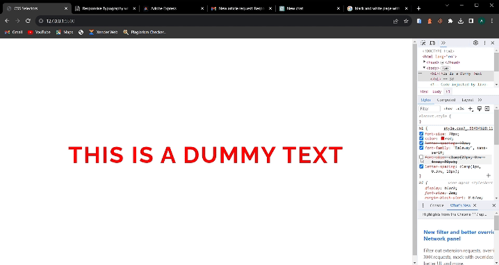
We can notice that when we turn off our font-size with CSS clamp() on our developer tools, the browser will immediately fall back to the other font-size specified.
Conclusion
In this article, we talked about responsive typography, CSS clamp(), and how to make our font-size, line-height, and letter-spacing responsive using CSS clamp(). We will stop here for now, and I urge you to do more research and discover more about CSS clamp() using the foundation I have given you.
Truly understand users experience
See every user interaction, feel every frustration and track all hesitations with OpenReplay — the open-source digital experience platform. It can be self-hosted in minutes, giving you complete control over your customer data.
Star on GitHub12k