Svelte Transitions: Creating Smooth UI Animations
Add nice animations to your Svelte code


Smooth UI animations can elevate the user experience of web applications, making interactions more intuitive and engaging. With Svelte, developers have a powerful tool to create these animations seamlessly. This article will dive into the realm of Svelte transitions, exploring how they enable developers to craft fluid and polished UI animations with ease.

Discover how at OpenReplay.com.
Svelte transitions revolve around the principle of simplicity and efficiency. Unlike traditional frameworks where animations are often handled manually, Svelte’s approach is declarative, requiring minimal code to achieve impressive results. The core concept lies in associating transitions with state changes, making it intuitive and easy to implement.
At its essence, a Svelte transition involves defining how an element should change when a specific state is reached. These changes can include properties like opacity, position, or scale.
Key Benefits of Using Svelte Transitions
In this section, we’ll explore the key benefits of leveraging Svelte transitions in web development.
Here are some key benefits of using Svelte Transitions:
-
Declarative Syntax: Svelte transitions embrace a declarative syntax, allowing developers to express the desired animation behavior without requiring intricate procedural code. This simplicity leads to quicker development and enhanced readability.
-
Automatic Transition Generation: One of the standout features of Svelte transitions is the ability to generate transitions based on state changes automatically. This automates much of the transition logic, reducing the potential for errors and streamlining the development process.
-
Performance Optimization: Svelte’s compilation process shifts the burden of animation computations from the browser to the build step. This results in highly optimized and efficient animations, contributing to smoother user experiences and faster page loads.
-
Integration with Svelte Ecosystem: Svelte transitions seamlessly integrate with the broader Svelte ecosystem. Developers can leverage the same principles and syntax for transitions across different components, fostering consistency and reducing the learning curve for those familiar with Svelte development.
Getting Started with Svelte Transitions
Integrating Svelte transitions into your projects is a straightforward process that enhances the overall user experience. You can leverage the built-in {#if} block within your Svelte components to define transitions based on state changes. This declarative approach simplifies the integration.
Let’s explore a straightforward example of the fade-in/fade-out effect in Svelte.
<script>
import { fade } from 'svelte/transition';
let isVisible = false;
function toggleVisibility() {
isVisible = !isVisible;
}
</script>
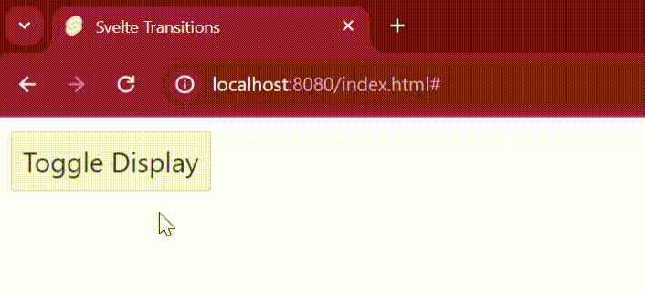
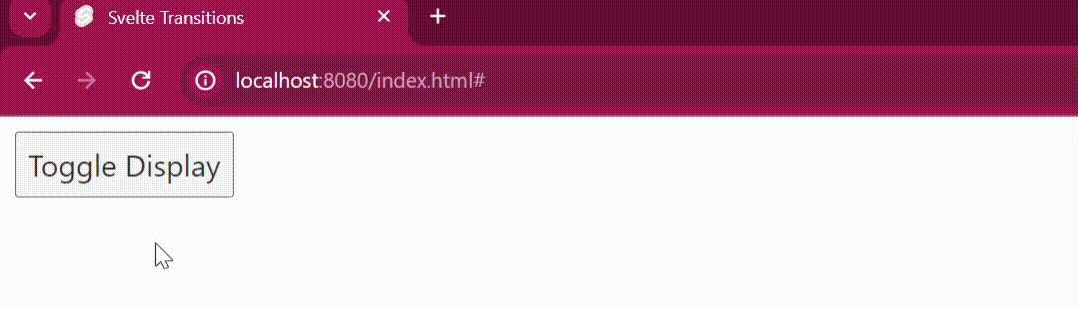
<button on:click={toggleVisibility}>Toggle Display</button>
{#if isVisible}
<div transition:fade>
Content to Fade In and Out
</div>
{/if}Here’s a breakdown of the code:
import { fade } from 'svelte/transition';
Here, we import the fade transition from the svelte/transition module.
let isVisible = false;
We declare a boolean variable named isVisible and initialize it to false. This variable represents the content’s current visibility state.
function toggleVisibility() {
  isVisible = !isVisible;
}
We define a function named toggleVisibility that toggles the value of the isVisible variable between true and false. This function is called when the button is clicked.
<button on:click={toggleVisibility}>Toggle Display</button>
We create a button element with an on:click directive that calls the toggleVisibility function when clicked. This button toggles the visibility of the content.
{#if isVisible}
  <div transition:fade>
    Content to Fade In and Out
  </div>
{/if}
We use the {#if} block to conditionally render the content based on the value of the isVisible variable. If isVisible is true, the content is rendered; otherwise, it’s not rendered. The transition:fade directive applies the fade transition to the content when it appears or disappears, resulting in a fade-in/fade-out effect.
Output:
Svelte’s In-Built Transition Types
Svelte offers a variety of built-in transition types that can be easily applied to different elements to achieve different animation effects. These include fade, slide, scale, blur, and more. Each transition type comes with predefined animation properties, making it simple to create smooth and visually appealing transitions without extensive coding. Let’s take a look at some of these transition types.
Slide
In this section, we’ll explore the concept of slide transitions in Svelte. Slide transitions enable elements to smoothly move in or out of view from a specified direction during state changes, providing a sleek and dynamic effect to user interfaces.
Let’s take a look at the slide transition.
<script>
  import { slide } from 'svelte/transition';
  let isVisible = false;

  function toggleVisibility() {
    isVisible = !isVisible;
  }
</script>

<button on:click={toggleVisibility}>Toggle Display</button>

{#if isVisible}
  <div transition:slide={{ y: 200 }}>
    Content to Slide In and Out
  </div>
{/if}
Here’s a breakdown of the code:
import { slide } from 'svelte/transition';
Here, we import the slide transition from the svelte/transition module.
The transition:slide directive applies the slide transition to the content when it appears or disappears, causing it to slide in from the top (y-axis) by 200 pixels.
Output:
Scale
In this section, we’ll explore the concept of scale transitions in Svelte. Scale transitions enable elements to smoothly resize or scale up/down during state changes, adding a dynamic and visually pleasing effect to user interfaces.
Let’s take a look at the scale transition.
<script>
  import { scale } from 'svelte/transition';
  let isVisible = false;

  function toggleVisibility() {
    isVisible = !isVisible;
  }
</script>

<button on:click={toggleVisibility}>Toggle Display</button>

{#if isVisible}
  <div transition:scale={{ start: 0, delay: 0.2 }}>
    Content to Scale In and Out
  </div>
{/if}
Here’s a breakdown of the code:
import { scale } from 'svelte/transition';
Here, we import the scale transition from the svelte/transition module.
The transition:scale directive applies the scale transition to the content when it appears or disappears. We specify start: 0 to indicate that the content should start from a scale of 0 and delay: 0.2 to introduce a delay of 0.2 seconds before the scaling animation starts.
Output:
Blur
In this section, we’ll explore the concept of blur transitions in Svelte. Blur transitions offer a visually appealing effect by gradually blurring or sharpening elements during state changes.
Let’s take a look at the blur transition.
<script>
  import { blur } from 'svelte/transition';
  let isVisible = false;

  function toggleVisibility() {
    isVisible = !isVisible;
  }
</script>

<button on:click={toggleVisibility}>Toggle Display</button>

{#if isVisible}
  <div transition:blur={{ amount: 5 }}>
    Content to Blur In and Out
  </div>
{/if}
Here’s a breakdown of the code:
import { blur } from 'svelte/transition';
Here, we import the blur transition from the svelte/transition module.
The transition:blur directive applies the blur transition to the content when it appears or disappears, with a blur amount of 5 pixels.
Output:
Customizing Transition Properties
While Svelte’s in-built transition types provide convenient defaults, transition properties can be customized to tailor animations to specific requirements. Customization options include adjusting duration, easing function, delay, and more. By fine-tuning these properties, precise animation effects can be achieved, adding a unique touch to web applications.
Let’s look at an example:
<script>
  import { scale } from 'svelte/transition';
  let isVisible = false;

  function toggleVisibility() {
    isVisible = !isVisible;
  }
</script>

<button on:click={toggleVisibility}>Toggle Display</button>

{#if isVisible}
  <div transition:scale={{ start: 0, duration: 1000, delay: 0.3 }}>
    In the quiet of the night, the stars shimmered like diamonds in the sky.
  </div>
{/if}
Here’s a breakdown of the code:
start: Specifies the starting scale of the content. In this example, the content starts from a scale of 0.
duration: Specifies the duration of the transition effect. Here, the duration is set to 1000 milliseconds (1 second).
delay: Specifies the delay before the transition starts. The delay is set to 0.3 seconds.
Output:
Real-world Examples
In practical scenarios, Svelte transitions significantly enhance user interactions on websites and web applications. They add finesse to navigation menus, form inputs, and modal dialogs, making the user experience smoother and more engaging.
Let’s look at an example of using svelte transitions in a to-do-list scenario.
<script>
import { fade } from 'svelte/transition';
import { onMount } from 'svelte';
let todos = [];
let newTodo = '';
function addTodo() {
if (newTodo.trim() !== '') {
todos = [...todos, { id: Date.now(), text: newTodo }];
newTodo = '';
}
}
function removeTodo(id) {
todos = todos.filter(todo => todo.id !== id);
}
onMount(() => {});
</script>
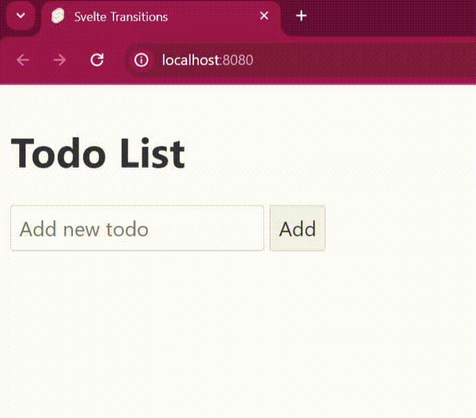
<h1>Todo List</h1>
<input bind:value={newTodo} placeholder="Add new todo" />
<button on:click={addTodo}>Add</button>
<ul>
{#each todos as todo (todo.id)}
<li transition:fade>
<span>{todo.text}</span>
<button on:click={() => removeTodo(todo.id)}>Remove</button>
</li>
{/each}
</ul>Here’s a breakdown of the code:
- We import the fade transition from Svelte.
- The
addTodo()function adds a new to-do item to the list with a fade-in effect. - The
removeTodo()function removes a to-do item from the list with a fade-out effect. - Each to-do item in the list is associated with a unique ID to ensure smooth transitions when adding or removing items.
‘onMount’:This is a lifecycle hook that gets called when the component is mounted to the DOM for the first time.
Output:
Let’s look at another example. We’ll be applying a transition to a basic dropdown component.
<script>
import { fade } from 'svelte/transition';
let isOpen = false;
const toggleDropdown = () => {
isOpen = !isOpen;
};
</script>
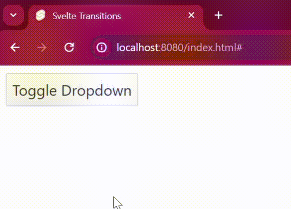
<div class="dropdown" class:open={isOpen}>
<button on:click={toggleDropdown}>Toggle Dropdown</button>
{#if isOpen}
<div transition:fade>
<div>
<a href="index.html">Option 1</a>
</div>
<div>
<a href="index.html">Option 2</a>
</div>
<div>
<a href="index.html">Option 3</a>
</div>
</div>
{/if}
</div>Here’s a breakdown of the code:
- We use the fade transition in the
divcontaining the dropdown options. - The dropdown menu toggles its visibility based on the
isOpenvariable. - Clicking the button toggles the value of
isOpen, causing the dropdown menu to fade in or out based on its visibility.
Output:
Conclusion
Throughout this article, we’ve covered the core concepts of Svelte transitions, including integration, customization, and event utilization. Practical examples have demonstrated the versatility of transition types like fade, slide, scale, and blur.
With Svelte transitions, applications can easily gain sophistication and polish, resulting in more engaging user interactions. As you explore Svelte further, consider leveraging transitions to create dynamic and delightful web experiences.
Gain Debugging Superpowers
Unleash the power of session replay to reproduce bugs, track slowdowns and uncover frustrations in your app. Get complete visibility into your frontend with OpenReplay — the most advanced open-source session replay tool for developers.
Star on GitHub12k