Understanding the Holy Grail Layout Pattern in CSS

The Holy Grail pattern is a CSS layout technique used to create a 3-column layout on the webpage. It is called the Holy Grail pattern because of the method of its implementation, a comprehensive structure for webpage layout that provides the essential components needed for most webpages, using CSS techniques to achieve equal heights of the multiple content columns. This layout is also responsive and adaptable to different screen sizes, and this article will show you how to use it.

Discover how at OpenReplay.com.
Layout patterns play an important role in web design. It constitutes the experience a user gets when engaging with that webpage. By providing a consistent structure, it becomes intuitive and easy to navigate. The layout design also plays a role in usability. Users can easily find the necessary information with a logical and intuitive flow. It also contributes to accessibility by ensuring the webpage is accessible to all users. A thoughtfully designed website creates visual appeal, thereby increasing user engagement.
In this blog post, you will learn about the Holy Grail layout pattern, components, and structure. You will also see how it adapts to different screen sizes, scenarios for implementing the layout, and a technique for creating the Holy Grail layout.
The Holy Grail Layout Pattern
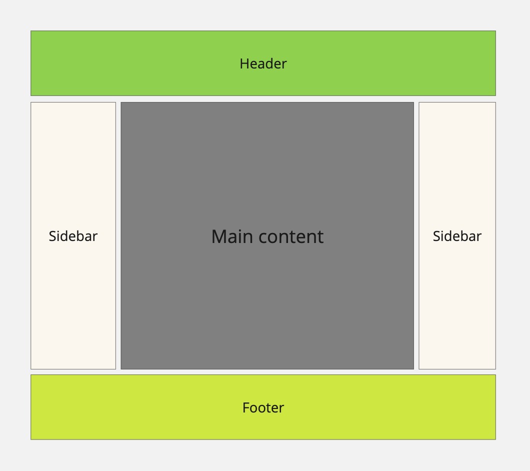
The Holy Grail layout patterns differ from the more common layout patterns in CSS, such as single-column, two-column, and Grid layouts. It uses a combination of CSS techniques such as flexbox and grid, CSS floats, or grid to create comprehensive layouts. The layout consists of a header, a footer, and three content columns of equal heights. The three content columns comprise a left sidebar, main content, and a right sidebar.
Here’s a visual representation:

This illustration shows the structure of the Holy Grail Layout pattern on a webpage.
Core components of the layout
There are core components that make up the Holy Grail Layout. Examine them below.
The header
The header is at the top of the webpage and contains features such as the company name, logo, navigation menu, search features, and slogan. It serves as an introduction to the website and provides users with easy access to important navigation links, allowing them to quickly access information.
The footer
The footer is the last element at the bottom of the page. It contains contact details, information regarding the company, social media links, copyright notices, and additional navigation links. The navigation link provides quick access to sections of the webpage without the need to scroll back to the top.
Main content
As the name implies, the main content contains primary information about the company. It includes information such as the services the company renders, testimonials, product listings, and other relevant information about the company’s business.
Sidebars
Sidebars are extra content areas located on the left and right sides of the main content. They are often used to display secondary content such as navigation menus, related links, or supplementary information. The main content and the sidebars are positioned between the header and the footer.
Structure of the Holy Grail Layout
There is a structure that is expected to implement the Holy Grail layout. Let’s delve into the details of it.
One key aspect is that the sidebars and main content are expected to maintain equal heights regardless of the amount of content in each column. In the HTML source, the main content should also be placed first in the HTML markup before the sidebars since it contains the most important information. This way, it improves accessibility and search engine optimization (SEO) by highlighting the most important information early in the document.
The layout is also expected to have fixed-width sidebars and fluid-width main content. This ensures that the main content occupies more of the viewport width, and the sidebars have a fixed width since they contain supplementary information. Another crucial element is ensuring that the footer remains at the bottom of the page, maintaining visual hierarchy and consistency throughout the website.
Overall, the layout requires minimal markup and CSS to facilitate easy maintenance and reduce page load times.
The HTML markup structure for the Holy Grail layout is as follows:
<body>
 <div class="container">
  <header>
    <!-- Holy Grail Layout -->
  </header>

    <div class="main-content">

    </div>

    <div class="left-sidebar">
    <!-- Navigation menu -->
      <li>Item 1</li>
      <li>Item 2</li>
      <li>Item 3</li>
      <li>Item 4</li>
      <li>Item 5</li>
    </div>

    <div class="right-sidebar">

    </div>

  <footer>
    <!-- Footer content -->
  </footer>
 </div>
</body>
The markup is kept simple, only containing the required elements. The main content also come before the sidebars.
Advantages of using the Holy Grail Layout in web design
This layout has features that distinguish it from other layouts. Consider its benefits:
-
The layout organization makes it easy for users to engage on the webpage by intuitively guiding users. This results in a more engaging and satisfying experience.
-
The layout brings together all elements into distinct sections, contributing to easy navigation and user interaction. It allows users to easily locate and access different parts of the webpage.
-
The Holy Grail Layout considers accessibility by providing a logical and intuitive structure for the webpage. It ensures screen reader compatibility.
-
The nature of the layout accounts for flexibility and responsiveness for different screen sizes and devices. Taking up all the available viewport width ensures a consistent and visually pleasing experience across devices.
-
The Holy Grail layout pattern’s modular and reusable nature makes the development and maintenance process easy for web developers and designers. Updates and modifications to the website can easily be made.
Common Use Cases in Web Design
In this section, we’ll go through some examples of websites that closely resemble the Holy Grail layout pattern.
One such website is LinkedIn. LinkedIn’s website uses a Holy Grail layout with a LinkedIn logo header, search feature, and navigation links. The main content is divided into three columns: news feed, sponsored content, and notifications. LinkedIn does not have a traditional footer at the bottom since the news feed is designed to be endless, and the website focuses on content.
Another website that closely resembles the Holy Grail layout is the Bootstrap documentation. The bootstrap documentation uses a header and multiple columns for documentation sections, code samples, and a navigation menu. The documentation also does not have a footer at the end of each webpage because it focuses on providing information about the Bootstrap framework.
Finally, CNN’s website employs the Holy Grail layout to showcase news, articles, and other content. It contains a header with the CNN logo and navigation links, a footer with links to different website sections, and a main content divided into three columns of news articles, advertisements, and related content.
Depending on their specific needs, websites may employ variations different from the ideal Holy Grail layout pattern. This is possible due to the versatile approach of the Holy Grail layout to web design.
Scenarios for implementing the Holy Grail layout pattern
There are certain scenarios where implementing the Holy Grail layout is suitable.
A common scenario is websites that contain a significant amount of content. Multiple columns and sidebars are beneficial in such cases, making it easy for users to navigate and access information. Another noteworthy use case is e-commerce platforms, as they can benefit from the structured organization of the layout. The navigation links, product listings, advertisements, and other platform sections can be allocated accordingly.
Also, websites prioritizing responsive design can leverage the Holy Grail layout to ensure an optimized user experience.
Implementing the Holy Grail Layout
CSS Grid can be used to achieve the Holy Grail layout pattern. In this section, we’ll demonstrate the styling used to achieve the layout and optimize for user experience with responsive design.
Here’s the styling following the markup code above:
.container {
  display: grid;
  grid-template-columns: 200px 1fr 200px;
  column-gap: 20px;
}
header {
  grid-column: span 3;
  text-align: center;
  border-bottom: 1px solid #ddd;
}
.left-sidebar {
  padding: 30px;
  border-right: 1px solid #ddd;
}
.left-sidebar li {
  text-decoration: underline;
  list-style: none;
}
.main-content {
  padding: 30px;
}
.main-content img {
  width: 100%;
  height: auto;
}
.right-sidebar {
  padding: 30px;
  border-left: 1px solid #ddd;
}
.right-sidebar ul {
  list-style: none;
}
footer {
  border-top: 1px solid #ddd;
  grid-column: span 3;
  text-align: center;
  padding: 30px;
}
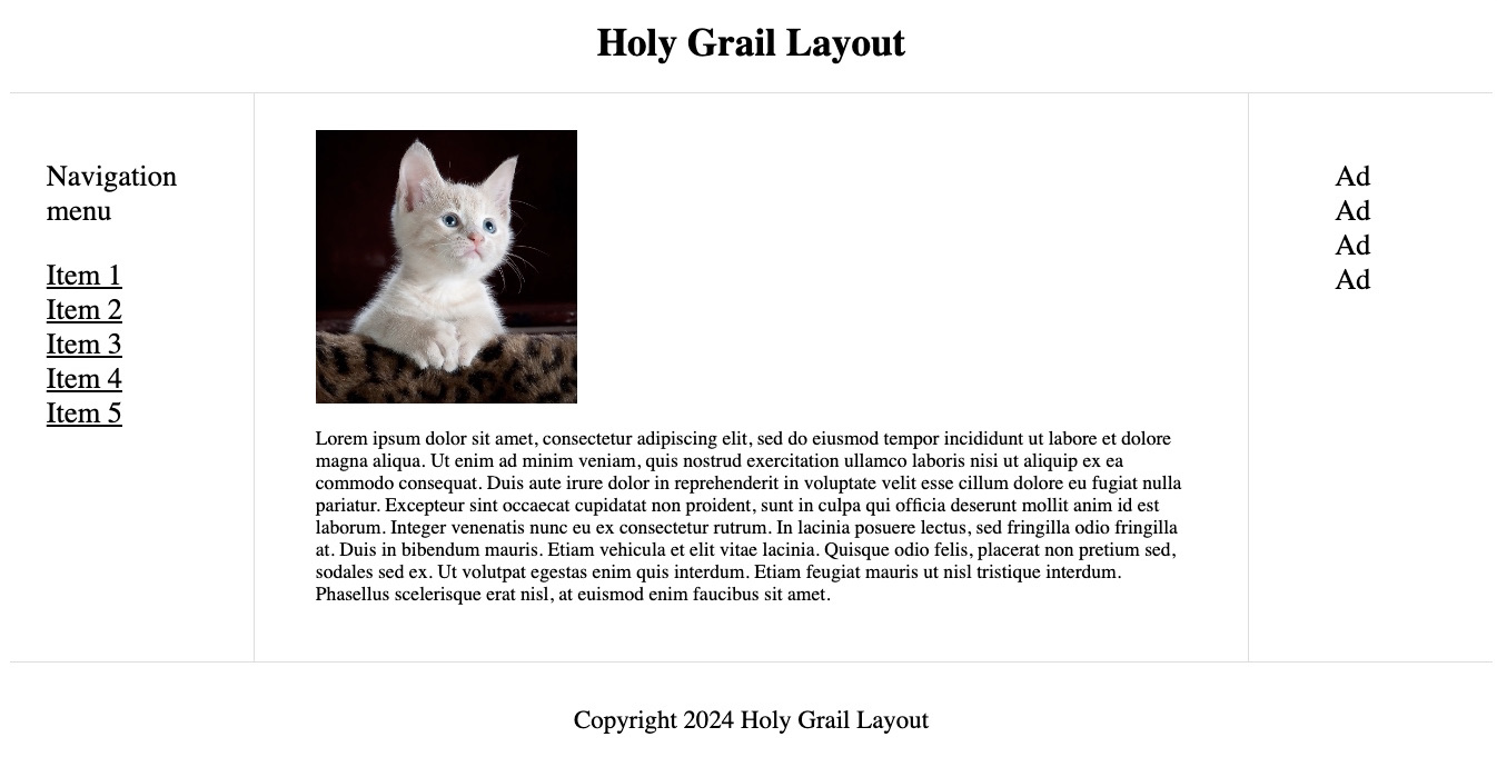
In this snippet, the container is made into a grid container. The left and right sidebar are given a fixed width of 200px, while the main content takes up 1fr of the remaining space. The header is made to span across three columns of the grid, thus giving it its characteristic full-width position.
The footer also spans across the three columns of the grid at the bottom of the page.
When the browser is resized to be smaller, the style will appear disorganized, so a responsive design will be employed to enhance the user experience.
@media screen and (max-width: 1200px) {
  .left-sidebar {
    grid-column: span 3;
    border-right: 0;
    border-bottom: 1px solid #ddd;
  }
  .left-sidebar li {
    display: inline-block;
    margin-right: 10px;
  }
  .main-content {
    grid-column: span 2;
  }
}
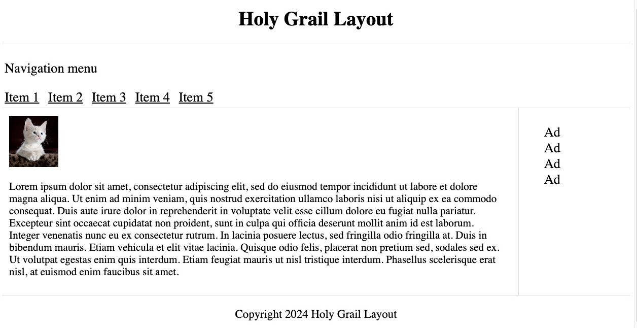
When the screen width is at 1200px or less, the left-sidebar spans the 3 columns making it a full-width, while the main-content spans two columns horizontally making it more prominent than the right sidebar.
To further make the layout responsive for smaller screens:
@media screen and (max-width: 980px) {
  .left-sidebar,
  .main-content,
  .right-sidebar {
    grid-column: span 3;
  }
  .right-sidebar {
    border-left: 0;
    border-top: 1px solid #ddd;
  }
}
When the screen width is at a maximum of 980px, the left-sidebar, main-content, and right-sidebar spans all 3 columns making the style appear on one column vertically.
Best practices for the Holy Grail layout implementation
Certain practices are recommended to ensure a seamless implementation of the Holy Grail layout.
These practices include the use of semantic HTML elements such as <header>, <footer>, <main>, and <aside>, which enhance accessibility and improve search engine optimization (SEO). In addition, the columns are expected to have equal height using CSS techniques regardless of the content length in each column. It is also important to ensure the layout is responsive by using media queries to adjust the layout based on viewport size.
Finally, you should test the layout across different browsers to ensure compatibility.
Challenges and Considerations
While the Holy Grail layout pattern offers many benefits, there are also challenges that you should be cautious of. Consider some of the challenges that could be encountered when working with the Holy Grail layout.
-
Equal Height Columns: One of the main challenges of the Holy Grail layout is achieving equal height columns. This can be a hassle, particularly when the content in each column varies in length.
-
Responsive Design Complexity: Implementing responsive design in the Holy Grail layout can be a stretch, especially when ensuring that the layout remains visually appealing and functional across different screen sizes and devices.
-
Cross-Browser Compatibility: Different web browsers may interpret CSS and layout rules differently, so the layout is displayed differently across browsers. Ensuring cross-browser compatibility will require more effort.
-
Semantic Markup Challenges: Maintaining a clean and accessible markup while achieving the desired layout may require careful planning and organization.
Conclusion
This article discussed the efficient and not-too-popular Holy Grail layout. We delved into its purpose, importance, and advantages. We also discussed scenarios for implementing it and implemented it using the CSS Grid technique. Finally, we reviewed the best practices and challenges of working with the Holy Grail layout.
Truly understand users experience
See every user interaction, feel every frustration and track all hesitations with OpenReplay — the open-source digital experience platform. It can be self-hosted in minutes, giving you complete control over your customer data. . Check our GitHub repo and join the thousands of developers in our community..


