

In React js, where classes function similarly to local variables in JavaScript, a CSS Module is just a .css file. It lessens React styling’s global scope. Additionally, it is a tool that prevents global scope and collisions by producing a random string as a className name and adding a unique hash to make each className unique. We can prevent namespace conflicts for CSS classes by using CSS Modules. Simply importing the CSS Modules file into your component will allow you to use the same CSS class across various CSS files.
Any CSS file can be securely updated without worrying that it will affect other pages because it only has a local scope and can only influence other components that are using the changed CSS module file. When presented in the browser using CSS Modules, it generates random CSS classes that are only visible when the page is closely examined.
The entire purpose of this article is to demonstrate that CSS-in-JS and Styled Component are not a must when using React and that React can also be used with CSS Modules without any issues.
Pros and Cons of CSS Modules
CSS Modules have several pros:
- By using CSS Modules, namespace conflicts for CSS classes are avoided. Multiple CSS files may contain the same CSS class. Except for global styles, everything appears to be quite stylish.
- In CSS Modules, you can send classes to multiple components.
- One of the key benefits of using CSS Modules is that you may edit any CSS file with assurance and without concern for how it would affect other sites.
- Create portable and reusable CSS files with CSS Modules. There is no longer a need to worry about rules affecting the styles of other components or selector name clashes.
- Despite the project’s complexity, CSS Modules make your code look tidy so that other developers can read and comprehend it.
There are also some cons:
- Styles must be included as an object with a dot or bracket notation when integrating into a project.
- In contrast to Styled Components, CSS Modules don’t accept props.
- In a time of working with global scope, CSS Modules will be a wrong choice.
So, why should we use CSS Modules?
- When using CSS Modules, you can be sure that every style for a given component is present in one location and only applies to the component where it was imported.
- Ever ponder whether you could get rid of some fashion trends without causing damage to something? Interested in knowing if the styles depended on other factors or stood on their own? Or have you changed styles somewhere else? With the help of CSS Modules and the concept of the local scope by default, the problem of global scope is avoided.
- You’re constantly forced to think about the consequences as you write styles, resulting in clear code.
- The issue of global scoping is avoided by using CSS Modules and the idea of the local scope by default. As you choose your writing styles, you must consider the implications.
- The style will not be applied, for example, if you use random-gross-class in HTML without applying it as a CSS Modules-style class since the CSS selector will be changed style random-gross value.
Using CSS Modules in React
A very good point is that it is not necessary to configure WebPack: React handles everything for you when you install create-React-app; thus, you don’t currently need to configure Webpack for CSS Modules.
If you add Typescript to an existing React project, you will typically encounter an error while utilizing CSS Modules. To resolve this, install Typescript with React using the following command line.
npx create-react-app my-app --template typescriptSince I started utilizing React Typescript with CSS Modules, I have run into this problem. To begin using CSS Modules in a React Project, you don’t need to import or install any third-party libraries. You must import the CSS module before utilizing its React components.
There is no additional code needed or third-party code that you are adding to CSS Modules while using them. You only need to change the CSS file name to “[filename].Modules.css”; you can substitute any other name for “[filename]”. You must use the import keyword when using CSS Modules to import the file to a specific component. You must specify the classes when integrating CSS Modules into your React projects, like how you would access an object’s property in standard Javascript using the dot notation or the bracket syntax.
Using the dot notation:
<div className={classes.parent_div}></div>You should use bracket notation if your CSS classes contain hyphens
<div className={classes.["parent-div"]}></div>You can combine styles:
const buttonClasses = classes.myBtn+ " " + classes.extra_classes;I believe everything is clear. These are the fundamental concepts of a plain vanilla Javascript object.
Creating a CSS Module
CSS libraries like Styled Component, Emotion, and styled-jsx are widely available today. I have observed that CSS Modules are the way forward, especially for the global scope and reusable qualities that make the styling experience that much more seamless. CSS Modules are becoming more widely used for describing styles locally and avoiding global scope in a particular component.
Let’s begin by working on a modest project. We will create a [fileName].module.css file. The component where our [fileName].module.css will be imported is shown below.
Typescript users must add a .d.ts file; in this situation, we would create “[fileName].module.css.d.ts.”
// [fileName].module.css.d.ts
export const styles: string;
export const someStyles: string;
export const moreStyles: string;
The [fileName].module.css would be as follows:
.container {
    width: 500px;
    padding: 20px;
    background-color: white;
    box-shadow: 17px 18px 10px #767676;
    text-align: center;
    line-height: 3;
    margin: 20px;
}
.border_radius {
    border-radius: 40px;
}
.counter-title {
    color: cornflowerblue;
    font-family: cursive;
    font-weight: bolder;
}
.container button {
    background-color: cornflowerblue;
    padding: 15px 20px;
    border-radius: 10px;
    color: white;
    border: none;
    outline: none;
}
Import the CSS module’s stylesheet under the [classes] or styles prefix to add it to the component. Styles or class prefixes are not mandatory, but we will use classes for best practices. To utilize styles, make sure the path includes the ”./[fileName].module.css”
import classes from "./Styles.module.css";Integrating CSS Modules
While consuming styles as JavaScript objects for additional processing and security, CSS Modules allow you to write styles in CSS files. The dot or bracket notation shown above (In Using CSS Modules topic) must be used to reference the imported CSS Modules in our React component. In our React component, leveraging CSS Modules is demonstrated in the following code.
In a React Function Component, we’ll use CSS Modules. The code below increases the count value by one and makes use of useState in the FunctionCounter.js Component that will be created.
import React, { useState } from "react";
import classes from "./Styles.module.css";
const FunctionCounter = () => {
    const [counter, setCounter] = useState(0);
    const handleClick = () => {
    setCounter(counter + 2);
    };
    return (
    <React.Fragment>
        <div className={classes.container}>
        <p>Function Base Component </p>
        <p className={classes["paragraph-text"]}>Increase by 2</p>
        <h2 className={classes["counter-title"]}>{counter}</h2>
        <button onClick={handleClick}>Generate</button>
        </div>
    </React.Fragment>
    );
};
export default FunctionCounter;
We’ll see a class component with CSS Modules. We’ll produce a Class base component with the ClassClounter.js file extension. The code below increases the value of the count by 2.
import React from "react";
import classes from "./Styles.module.css";
class ClassCounter extends React.Component {
constructor() {
super();
this.state = { counter: 0 };
//This binding is necessary to make `this` work in the callback
this.handleClick = this.handleClick.bind(this);
}
handleClick = () => {
this.setState({
counter: this.state.counter + 1,
});
};
render() {
return (
<div className={`${classes.container} ${classes.border_radius}`}>
<p>Class Base Component </p>
<p className={classes["paragraph-text"]}>Increase by 1</p>
<h2 className={classes["counter-title"]}>{this.state.counter}</h2>
<button onClick={this.handleClick}>Generate</button>
</div>
);
}
}
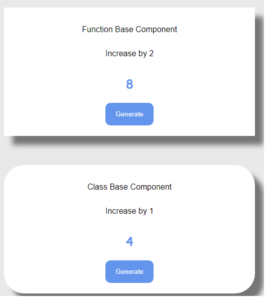
export default ClassCounter;Finally, let’s look at the App.js component. We’ll import the FunctionCounter.js and ClassCounter.js components into the App.js component.
import React from "react";
import ClassCounter from "./ClassCounter";
import FunctionCounter from "./FunctionCounter";
const App = () => {
    return (
    <div>
        <FunctionCounter />
        <br />
        <ClassCounter />
    </div>
    );
};
export default App;
The Class and Function Base Component’s output from our CSS Modules is displayed below.
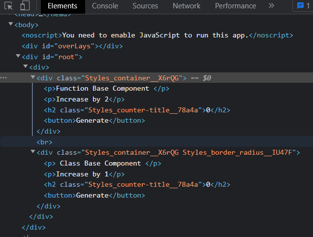
Let’s investigate the browser to observe how the className is formed using a hash obtained from the CSS Modules and see the code on the browser.
Open Source Session Replay
OpenReplay is an open-source, session replay suite that lets you see what users do on your web app, helping you troubleshoot issues faster. OpenReplay is self-hosted for full control over your data.

Start enjoying your debugging experience - start using OpenReplay for free.
Global CSS
Using global CSS is not prohibited by CSS Modules. You may import your stylesheet using the same approach you used to import ES6.
import './App.css'Additionally, you can use the keyword “global” to change the scope of your class so that CSS Modules cannot modify it, such as by appending a random id next to it.
:global(.class) {
    font-family: cursive;
}

:global .button {}
Multiple CSS Modules
Using multiple classes is not restricted by CSS Modules; you can add several classes in the manners described below by using CSS Modules:
<div className={`${classes.container} ${classes.border_radius}`}></div>


function Footer( props) {
    return (
        <div className={styles.section}>
            <div className={`${styles.description} ${styles.black}`}>
                <p>This is my page section </p>
            </div>
        </div>
    );
}
Pseudo class selectors
A selector called pseudo-class picks out items that are in a particular state. Because CSS modules function by giving your items classes, adding pseudo-class selectors is simple.
.button:hover {background-color;: }
.button:disabled {color: #ddd}
.button:active {color: grau}


import classes from "./Button.module.css";
import React, { Component } from "react";
export default class Text extends Component {
    render() {
    return <button className={classes.button}>Text with hover</button>;
    }
}
Conclusion
In this article, we have learned how to use CSS Modules in React Function and Class Base Component. CSS Modules are, in my opinion, an ideal solution for the issues mentioned above. Whatever you decide, don’t let the hoopla deceive you; instead, develop meaningful code. We must all accept that hype will eventually fade. There’s always room to improve this program’s usefulness and your knowledge of CSS Modules.
Repository on Github
Click here to see the finished project on Github.
A TIP FROM THE EDITOR: For a discussion of varied ways of working with CSS in JavaScript, don’t miss our 5 CSS-in-JS Frameworks to use in 2021 article.