

This tutorial will explore how to supercharge your custom drag-and-drop file uploader with Vue.js, taking your web development skills to the next level. “Whether you are an experienced developer or just starting, this tutorial provides the knowledge and tools to create a more efficient and engaging file-uploading experience for your users.

Discover how at OpenReplay.com.
This article is an expanded version of a previous article, Building A Custom File Upload Component For Vue; we’ll show how to add features like file preview, removal, and preventing duplicates to enhance the drag-and-drop component. I suggest reviewing that article so you’ll get more out of this new text.
a BUilding a superficial drop zone
In this part of the guide, we’ll start by revisiting the fundamental concepts of a drop zone. A drop-zone is an area on a web page where users can drag and drop files for uploading. We’ll refresh your understanding of how an essential drop-zone works, including HTML and CSS elements that create this area. This step is crucial because it lays the groundwork for implementing advanced features with Vue.js.
You’ll be better prepared to enhance and customize the drop zone by understanding the basics.
The HTML <input> tag with the ‘file’ type allows drag-and-drop functionality but usually only accepts one file at a time. To enable it to get multiple files, we can simply add the ‘multiple’ attribute (i.e., <input type="file" multiple />), adjust its width as needed, and add a border and padding.
 You’ll agree that this needs to be improved in terms of aesthetics. Instead, we’ll create a similar drag-and-drop file uploader; we’ll still have a file input, but it will be hidden. Then, we’ll create a visible label to allow dragging to the file input. We’ll add another custom event to alter the dragging state and show or delete chosen files.
Creating an advanced drop zone
To start, run the following command to build a new Vue application:
npm init vue@latest dropfileOpen your text editor, then create an empty DropFile.vue file in the src/component directory. Let’s now add this component to our entry file. Replace the contents of App.vue with the following code:
<template>
  <div id="app">
    <DropFile />
  </div>
</template>

<script>
import DropFile from "./components/DropFile.vue";

export default {
  name: "App",
  components: {
    DropFile,
  },
};
</script>
Subsequently, we’ll arrange all of the CSS codes. In the src/assets directory, create a new dropfile.css file and put the following code into it:
.main {
    display: flex;
    flex-grow: 1;
    align-items: center;
    height: 100vh;
    justify-content: center;
    text-align: center;
}

.dropzone-container {
    padding: 4rem;
    background: #f7fafc;
    border: 2px solid #e2e8f0;
}

.hidden-input {
    opacity: 0;
    overflow: hidden;
    position: absolute;
    width: 1px;
    height: 1px;
}

.file-label {
    font-size: 25px;
    display: block;
    cursor: pointer;
}

.preview-container {
    display: flex;
    margin-top: 2rem;
}

.preview-card {
    display: flex;
    border: 2px solid #a2a2a2;
    padding: 6px;
    margin-left: 6px;
}

.preview-img {
    width: 50px;
    height: 50px;
    border-radius: 6px;
    border: 1px solid #a2a2a2;
    background-color: #a2a2a2;
}
Next, we will replace the content in the DropFile.vue file with the following code:
<template>
<div class="main">
<div
class="dropzone-container"
@dragover="dragover"
@dragleave="dragleave"
@drop="drop"
>
<input
type="file"
multiple
name="file"
id="fileInput"
class="hidden-input"
@change="onChange"
ref="file"
accept=".pdf, .jpg, .jpeg, .png"
/>
<label for="fileInput" class="file-label">
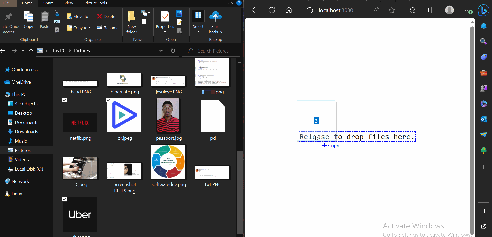
<div v-if="isDragging">Release to drop files here.</div>
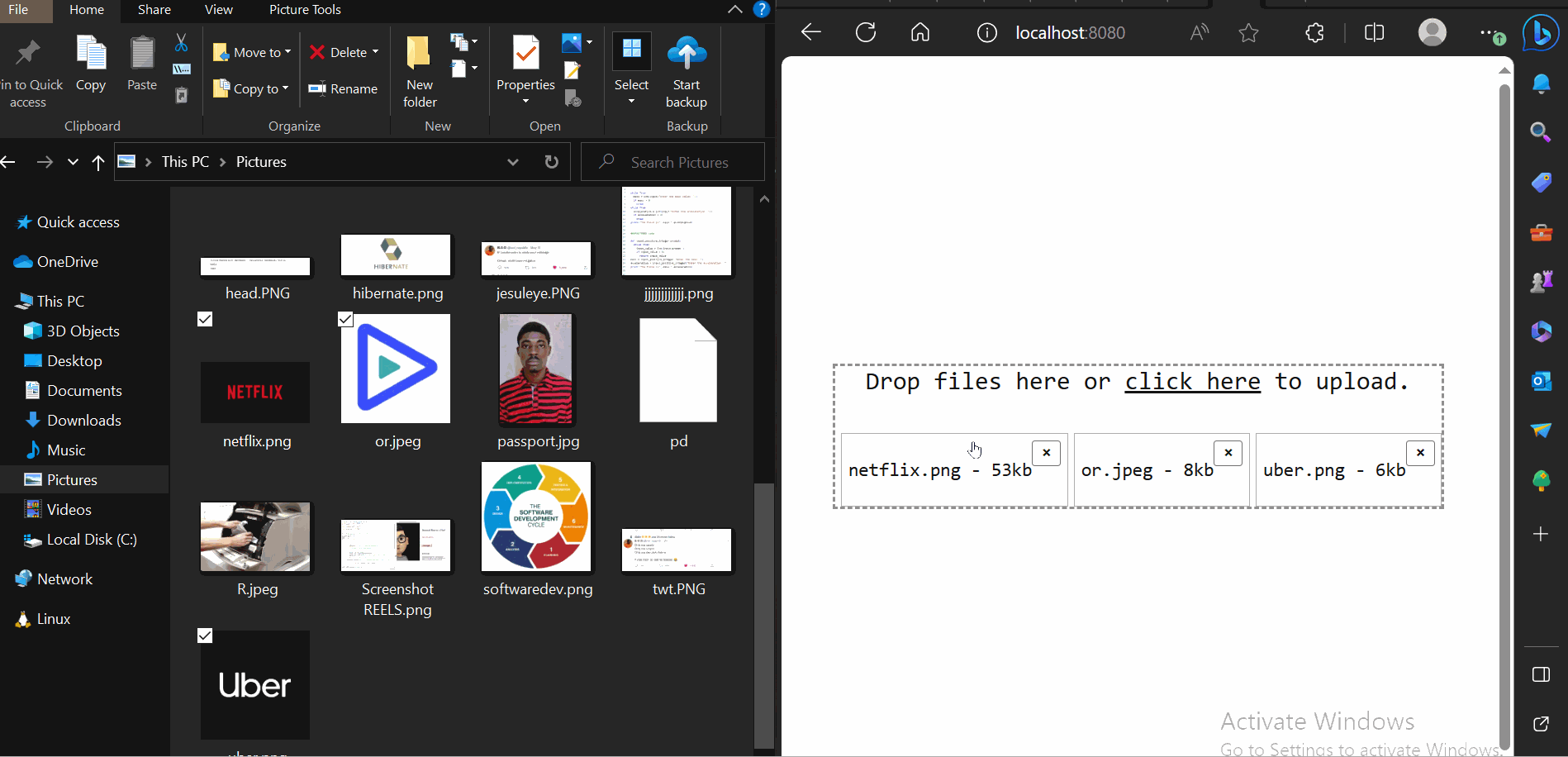
<div v-else>Drop files here or <u>click here</u> to upload.</div>
</label>
</div>
</div>
</template>
<script>
export default {
data() {
return {
isDragging: false,
files: [],
};
},
methods: {
onChange() {
this.files.push(...this.$refs.file.files);
},
dragover(e) {
e.preventDefault();
this.isDragging = true;
},
dragleave() {
this.isDragging = false;
},
drop(e) {
e.preventDefault();
this.$refs.file.files = e.dataTransfer.files;
this.onChange();
this.isDragging = false;
},
},
};
</script>
<style scoped src="@/assets/dropfile.css"></style>In this case, we defined two reactive states: isDragging, Indicate if the user is trying to drag a file onto our drop zone and list the picked or dropped files in an array. The primary file input was then given a special ref to make it more available in our Vue instance. We also included an onChange event, which changes our files array with the files associated with our input.
After that, we added the dragover, dragleave, and drop-methods to the container that held our primary file input. As a result, using the custom ref we defined before, the drop event and method will catch the dropped file and connect it to our file input.
We can also use the dragover and dragleave methods to change the status of isDragging as needed. Finally, we utilized conditional rendering with v-if and v-else to check the status of isDragging and show a different message depending on the state.
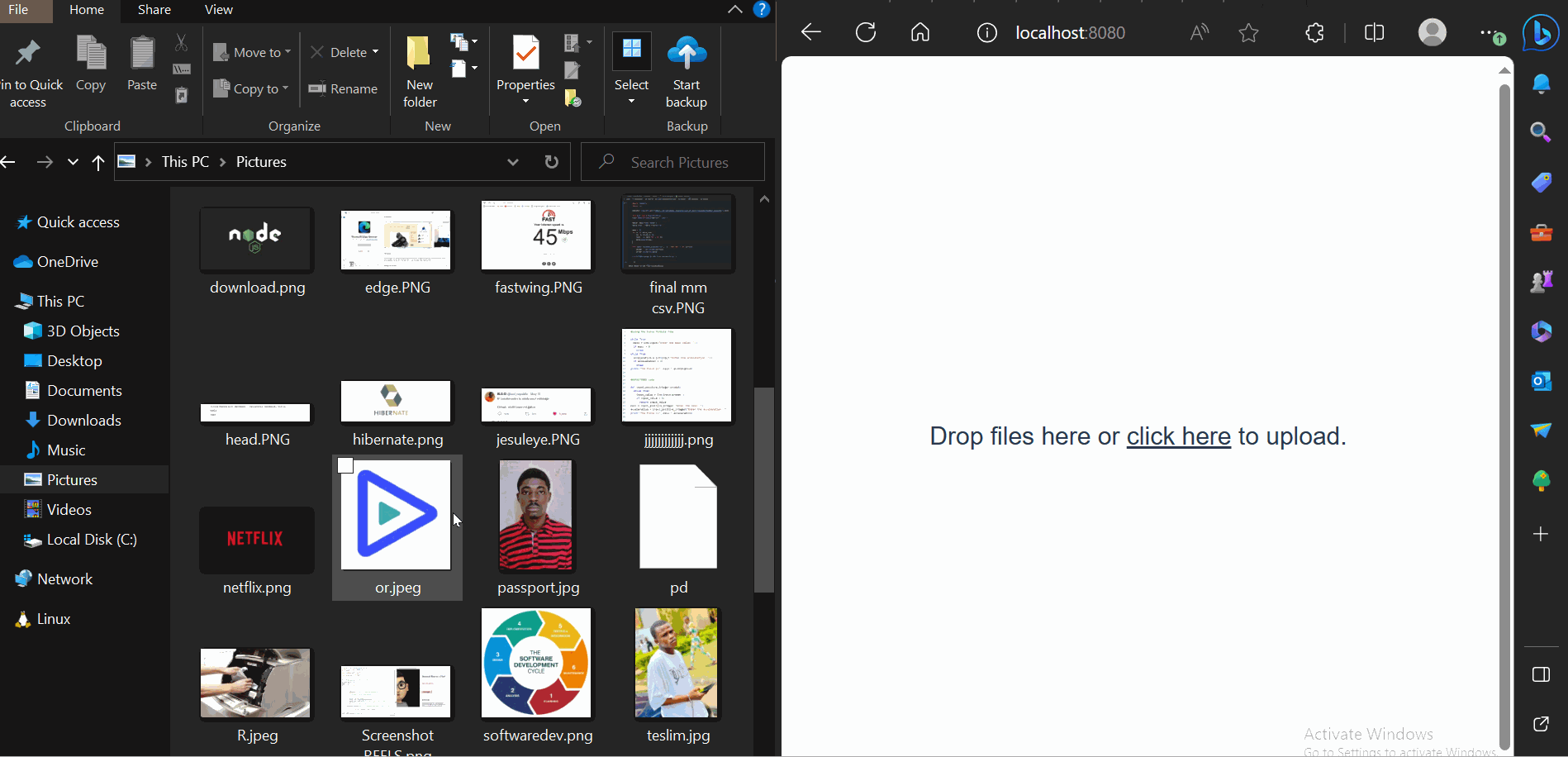
If we run our app now, we should get the following results:
 Although we cannot see the dropped files, they are in the background. To test this, please log these
 .files to the console inside the onChange() function. The array should be recorded to the console whenever you drop or manually pick a file, with each file having the file name, size, last changed date and other associated information.
Improve dragging state
We may change the drop zone border to reflect its current operation state to improve the dragging and dropping experience.
Add the following border styling code to the dropzone-container in the css file:
.dropzone-container {
  /* . . .  */
  border: 3px dashed;
  border-color: #9e9e9e;
}
Next, then you update the dropzone-container markup under the DropFile.vue file to style its border conditionally during the dragging state:
<div class="main">
  <div
    class="dropzone-container"
    @dragover="dragover"
    @dragleave="dragleave"
    @drop="drop"
    :style="isDragging && 'border-color: blue;'"
  ></div>
</div>
With this new update, the drop zone should look like the GIF below, in which the borderline will change to blue when you drag the file to upload:
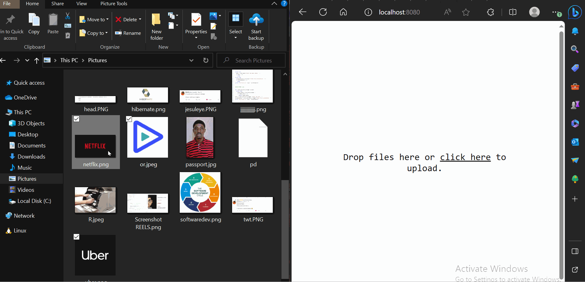
Listing the dropped files
It is simple to preview the files that have been selected and dropped. We’ll need to cycle over our file array. To do so, insert the following code directly after the </label> tag in the preceding code:
<!-- ... -->
</label>
<!-- Note: Only add the code block below -->
<div class="preview-container mt-4" v-if="files.length">
  <div class="preview-cart" v-for="file in files" :key="file.name">

    <div>
      <p>{{ file.name }}</p>
    </div>
    <div>
      <button
        class="ml-3"
        type="button"
        @click="remove(files.indexOf(file))"
        title="Remove file"
      >
        <strong>×</strong>
      </button>
    </div>
  </div>
</div>

</div>
In the code mentioned above, we utilized conditional rendering to determine whether our file array had a valid length. Then, we ran through it all, showing each file name in a paragraph.
The GIF below shows the output of the above code:

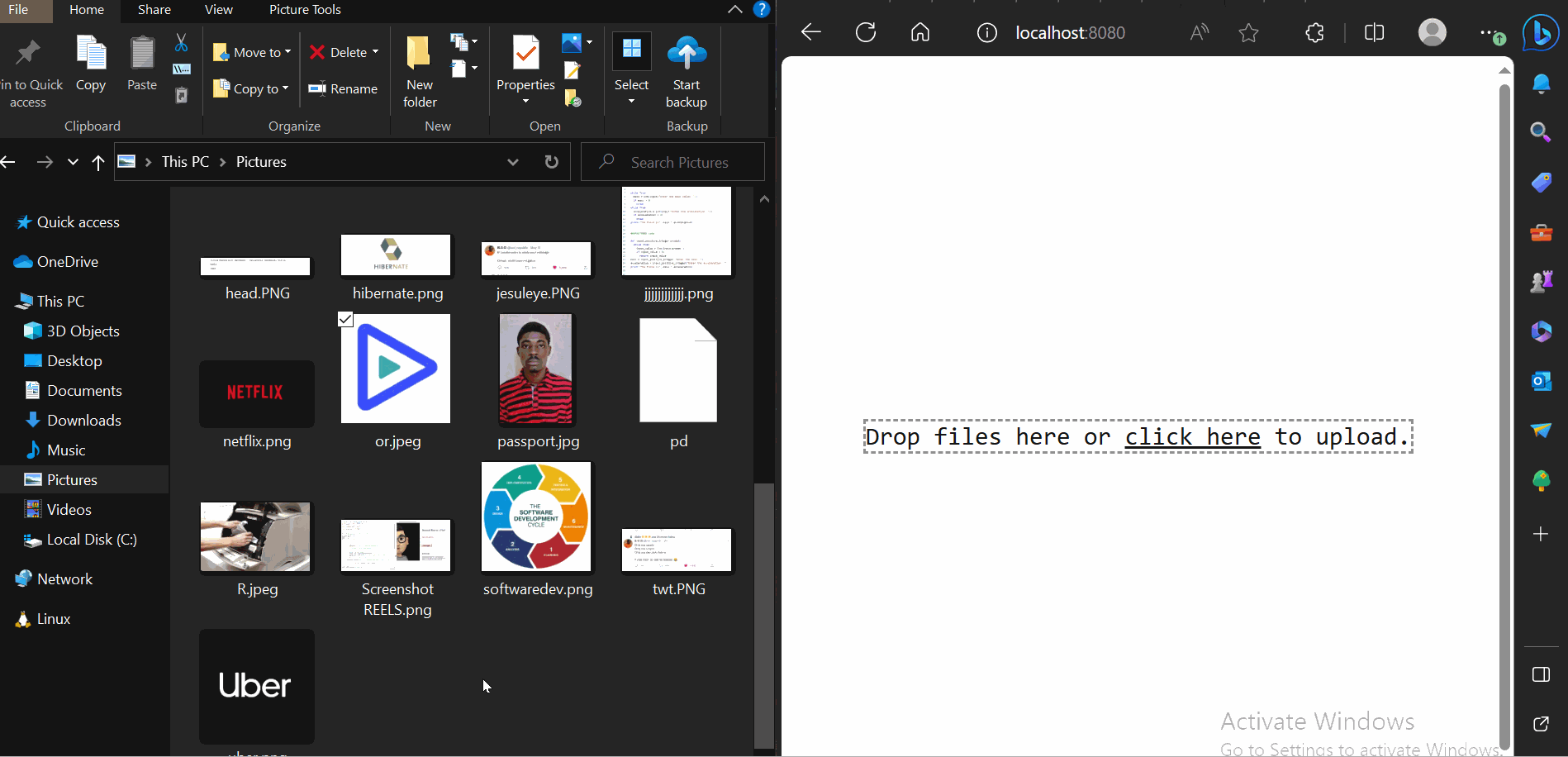
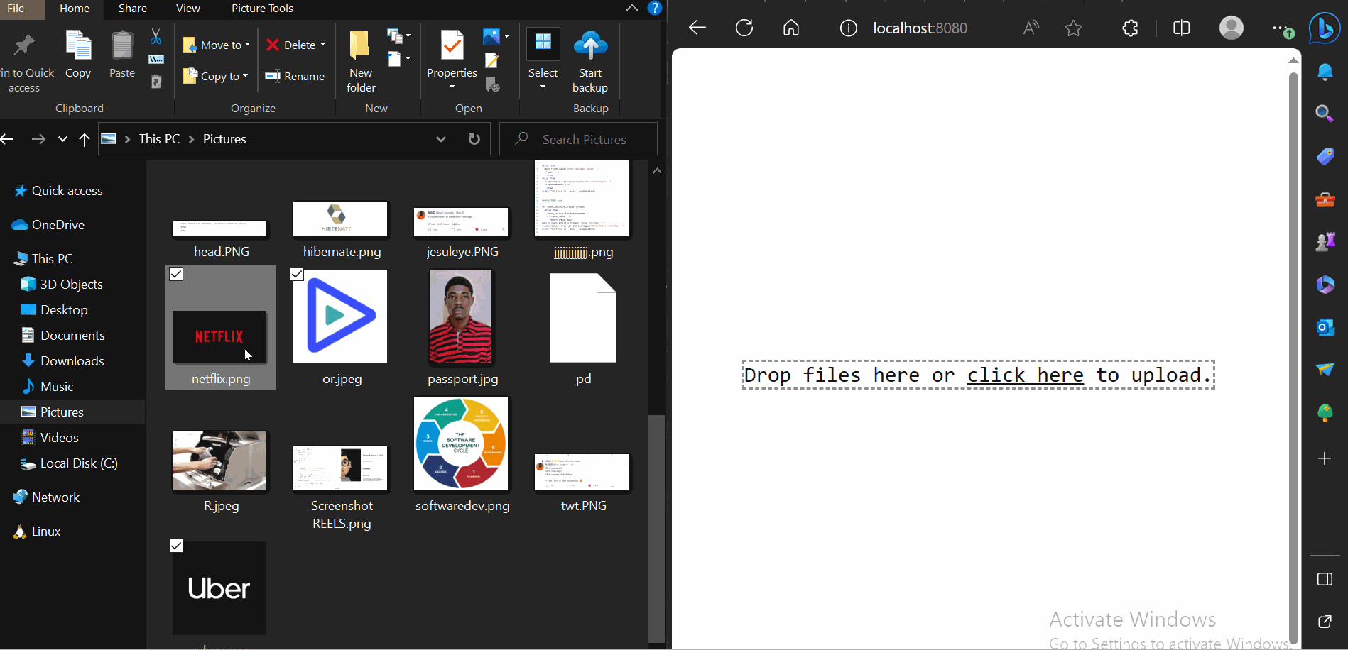
Removing files
You’ll note in the earlier code block that we also added a button to each iterable item, executing a remove() method and supplying the index of the current file as its input. If we start our app now, we should see the selected file names shown as expected and a button to delete them.
Nevertheless, the option to delete selected images still needs to be fixed. To solve this, we will need to attach a new remove() function to all preceding methods:
// ..
remove(i) {
    this.files.splice(i, 1);
},
At this point, everything should work perfectly. We should be able to pick files manually, drag and drop them, view their names, and delete them.
A preview of the output is shown in the GIF below:
Previewing selected image files
Reviewing chosen picture files is an extra feature that will make our drop zone component even more user-friendly. We can do this by constructing an arbitrary URL using the native URL.createObjectURL()method:
// ..
generateURL(file) {
    let fileSrc = URL.createObjectURL(file);
    setTimeout(() => {
        URL.revokeObjectURL(fileSrc);
    }, 1000);
    return fileSrc;
},
To minimize memory loss, it is best to always revoke a URL after generating one with the URL.createObjectURL() function. We’ve included an extra delay to accomplish this automatically after one second.
Next, replace the paragraph <p> tag that displays the names of all chosen or dropped files with the following code:
<img class="preview-img" :src="generateURL(file)" />
<p>{{ file.name }}</p>
And now everything is running! We can now drag and drop files, select them, remove them, and even preview them:
Showing file size
As stated earlier, we have immediate access to each selected file size and its latest changed date. By default, the file size is displayed in bytes., but we can easily divide it by 1,000 to convert it to KB. Add the following code to the section of the file that displays the file name:
<p>{{ file.name }} - {{ Math.round(file.size / 1000) + "kb" }}</p>Each selected file size is now shown beside its name:
 GIF file with name
Preventing duplicate files
Currently, our file drop zone allows us to dump duplicate files. We can compare incoming files to those already in our file array to avoid duplicates. If a duplicate is discovered, a notification will be displayed.
To do so, add the following code to the onChange method:
onChange() {
  const self = this;
  const incomingFiles = Array.from(this.$refs.file.files);

  const fileExist = self.files.some(existingFile =>
    incomingFiles.some(file =>
      file.name === existingFile.name && file.size === existingFile.size
    )
  );

  if (fileExist) {
    self.showMessage = true;
    alert("The new upload contains files that already exist.");
  } else {
    self.files.push(...incomingFiles);
  }
}
Using the above code addition, the drop zone will check if the user attempts to upload an existing file based on its name and size.

Uploading files to the server
Uploading the specified files to the server is simple since they are tied to the file’s state. Although there are other approaches to accomplishing this, utilizing FormData is the most frequent.
The following code demonstrates how we could use FormData with Axios to submit our files to an API or server for processing:
// . . .
uploadFiles() {
    const files = this.files;
    const formData = new FormData();

    files.forEach((file) => {
        formData.append("selectedFiles", file);
    });

    axios({
        method: "POST",
        url: "http://path/to/api/upload-files",
        data: formData,
        headers: {
            "Content-Type": "multipart/form-data",
        },
    });
},
We could then utilize various built-in methods or frameworks on the backend to process the files as needed, but this is outside the article’s purpose and outline.
Conclusion
This tutorial taught us how to use Vue to develop a simple yet interactive drag-and-drop file uploader. Before uploading, we may inspect the titles and sizes of the selected files, preview picture files, and even delete files.