Data Visualization in Vue with Chart.js


In web applications, charts are very useful in creating dashboards for visualizing site data and activities since they help us understand data better than merely looking at numbers and decimals.
Chart.js is an open-source Javascript library that allows developers to draw all kinds of charts using the HTML canvas API. It is simple, lightweight, and very responsive.
Aside from being simple, lightweight, and very responsive, Chart.js is known for its flexibility and swift animation. It also has a large community of support that maintains and updates the library, making it super reliable and efficient.
In this tutorial, we’ll use the Chart.js package to visualize our data.
Setting Up Work Environment
Let’s get started with scaffolding our Vue application without any further ado. With Vue CLI installed globally on your device, run the command below.
vue create vue-chartjsHead over to the official Vue site and install the Vue CLI if you don’t have it installed on your device.
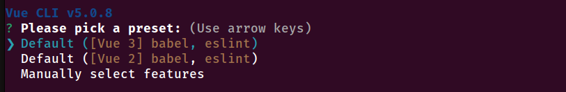
Select the Default Vue configuration, as shown in the image below.
Installing ChartJs
Once the project has been created, change the directory to the project directory and install the ChartJs package.
cd vue-chartjs && yarn add chart.jsFinally, run the application using the command below.
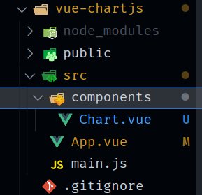
yarn serveWith our package installed, let’s adjust the file structure. Delete the assets/ folder and the HelloWorld.vue file in the components folder and create a new file inside the components folder called Chart.vue. With that done, your file structure should resemble the image below.
Exploring ChartJs
With everything in place, Let’s start building our chart. Paste the code below into the newly created Chart.vue file.
<template>
  <div class="container">
    <canvas id="chart"></canvas>
  </div>
</template>
In the code block above, we’re using the canvas tag from HTML and giving it an id of chart while wrapping it in div with the class of container. The canvas element will be used later on to draw our charts.
Next, let’s import and use the chart.js package.
<script>
import Chart from 'chart.js/auto';

export default {
  name: 'ChartJs',
  props: {
    type: String,
    data: {}
  },
  mounted() {
    const chrt = document.getElementById('chart');
    const chart = new Chart(chrt, {
      type: this.type,
      data: this.data
    });
    chart;
  }
}
</script>
In the code block above, we’re grabbing the canvas element using the id and assigning it the chrt. Next, we’re creating a new instance of the Chart package. We’re also specifying some props, thus making our component dynamic. The process is placed in a mounted hook. This will allow the component to run immediately as the page loads.
Finally, let’s style our container by giving it some height and width.
<style>
.container {
  height: 40rem;
  width: 40rem;
}
</style>
Displaying Charts
With our Chart Component all set, let’s use it by calling and adding some parameters.
Bar Chart
The Bar chart is a candle-stick-like representation of data. Let’s implement this by heading to the App.vue file and replacing the <script> tag with the code below.
<script>
import Chart from './components/Chart.vue'
export default {
name: 'App',
components: {
Chart,
},
data () {
return {
barName: 'Bar Chart',
bar: 'bar',
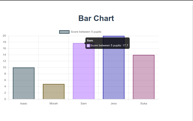
barData: {
labels: ['Isaac', 'Morah', 'Sam', 'Jess', 'Suka'],
datasets: [{
label: 'Score between 5 pupils',
data: [10, 4.8, 17.7, 20, 14],
backgroundColor: [
'rgba(17, 50, 64, 0.4)',
'rgba(94, 72, 0, 0.4)',
'rgba(171, 122, 232, 0.4)',
'rgba(27, 25, 169, 0.4)',
'rgba(141, 47, 108, 0.4)'
],
borderColor: [
'rgba(17, 50, 64, 1)',
'rgba(94, 72, 0, 1)',
' rgba(171, 122, 232, 1)',
'rgba(27, 25, 169, 1)',
'rgba(141, 47, 108, 1)'
],
borderWidth: 2
}]
},
}
},
}
</script>We imported and registered our Chart component in the code block above. We’ve also created the values for our Chart component.
Finally, let’s display our chart.
<template>
  <h1>{{barName}}</h1>
  <Chart :type="bar" :data="barData" />
</template>
Based on the code block above, we’re passing the values created earlier into our Chart component.
With our progress so far, we should be able to achieve the result below.
Session Replay for Developers
Uncover frustrations, understand bugs and fix slowdowns like never before with OpenReplay — an open-source session replay tool for developers. Self-host it in minutes, and have complete control over your customer data. Check our GitHub repo and join the thousands of developers in our community.
Using multiple charts
The Chart.js package comes with many chart types. Let’s get to play around with some.
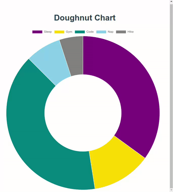
Doughnut Chart
The Doughnut Chart displays data in a round doughnut-like manner similar to the pie chart. Let’s visualize this by pasting the code below into the data hook in the App.vue’s script tag.
data () {
  return {
    ...

    doughnutName: 'Doughnut Chart',
    doughnut: 'doughnut',
    doughnutData: {
      labels: ['Sleep', 'Gym', 'Code', 'Nap', 'Hike'],
      datasets: [{
        label: 'My Daily Activity,
        data: [7, 2.5, 8, 1.5, 1],
        backgroundColor: [
          'purple ',
          'gold',
          'teal',
          'skyblue',
          'grey'
        ],
        borderWidth: 1,
        hoverOffset: 8
      }]
    },
  }
},
Next, Update the <template> tag to the code block below.
<template>
  <h1>{{ doughnutName }}</h1>
  <Chart :type="doughnut" :data="doughnutData" />
</template>
Upon refreshing the Browser, your animated doughnut chart should appear like the gif below.
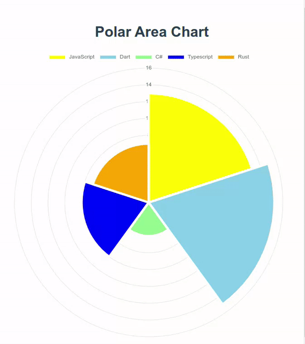
Polar Area Chart Let’s take a look at our final chart, the Polar Area chart. It represents data in a round half-pie-like manner.
data () {
  return {
    ...

    polarName: 'Polar Area Chart',
      polar: 'polarArea',
    polarData: {
      labels: ['JavaScript', 'Dart', 'C#', 'Typescript', 'Rust'],
      datasets: [{
        label: 'Programming Language Strength',
        data: [13, 15, 4, 8, 7],
        backgroundColor: [
          'yellow',
          'skyblue',
          'lightgreen',
          'blue',
          'orange'
        ],
        borderWidth: 5
      }]
    }
  }
},
The data above displays the Programming language strength of a particular developer in a Polar area chart.
Next, update the <template> tag providing the name, type, and data.
<template>
  <h1>{{ polarName }}</h1>
  <Chart :type="polar" :data="polarData" />
</template>
You should see your progress as shown below.
Other Chart Types
ChartJs contain many other chart types that are very useful in data visualization. Below is a list of available chart types in Chart.js.
Conclusion
In this tutorial, we’ve been able to explore the Chart.js package and how to implement it into our Vue project. Many more charts are yet to be implemented, so head over to Chart.js Official Documentation to see more.
Here is the link to the complete source code.
A TIP FROM THE EDITOR: For an alternative to build charts, read our Data Visualization With Google Charts article.
Gain Debugging Superpowers
Unleash the power of session replay to reproduce bugs and track user frustrations. Get complete visibility into your frontend with OpenReplay, the most advanced open-source session replay tool for developers.