
You may come across a scenario where you want to style an HTML structure and you may use up to three to five lines of code for something you can use a single line of code for. Using the 10 different tips in this article can save you stress and time and help you do your work faster with less stress.

Discover how at OpenReplay.com.
Creating Gradient Patterns and Transition Effects
In this section, we’ll cover the repeating-linear-gradient and gradient transition hover effects and how they can be used.
Exploring Infinite Patterns with repeating-linear-gradient
The repeating-linear-gradient CSS property goes further than linear-gradient in the way that it combines or blends two or more colors along a straight path, resulting in a pattern that repeats indefinitely.
The repeating-linear-gradient is often used to style backgrounds, buttons, and borders on a website. It is relevant since it saves time and effort when creating patterns. It provides a less complicated syntax than adding many linear-gradient properties, making it easier to achieve specific design results.
Now, let’s explore an example.
In this example, we’ll see how to use the repeating-linear-gradient as a background-image.
Add this code to your HTML file:
<section>
  <div class="repeating-linear-gradient">
    <h3>Repeating Linear Gradient</h3>
  </div>
</section>
Add this code to your CSS file:
.repeating-linear-gradient {
  border: 1px solid whitesmoke;
  margin: 0 auto;
  padding: 3rem;
  width: 400px;
  height: 400px;
  border-radius: 50%;
  text-align: center;
  color: white;
  background-image: repeating-linear-gradient(
    45deg,
    rgba(119, 9, 85, 0.5) 35%,
    rgb(11, 11, 88) 50%
  );
}
We created a circular element with a repeated-linear-gradient as its background-image. The gradient starts at a 45-degree angle and shifts between 35% purple and 50% dark blue.
Output:
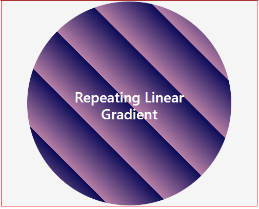
We can see from the output above how the combined colors have been repeated in a particular pattern. The repeating-linear-gradient CSS property can also be used to create button backgrounds, border backgrounds, text backgrounds, and much more.
Creating Smooth Gradient Transitions on Hover
This type of CSS effect is used when you hover over an element, like a button, to change its appearance. The change occurs with a smooth transition between gradient colors.
The gradient transition hover effect is useful because it offers a nice design and interaction with elements, making them more engaging for users. It can be applied to various web page elements, including buttons, links, backgrounds, etc.
I know you know what comes next. yeah? Let’s get into it.
In this example, we will explore how to apply the gradient transition hover effect to a button.
Add this code to your HTML file:
<section>
  <div class="btn-container">
    <button class="btn">Hover Me</button>
    <button class="btn1">Hover Me</button>
  </div>
</section>
Add this code to your CSS file:
.btn-container {
  border: 1px solid red;
  margin: 0 auto;
  width: 400px;
  height: 160px;
  display: flex;
  gap: 20px;
  padding: 40px;
}
.btn,
.btn1 {
  border-radius: 10px;
  width: 200px;
  height: 70px;
  color: white;
  background-size: 200%;
  font-weight: 500;
  transition: 0.6s ease-in;
}
.btn {
  border: 1px solid white;
  background-image: linear-gradient(to left, #c0392b, #e74c3c, #3498db);
}
.btn1 {
  border: 1px solid white;
  background-image: linear-gradient(to left, #34495e, #2c3e50, #27ae60);
}
.btn:hover,
.btn1:hover {
  background-position: right;
}
Here, we defined a background-image for the buttons using linear-gradient, resulting in a gradient transition effect. We also added hover styles for the buttons to smoothly transition the background-image when they are hovered over.
Output:
Controlling Items Wrapping with flex-wrap
With the flex-wrap property, we do not always need to add margin or padding to each item in a container, as it makes it possible to manage the space between items in a container, irrespective of the size of the screen.
We use the flex-wrap property to handle the wrapping behavior of flex items within a flex container, choosing whether they should wrap across several lines or remain on a single line. This property is of great importance since it allows you to create responsive layouts.
Let’s take a look at an example without the use of flex-wrap and see what our result will be.
Add this code to your HTML file:
<section class="container">
  <div>Container 1</div>
  <div>Container 2</div>
  <div>Container 3</div>
  <div>Container 4</div>
  <div>Container 5</div>
</section>
Here, we defined a container with items in it.
Add this code to your CSS file:
.container {
  border: 1px solid red;
  color: white;
  display: flex;
  gap: 10px;
  justify-content: space-between;
  width: 100%;
}
.container div {
  width: 120px;
  height: 50px;
  padding: 10px;
  text-align: center;
  background-color: salmon;
}
Here, we flex the items in the container, giving them a gap of 10px.
Output:
From the output above, you’ll notice at some point there was spillage as the screen got smaller. To avoid that, we’ll add the flex-wrap property.
Now, let’s add the flex-wrap property and see what happens.
Update your CSS file as seen below:
.container {
  /* existing code remains here*/
  flex-wrap: wrap;
}
Output:
Using the flex-wrap property, you’ll notice that even as the screen got smaller, the items adjusted and there was an equal amount of space between them.
Ensuring Element Visibility with scroll-padding-top
The scroll-padding-top property helps to add space to the top of an element that is scrolled to, so that it won’t be covered up by other elements, such as a fixed navigation menu.
This property is important for creating smooth scrolling interactions and making sure the content being scrolled to is not hidden by a fixed navigation menu or other elements at the top of the webpage.
The illustration below demonstrates the top of an element covered up when it is scrolled to.
To avoid this, we’ll use the scroll-padding-top property to add a space at the top of each heading.
Enter the following code into your HTML file:
<section class="scroll-container mt-5">
  <div class="navLinks p-2">
    <p (click)="scrollTo(homeSection)">Home</p>
    <p (click)="scrollTo(contactSection)">Contact</p>
    <p (click)="scrollTo(aboutSection)">About</p>
  </div>
  <div class="p-4 mt-5" #homeSection>
    <h3>Home</h3>
    <p>
      Lorem ipsum dolor sit amet consectetur, adipisicing elit. Nesciunt tempora
      voluptatum repellat distinctio aliquam laboriosam accusamus enim earum
      delectus in beatae deserunt eligendi, laudantium necessitatibus quisquam
      perferendis ipsum rem id quod tenetur, ea eaque dignissimos harum amet.
      Doloribus aliquid recusandae laudantium sunt necessitatibus, molestiae,
      quidem nisi voluptates, cum et quas? Lorem ipsum dolor sit amet,
      consectetur adipisicing elit. Et distinctio repellendus, totam magnam
      iusto ex, ad reprehenderit quae dolore ab excepturi placeat tenetur unde
      amet fugiat expedita minus dolor velit!
    </p>
  </div>
  <div class="p-4" #contactSection>
    <h3>Contact</h3>
    <p>
      Lorem ipsum dolor sit amet consectetur, adipisicing elit. Nesciunt tempora
      voluptatum repellat distinctio aliquam laboriosam accusamus enim earum
      delectus in beatae deserunt eligendi, laudantium necessitatibus quisquam
      perferendis ipsum rem id quod tenetur, ea eaque dignissimos harum amet.
      Doloribus aliquid recusandae laudantium sunt necessitatibus, molestiae,
      quidem nisi voluptates, cum et quas? Lorem ipsum dolor sit amet,
      consectetur adipisicing elit. Et distinctio repellendus, totam magnam
      iusto ex, ad reprehenderit quae dolore ab excepturi placeat tenetur unde
      amet fugiat expedita minus dolor velit!
    </p>
  </div>
  <div class="p-4" #aboutSection>
    <h3>About</h3>
    <p>
      Lorem ipsum dolor sit amet consectetur, adipisicing elit. Nesciunt tempora
      voluptatum repellat distinctio aliquam laboriosam accusamus enim earum
      delectus in beatae deserunt eligendi, laudantium necessitatibus quisquam
      perferendis ipsum rem id quod tenetur, ea eaque dignissimos harum amet.
      Doloribus aliquid recusandae laudantium sunt necessitatibus, molestiae,
      quidem nisi voluptates, cum et quas? Lorem ipsum dolor sit amet,
      consectetur adipisicing elit. Et distinctio repellendus, totam magnam
      iusto ex, ad reprehenderit quae dolore ab excepturi placeat tenetur unde
      amet fugiat expedita minus dolor velit!
    </p>
  </div>
</section>
Add the following CSS code:
.scroll-container {
  border: 1px solid red;
  background-color: #d35400;
  margin: 0 auto;
  width: 500px;
  height: 300px;
  overflow-y: auto;
  color: white;
  scroll-padding-top: 50px;
}
.navLinks {
  border: 1px solid whitesmoke;
  position: fixed;
  width: 480px;
  display: flex;
  justify-content: space-evenly;
  background-color: white;
  color: black;
  font-size: 18px;
  font-weight: 600;
}
.navLinks p {
  cursor: pointer;
}
With the scroll-padding-top property added to the scroll-container, the headings of each section scrolled to will no longer be covered.
Output:
Exploring Color Mixing with color-mix() and Ensuring Element Size Limits with clamp()
In this section, we’ll look at what each of these CSS functions is and how to use them.
Let’s take a look at what the color-mix() function entails.
Using the color-mix() Function
color-mix() is a CSS function that is used to create color harmonies on a website. We use this function to blend or mix two colors. You can apply the color-mix() function to a background, text, or even a border.
This function is essential, as it helps developers easily build challenging color combinations.
The color-mix() function syntax is as follows:
color-mix(in hwb, white 20%, orange);Syntax explanation:
in hwb: This stands for the color model we want our resulting mixed color to be in. So in place ofhwb, you can usehslor any other color model of your choice.white 20%: This is the first color we want to start with.20%is the percentage of the first color we want to mix.orange: This is the color we want to blend or mix with. A percentage can also be added toorange.
Let’s look at an example where this function can be applied:
In your HTML file, add this:
<div class="colorMix p-4"></div>In your CSS file, add this code:
.colorMix {
  border: 10px solid color-mix(in hwb, #d35400 50%, #2c3e50);
  background-color: color-mix(in hwb, #9b59b6 40%, #16a085);
  font-size: 20px;
  margin: 0 auto;
  width: 350px;
  height: 350px;
  border-radius: 50%;
}
What we did above was add the color-mix() function to both the border and background-color properties of the colorMix CSS class.
This is what it’ll result in:
Using the clamp() Function
The clamp() function allows us to provide a range of numeric values to resize elements depending on the size of a screen or page. It’s just like saying a property should not go above a set value or below another set value, no matter the size of a web page.
It can be used in CSS properties such as width, height, font-size, margin, padding, and so much more.
The clamp() function is helpful as it helps to maintain your website’s appearance on different devices by ensuring that items remain under specific size restrictions.
clamp() syntax:
clamp(min-value, preferred-value, max-value);Syntax explanation:
- The
min-valuerepresents the minimum value a CSS property can take. It means it will not receive a lesser value. - The
preferred-valueis the value the property will take if the size of a screen falls in between themin-valueandmax-value. - The
max-valueis the maximum value the CSS property can take. It means it will not receive a higher value.
Let’s see an example where clamp() is used. In this example, we’ll resize the font-size of the h3 and p elements depending on the screen size.
In your HTML file, add this code:
<div class="p-5">
  <h3>The Clamp CSS Function</h3>
  <p>
    Lorem ipsum dolor sit amet consectetur adipisicing elit. Soluta laboriosam
    voluptatem blanditiis necessitatibus nobis! Saepe a expedita optio quam vel
    sunt possimus odit nam assumenda aliquam iusto inventore unde placeat
    incidunt fugiat nulla, reiciendis voluptas, cumque eius qui perspiciatis eos
    aut dolor omnis! Corporis dolores repellendus, cupiditate rerum unde ducimus
    consequatur debitis inventore numquam, sunt sapiente, ullam dolorem! Aut
    iusto optio animi omnis neque vero, placeat unde rerum exercitationem illo
    quos tenetur fugiat. Delectus dignissimos earum nemo quae, fuga
    exercitationem deleniti pariatur, ut dolorem repellendus porro magni tempora
    laudantium aut libero dolor. Optio veniam ut corrupti, quod numquam non
    quam.
  </p>
</div>
In your CSS file, enter this code:
h3 {
  font-size: clamp(48px, 10vw, 98px);
}
p {
  font-size: clamp(16px, 5vw, 32px);
}
Code breakdown:
- For
h3,48pxis themin-value,10vw, which is 10% of any viewport size, is the preferred value, and98pxis the maximum value. - Still on
h3, If the viewport size is1000px, the preferred value will be100pxexceeding themax-value. As a result, thefont-sizeofh3will stay at98px. But if the viewport size is300px, the preferred value will be30pxfalling below themin-value. As a result, thefont-sizeofh3will stay at48px. This means thefont-sizeofh3cannot go above themax-valueor below themin-value.
Output:
Customizing Dialog Appearance with the ::backdrop Pseudo-Element
The ::backdrop pseudo-element is the background that appears behind a dialog box. The ::backdrop pseudo-element, when used, covers the parent page of the dialog box.
You can change the appearance of the ::backdrop pseudo-element, such as color or transparency, to improve the look and user experience of dialogs. This property is particularly beneficial for generating stylish and user-friendly interfaces in web applications.
Let’s look at an example.
In your HTML file, enter this code:
<section>
  <button (click)="openPopUpBox()">Open pop-up box</button>
  <dialog *ngIf="showPopUp" class="modal">
    <p class="modalContent">
      Lorem ipsum dolor sit amet consectetur adipisicing elit. Perspiciatis
      dolor, nobis neque accusantium deserunt a rerum inventore enim beatae. Id
      qui hic est laborum accusantium asperiores consectetur similique assumenda
      eius voluptatem, optio magni officia nulla ad. Odio error blanditiis
      reiciendis.
      <button class="mt-3" (click)="closePopUpBox()">Close</button>
    </p>
  </dialog>
</section>
Code breakdown:
- When the first button is clicked, it calls the
openPopUpBoxfunction, which shows the dialog box. - The dialog element contains the content that will be shown in the dialog. It only pops up if the value of
showPopUpis true.
In your JavaScript file, add the following code:
 showPopUp: boolean = false;

  openPopUpBox() {
    this.showPopUp = true;
  }
  closePopUpBox() {
    this.showPopUp = false;
  }
In the code above, we defined two functions for opening and closing the dialog box.
In your CSS file, enter this code:
.modal {
  position: fixed;
  left: 0;
  top: 0;
  right: 0;
  bottom: 0;
  display: flex;
  align-items: center;
  justify-content: center;
}
::backdrop {
  --backdrop: color-mix(in hsl, white 20%, blue);
}
dialog::backdrop {
  background: var(--backdrop);
}
.modalContent {
  width: 518px;
  height: 220px;
  border-radius: 10px;
  padding: 2rem;
  background-color: #ffffff;
}
In the code above, we style a dialog box with a ::backdrop pseudo-element using the color-mix() function to blend colors.
The resulting output will be as follows:
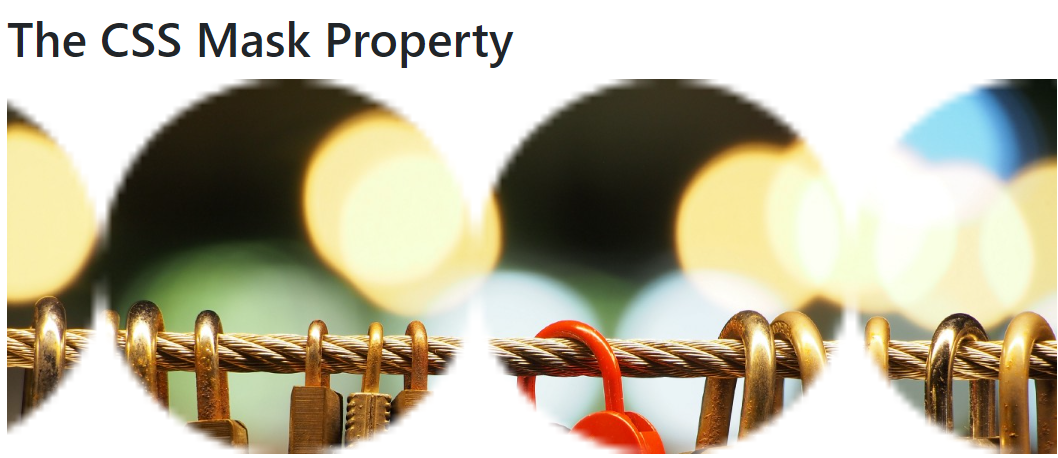
Concealing Portions of Elements with the mask Property
The CSS mask property is used to cover specific portions of an element. Masking acts similar to a background image. You can use an image, shape, or gradient as your mask.
This property is important since it allows you to monitor the visibility of elements depending on shapes or images. This can be handy for creating custom shapes or showing sections of an image.
We’ll go through an example where we’ll mask an image with another image.
In your HTML file, enter this code:
<section class="p-4">
<h1>The CSS Mask Property</h1>
<main class="mt-3">
<div class="maskImg">
<img src="../../../assets/img1.jpeg" alt="img1" />
</div>
</main>
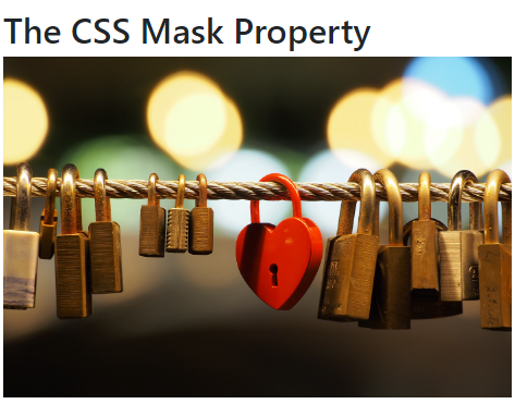
</section>The above code specifies the image we want to mask.
It’ll result in this:
Let’s add these mask properties to our CSS file as follows:
.maskImg {
  --webkit-mask-image: url(../../../assets/johnEmma.png);
  mask-image: url(../../../assets/johnEmma.png);

  --webkit-mask-position: top center;
  mask-position: top center;

  --webkit-mask-repeat: repeat-x;
  mask-repeat: repeat-x;

  --webkit-mask-size: 500px;
  mask-size: 500px;

  object-fit: cover;
  width: 100%;
}
Code breakdown:
- We used the
--webkit-prefix because themaskproperties may not be compatible with your choice of browser. - The
mask-imagedefines the image that will serve as themasklayer. - The
mask-positionproperty sets the position of the masked image to thetop-centerof the element. - The
mask-repeatdefines if the image to be masked will be repeated. Here, we specified it to be repeated towards the x-axis, which is horizontal. - The
mask-sizedefines the size of themaskimage.
Here is the output:
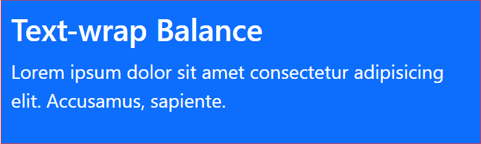
Achieving Text Balance with the text-wrap Property
The text-wrap property solves the problem of text not being balanced on a web page. So, what this property does is make the browser check the number of words you have in your text container, and when it does, it keeps the text balanced on the correct number of lines.
It helps to improve the ease of reading and appearance of text-filled content by retaining correct positioning and space around floated elements.
For example, the text below, which does not have a text-wrap balance property, will look as follows:
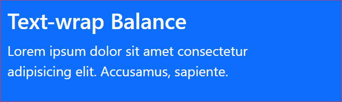
Let’s add a text-wrap balance property to see how the text form will change.
Add this code to your HTML file:
<div class="border border-danger textWrap bg-primary text-white p-2">
  <h3>Text-wrap Balance</h3>
  <p class="f-4">
    Lorem ipsum dolor sit amet consectetur adipisicing elit. Accusamus,
    sapiente.
  </p>
</div>
In your CSS file, add:
.textWrap {
  max-width: 400px;
  text-wrap: balance;
  margin: 0 auto;
}
In the code above, we added the text-wrap property to the p element, making it balanced on both lines.
This will be the output:
Avoiding Manual Counting with CSS counters
With CSS counters, we can dynamically add numbers to our content. It can also be used to count the number of elements in a section of a web page.
It is useful for dynamically counting or labeling content, such as ordered lists or sections in a document, avoiding the need for manual counting.
Let’s take a look at an example.
The following are properties we should take note of when using counters:
counter-reset: This property makes thecounterstart from a specified value. Yourcounter-resetvalue can start from any number, and it is not compulsory to use the default number, which is0.counter-increment: This property increments thecounterfor each element in the list.content: This property displays thecounter.
In your HTML file, enter this code:
<div class="border border-danger bg-primary text-white p-2">
  <h3>Counters</h3>
  <ol>
    <li>Beans</li>
    <li>Dauwa</li>
    <li>Bacon</li>
    <li>Berries</li>
    <li>Okpa</li>
    <li>Onion</li>
  </ol>
</div>
In your CSS file, enter this code:
ol {
counter-reset: foodType;
list-style-type: none;
}
li {
counter-increment: foodType;
}
li::before {
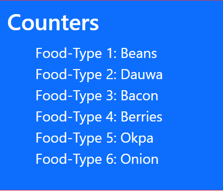
content: "Food-Type " counter(foodType) ": ";
}The value foodType represents the name of our counter, and it starts counting from 0 since we did not give a specific number for it to start counting from.
Output:
Adding Depth with drop-shadow and Shaping Text Layouts with shape-outside Property
In this section, we’ll look at what each of these properties is and how to use it.
Let’s look at what the drop-shadow CSS property entails.
Applying the drop-shadow Effect
The drop-shadow property is used to apply a drop-shadow effect to an element. It can be applied to elements like images, buttons, and text to enhance the entire look and user experience.
Let’s look at how a drop-shadow effect can be added to an image.
Add this code to your HTML file:
<section>
  <div class="drop-shadow-container p-2">
    <img src="../../../assets/illustration.svg" alt="illustration" />
    <img src="../../../assets/illustration.svg" alt="illustration" />
  </div>
</section>
Add this code to your CSS file:
.drop-shadow-container {
border: 1px solid red;
background-color: salmon;
text-align: center;
}
.drop-shadow-container img {
padding: 20px;
width: 20%;
}
.drop-shadow-container img:last-child {
filter: drop-shadow(5px 8px 12px red);
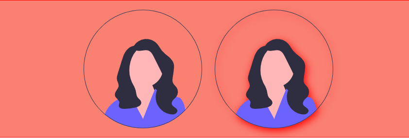
}In the example above, we have two identical images, but the last image is the one with a drop-shadow effect.
Apart from images, the drop-shadow property can also be used on modals, backgrounds, texts, cards, and many more elements.
Output:
Implementing the shape-outside Property
The shape-outside CSS feature comes in handy when you’re dealing with a whole bunch of text, especially when the text is within an image.
It is used to wrap text around certain shapes, such as a circle, resulting in more flexible and stylish layouts. It is useful for creating text that flows around images and more complex text arrangements.
Let’s look at an example of paragraph text that is wrapped around an image.
Enter the HTML code below:
<section class="shape-outside-container">
  <h2>Shape Outside</h2>
  <div>
    <img
      class="shape-outside-img"
      src="../../../assets/illustration.svg"
      alt="illustration"
    />
    <p>
      Lorem ipsum dolor sit amet consectetur adipisicing elit. Temporibus omnis
      iste odio perspiciatis hic officia delectus vel enim labore sint, id nulla
      cumque voluptas porro, voluptatem nostrum fugiat modi! Nobis dolorum
      necessitatibus, voluptates voluptate non quas ipsum in? Ipsum vel
      cupiditate consequatur alias veniam voluptate provident iste excepturi
      consectetur, fugit suscipit quasi qui laudantium nesciunt fuga placeat
      deleniti quod neque id facilis ex voluptates, ullam rerum. Dicta odit
      perspiciatis quod repellat dolor. Voluptas est rem debitis atque nemo
      possimus. Inventore. Lorem ipsum dolor sit, amet consectetur adipisicing
      Lorem ipsum dolor sit amet consectetur adipisicing elit. Mollitia incidunt
      neque autem eos, esse tempora eligendi nemo fugit inventore quisquam vel
      rem id recusandae ex nesciunt! Neque fugiat nihil quasi.
    </p>
  </div>
</section>
Enter the following CSS code:
.shape-outside-container {
border: 1px solid red;
padding: 2rem;
background-color: salmon;
color: white;
font-size: 25px;
}
.shape-outside-container img {
width: 20%;
}
.shape-outside-img {
width: 300px;
height: 300px;
float: left;
margin: 53px 0 0 4px;
shape-outside: content-box circle(115px at 150px 150px);
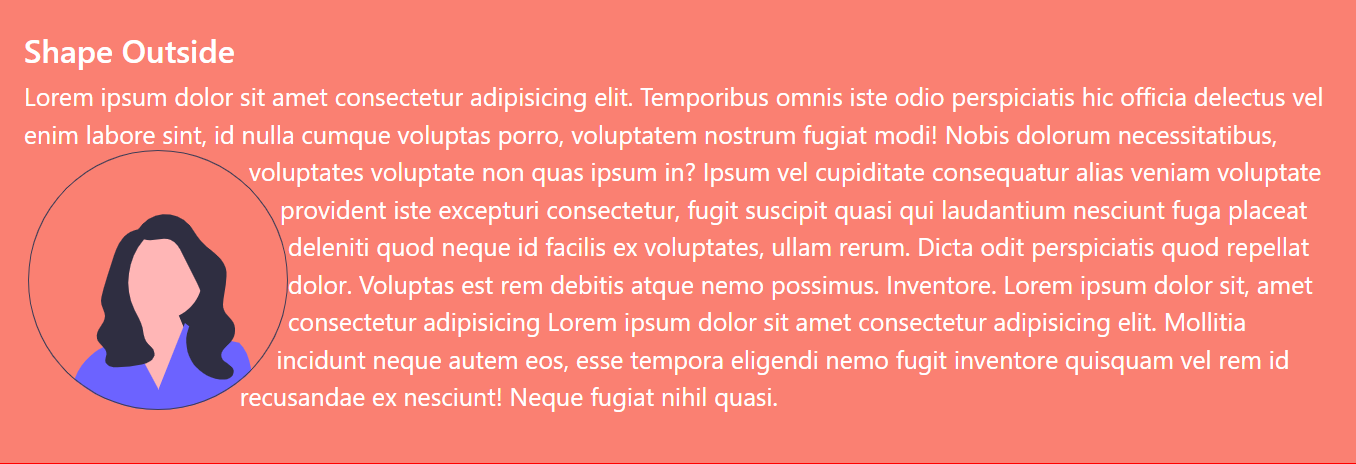
}In the code above, we used the shape-outside property to make the text wrap around the image.
Here’s an example of the shape-outside property in action:
Understanding the :has() and :is() Pseudo-Classes for Element Interaction
Pseudo-classes are keywords in CSS that give an element, like a button or text, extra interactivity. Some examples of pseudo-classes include: :hover, :has, :is, and :active.
Styling Elements Based on Their Contents with the :has() Pseudo-Class
The :has() pseudo-class selects and adds styles to a parent element based on the presence of a child element. This goes to say that two or more parent elements can have the same CSS selector name, and then we can select and style any of the parent elements based on the presence of their child elements.
It can be used in a lot of scenarios, like styling a parent element if it has a certain type of child element or applying a font-size to a div if it contains a button.
Let’s look at an example of where the :has pseudo-class can be used.
In your HTML file, enter the following code:
<section class="has-pseudo-container">
  <div class="has-pseudo-example">
    <p>
      Lorem ipsum dolor sit amet consectetur, adipisicing elit. Odit dolores
      atque eveniet magnam, fuga aperiam libero modi temporibus porro
      asperiores. Accusamus deserunt excepturi soluta sit eum recusandae
      repellendus pariatur corrupti!
    </p>
    <button>Click Me</button>
  </div>
  <div class="has-pseudo-example">
    <img src="../../../assets/johnEmma.png" alt="" />
    <p>
      Lorem ipsum, dolor sit amet consectetur adipisicing elit. Odio maiores
      optio dolor commodi voluptas provident ab illo corporis explicabo a!
      Praesentium dicta dignissimos fugiat nobis officia ipsum, sapiente
      perferendis ducimus.
    </p>
  </div>
</section>
In your CSS file, enter the following code:
.has-pseudo-container {
border: 1px solid red;
width: 800px;
height: 300px;
display: flex;
gap: 20px;
margin: 0 auto;
}
.has-pseudo-example {
padding: 25px;
}
.has-pseudo-example:has(button) {
background-color: #7f8c8d;
text-align: justify;
font-size: 16px;
font-family: "Gill Sans", "Gill Sans MT", Calibri, "Trebuchet MS", sans-serif;
}
.has-pseudo-example:has(img) {
background-color: #e74c3c;
color: white;
font-size: 18px;
font-family: Verdana, Geneva, Tahoma, sans-serif;
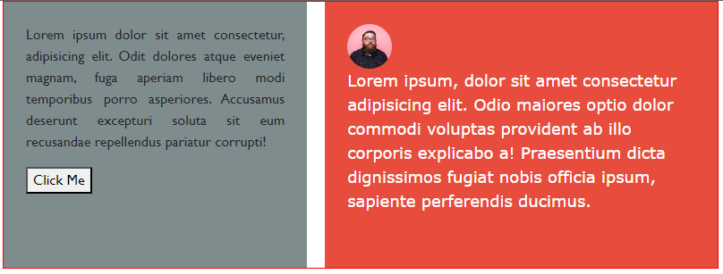
}We added the :has pseudo-class to parent elements having the same class name but styled differently based on their child element. For the first parent element, we checked if it had a button element before we gave it styles, and for the other parent element, we checked if it had an img element before styling it.
Output:
With the :has pseudo-class, we can go further by styling the child element. So, if we want to design the button on the first parent element, we may do the following:
.has-pseudo-example:has(button) > button {
  border: 1px solid salmon;
  background-color: salmon;
  color: white;
  font-size: 14px;
}
What the code does is check for the parent element that has a button element, then style the button element.
Simplifying Element Selection with the :is() Pseudo-Class
The :is pseudo-class helps us select multiple child elements of the same parent element and give them the same styles.
It is useful for simplifying CSS selectors, especially when you have to deal with several selectors that have similar styles.
If you have styled different descendants of a parent element as follows:
.is-container h1,
.is-container p,
.is-container button {
  background-color: salmon;
}
Then, you now have a better way of doing that by using the :is CSS pseudo-class.
Supposing we want to give the p, h5, and button elements of a particular parent element the same background-color, we can do that using the :is pseudo-class as follows:
<section>
  <div class="is-container">
    <h5>The :is CSS Pseudo Class</h5>
    <p>
      Lorem ipsum dolor sit, amet consectetur adipisicing elit. Animi totam id
      sint itaque fugiat neque, laborum doloribus alias modi cumque optio
      reiciendis maxime at possimus quis perferendis magni, dignissimos
      exercitationem.
    </p>
    <button>Click Me</button>
  </div>
</section>
Add the following CSS code:
.is-container {
  border: 1px solid red;
  background-color: salmon;
  margin: 0 auto;
  width: 400px;
  height: 250px;
  padding: 20px;
}
.is-container button {
  border: 1px solid rgb(0, 15, 15);
  background-color: rgb(0, 15, 15);
  font-size: 12px;
}
.is-container :is(h5, p, button) {
  text-align: center;
  color: white;
}
In the code above, we used the :is pseudo-class to select and style elements from the same parent element, giving them the same styles.
Output:
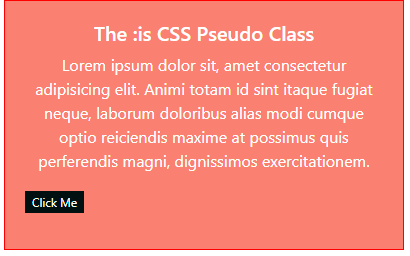
We can see how it was very easy using the :is pseudo-class to select as many elements of the same parent and style them instead of calling them separately.
Conclusion
We’ve come a long way, having seen some CSS tricks and the practical ways they can be applied. There’s no limit to what we can do with CSS and how it can make the life of a developer less stressful.
Truly understand users experience
See every user interaction, feel every frustration and track all hesitations with OpenReplay — the open-source digital experience platform. It can be self-hosted in minutes, giving you complete control over your customer data.
Star on GitHub12k