CSS - Implementing Responsive Masonry Layouts
Learn how to do modern masonry layouts with CSS


Masonry layout is a design approach that arranges elements in a staggered manner. It positions each element based on the available space, like a mason laying bricks. The result? An asymmetrical grid that breaks free from the rigid constraints of traditional layouts. This fluid arrangement resonates particularly well with modern web design aesthetics, and this article will show you how to achieve these results.

Discover how at OpenReplay.com.
Masonry layouts have gained appeal due to their striking visual appeal. They also adapt to different screen dimensions, ensuring a consistent and compelling presentation.
To appreciate Masonry layouts, it’s essential to contrast them with traditional layouts. Traditional layouts sometimes limit creativity and fail to optimize space. Masonry layouts offer a more flexible canvas for designers to express their creativity. In this practical guide, we will create a responsive Masonry layout. We will delve into the principles of Masonry layouts, implementation, and advanced styling techniques. We will also discuss what makes them a valuable asset for various design scenarios.
Masonry Layout Principles
Before discussing the characteristics of Masonry layouts, let’s check out where they truly shine:
- Image galleries: Have you ever wondered how those Pinterest boards look so cool? Masonry layouts are the secret sauce behind photo galleries that feel alive. Without boring, rigid grids, images find their natural rhythm. Masonry layouts create a visual feast as dynamic as the photo collection.
- Portfolios: Designers, artists, and creators, this one’s for you! Showcase your best work in a way that feels curated and dynamic. Using Masonry layouts transforms your portfolio into an immersive experience.
- Content-heavy websites: Got a blog or a content-heavy website? Masonry layouts remove the monotony of endless scrolling through uniform posts. The layout adapts to the size and type of each piece, making your website a joy to explore.
Characteristics of Masonry Layout
-
Variable height: Each element has its own height, creating a dynamic rhythm. It’s like giving your layout a personality, where each piece contributes to the design.
-
Staggered appearance: Masonry layouts introduce a staggered look where items aren’t perfectly aligned. This look is interesting and a tad unpredictable, making your layout far from ordinary.
-
Adaptive design: Masonry Layouts adapt like chameleons. Whether your users are on a large screen or a tiny smartphone, the layout adjusts to it. It’s the secret for a consistent and delightful user experience across all devices.
Setting up the HTML Structure
So let’s get into it. First, we’ll write the HTML code:
<div class="masonry-container">
  <div class="masonry-item">
    <img src="image-file-path" />
  </div>
  <div class="masonry-item">
    <img src="image-file-path" />
  </div>
  <div class="masonry-item">
    <img src="image-file-path" />
  </div>
  <div class="masonry-item">
    <img src="image-file-path" />
  </div>
  <!-- Replace image-file-path with the actual path to your image file -->
  <!-- Add more items as needed -->
</div>
This code adds the layout items. Fill in the src with the actual path to your preferred images.
For a Masonry component in React, use this code:
import MasonryContainer from './MasonryContainer';

const YourMainComponent = () => {
  // Create an array of items, each with an id and image source
  const items = [
    { id: 1, imageUrl: 'image1.jpg' },
    { id: 2, imageUrl: 'image2.jpg' },
    { id: 3, imageUrl: 'image3.jpg' },
    // Add more items as needed
  ];

  return (
    <div>
      <h1>Main Component</h1>
      <MasonryComponent items={items} />
    </div>
  );
};

export default YourMainComponent;
Here, we include the data in the parent component and pass it down to the Masonry component.
In the Masonry component:
const MasonryComponent = ({ items }) => {
  return (
    <div className="masonry-container">
      {items.map((item) => (
        <div key={item.id} className="masonry-item">
          <img src={item.imageUrl}/>
        </div>
      ))}
    </div>
  );
};

export default MasonryContainer;
The output is the same for plain HTML and React:
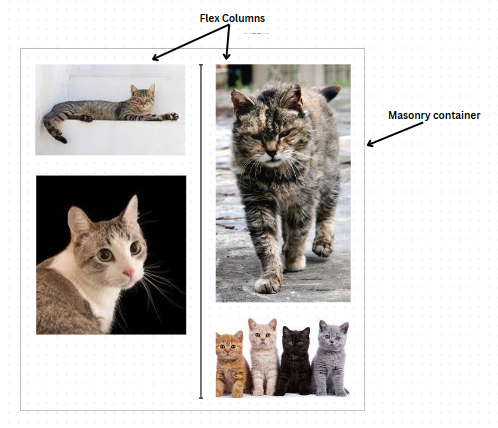
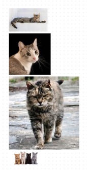 Here, we have random images of varying heights and widths. This is a perfect situation to use a Masonry layout.
Implementing Masonry Layout with CSS
To create a Masonry Layout with CSS, we can use CSS Columns, CSS Flexbox, or CSS Grid. Each technique offers its unique advantages. Let’s try to understand their workings, differences, and when to use which.
CSS Columns
CSS Columns provide a straightforward way to create a multi-column layout. With column-count, we can distribute items across columns based on the available space. CSS columns are simple to achieve but have certain limitations. We have little control over item positioning and handling unequal column heights. This makes CSS columns apt for basic layouts where equal-height columns aren’t critical.
Here’s how to create a Masonry layout with CSS columns:
.masonry-container {
column-count: 2; /* Adjust the number of columns as needed */
column-gap: 10px;
margin: 10px;
}
.masonry-item {
break-inside: avoid; /* Prevent items from breaking across columns */
margin-bottom: 10px;
cursor: pointer;
}
.masonry-item img {
width: 100%;
height: auto;
display: block; /* Remove extra space below images */
}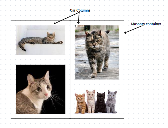 This creates two columns. The height is not specified and we allow each item to take up the space it needs.
One thing to note here is we have no control over the height of the columns. So if for example, one of the images was a lot taller, our layout could like this:
To reiterate, this option is suitable when equal height columns aren’t critical. Otherwise, let’s check out flexbox.
CSS Flexbox
Flexbox is an alternative to CSS columns. We can achieve this by applying the display: flex; property to the container. Flexbox offers more control over item positioning. It’s particularly effective for single-row or single-column layouts, allowing for equal-height columns. So, go for this for a more organized layout. Note that achieving a true masonry effect may need extra adjustments.
Let’s apply a flex display to the Masonry container:
.masonry-container {
  display: flex;
  flex-direction: column;
  flex-wrap: wrap;
  justify-content: space-between;
  gap: 12px;
  max-height: 600px;
}

.masonry-item {
  width: calc(50% - 1rem); /*adjust this based on the number of columns you want.
                            * This gives 2 columns*/
  overflow: hidden;
}

.masonry-item img {
  width: 100%;
  height: auto;
  display: block;
}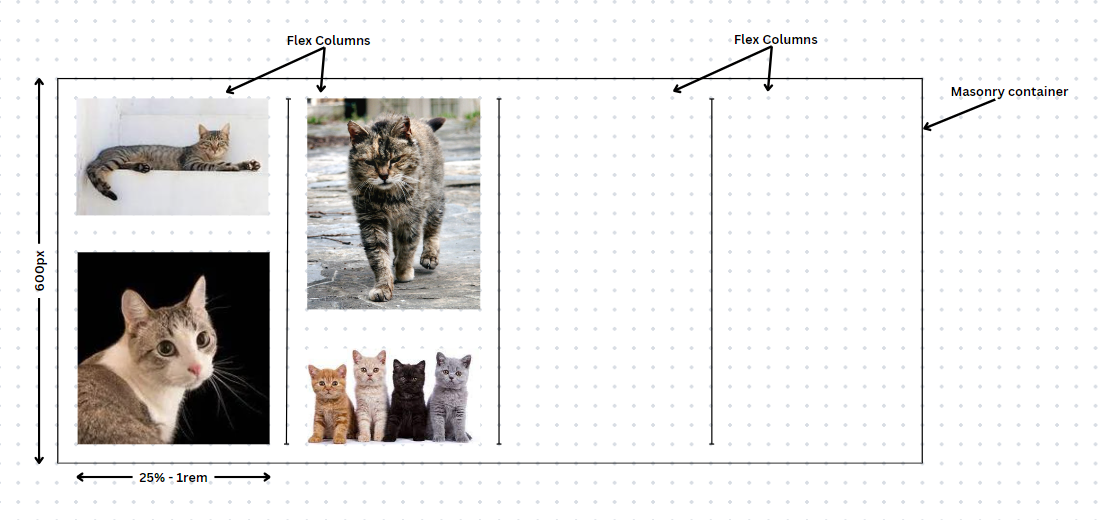
The trick here is to set a fixed height on the container, put all the items in a column flex, and set flex wrap: wrap;. The wrap property makes the items form a new column instead of overflowing. Next, we set a width on each masonry-item to determine the number of columns. This would depend on the number of items you have. If they only take up half of the space (minus the gap), then we can have two columns. If they take up a third of the space, we can have three columns, and so on. For a horizontal layout, make it a row display with a fixed width on the container and a height on the items.
CSS Grid
CSS Grid provides precise control over item placement. We apply it with the display: grid; property on the container. It’s well-suited for more complex layouts, including masonry designs. It offers advanced customization options and requires deeper understanding of grid properties. The downside of the CSS grid is that it requires setting strict grid lines. Working around this requires advanced knowledge of CSS Grid.
Here’s how:
.masonry-container {
  display: grid;
  grid-template-columns: repeat(auto-fill, minmax(240px, 1fr));
  gap: 20px;
  padding: 10px;
}

.masonry-item {
  width: 100%;
  height: auto;
}

.masonry-item:nth-child(2) {
  grid-row: span 2;
}

.masonry-item:nth-child(3) {
  grid-column: span 1;
  grid-row: span 2;
}

.masonry-item:nth-child(n + 4) {
  grid-column: span 1;
  grid-row: span 1;
}

.masonry-item img {
  width: 100%;
  height: 100%;
  display: block;
}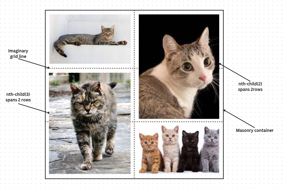
Here, we use grid-row: span n; to manipulate the grid layout. The grid cells have a fixed width and height but we can span grid items over many rows/columns. masonry-item:nth-child(n) targets the exact grid item we want to tweak.
The approach to follow depends on your project needs. Consider the design complexity and browser compatibility. For simpler layouts, CSS Columns or Flexbox may suffice. More intricate designs would need the flexibility of CSS Grid and JavaScript. Of course, if you’d rather not do it yourself, Masonry is a super cool Masonry layout library.
Making the Layout Responsive
For this, we will add media queries to make our layout adjust to different viewports:
@media (min-width: 768px) {
  .masonry-item {
    width: calc(100% - 10px); /*Adjust to suit your needs*/
  }
}

@media (min-width: 1024px) {
  .masonry-item {
    width: calc(100% - 10px);
  }
}
Advanced Styling Techniques
We can make our layout even more beautiful with transitions, shadows, animations, etc.
Let’s add some shadows and a cool transition effect on hover:
.masonry-item {
  /*previous styles*/
  transition: transform 0.3s ease;
  box-shadow: 0px 4px 8px rgba(0, 0, 0, 0.1);
  border: 4px solid #ddd;
}
.masonry-item:hover {
  transform: scale(1.05);
}
If you want to implement more animations, read all about CSS animations here.
Accessibility Considerations
Ensuring accessibility is crucial for a user-friendly experience. Here’s how we can achieve that in our layout.
- Keyboard accessibility: The
:focuspseudo-class highlights the focused Masonry item, ensuring keyboard accessibility. This helps users navigate our Masonry Layout using the keyboard.
.masonry-item:focus {
  border: 4px solid #3498db;
}- Alternative text: Providing alternative text (description) for images. This ensures that screen readers can convey the content to users who may not be able to see the images. It is also the text displayed in a case where the user’s network cannot load the image.
<img src="image-file-path" alt="a cat"/>- Screen reader testing: Visually-impaired users need screen readers. Test the layout with screen readers to ensure that they can interact with the content.
Troubleshooting Common Issues
Let’s look at some common issues that could affect user experience.
- Handling overlapping items: This is common with flexboxes and grids. We can avoid this by adding a pseudo-element after the last item. This creates extra space for the items to adjust, preventing overlapping. We’d also add a
flex-grow: 9999;styling so it can grow as much as necessary. Here’s the clear fix to prevent overlapping in a flex container:
.masonry-container:after {
  content: '';
  flex-grow: 9999;
}- Managing unintended gaps: Since we allow items to take the space they need, we have to watch out for this one. Define the gap between the items based on your design requirements.
masonry-container {
  gap: 12px;
}- Addressing Performance Concerns: The
imgrule.max-width: 100%;ensures images stay within the container’s width.height: auto;maintains their aspect ratio:
img {
  max-width: 100%; /* Ensure images don't exceed container width */
  height: auto; /* Maintain image aspect ratio */
  display: block;
}
Conclusion
In this article, we’ve built a responsive Masonry layout with CSS. Masonry layouts enhance the visual appeal and responsiveness of our content. The discussed techniques contribute to a more engaging and inclusive user experience. You’re now well-equipped to create your own responsive Masonry layout. Remember to test your layout across different screen sizes to ensure responsiveness. Also, feel free to customize the styles and features based on your preferences. The entire code can be found over on Codepen.
For further reading on creating a responsive Masonry Layout, check out:
- Approaches for a CSS Masonry Layout
- MDN Web Docs- Masonry Layout
- Animations and Transitions with Tailwind CSS
Truly understand users experience
See every user interaction, feel every frustration and track all hesitations with OpenReplay — the open-source digital experience platform. It can be self-hosted in minutes, giving you complete control over your customer data.
Star on GitHub12k